Illuminate data stories with area chart PowerPoint templates that make trends pop. Geared toward analysts, marketers, and executives, these tools layer metrics into flowing visuals that reveal insights at a glance.
Stacked or clustered configurations handle multi-series data effortlessly, with smooth fills and axis labels that adapt to your scale. Muted yet distinct hues prevent overlap, ensuring every area stands out in boardrooms or webinars.
Ditch tedious builds - pre-formatted in PowerPoint, they import CSV data seamlessly and support theme overrides for corporate polish. Perfect for sales forecasts or environmental tracking, they turn numbers into narratives.
Chart your success with clarity and style. Check out our area chart selection and plot your next breakthrough.
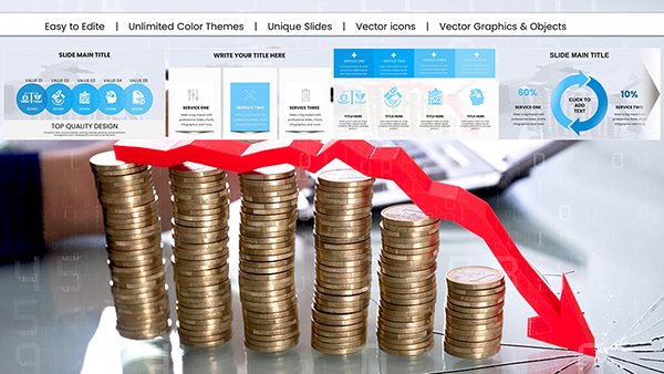
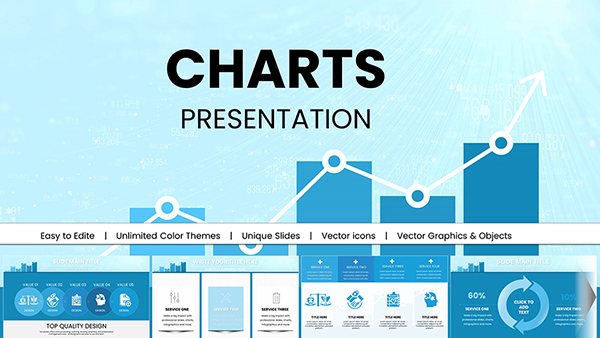
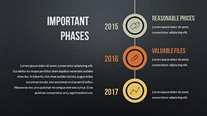
Services PowerPoint Charts Template: Elevate Your Professional Presentations
ID: #PC00492
$18.00
(607)
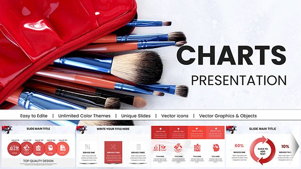
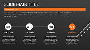
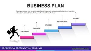
Business Plan PowerPoint Charts - Instant Download
ID: #PC00468
$20.00
(838)
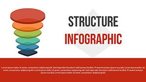
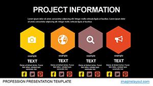
Project Information Animation PowerPoint Charts Templates
ID: #PC00467
$21.00
Strategic Use Cases for Area Chart Templates
Area chart PowerPoint templates thrive in data-heavy environments. Finance teams stack revenue streams to forecast profitability, highlighting seasonal swells. Marketers overlay campaign performances, shading ROI curves for quick scans.
Environmental reports use them for pollution trends, filling areas under emission lines. Educators demonstrate population dynamics with historical overlays.
Financial Reporting: Cumulative earnings visuals.
Marketing Analytics: Engagement accumulation.
Sustainability Dashboards: Impact layering.
Academic Studies: Trend evolutions.
Better Than Default PowerPoint Charts
PowerPoint`s built-ins demand heavy formatting for stacks; ours arrive styled, with auto-legends and grid toggles. They edge out basics with gradient fills for depth, ideal for 3D illusions without plugins.
Free templates often glitch on updates - ours maintain integrity across versions.
Core Value Propositions and Charting Tips
Emphasize baselines for zero-clutter views, and use transparency for overlaps. Best practices: Limit series to four for readability, pairing with annotations for peaks.
Innovate by animating fills sequentially, unveiling contributions one by one for dramatic reveals.
Visualize victory? Download and layer your data now.
Advanced Customization Guide
Series Management: Drag to reorder stacks.
Axis Tweaks: Log scales for exponential data.
Integration: Link to Excel for live refreshes.
Export Prep: Flatten for print fidelity.
Compelling Examples in Practice
A startup pitch stacks user growth against churn, shading net gains vividly. In climate talks, area fills depict deforestation rates, urging action through visual scale.
HR dashboards accumulate absenteeism trends, correlating with wellness spends. These highlight how templates uncover hidden patterns.