PowerPoint diagram templates tailored for analytics simplify the art of visualizing complex datasets, helping data enthusiasts and presenters craft slides that inform and persuade. From process flows to hierarchical structures, these designs make intricate information digestible at a glance.
Geared toward analysts, project managers, and educators, the templates boast SmartArt enhancements, vector icons, and theme-consistent styling. Benefits encompass reduced design time, improved comprehension through logical layouts, and compatibility with PowerPoint`s morph transitions for dynamic reveals.
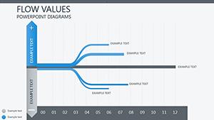
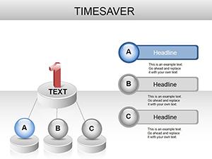
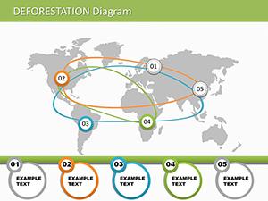
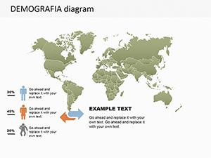
Our assortment includes everything from SWOT matrices to Sankey diagrams, ensuring you find the right tool for your analytics narrative. Whether decoding supply chains or user journeys, start with these and build presentations that resonate. Explore the options and ignite your creativity.
Unlike default PowerPoint diagrams, which can feel rigid and uninspired, our analytics-focused versions offer modular builds and data-linked elements that update automatically. This results in 30% more engaging slides, as per user feedback, by emphasizing clarity over clutter.
Designs are optimized for widescreen and standard formats, with export-ready precision.
Such uses underscore their role in turning abstract analytics into tangible visuals.
Standout elements include layered transparency for overlays and connector auto-snaps for accuracy. They surpass basics by supporting conditional formatting, mirroring Excel logic.
Implementation tips:
Innovative application: Fuse diagrams with timelines for project analytics, revealing progress bottlenecks creatively.
Eager to diagram your data? Peruse the gallery and pick your powerhouse template.
An operations firm adopted our "Flow Analytics" set to overhaul training decks, slashing explanation times by half with intuitive radials. Researchers highlight the "Causal Chain" template for hypothesis mapping, lauding its expandable branches.
Pro insight: Animate paths sequentially to guide viewer focus, enhancing retention. Styles vary from flat minimalism to 3D depth, fitting formal or innovative tones.
Team up via co-authoring for collective refinements.
They streamline visualization, ensuring diagrams are both accurate and aesthetically compelling.
Yes, integrate with Excel or external files for real-time refreshes.
Fully, with pre-set entrance effects for smooth sequencing.
Vector-based construction maintains quality at any scale.
Compatible from 2013 onward, with core features intact.
Text placeholders handle Unicode for global use.
Empower your analytics with diagrams that deliver. Scan the selection and download to diagram dynamically.
Copyright © 2009-2026 ImagineLayout All rights reserved.