Infuse energy into your agile reports using our Keynote charts, where data dances to life through elegant animations. These charts are perfect for visualizing epic progress, defect trends, and capacity planning, tailored for designers, strategists, and agile enthusiasts who prioritize aesthetics alongside accuracy.
With fluid builds, interactive hotspots, and theme-aware styling, they leverage Keynote`s prowess for standout slides. Track everything from cycle times in waveform charts to stakeholder value in radial distributions, making abstract metrics tangible and exciting. These aren`t just charts; they`re conversation starters that propel discussions forward.
Suited for creative agencies, tech conferences, and internal retrospectives, our charts cut through noise to highlight what matters. Effortless scalability and export options mean your visuals adapt to any format. Step into our selection and animate your agile journey with tools that inspire clarity and action.
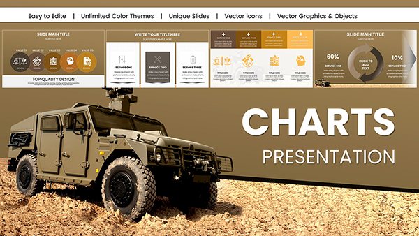
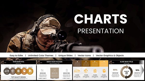
Military Vehicle Keynote Charts Presentation: Elevate Your Defense Strategies
ID: #KC01008
$20.00
(1173)
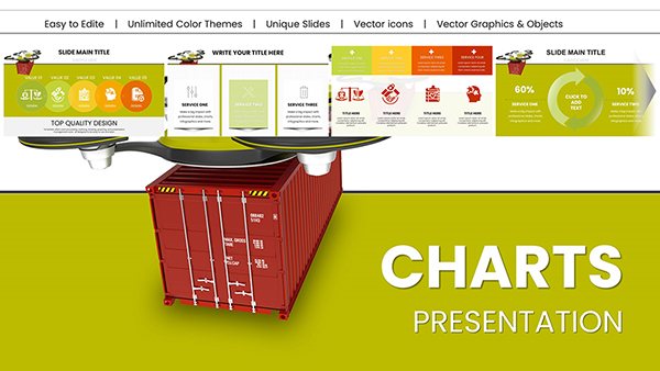
Military Technology Drones Keynote Charts for Presentation
ID: #KC00997
$18.00
(520)
Armed Forces Keynote Charts for Military Presentation
ID: #KC00995
$18.00
(444)
Military Pay Keynote Charts Template
ID: #KC00994
$18.00
(966)
Armed Forces PowerPoint Charts for Military Presentation
ID: #KC00993
$16.00
(1062)
Army Pay Keynote Charts for Military Presentation
ID: #KC00992
$18.00
(605)
Business Correspondence Keynote Charts Template
ID: #KC00957
$20.00
(466)
Professional Business Report Keynote Charts
ID: #KC00938
$25.00
(532)
Sustainable Development Keynote Charts: Empower Your Eco-Presentations
ID: #KC00937
$25.00
(700)
Technical Analysis Keynote Charts: Charting Paths to Profit
ID: #KC00924
$22.00
(963)
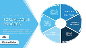
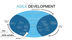
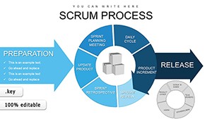
Scrum Agile Development Process: Keynote Charts for Efficient Teams
ID: #KC00856
$18.00
(840)
Agile Methodology Keynote Charts: 45 Slides
ID: #KC00831
$13.00
(770)
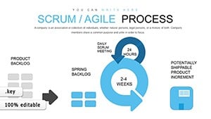
Agile Scrum Methodology Process Flow Keynote Charts Template
ID: #KC00829
$18.00
(593)
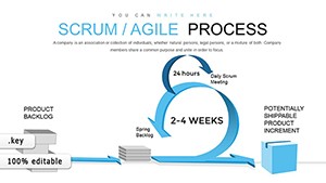
Scrum Agile Process Keynote Charts Template
ID: #KC00828
$18.00
(735)
Scrum Process Flow Pie Keynote Charts Template
ID: #KC00795
$20.00
(1091)
Puzzle Charts for Keynote: Decode Complex Data
ID: #KC00444
$18.00
(172)
Starting Business Keynote Charts: Blueprint Your Path to Profitable Growth
ID: #KC00396
$15.00
(923)
Technical Analysis Keynote Charts Template
ID: #KC00386
$18.00
Bring Data to Life with Agile Keynote Charts
Keynote charts in our agile lineup harness motion graphics to underscore iterative themes, far surpassing static alternatives. A lead time chart, for example, can pulse with incoming data points, mirroring the heartbeat of your sprints. This dynamic approach contrasts sharply with rigid defaults, offering 360-degree interactivity via hyperlinks to detail views.
In practice, educators use these for agile certification prep, animating principle breakdowns to reinforce learning retention by 35%.
Targeted Scenarios for Chart Deployment
UX Research: Heatmap charts to map user journey friction points.
Operations: Sankey diagrams for resource flow optimization.
Investor Meetings: Bubble charts scaling ROI by risk levels.
Wellness Programs: Gauge charts for habit formation milestones.
Unique perks: Auto-sync with Numbers for real-time updates and gesture-friendly touches for iPad use. Advise starting with minimalism - let animations do the heavy lifting.
Outshining Everyday Chart Options
Conventional Keynote charts falter in agile`s fluid context, missing nuanced overlays like confidence intervals. Ours integrate these natively, as seen when a fintech team charted compliance velocities to ace audits. Innovate by syncing chart beats to presentation music for thematic flair. Grab a chart template to energize your deck.
Pro Animation Hacks
Chain builds across charts for narrative continuity.
Use object tracking for evolving data paths.
Export as GIFs for quick shares in chat tools.
Frequently Asked Questions
These tips unlock full potential. Explore animations and watch your data soar.