Revolutionize how you present data with abstract PowerPoint chart templates that merge analytics with artistic flair. Geared toward analysts, managers, and educators, these templates employ curved bars, ethereal pies, and dynamic scatters to make numbers narrative. Say goodbye to boring spreadsheets - hello to slides that illuminate insights with elegance.
Compatible with PowerPoint`s native tools, edits are straightforward: resize elements, recolor palettes, and animate flows. Themes range from corporate neutrals to vivid abstracts, fitting boardrooms to classrooms. High-fidelity vectors ensure sharpness on large screens.
Elevate your reports from functional to fascinating. Scroll through options, choose one that aligns with your dataset, and access editable files right away. Turn complex info into clear, captivating stories today.
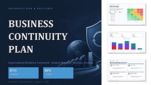
Business Continuity Plan PowerPoint Template and Charts
ID: #PC01146
$20.00
(17)
Equity Capital Dynamics PowerPoint Template and Charts
ID: #PC01141
$15.00
(17)
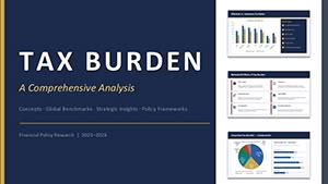
PowerPoint Tax Burden Analysis - Editable PPTX
ID: #PC01125
$15.00
(594)
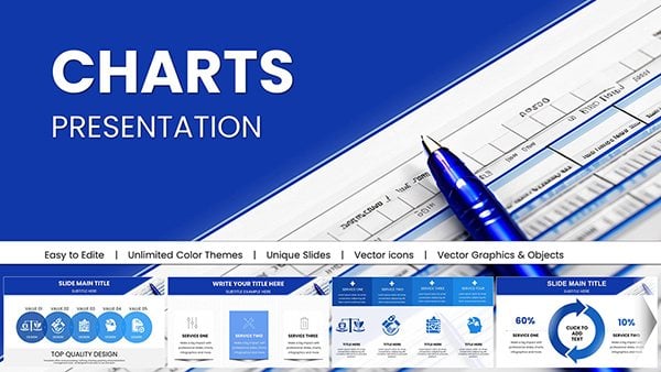
Business Financial PowerPoint Charts - Drive Decisions
ID: #PC01036
$25.00
(1009)
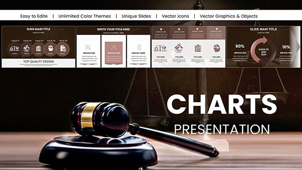
Judge and Laws PowerPoint Charts for Impactful Delivery
ID: #PC01032
$25.00
(921)
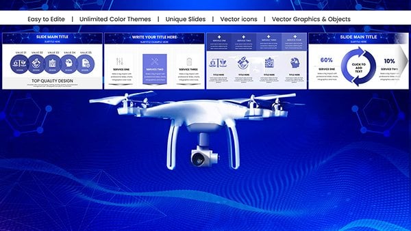
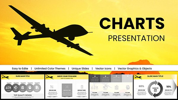
Flying Drone PowerPoint Charts Presentation: Capture Aerial Perspectives in Your Slides
ID: #PC01019
$18.00
(26)
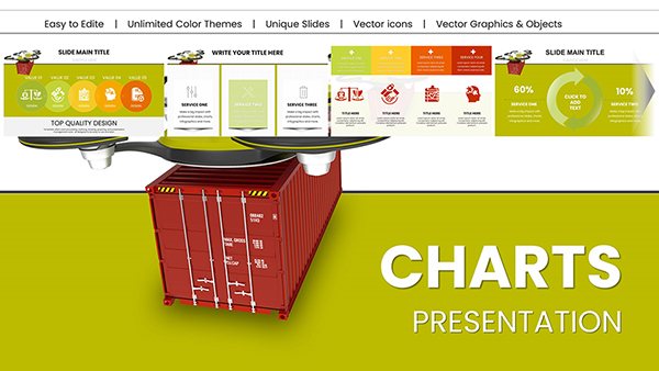
Heavy Cargo Drone Delivery PowerPoint Charts - Download Logistics Templates
ID: #PC01014
$20.00
(958)
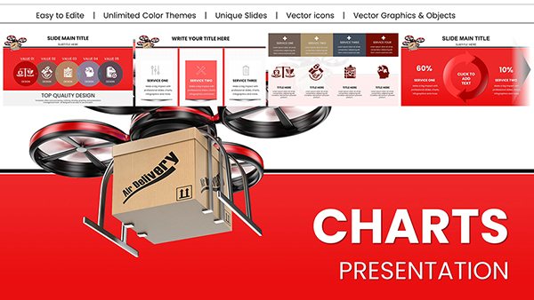
Drone Delivery PowerPoint Charts Presentation: Chart the Course of Modern Logistics
ID: #PC01013
$22.00
(743)
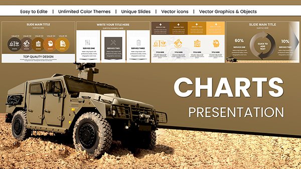
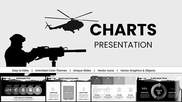
Military Vehicle PowerPoint Charts Template
ID: #PC01008
$20.00
(1177)
Military Technology Drone Warfare PowerPoint Charts Template
ID: #PC00997
$18.00
(1136)
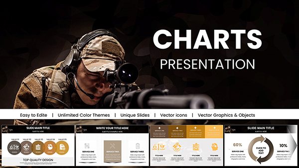
Sharpshooter PowerPoint Charts Template for Precision Presentations
ID: #PC00995
$18.00
(627)
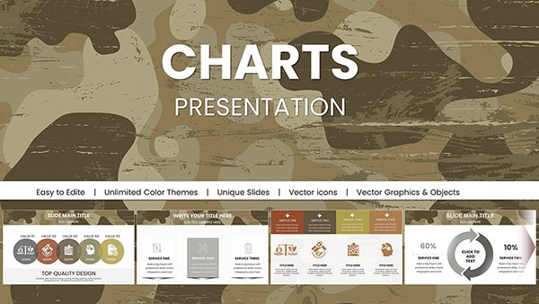
Military Camouflage PowerPoint Charts Templates
ID: #PC00994
$18.00
(666)
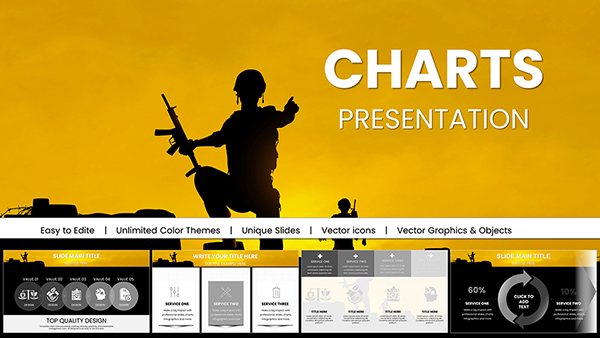
War Armed Forces PowerPoint Charts - Download Presentation
ID: #PC00993
$16.00
(901)
Battle Military PowerPoint Charts Template - Instant Download | Tactical Briefing Slides for Defense & Operations
ID: #PC00992
$15.00
(585)
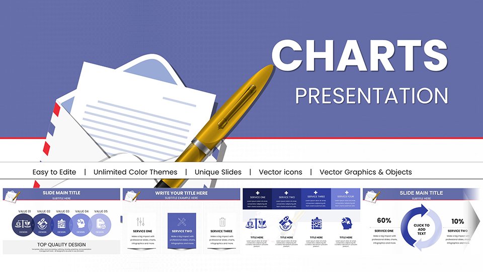
Business Correspondence PowerPoint Charts: Pro PPTX
ID: #PC00957
$20.00
(112)
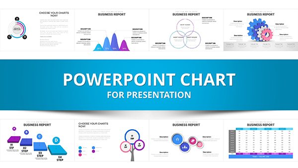
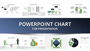
Professional Business Report PowerPoint Charts Template
ID: #PC00938
$25.00
(574)
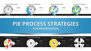
Pie Process Strategies PowerPoint Charts Template - Presentation PPT
ID: #PC00293
$24.00
(910)
Sustainable Development PowerPoint Charts: Inspire Eco-Innovation
ID: #PC00937
$25.00
(749)
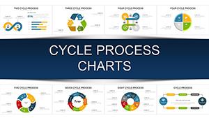
Cycle Process PowerPoint Charts Template: Visualize Your Workflows Effortlessly
ID: #PC00922
$20.00
(583)
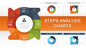
Steps Analysis PowerPoint Charts Template: Visualize Processes with Precision
ID: #PC00918
$18.00
(212)
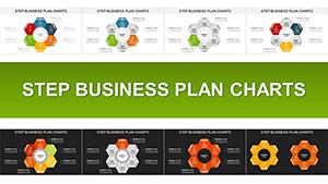
Step Business Plan PowerPoint Charts Template for Compelling Pitches
ID: #PC00916
$23.00
(911)
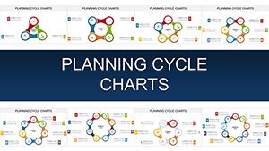
Planning Cycle PowerPoint Charts Template for Strategic Presentations
ID: #PC00915
$20.00
(248)
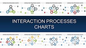
Interaction Processes PowerPoint Charts for Dynamic Presentations
ID: #PC00914
$22.00
(508)
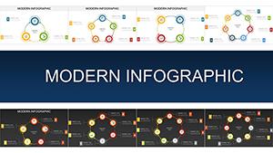
Modern Infographic Charts - Editable PPTX | ImagineLayout
ID: #PC00913
$15.00
Transforming Data with Abstract Charts
Abstract chart templates in PowerPoint elevate mundane metrics into visual symphonies, using form over function to guide viewer intuition. This contrasts sharply with default charts` stark lines, offering layered depths that reveal trends organically. Data pros in finance and research favor them for simplifying multifaceted datasets.
Custom Animation: Built-in sequences for phased reveals.
Scalable Integration: Embed into any slide deck seamlessly.
Studies indicate 50% faster comprehension with artistic data viz.
Industry-Specific Applications
Marketing teams chart campaign ROI via abstract funnels, while HR visualizes diversity metrics with inclusive patterns. In academia, professors depict statistical models through fractal-inspired graphs.
Research Summaries: Heatmap abstracts highlight correlations.
Best: Limit data points per chart for focus, using legends sparingly.
Exclusive Template Highlights
Our PowerPoint abstracts include formula-linked charts for auto-updates and theme variants. Designer-curated, like "Orbit Analytics" for circular data or "Flux Bars" for growth. Download to dynamize your decks.
Expert Tips for Implementation
Harmonize chart styles with deck themes; use tooltips for details. User feedback praises ease in turning raw Excel into polished pros.
Layer transparencies for overlapping insights without confusion.
Frequently Asked Questions
Chart your success. Browse charts for more data delights.