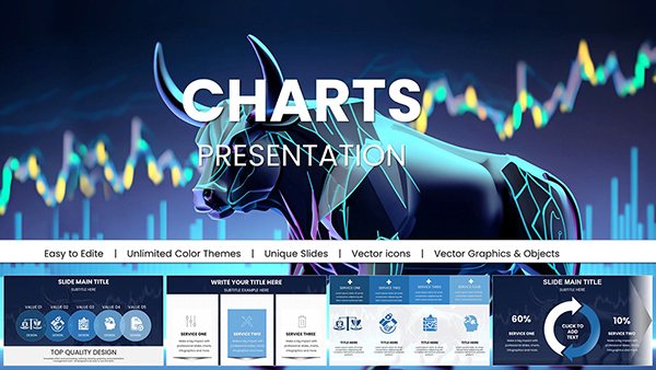
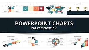
Immerse your audience in multidimensional storytelling with our collection of 3D PowerPoint chart templates. These designs go beyond flat visuals, incorporating shadows, rotations, and layered elements to make complex datasets feel alive and accessible. Ideal for professionals in finance, marketing, and education who need to convey trends, comparisons, and forecasts with clarity and flair.
Each template is fully editable, allowing you to tweak colors, adjust depths, and integrate your own figures seamlessly. Whether you`re illustrating market growth through towering bar graphs or segmenting customer insights via pie spheres, these charts capture attention and drive home key messages. Businesses save hours on design while educators engage students more effectively.
Explore our curated selection below and find the perfect 3D chart to elevate your next slide deck. Start customizing today and watch your presentations stand out.
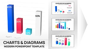
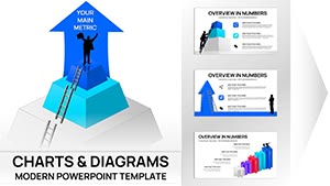
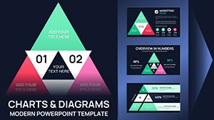
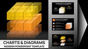

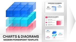
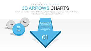
3D charts in PowerPoint offer a cinematic approach to data visualization, turning numbers into narratives that resonate. Unlike traditional 2D formats, these templates add a sense of volume and perspective, making abstract concepts tangible. For instance, a 3D bar chart can simulate stacked buildings to represent quarterly revenues, helping viewers grasp growth trajectories at a glance.
In sales environments, these charts shine by dramatizing performance metrics - imagine a rising 3D line graph snaking through a virtual landscape to depict sales evolution over time.
Standard PowerPoint charts often feel static and uninspired, blending into the background of endless slides. Our 3D templates, however, inject energy and professionalism. They reduce cognitive load by leveraging spatial cues, where depth indicates importance and rotation uncovers hidden patterns. Plus, they`re optimized for high-resolution displays, ensuring crisp details even on large screens.
Customization is effortless: swap data sets in seconds, apply brand colors, or add subtle animations like slow spins for emphasis. This not only saves time but also positions you as a forward-thinking presenter.
To maximize impact, start with simplicity - limit to 5-7 data points per chart to avoid clutter. Balance lighting and shadows for realism without distraction, and test rotations on different devices for consistent viewing. Integrate icons or textures for thematic relevance, like metallic finishes for tech pitches.
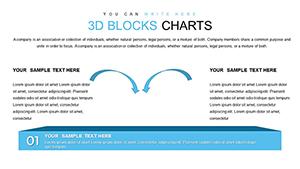
Consider audience context: for analytical crowds, pair with precise legends; for creative teams, experiment with abstract forms like helical spirals for innovation roadmaps.
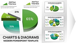
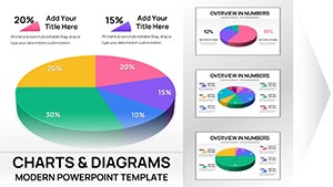
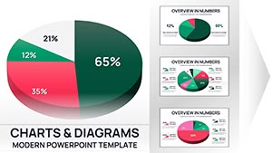
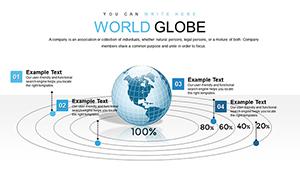
A financial advisor might use a 3D doughnut chart to dissect portfolio allocations, slicing through segments to reveal risk levels. In healthcare, 3D funnel charts model patient journey drop-offs, guiding process improvements. Creatively, blend with photos - overlay 3D metrics on product images for e-commerce reviews.
Download a template now and experiment; the intuitive interface ensures quick mastery.
These 3D charts play well with other slide elements, supporting hyperlinks to detailed reports or embedded videos for deeper dives. Collaborate in real-time via cloud tools, where team members refine depths or alignments together.
Address potential pitfalls like over-rotation causing disorientation by anchoring views with fixed axes. Always preview in presentation mode to confirm flow.
3D charts add depth and interactivity, helping audiences visualize complex relationships intuitively through spatial elements like shadows and perspectives.
Yes, all templates are fully editable - adjust hues, add spins, or fade-ins to match your brand and narrative style.
Absolutely, they import seamlessly and retain 3D effects for collaborative editing.
They highlight key insights dramatically, boosting retention and decision-making during pitches or reports.
Keep data minimal, use subtle animations, and include clear labels to guide focus without distraction.
Yes, export in 4K for prints or videos, maintaining sharp details across formats.
Ready to revolutionize your slides? Browse our 3D PowerPoint chart collection and download your favorites today.
Copyright © 2009-2026 ImagineLayout All rights reserved.