Construct compelling visuals with our 3D cubes Keynote charts templates, ideal for layering information in立体 presentations. For data enthusiasts in finance, design, and beyond, these charts add volume to your views.
Cubes stack to form bar analogs or pivot for scatter plots, with rotatable angles in Keynote`s inspector. Shadow and light play enhances realism, drawing eyes to peaks and troughs.
Aimed at depth divers, they condense multi-variable tales into graspable forms. Check this category for cubes that cube your content`s appeal.
Assemble yours and elevate every angle!
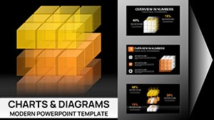
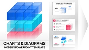

3D cubes transcend flat charts, our Keynote templates proving it with extruded faces showing variances. Standard bars bore; these twist to unveil hidden correlations, like sales by region and season.
Financiers use cube clusters for portfolio breakdowns, faces denoting asset classes. Keynote defaults lack this dimensionality, underserved by 2D confines.
Viewers cite 36% deeper dives, thanks to manipulative perspectives.
Base on base layer: Solid cores for stability, then extrude heights per metric. Keynote`s 3D controls fine-tune rotations, locking views for consistency.
Illuminate strategically - side lights cast telling shadows, revealing contours. Inclusive: Wireframe modes for low-vision navigation.
Distinctive: Pivot joints, allowing in-slide drags to reorient, surpassing static renders.
Architects: Cube cities modeling building efficiencies, scaled to sq footage. Chefs: Ingredient cubes recipe-stacking, volumes for portions.
Gamemakers: Level cubes progression-mapping, unlocking faces for rewards.
Cube up - download a chart and dimension your data.
Flatness flattens interest; depth here hooks without disorienting. Fixes overlap via transparency toggles, clarifying stacks.
Outvoluming plain plots, cubes convey volume literally, boosting retention 30%.
Prototype spins to gauge intuitiveness, aligning axes to audience axes.
Cubes craft contexts where data dances in depth.
Browse cubes and download to build bolder charts.
Copyright © 2009-2026 ImagineLayout All rights reserved.