South America Keynote Maps
This collection contains fully editable South America map templates for Keynote, built for business analysts, regional consultants, market strategists, and academic presenters who need to visualize geographic data across the continent without sourcing and formatting raw map assets from scratch.
Each template covers the full South American continent with country-level outlines, selectable regions, and clean vector-based layouts that scale without quality loss at any slide dimension. Whether you are mapping sales territory coverage across Brazil and Argentina, showing logistics routes between key distribution hubs, or presenting regional market entry analysis to a leadership team, these templates give you a geographically accurate and visually consistent starting point. Download a layout, apply your data, and present - no cartography skills required.
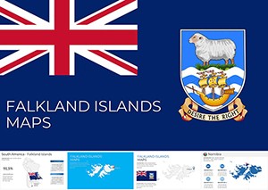 (573)
(573) Falkland Islands Maps Keynote Template: Islands of InnovationID: #KM00225$15.00
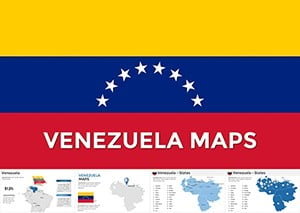 (883)
(883) Venezuela Keynote Maps: Editable & DynamicID: #KM00201$56.00
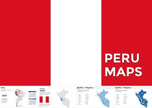 (90)
(90) Interactive Peru Keynote Maps TemplateID: #KM00200$50.00
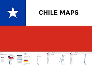 (1054)
Custom Chile Maps Keynote Template - Editable ProID: #KM00186$48.00
(1054)
Custom Chile Maps Keynote Template - Editable ProID: #KM00186$48.00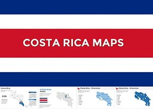 (1153)
Costa Rica Keynote Maps - Fully Editable | ImagineLayoutID: #KM00185$40.00
(1153)
Costa Rica Keynote Maps - Fully Editable | ImagineLayoutID: #KM00185$40.00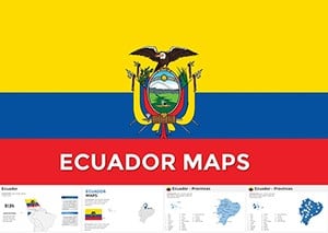 (952)
(952) Ecuador Keynote Maps Template: Craft Compelling Narratives with Editable South American VisualsID: #KM00180$55.00
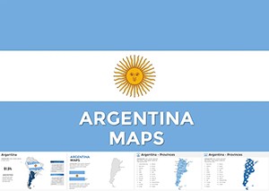 (586)
Argentina Keynote Maps - Fully Editable | ImagineLayoutID: #KM00176$40.00
(586)
Argentina Keynote Maps - Fully Editable | ImagineLayoutID: #KM00176$40.00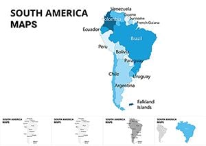 (785)
South America Maps Keynote Template: Charting Continental NarrativesID: #KM00074$25.00
(785)
South America Maps Keynote Template: Charting Continental NarrativesID: #KM00074$25.00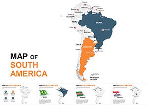 (349)
South America Editable Keynote Maps 2022: Ignite Your Global NarrativesID: #KM00054$45.00
(349)
South America Editable Keynote Maps 2022: Ignite Your Global NarrativesID: #KM00054$45.00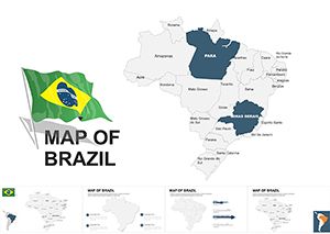 (600)
Brazil Maps Keynote Template: Ignite South American StoriesID: #KM00037$48.00
(600)
Brazil Maps Keynote Template: Ignite South American StoriesID: #KM00037$48.00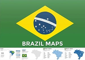 (20)
Customizable Brazil Keynote Maps Template: Explore Geography and EconomyID: #KM00028$48.00
(20)
Customizable Brazil Keynote Maps Template: Explore Geography and EconomyID: #KM00028$48.00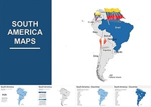 (782)
South America Maps Keynote Template - 41 Editable SlidesID: #KM00007$54.00
(782)
South America Maps Keynote Template - 41 Editable SlidesID: #KM00007$54.00
Why a Dedicated South America Map Template Outperforms a Generic World Map Slide
A standard world map slide serves a different purpose than a focused regional map. When your presentation is about South America specifically - a market expansion analysis, a regional operations review, a trade flow discussion - dropping a world map on the slide and circling one continent sends a weak visual signal. It suggests the presenter repurposed a generic asset rather than designing for the audience's actual context.
A dedicated South America map template fills the slide with the region that matters. Country borders are clearly visible, the continent's geography is immediately recognizable, and you have space to add labels, color-coded regions, or data callouts without the rest of the world competing for visual attention. This is particularly important for presentations to regional stakeholders - a Latin American country manager or a cross-border logistics team - who will evaluate the slide's geographic accuracy before they engage with its data.
The templates in this Keynote collection are built at continent scale, which means country proportions are accurate, coastal and border details are clean, and the layout works equally well for a full-continent view and for highlighting individual countries or sub-regions. That level of cartographic precision is not available in a world map slide where South America occupies roughly 15% of the total slide area.
Use Cases: How These Map Templates Are Used in Practice
Map templates are most effective when the geographic dimension of your data is central to the argument you're making - not decorative, but analytical. These are the scenarios where South America Keynote map templates deliver clear value.
Regional Market Entry Analysis - Strategy Consultants
A strategy consultant preparing a market entry assessment for a consumer goods company looking at expansion into Colombia, Chile, and Peru needs a map slide that shows the three target markets clearly against the rest of the continent. Color-coding the three priority countries while leaving others neutral creates an instant visual argument for geographic focus. This type of slide appears in board-level strategy decks, investor materials, and internal business case documents - and it needs to look deliberate, not like a last-minute screenshot from a mapping tool.
Sales Territory Mapping - Regional Sales Directors
A regional sales director covering Latin America presenting territory assignments to a new sales team benefits enormously from a map that shows which rep owns which country or sub-regional cluster. Color-coded territories communicate ownership and coverage gaps far more efficiently than a table of country names. The map also becomes a shared reference point - something the team looks at in every quarterly business review to assess where performance is concentrated and where white space remains.
Logistics and Supply Chain Reviews - Operations Teams
An operations manager at a manufacturing or distribution company presenting a supply chain review that covers production sites, distribution centers, and last-mile coverage across South America needs a map that can carry multiple data layers: site locations, route overlays, and country-level performance indicators. A clean vector map template provides the geographic foundation for this type of multi-layer visualization without requiring the presenter to source and format geographic assets independently.
Academic and Research Presentations - University Faculty and Think Tanks
A researcher presenting findings on regional economic development, climate data patterns, or public health outcomes across South American countries needs a map that is geographically accurate and visually neutral - free from the decorative styling that makes business-oriented map templates inappropriate for academic contexts. Several layouts in this collection use clean, minimal styling suited to research presentations, conference papers, and institutional reports.
South America Map Templates vs. Default Keynote Shapes
Keynote does not include a built-in South America map asset. The closest default option is a world map image, which is a flat graphic that cannot be edited at the country level - you cannot color individual countries, add data labels to specific regions, or adjust borders without external image editing software. For any presentation where South America is the geographic focus, the default Keynote toolkit is genuinely insufficient.
The templates in this collection are built with vector-based country shapes, which means each country is an independently selectable object in Keynote. You click on Brazil, change its fill color, and it updates instantly - no image editing, no external tools. This makes the templates practical for iterative work: updating a market map from Q3 to Q4, changing territory colors for a new sales structure, or swapping a data label without rebuilding the entire slide.
There is also a consistency argument. A world map image scaled and cropped to show South America will often look slightly off - pixelated edges, inconsistent proportions, or alignment issues at the slide boundary. Vector country shapes render sharply at any zoom level and can be repositioned and scaled without any quality loss. For a presentation that will be shown on a large screen or exported as a high-resolution PDF, this matters.
Beyond technical quality, pre-built map templates save significant preparation time. Sourcing a clean South America map, importing it into Keynote, ungrouping it into editable country shapes, and applying consistent styling can take 30–60 minutes for someone without a design background. A properly built template collapses that work into five minutes of content editing.
Finally, a well-designed map template brings visual coherence that a DIY approach rarely achieves. Country outlines, label typography, color contrast ratios, and data callout styling are all pre-calibrated to work together. The result is a slide that looks like it was designed for the presentation, not assembled from parts.
Best Practices for Using South America Map Templates in Keynote
A map template is only as effective as the data and design decisions layered onto it. These practices will help you produce map slides that communicate clearly rather than simply displaying geography.
Limit the Number of Highlighted Countries per Slide
Highlighting more than five or six countries on a single map slide creates visual competition - the audience's eye doesn't know where to focus. If your analysis covers more countries, use a sequence of slides: one overview map showing all relevant countries with a single color, followed by detail slides for each priority country or sub-region. This approach keeps each slide readable while giving your narrative the geographic structure it needs.
Use Color to Encode Meaning, Not Decoration
Country color on a map slide should always mean something specific: performance tier, market priority, territory ownership, or data category. Avoid using multiple colors simply to make the map look more varied. If all highlighted countries are in the same category, use a single color. If they represent different tiers, use a sequential palette where color intensity corresponds to value. This discipline makes your map slides analytically rigorous rather than visually busy.
Add Data Callouts Sparingly
Data callout boxes - labels that float next to a country with a specific metric - are most effective when used for three to five countries maximum on a single slide. More than that, and the map becomes a data table with geographic decoration. If you have country-level metrics for the full continent, consider a choropleth approach (color intensity reflects value) rather than individual callouts. Most templates in this collection support both approaches through their layered object structure.
Technical Tip: Editing Country Fill Colors in Keynote
In Keynote, vector country shapes are grouped by default when you first open a map template. To edit individual countries, click the map once to select the group, then click a second time to select an individual country shape within the group. You can then use the Format panel on the right to change the fill color, add a stroke, or adjust opacity. To update multiple countries to the same color simultaneously, hold Shift while clicking each country shape, then apply the fill color once. This is faster than editing countries individually and ensures color consistency across all selected regions.
Why ImagineLayout's South America Keynote Maps Stand Apart
Most template platforms that offer regional map slides provide them as part of a generic world maps bundle - you get a South America slide among 50 other regional slides, all styled to match a single corporate template that may have no relevance to your presentation's visual identity. ImagineLayout's South America map collection is a dedicated category, which means every template in it was built specifically for South America use cases and tested for the types of presentations described above.
The layouts here are also built natively for Keynote, not converted from PowerPoint. Keynote handles vector objects, animations, and color fills differently than PowerPoint, and templates designed for one application often lose fidelity when converted to the other. By building directly in Keynote, ImagineLayout ensures that object grouping, animation behavior, and color rendering all work as expected without requiring the user to troubleshoot conversion artifacts.
Compared to competitors like Envato Elements or SlideTeam - which offer large volume libraries with inconsistent quality control - ImagineLayout's map templates are reviewed for geographic accuracy, object editability, and visual consistency before publication. You are not downloading a map that was auto-generated from a data source and packaged with minimal QA. These are presentation-ready assets built by designers who understand how map slides function in a real business or academic context. Browse the collection below and download the layout that fits your presentation's geographic and analytical needs.
Frequently Asked Questions
Are the country shapes in these map templates individually editable in Keynote?
Yes. Each country in the map templates is built as an independent vector shape within a grouped object. In Keynote, you can double-click into the group to select individual country shapes and then change their fill color, opacity, stroke, or other properties using the Format panel. You can also ungroup the entire map if you prefer to work with all country objects as independent elements. This structure makes it straightforward to color-code countries by territory, performance tier, or any other categorical variable relevant to your presentation.
Can I use these Keynote map templates in PowerPoint?
These templates are designed and optimized for Keynote. You can export a Keynote file to .pptx format and open it in PowerPoint, but vector shape behavior, animation timing, and font rendering may change during the conversion. For presentations that will be delivered in PowerPoint, check the ImagineLayout catalog for PowerPoint-native map templates, which are built and tested specifically for that application. Using a natively built file will always give you better results than a converted one, particularly for complex vector layouts like maps.
How geographically accurate are the country outlines?
The map templates in this collection use country outlines derived from standard cartographic reference data, appropriate for business presentation use. The borders reflect internationally recognized country boundaries at a level of detail suitable for continent-scale visualization in a 16:9 slide format. These templates are not designed for technical geographic analysis or scientific research that requires surveying-grade precision, but for the vast majority of business, consulting, and academic presentation contexts, the geographic accuracy is fully appropriate and will not present issues with informed audiences.
What license is included with the download?
Each template download includes a commercial use license covering client presentations, internal business decks, investor materials, and academic presentations. The license does not cover redistribution of the template files, resale of the designs as standalone assets, or incorporation into template products intended for third-party sale. If you need a specific licensing arrangement for an agency workflow or white-label project, review the full license terms on the product detail page before purchasing.
Do the templates include all 12 South American countries?
Most templates in this collection include all 12 sovereign South American countries - Argentina, Bolivia, Brazil, Chile, Colombia, Ecuador, Guyana, Paraguay, Peru, Suriname, Uruguay, and Venezuela - as individually editable shapes. Some layouts also include French Guiana as a labeled territory. The specific country coverage is detailed on each product page. If you need a template that highlights a specific sub-region (such as the Andean countries or the Southern Cone), look for the filter options within this category to narrow the selection to layouts that match your geographic focus.