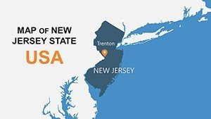
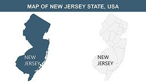
New Jersey USA PowerPoint Maps: Transform Data into Dynamic Stories


Type: PowerPoint Maps template
Category: North America
Sources Available: .pptx
Product ID: PM00125
Template incl.: 26 editable slides
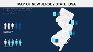
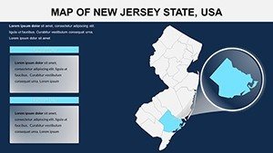
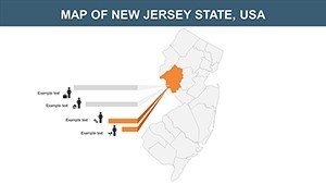
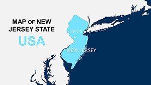
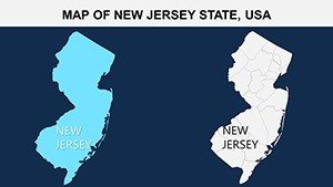
When it comes to presenting complex regional information, nothing beats a well-crafted map that brings clarity and engagement to your audience. Our New Jersey USA PowerPoint maps template, featuring 26 editable slides, is engineered for those who need to convey everything from urban density in Newark to pharmaceutical hubs in Princeton with precision and flair. Ideal for business executives mapping out logistics networks or teachers exploring the state's revolutionary history, this toolkit turns geographical data into persuasive visuals. Customize colors to reflect brand identities, add demographic overlays for in-depth analysis, and integrate charts seamlessly - all within PowerPoint's familiar environment. Say goodbye to generic slides that fail to capture attention; instead, leverage these high-quality maps to highlight market opportunities along the Jersey Shore or economic trends in the Meadowlands, making your presentations not just informative but unforgettable. With compatibility across PowerPoint versions, it's a reliable choice for collaborative teams aiming to impress clients or students alike.
Exploring Advanced Customization for New Jersey Insights
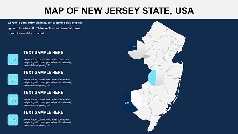
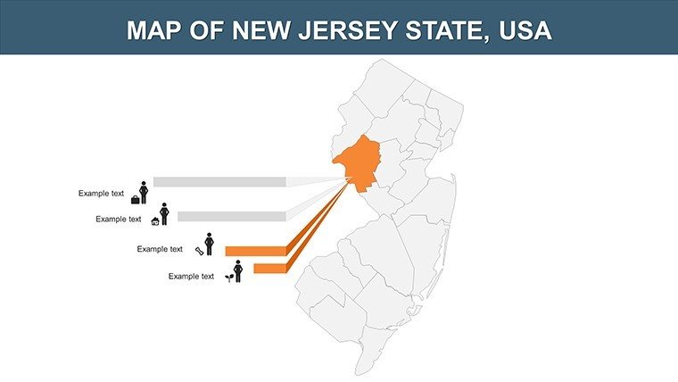
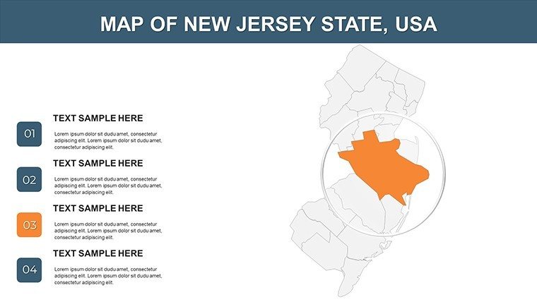
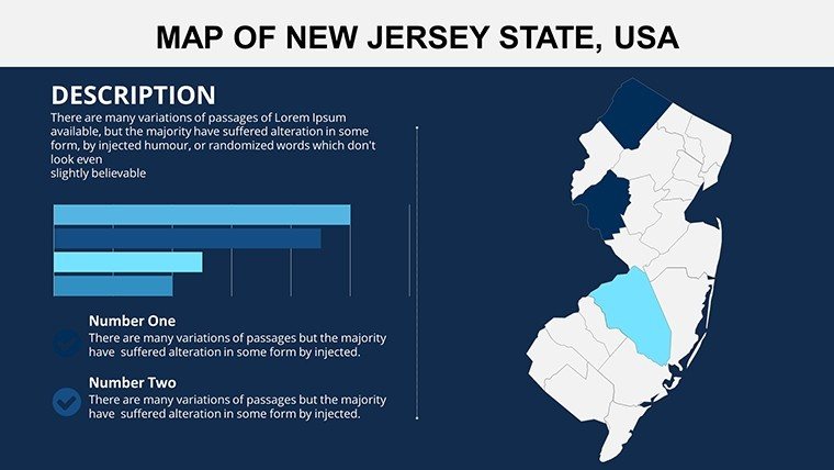
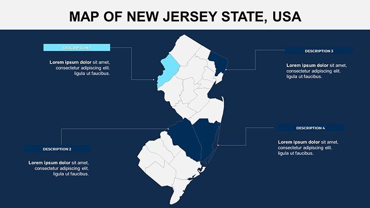
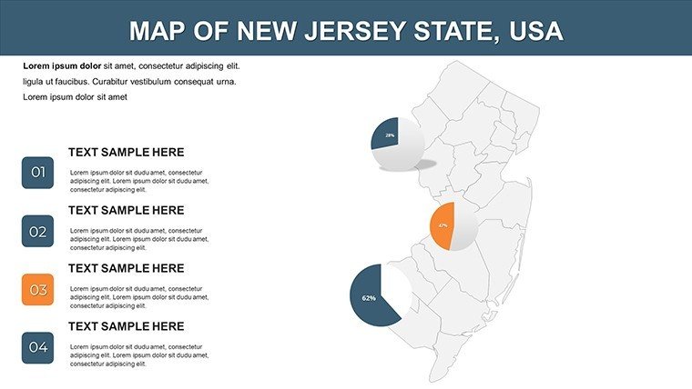
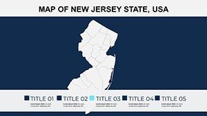
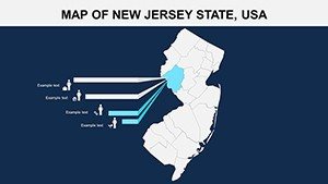
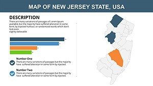
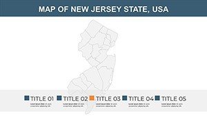
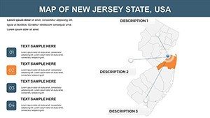
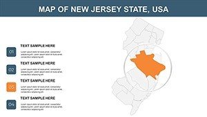
The heart of this template lies in its robust customization options, designed to cater to diverse presentation needs. Begin with a foundational map of New Jersey's 21 counties, from Bergen to Cape May, and build layers that suit your story - perhaps heat maps showing population growth or pinpoints for major corporations like Johnson & Johnson. The user-friendly interface allows font adjustments, style variations, and even integration of graphs for data like GDP contributions from sectors such as finance or tourism. Unlike rigid templates, this one supports multiple design themes, enabling you to switch from professional grayscale for reports to vibrant hues for marketing pitches. Embed real-time data links, such as from the New Jersey Department of Labor statistics, to add authority, ensuring your slides reflect current realities. This flexibility is particularly valuable for sectors like logistics, where mapping routes along I-95 can illustrate efficiency gains, or education, where visualizing the Delaware River's role in history fosters deeper understanding.
Standout Features for Professional Edge
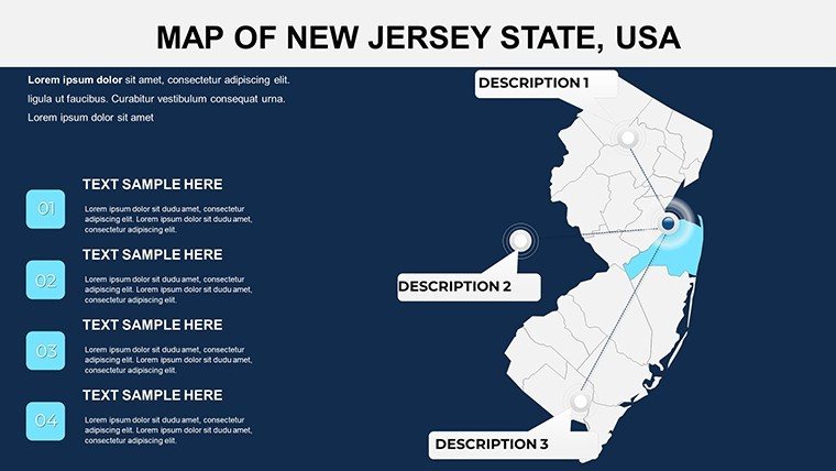
- Detailed Mapping: Includes counties, cities, and infrastructure like the Garden State Parkway, aligned with accurate GIS standards for credibility.
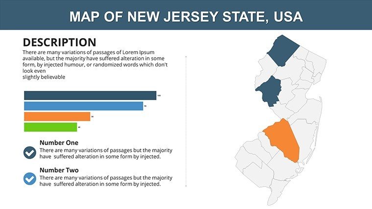
- Seamless Integration: Combine with charts, icons, and text for comprehensive infographics, enhancing narratives on topics like biotech innovations.
- Full Compatibility: Works flawlessly with Microsoft PowerPoint and Google Slides, supporting hybrid work environments.
- Visual Versatility: Options for thematic maps, such as economic zones or environmental areas, to address specific audience queries.
- Unlimited Usage: Licensed for repeated applications, from quarterly reviews to academic curricula.
These elements empower users to create polished outputs that surpass basic tools, focusing on by drawing from trusted sources like the U.S. Bureau of Economic Analysis for data-backed visuals.
Practical Use Cases Tailored to the Garden State
For a pharmaceutical company in New Brunswick, this template could facilitate a slide deck outlining clinical trial distributions across counties, using color-coded regions to denote participant demographics and overlaying bar charts for success rates. Educators might craft lessons on New Jersey's role in the Industrial Revolution, mapping factories along the Passaic River with timelines for interactive learning. In government, planners could use it for urban development proposals, highlighting transit-oriented growth in Hoboken with embedded photos and stats from the New Jersey Transit authority. Compared to standard PowerPoint maps, which lack granularity, this template provides zoomable details for precise discussions, such as analyzing traffic patterns in the Pinelands. Real-world inspiration comes from case studies like those from the New Jersey Business Action Center, where similar visuals have streamlined investor pitches, demonstrating how maps can bridge data gaps and foster consensus.
Workflow Optimization: From Concept to Delivery
- Choose Your Template Variant: Select from county-focused or city-specific slides to align with your objectives.
- Personalize Elements: Modify hues and add annotations to emphasize points, like marking Atlantic City's tourism impact.
- Incorporate Analytics: Embed external data via hyperlinks or charts for a multifaceted view.
- Enhance Engagement: Apply subtle animations to unveil layers, keeping viewers hooked during long sessions.
- Finalize and Share: Export or present directly, ensuring accessibility for all devices.
This structured approach, informed by design principles from experts like Edward Tufte, minimizes clutter and maximizes impact, ideal for high-pressure environments like sales meetings.
Elevating Beyond Basics: Value in Every Slide
What elevates this template is its departure from cookie-cutter solutions; it's built for depth, offering more than just outlines - think pre-designed infographics for quick assembly of complex ideas like supply chain mappings. Users often note a boost in audience retention, akin to findings from presentation research by Gartner, where visual aids increase comprehension by 65%. For New Jersey-specific contexts, it's invaluable for industries like logistics, where visualizing port activities in Elizabeth can secure partnerships. A hypothetical yet grounded example: A real estate firm used analogous maps to present property trends, resulting in faster deal closures by clearly delineating opportunity zones.
Pro tips include balancing visuals with whitespace for readability, sourcing from reliable databases like NJGIN for accuracy, and rehearsing to refine timing. This ensures your presentations exude expertise, whether discussing environmental policies in the Pine Barrens or economic forecasts for the state.
Ready to revolutionize your New Jersey presentations? Secure this versatile template now and craft visuals that command attention and drive results.
Frequently Asked Questions
Can I integrate external data into the maps?
Yes, easily add charts, hyperlinks, or imported data points to enrich your slides with real-time insights.
Does it support team collaboration?
Absolutely, compatibility with Google Slides makes sharing and editing straightforward for groups.
Are the maps suitable for print?
High-resolution vectors ensure crisp prints, perfect for handouts or reports.
How do I handle color schemes for branding?
Customize palettes freely to align with your company's colors using PowerPoint's tools.
What if I need more slides?
Duplicate and modify existing ones; the template's flexibility allows endless expansions.