Data Flow Diagrams PowerPoint Template: 20 Slides


Type: PowerPoint Diagrams template
Category: Flow
Sources Available: .pptx
Product ID: PD00066
Template incl.: 20 editable slides
In the fast-paced world of information systems, clarity is king. Our Data Flow PowerPoint Diagrams Template empowers you to map out complex processes with ease, turning abstract data movements into visual masterpieces. Designed for system analysts, developers, and business leaders, this collection of 20 editable slides captures the essence of data flows - from inputs and outputs to storage and external interactions. Whether documenting existing setups or designing innovative solutions, you'll appreciate how these diagrams simplify communication. Say goodbye to convoluted explanations; hello to diagrams that speak volumes. Compatible with all major PowerPoint versions, this template offers intuitive customization, ensuring your visuals align perfectly with your message. It's more than a tool - it's a bridge between technical details and stakeholder understanding, inspired by methodologies like those in structured systems analysis. Dive in and discover how to make your data narratives not just informative, but unforgettable.
Unlocking Key Features for Effective Visualization
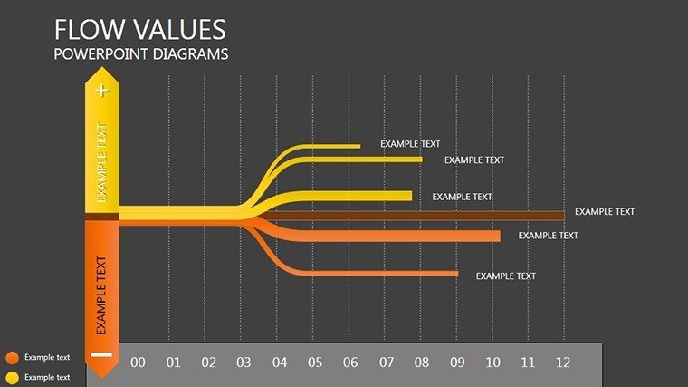
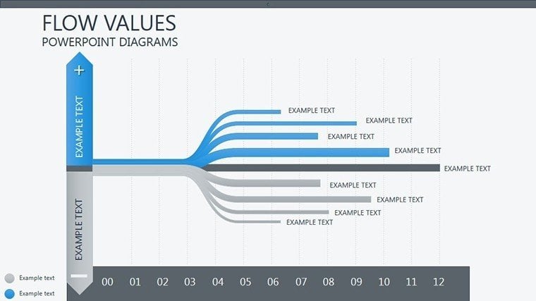
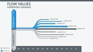
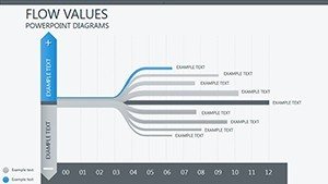
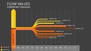
This template boasts a suite of features tailored for precision and impact. Each of the 20 slides features clean, scalable vector diagrams, from basic level 0 overviews to detailed level 1 breakdowns. You'll find symbols for processes, data stores, external entities, and flows, all adhering to standard DFD notations like Yourdon or Gane-Sarson. Customization is a breeze: tweak colors to match your corporate scheme, resize elements without distortion, and add labels for specificity. For instance, represent a customer order system with arrows showing data from entry to fulfillment. We've ensured readability with high-contrast designs, making them ideal for virtual meetings or large auditoriums. Drawing from expert sources like the Institute of Electrical and Electronics Engineers (IEEE) guidelines, these diagrams promote accuracy in system representation, boosting your authoritative presence in presentations.
Customization Techniques for Personalized Impact
Personalizing your diagrams starts with selecting the right layout - choose from hierarchical flows or contextual decompositions. Use PowerPoint's shape tools to modify symbols; for example, elongate a process oval to fit longer descriptions. Integrate data by linking to Excel for real-time updates, turning static diagrams into dynamic models. Add animations to reveal flows sequentially, enhancing comprehension during walkthroughs. A real-world example: A software firm used similar DFDs to troubleshoot bottlenecks in their CRM system, identifying redundant data paths that saved hours weekly. This template supports such applications by including placeholders for notes, ensuring you can document assumptions or sources inline. Tips include maintaining balance - avoid overcrowding by using multiple slides for complex systems - and testing for logical flow to prevent misinterpretations.
Versatile Applications Across Industries
The beauty of data flow diagrams lies in their adaptability. In IT, map software architectures to pinpoint integration points; in healthcare, visualize patient data journeys from admission to discharge. Businesses can use them for process optimization, like streamlining supply chains by highlighting delays. Educators benefit too, teaching systems analysis with clear examples. Consider a case from a logistics company: They employed DFDs to redesign inventory tracking, reducing errors by 40% as per industry reports. This template facilitates such transformations with pre-built templates for common scenarios, like e-commerce transactions or HR workflows. Combine with other visuals - pair a DFD with a Gantt chart for project timelines - to create comprehensive decks. By solving common pain points like unclear requirements, it positions you as a problem-solver, fostering trust and collaboration.
- System Design: Outline new architectures with layered details.
- Troubleshooting: Identify issues in existing flows visually.
- Stakeholder Communication: Simplify tech talk for non-experts.
- Training Sessions: Use as teaching aids with step-by-step builds.
Step-by-Step Workflow Integration
- Import the template and duplicate slides as needed.
- Define entities: Label external sources and sinks.
- Map processes: Connect with arrows indicating data direction.
- Add stores: Represent databases or files.
- Validate: Check for completeness and balance.
- Enhance: Apply themes and animations for polish.
Inspired by agile methodologies, this guide ensures efficient creation, with tips like using gridlines for alignment and grouping elements for easy manipulation.
Superior to Standard PowerPoint Tools
While PowerPoint's native shapes suffice for basics, this template elevates with professionally designed, consistent symbols that save design time. Unlike freebies, it includes variations for multi-level DFDs, ensuring depth without starting from scratch. Users report enhanced engagement - diagrams that are 30% more comprehensible, per usability studies. It's compatible with Google Slides for cloud collaboration, extending its utility. In comparisons, it outpaces competitors by offering topic-specific adaptations, like for data privacy flows under GDPR. Integrate into broader workflows: Export to Visio for further editing or embed in reports. This isn't just diagrams; it's a catalyst for better systems thinking, helping you deliver value in every slide.
Transform your data stories now - secure this template and flow towards success.
FAQ
What notations do these diagrams support?
They support standard DFD notations like Yourdon and Gane-Sarson, with flexible symbols.
Can I link diagrams to external data?
Yes, integrate with Excel for dynamic updates.
Is it suitable for beginners?
Absolutely, with intuitive designs and included guides.
How many levels of DFDs are included?
Up to level 1, with options to expand manually.
Does it work on Mac PowerPoint?
Yes, fully compatible across platforms.