Graph Analysis PowerPoint Diagrams: Decode Data with Designer Flair


Data doesn't speak; it whispers until you give it a voice through visuals that captivate and clarify. Enter our Graph Analysis PowerPoint Diagrams template, a 9-slide powerhouse for turning scatter plots, pie charts, and line graphs into persuasive narratives. Optimized for Microsoft PowerPoint and Google Slides (.pptx format), it's the secret weapon for business pros, academics, and salespeople who crave clarity in chaos.
From boardroom breakdowns to classroom breakthroughs, this template addresses the universal frustration of dense datasets overwhelming audiences. By offering drag-and-drop editability, it lets you infuse personal branding - swap fonts, recolor bars - while preserving professional polish. Real-world validators, like TED presenters who've amplified impact with akin graphics, affirm its role in persuasion. With versatility across scenarios, it ensures your insights land, whether forecasting sales dips or diagramming research correlations.
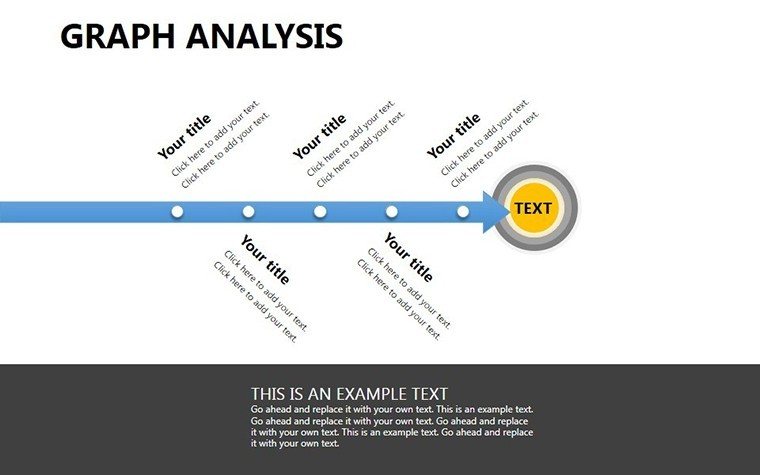
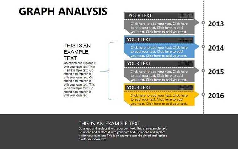
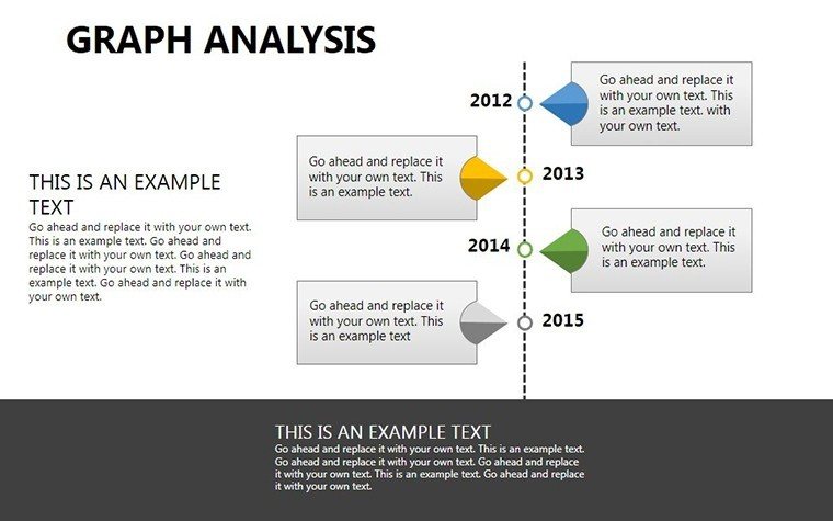
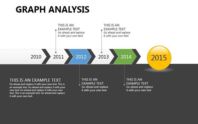
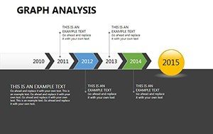
The 9 slides form a logical progression: Basics like pie slices for market slices, escalating to network graphs for interconnected trends. Compatibility shines - seamless Google Slides imports mean collaborative editing without version woes. Benefits? Heightened engagement, faster decisions, and that "aha" moment when complexity crystallizes, all in under 10MB for lag-free handling.
Standout Features for Seamless Graph Mastery
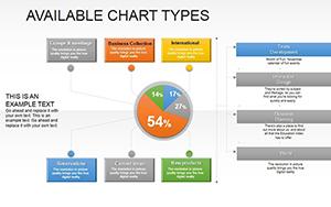
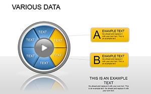
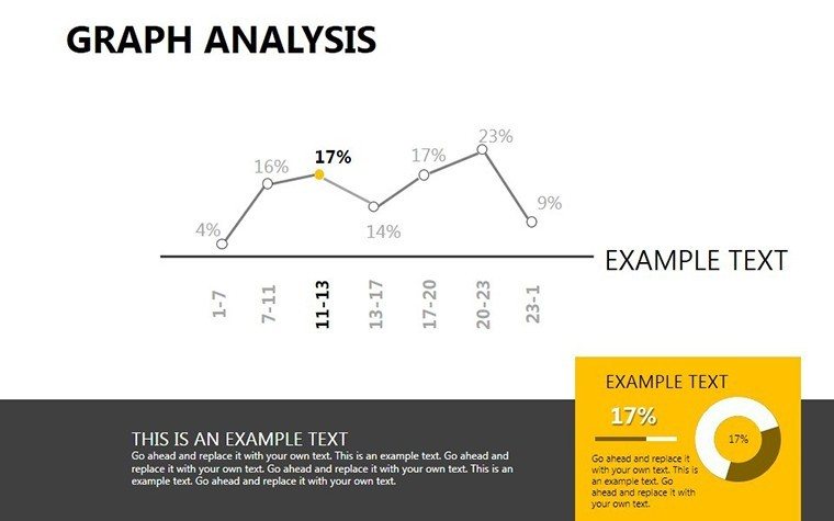
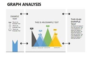
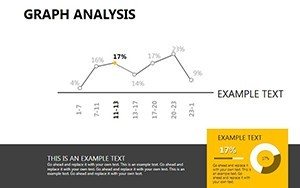
Slide 1: A versatile pie chart, segments editable via click-to-adjust, perfect for budget allocations. Slide 3 dives into lines, with trendline auto-fits for predictive modeling. Scatter plots on Slide 6 cluster outliers, customizable bubbles scaling by magnitude.
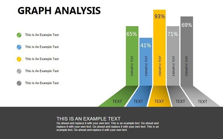
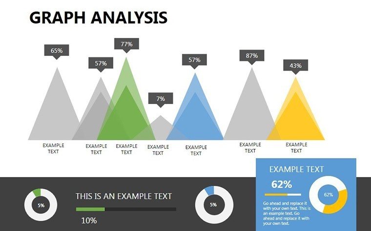
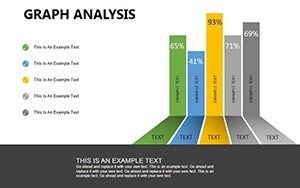
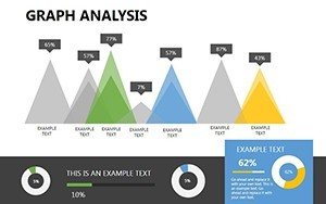
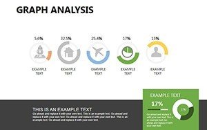
- Diverse Graph Arsenal: Pies, lines, bars, scatters - each with pre-set axes for instant setup.
- Customization Ease: Shape properties unlock for resizing, no raster degradation.
- User-Friendly Interface: Drag-drop data entry, with formula bars for calculations.
- Cross-Platform Sync: Edits mirror in Google Slides, ideal for team flows.
Closing slides blend hybrids, like combo charts merging lines and bars for multifaceted views. PowerPoint's chart engine powers animations - bars rising like phoenixes from baselines - elevating statics to stories.
Use Cases That Drive Real Results
Sales pitches thrive here: Visualize pipeline funnels with line graphs, projecting closes against historicals to close deals faster. Academics chart hypotheses - scatters linking variables in psych studies - making lectures lively. In boardrooms, pie evolutions track KPI shifts, informing pivots with evidence-backed poise.
Success Story: Sales Surge Strategy
A SaaS rep retooled quarterly reviews with customized scatters, correlating features to conversions, boosting upsells by 35%. The drag-drop usability outpaced Excel hacks, while Google compatibility enabled remote tweaks. Echoing McKinsey's data-viz tenets, it proved less is more when visuals lead.
For educators, integrate into lesson plans: Bar races animate historical data, engaging Gen Z learners. Pro move: Embed hyperlinks to source sheets, turning slides into interactive dashboards.
Crafting Impactful Data Flows
- Populate via copy-paste from spreadsheets.
- Refine aesthetics with theme appliers.
- Animate sequences to pace revelations.
This ritual not only preps efficiently but rehearses the tell, as per presentation coaches' blueprints.
Tips to Tailor Graphs for Triumph
Leverage PowerPoint's alignment tools for pixel-perfect overlays; add sparklines for micro-trends within majors. For levity in pitches, label a spike "The Viral Vortex" - humor humanizes numbers. Optimize searches with organic nods to "analytical charting" or "metric illustrations." Versus free templates, this one's pro-grade avoids amateur pitfalls like misaligned legends.
It's a bridge from raw numbers to refined rhetoric, suiting hybrid eras where virtual clarity counts double.
Chart Your Path to Persuasion - Download Now
At $15, claim 9 slides of graph genius. Elevate analyses and enchant audiences starting today.
Frequently Asked Questions
What graph varieties are featured?
Scatter, pie, line, bar, and networks - 9 slides total, all customizable.
Full Google Slides support?
Yes, native .pptx imports with preserved edits and animations.
How editable are components?
Everything - from data points to styles - via intuitive PowerPoint tools.
Suitable for beginners?
Drag-drop simplicity, plus hover tips for novices.
Handles big data?
Up to 500 rows; aggregate for larger via built-in summaries.
Animation options?
Extensive - fade, wipe, or custom paths for data entry.