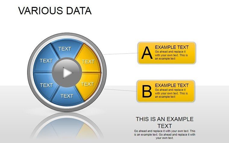
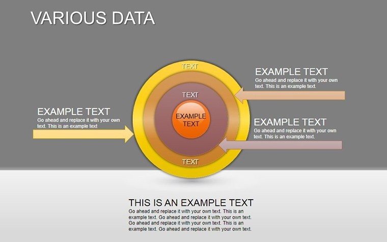
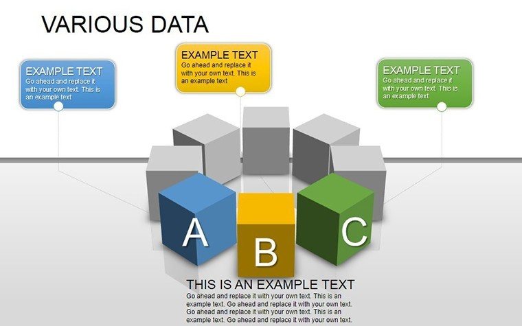
Various Data PowerPoint Template: Infuse Your Presentations with Visual Intelligence


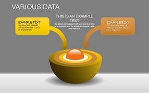

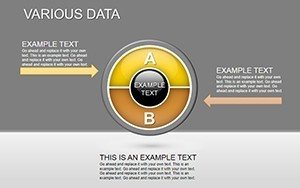

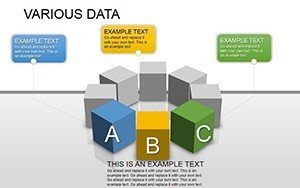
In an era where data drives destiny, the ability to distill volumes of information into digestible visuals isn't just a skill - it's a superpower. Our Various Data PowerPoint Template equips you with 22 editable slides brimming with diverse diagrams, from timeless bar charts to intricate flowcharts, all designed to elevate your storytelling in business boardrooms, academic lectures, or healthcare briefings. This isn't mere clipart; it's a curated arsenal for professionals who demand precision and persuasion in equal measure.
Think of the last time a dense spreadsheet bored your audience to distraction. Now flip the script: With this template, you craft narratives that stick, using pie charts to apportion market shares or scatter plots to reveal correlations in patient outcomes. Compatible across PowerPoint ecosystems (Windows, Mac, Online), it harnesses vector graphics for scalability and animations for dynamism, ensuring your message lands with impact whether projected large or shared digitally.
The beauty lies in its breadth - covering bar, line, pie, area, scatter, bubble, radar, and more - while maintaining a cohesive aesthetic. No design degree required: Drag-and-drop placeholders invite your data, while smart colors adapt to themes. For teams juggling multiple sectors, themed variants (business blues, academic neutrals, healthcare greens) streamline branding, saving precious prep time.
Picture a marketing exec prepping a quarterly review. Slide 6's multi-series line graph tracks campaign ROI over time, with trendlines auto-generated from inserted values, spotlighting wins and pivots. Transition to Slide 12's Sankey diagram for budget flows, where thick lines visualize allocations, making abstract finances tangible and actionable.
Core Features: Diagrams That Deliver Depth
What powers this template? A fusion of functionality and finesse. All 22 slides are resolution-independent, with editable paths for custom shapes and data-driven updates via chart tools. Integrate from Excel for live refreshes, or embed images for hybrid visuals - icons, photos, even QR codes linking to datasets.
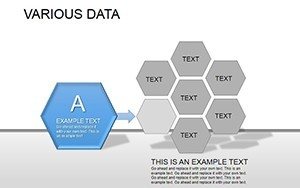
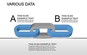
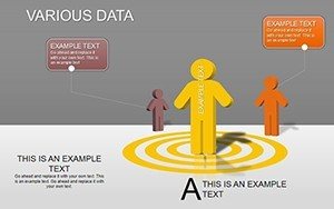
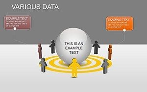
- Diverse Chart Arsenal: From basics like columns and pies to advanced like heatmaps and treemaps, each optimized for specific data types.
- Animation Mastery: Sequential builds reveal data points progressively, guiding eyes and building drama.
- Customization Suite: Font pairings (sans-serif for modernity), gradient fills, and shadow effects for subtle depth.
- Accessibility Built-In: Alt text prompts, color-blind friendly palettes, and screen-reader compatible labels.
Case in point: A university research team at EduAnalytics wielded this for a grant proposal. Employing Slide 18's box plot to depict experimental variances, they secured funding by clarifying statistical significance visually - a feat that raw numbers couldn't achieve. Such stories underscore how these diagrams don't just display data; they decode it.
Slide Deep-Dive: Mapping Diagrams to Missions
Navigate the 22 slides strategically:
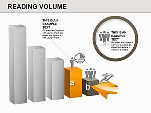
- Slide 1: Bar Chart Basics – Horizontal/vertical variants for categorical comparisons; stack for sub-groups.
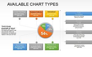
- Slide 2: Pie Chart Precision – Exploded slices for emphasis; doughnut alternative for inner rings.
- Slide 3: Line Graph Dynamics – Multi-line for trends; markers for key events.
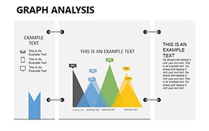
- Slide 4: Area Chart Accumulation – Stacked for totals over time; transparency for overlaps.
- Slide 5: Scatter Plot Correlations – Bubble sizing for third variables; regression lines optional.
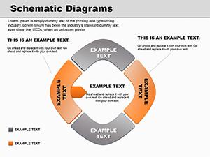
- Slide 6: Flowchart Logic – Decision trees with swimlanes for processes.
- Slide 7: Radar Chart Balance – Polygons for multi-attribute scoring.
- Slide 8: Histogram Distributions – Bins for frequency analysis.
- Slide 9: Waterfall Cascades – Bridges for variance explanations.
- Slide 10: Funnel Conversions – Stages for sales pipelines.
- Slide 11: Gantt Timelines – Bars for project scheduling.
- Slide 12: Sankey Flows – Nodes for energy or resource streams.
- Slide 13: Heatmap Intensity – Color gradients for matrices.
- Slide 14: Treemap Hierarchies – Nested rectangles for proportions.
- Slide 15: Venn Overlaps – Circles for set intersections.
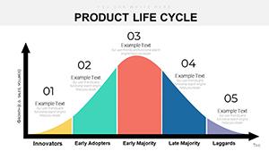
- Slide 16: Pyramid Structures – Tiers for population or org levels.
- Slide 17: Combo Hybrids – Line + bar for dual metrics.
- Slide 18: Box Plot Outliers – Whiskers for quartiles.
- Slide 19: Bubble Advanced – 3D illusions for volume.
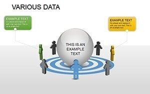
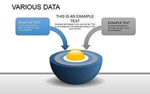
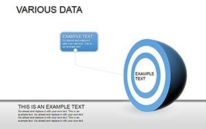
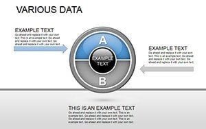
- Slide 20: Gauge Targets – Dials for KPIs.
- Slide 21: Map Overlays – Choropleth basics (placeholders).
- Slide 22: Summary Infographic – Collage of minis for overviews.
For seamless integration, use PowerPoint's chart wizard to populate, then fine-tune axes and legends. In collaborative environments, version history tracks changes, while presenter view notes add context for uncharted data points.
Versatile Applications Across Industries
This template's reach spans far: In tech, debug workflows with flowcharts; in finance, forecast with lines. Educators animate histograms for stats classes, while clinicians chart vitals via scatters. Non-profits? Funnels for donor journeys.
A healthcare innovator, MediViz, harnessed Slide 13's heatmap for trial efficacy mapping, streamlining FDA submissions with visual clarity that expedited approvals. It's proof that the right diagram turns data deluges into decision drivers.
Insider Strategies for Diagram Domination
- Choose charts wisely - bars for counts, lines for changes, pies for wholes (under 7 slices).
- Layer narratives: Annotations over visuals for guided tours.
- Iterate with feedback - duplicate slides for A/B testing designs.
Data without diagrams is noise; with them, it's insight. This Various Data PowerPoint Template empowers you to orchestrate that symphony, making every presentation a revelation.
Seize the visuals - download now and infuse intelligence into your slides. Flash sale alert: 00LAYOUTS unlocks deals. Chart your course to clarity today.
Frequently Asked Questions
Which PowerPoint versions are supported?
From 2016 onward, including 365; older via compatibility mode with minor animation tweaks.
Can I import data from Google Sheets?
Yes - export CSV, then use PowerPoint's data import for charts.
Are animations customizable per slide?
Fully - adjust timing, direction, and start triggers in the animations pane.
How do I handle large datasets?
Sample or aggregate first; use filters in source files for focused views.
Does it include industry-specific themes?
Yes - pre-sets for business, education, health, tech; mix and match.