Available Types PowerPoint Diagrams: Weave Data Dependencies into Compelling Visuals


When data whispers secrets of interconnection, only the right diagrams can amplify them into roars of revelation. The Available Types PowerPoint Template delivers 15 editable slides focused on cycles and graphs, empowering analysts, strategists, and educators to illuminate how variables interplay - from causal chains in supply models to comparative cycles in market trends. This tool isn't for rote reporting; it's for revealing the relational rhythms that underpin decisions.
In realms where one metric's ripple affects another's tide, like economic forecasts or process optimizations, clarity in visualization is paramount. This template, honed for PowerPoint's graphing prowess, offers pre-configured layouts that adapt to your narrative, blending cycle diagrams for loops (think feedback mechanisms) with graph variants for dependencies (nodes and edges tracing influences). Widescreen-ready and theme-agnostic, it integrates with Office 365 for collaborative polishing.
Its edge? Precision without complexity. Editable nodes, arcs, and connectors respond to data inputs, auto-adjusting scales and labels. For those bridging qualitative and quantitative, overlay text callouts or icons to annotate relationships, turning abstract dependencies into annotated adventures.
Envision an operations manager dissecting workflow bottlenecks. Slide 3's cycle diagram loops through stages - input, process, output - with thickness varying by volume, pinpointing chokepoints. Shift to Slide 9's dependency graph, where arrows weighted by impact scores map supplier risks to production delays, forecasting disruptions before they strike.
Essential Features: Relations Rendered Radiant
Powered by PowerPoint's vector engine, these 15 slides ensure scalability from thumbnails to billboards. Key to its relational focus: Dynamic connectors that bend with repositioned elements, maintaining arrow integrity, and cycle tools for seamless loop closure.
- Cycle and Graph Hybrids: Radial cycles for circular processes; network graphs for linear dependencies.
- Auto-Layout Aids: Smart alignment for balanced compositions; hierarchy detection for tree-like structures.
- Interactive Layers: Grouped elements for phased reveals; hyperlinks on nodes for deeper dives.
- Style Versatility: Dashed lines for hypotheticals, gradients for gradients in influence.
Impact validated: A logistics firm, ChainLink Solutions, deployed Slide 11's comparative graph to model route optimizations, slashing fuel costs by 15% through visualized trade-offs. Such applications prove diagrams as diagnostic devices, not decorative.
Slide Spectrum: From Cycles to Connections
Unravel the 15 slides' relational repertoire:
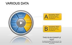
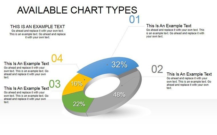
- Slide 1: Simple Cycle Overview – Basic loop for introductory processes.
- Slide 2: Variable Dependency Map – Arrows linking factors with labels.
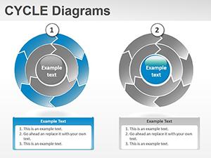
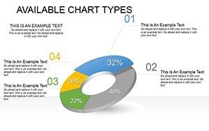
- Slide 3: Multi-Stage Cycle – Segmented wheel for phased evolutions.
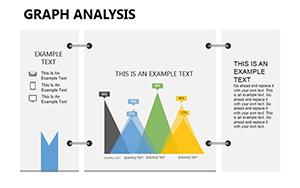
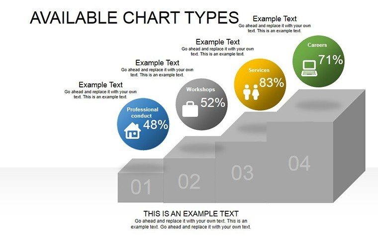
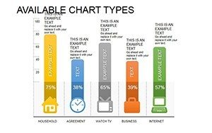
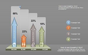
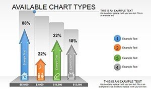
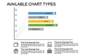
- Slide 4: Comparative Bar Graph – Clustered for side-by-side relations.
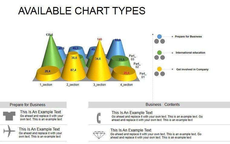
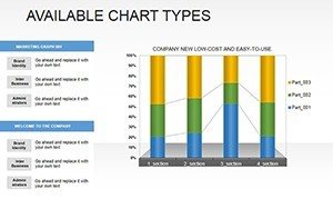
- Slide 5: Line Dependency Trends – Dual axes for correlated changes.
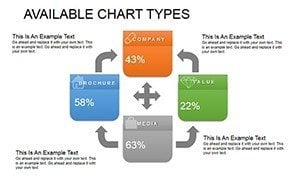
- Slide 6: Network Node Graph – Central hub with spokes for influences.
- Slide 7: Feedback Loop Cycle – Bidirectional arcs for iterations.
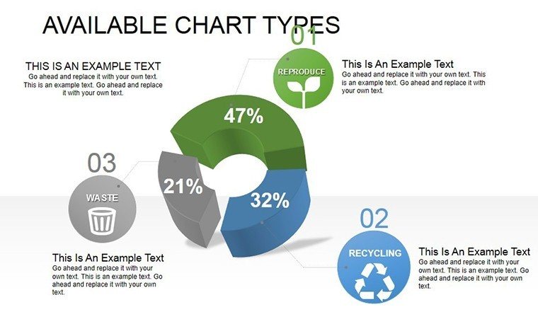
- Slide 8: Scatter Relation Plot – Points sized by strength.
- Slide 9: Causal Chain Diagram – Sequential boxes with impact metrics.
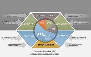
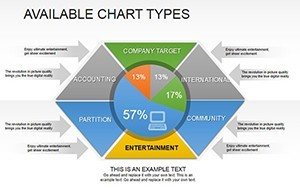
- Slide 10: Radial Comparison – Spokes for multi-variable balance.
- Slide 11: Weighted Edge Graph – Thickness denoting dependency degree.
- Slide 12: Hierarchical Cycle – Nested rings for layered systems.
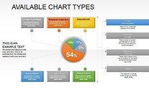
- Slide 13: Matrix Relation Table – Grid with color-coded intersections.
- Slide 14: Flow Dependency – Curved paths for non-linear ties.
- Slide 15: Synthesis Summary – Integrated view of key relations.
Incorporate via copy-paste from Visio or draw.io for hybrid workflows. Animate paths to trace influences sequentially, enhancing comprehension in live sessions.
Applications: Relating Data to Real Outcomes
Suited for strategy sessions mapping SWOT interlinks or R&D charting innovation cycles. In sustainability, graph carbon footprints' dependencies; in HR, cycle talent pipelines.
An environmental consultancy, EcoRelations, used Slide 7's feedback loop to model climate interventions, influencing policy with relational clarity that swayed stakeholders. Here, diagrams democratize complexity.
Relational Rendering Tips
- Prioritize primary paths - limit edges to avoid clutter.
- Use legends for symbol decoding; test with non-experts.
- Version for scenarios: Solid for facts, dotted for assumptions.
Relations unspoken remain unrealized; visualized, they vitalize. This Available Types PowerPoint Template connects the dots, so you can too.
Link your data legacy - acquire now with 00LAYOUTS perks. Diagram dependencies; download and discover.
Frequently Asked Questions
Can graphs handle quantitative weights?
Yes - adjust line weights or node sizes via data-linked properties.
Is it suitable for non-linear relationships?
Perfectly - curved connectors and radial layouts accommodate curves.
How to collaborate on these diagrams?
Share via OneDrive; real-time edits with comments for feedback.
Are there templates for specific industries?
Adaptable - add sector icons for tailored resonance.
Export options for print or web?
PDF for print, SVG via add-ins for web scalability.