Tourist Services PowerPoint Diagram Template


Type: PowerPoint Diagrams template
Category: Tables, Illustrations, Analysis
Sources Available: .pptx
Product ID: PD00131
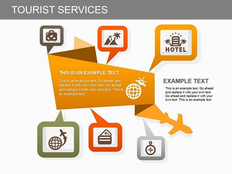
Template incl.: 18 editable slides
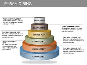
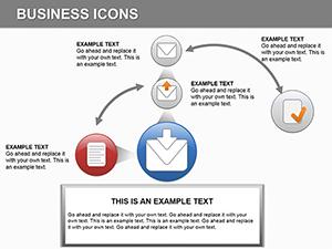
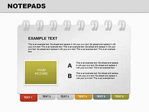
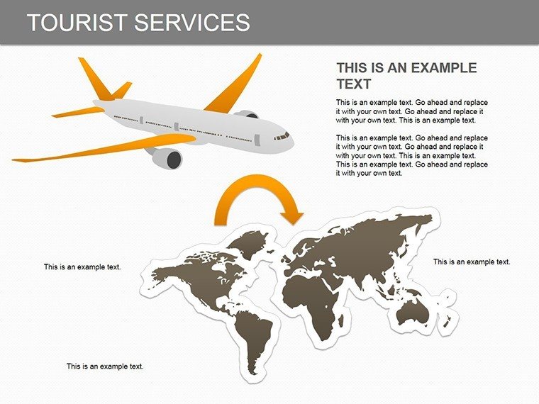
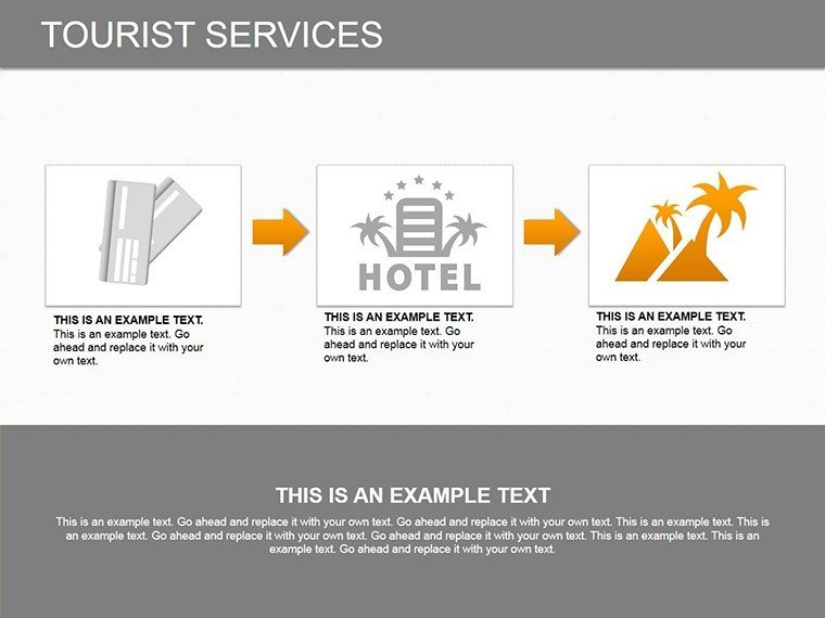
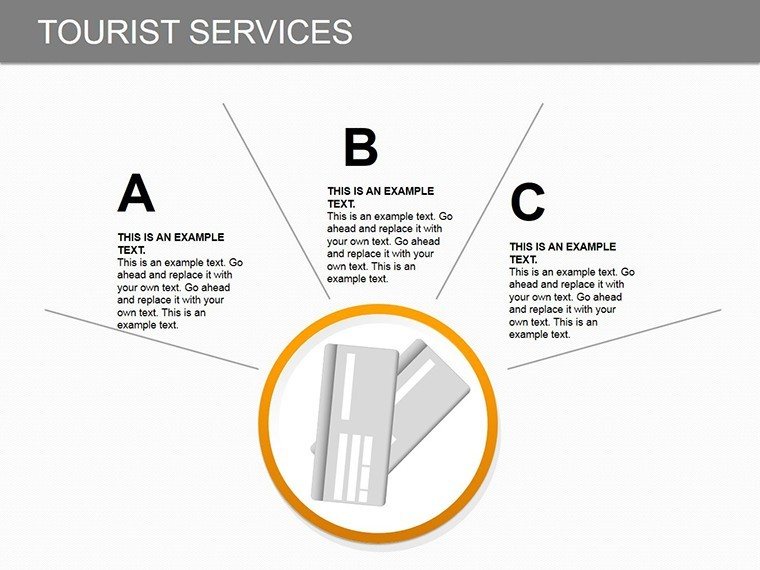
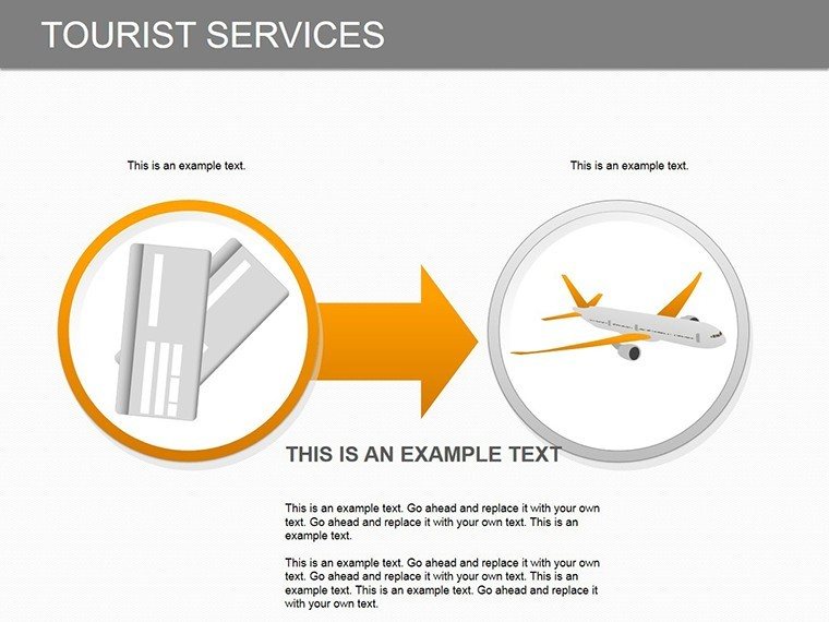
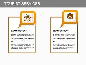
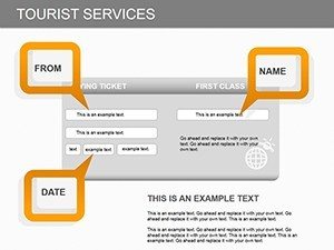
Imagine transforming your tourism data into captivating visuals that draw in clients and stakeholders alike. Whether you're a travel agency owner pitching bespoke tours or a hospitality consultant analyzing service ranges, this Tourist Services PowerPoint diagram template is your go-to tool. With 18 fully editable slides, it empowers you to highlight key aspects like transportation options, accommodation choices, nutritional services, tour organization, and sightseeing adventures. Designed for clarity and impact, these diagrams help you compare service ranges, spotlight extreme values, and illustrate data distributions effortlessly. Forget bland spreadsheets; this template turns complex information into easy-to-digest visuals that resonate with your audience, saving you hours of design time while boosting engagement in meetings or reports.
Unlock the Power of Visual Storytelling in Tourism
In the fast-paced world of tourism, where first impressions can make or break a deal, having the right tools to present your services is crucial. This template isn't just a set of slides - it's a strategic asset tailored for professionals who need to convey the breadth and depth of tourist offerings. Drawing from real-world applications, such as how leading agencies like TripAdvisor or Expedia use similar visuals to map out customer journeys, you can adapt these diagrams to showcase how your services align with traveler needs. For instance, use a range comparison slide to demonstrate how your premium accommodations outperform budget options in comfort and amenities, backed by industry benchmarks from the World Tourism Organization (UNWTO) reports on service quality.
Key Features That Set This Template Apart
Every slide in this collection is crafted with precision, ensuring compatibility with Microsoft PowerPoint and easy integration into your existing workflows. The editable nature means you can tweak colors, fonts, and layouts to match your brand identity - perhaps incorporating earthy tones for eco-tourism pitches or vibrant hues for adventure travel proposals. Highlights include:
- Versatile Diagram Types: From bar charts comparing transportation modes to pie charts breaking down service categories, each element is designed for quick customization.
- Data Visualization Tools: Focus on distributions with histograms or emphasize extremes with box plots, all pre-formatted for tourism data like booking trends or satisfaction scores.
- High-Resolution Graphics: Ensure your presentations look sharp on any screen, from boardroom projectors to virtual Zoom calls.
- User-Friendly Edits: No design degree needed - simply drag, drop, and input your data for professional results.
Compared to basic PowerPoint tools, which often result in cluttered slides, this template offers themed icons and layouts that maintain a cohesive tourist theme, enhancing readability and retention.
Real-World Applications and Use Cases
Let's dive into how this template can revolutionize your presentations. Picture a scenario where you're presenting to investors for a new resort development. Start with an overview slide mapping out comprehensive services - from airport shuttles to gourmet dining - using interconnected diagrams that show how each element contributes to the overall tour experience. In educational settings, tourism students can use these slides to analyze case studies, like how Airbnb's service diversification impacted market share, visualizing data from sources such as Statista's tourism reports.
Step-by-Step Guide to Customizing Your Slides
- Select Your Base Slide: Choose from the 18 options based on your data type - e.g., a multi-layer diagram for layered services like add-on excursions.
- Input Data: Populate with real metrics, such as average stay durations or service ratings, ensuring alignment with UNWTO guidelines for accurate representation.
- Customize Visuals: Adjust scales to highlight key insights, like peak season transportation demands, and add annotations for clarity.
- Incorporate Branding: Embed your logo and color palette to make the presentation uniquely yours.
- Review and Refine: Test for flow, ensuring each slide builds on the last to tell a compelling story of tourist satisfaction.
This approach not only solves common pain points like data overload but also positions you as an expert in tourism visualization, much like how professionals at the International Tourism Fair (FITUR) use advanced diagrams to secure partnerships.
Enhance Your Presentations with Expert Tips
To maximize impact, pair these diagrams with storytelling techniques. For example, weave in anecdotes from successful tours, supported by visuals that quantify outcomes - say, a 20% increase in bookings post-service upgrade, illustrated via a before-and-after range chart. Avoid common pitfalls like overcomplicating slides; keep text concise and let the diagrams speak. For virtual presentations, leverage animations to reveal data progressively, keeping audiences engaged. This template's flexibility also extends to hybrid uses, such as exporting slides for reports or integrating with tools like Canva for further enhancements.
In terms of trustworthiness, rest assured that all elements adhere to best practices in data presentation, drawing from authoritative sources like the American Society of Travel Advisors (ASTA) for ethical visualizations. Whether you're scaling a small tour operator or managing a global chain, this tool adapts seamlessly, offering value that far exceeds its cost.
Why Choose This Template for Your Tourism Needs
Standing out in the competitive tourism landscape requires more than facts - it demands visuals that inspire action. This Tourist Services diagram template delivers just that, with its focus on practical, editable content that evolves with your projects. Users rave about its time-saving features, echoing sentiments from industry pros who've streamlined their pitches. Ready to elevate your tourism narratives? Customize this template today and watch your presentations transform from informative to unforgettable.
Frequently Asked Questions
How editable are the slides in this template?
All 18 slides are fully editable, allowing changes to text, colors, shapes, and data inputs directly in PowerPoint.
Is this template compatible with Google Slides?
While designed for PowerPoint, you can upload the .pptx file to Google Slides for basic compatibility, though some advanced features may require adjustments.
What types of data work best with these diagrams?
It's ideal for range comparisons, such as service costs or customer ratings, and distributions like seasonal booking patterns in tourism.
Can I use this for non-tourism presentations?
Absolutely - adapt it for any service-based industry, like hospitality or event planning, by customizing the labels and visuals.
How do I incorporate my own data?
Simply replace placeholders with your metrics; the diagrams update automatically for accurate visualizations.
Are there any usage restrictions?
No, once purchased, use it freely for personal or commercial presentations without limitations.