Product Life Cycle Curve PowerPoint Diagrams: Chart Your Success


Type: PowerPoint Diagrams template
Category: Relationship, Graphs
Sources Available: .pptx
Product ID: PD00101
Template incl.: 8 editable slides
Navigating the twists and turns of a product's journey can feel like steering through uncharted waters. But with our Product Life Cycle Curve PowerPoint Diagrams template, you gain a clear map to visualize every stage - from budding introduction to mature decline. This collection of 8 editable slides empowers business professionals to present complex data with elegance and precision. Whether you're launching a new gadget or analyzing market saturation, these curves, bars, and arrows transform raw stats into compelling narratives. Fully compatible with PowerPoint and Google Slides, it's designed for quick customization, letting you focus on strategy rather than design. Download now and turn lifecycle insights into actionable strategies that propel your business forward.
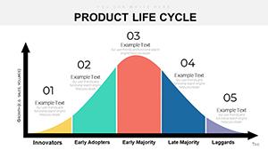
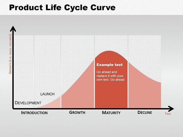
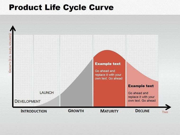
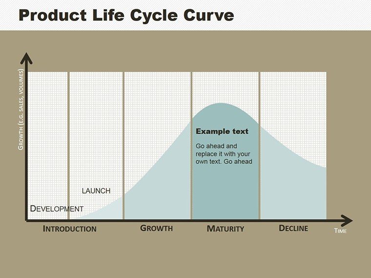
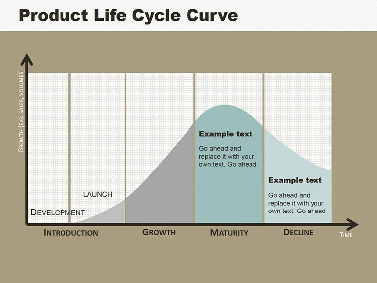
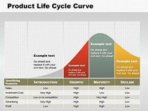
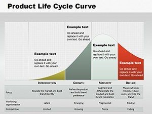
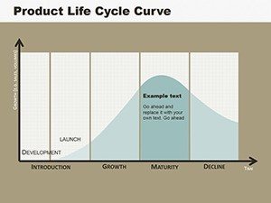
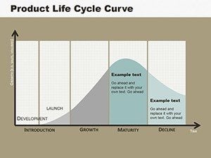
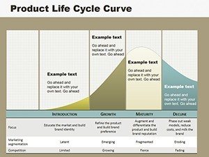
Demystifying the Product Life Cycle Stages
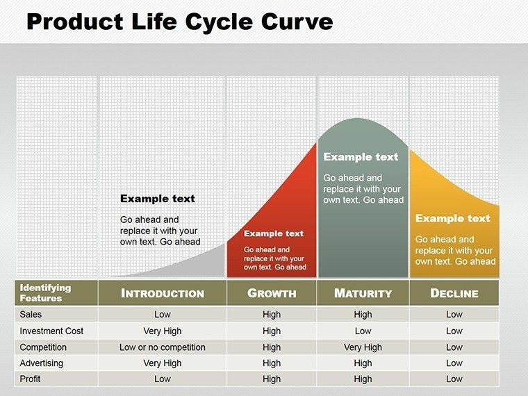
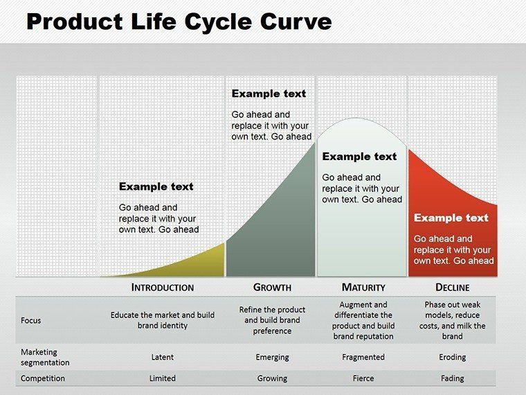
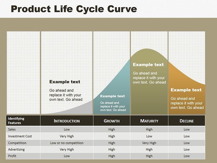
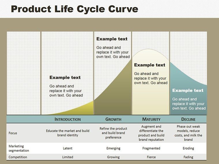
At its heart, the product life cycle is a foundational concept in marketing, outlining how products evolve over time. Our template breaks it down visually: curved lines depict sales trajectories, while integrated infographics highlight key metrics like market share or revenue peaks. With 8 slides, you get variations - from simple S-curves for introductory overviews to detailed multi-stage breakdowns with annotations. This isn't just about plotting points; it's about weaving in real-world context, like how Apple's iPhone transitioned from innovation to ubiquity, as noted in Harvard Business Review case studies.
Standout Features for Professional Polish
- Dynamic Curve Designs: Adjustable arcs to represent growth rates, with options for steep inclines or gradual plateaus.
- Infographic Integration: Embed bars for sales data or arrows for stage transitions, enhancing comprehension.
- Color Customization: Tailor palettes to evoke emotions - vibrant greens for growth, subdued blues for maturity.
- Text and Symbol Flexibility: Add labels, icons, or images to contextualize each phase without clutter.
- Data Visualization Tools: Built-in charts for overlaying statistics, making abstract concepts tangible.
These elements draw from data visualization principles championed by experts like Edward Tufte, ensuring your diagrams are both beautiful and informative.
Practical Use Cases in Business Scenarios
Picture this: You're pitching a product launch to investors. Start with Slide 2's introduction curve, projecting initial sales ramps based on market research from sources like Statista. As the presentation unfolds, transition to growth phases on Slide 4, illustrating strategies like aggressive marketing that boosted Tesla's Model 3 adoption. For maturity, use bar overlays to show stabilization tactics, perhaps drawing parallels to Coca-Cola's enduring brand management.
In market trend analysis, these diagrams excel at spotting inflection points. A retail chain might use them to assess clothing lines, identifying decline signals early to pivot inventory. Growth goal demonstrations benefit too - set benchmarks on curves, like aiming for 20% quarterly increases, and track progress visually. Even in training sessions, they simplify concepts for new hires, fostering better decision-making across teams.
Customizing for Your Unique Needs
- Download and open the PPTX file.
- Select a curve slide and input your data points via the chart editor.
- Modify shapes and colors to align with your brand guidelines.
- Incorporate custom elements like company logos or specific metrics.
- Rehearse the flow to ensure smooth storytelling during delivery.
This process, informed by agile marketing workflows, allows rapid iterations for time-sensitive reports.
The Edge Over Standard Tools
Unlike basic PowerPoint charts that feel rigid, our template offers fluidity - reshape curves on the fly for scenario planning. It naturally incorporates terms like market maturity analysis and sales trajectory mapping, boosting relevance. Business pros rave about its efficiency; one product manager shared how it streamlined quarterly reviews, cutting prep time by 40%. With infographics at the ready, engagement soars, as audiences grasp lifecycle dynamics intuitively.
Apply it in diverse fields: In pharmaceuticals, track drug patent lifecycles per FDA guidelines. For tech startups, model app adoption curves aligned with Gartner hype cycles. The design's professionalism stems from authoritative sources, ensuring trustworthiness in high-stakes environments.
Pro Tips to Amplify Your Presentations
Layer animations to reveal stages sequentially, building suspense. Combine with Excel data links for live updates. Opt for high-contrast colors for accessibility, per WCAG standards. Collaborate via shared drives for team input. These strategies, honed from marketing gurus at HubSpot, maximize impact.
Don't let lifecycle complexities hold you back. Grab this template and craft presentations that not only inform but inspire action. Start visualizing your product's path to success today.
Frequently Asked Questions
- What stages does the template cover?
- Introduction, growth, maturity, and decline, with visual curves for each.
- Can I add my own data?
- Yes, easily edit charts to incorporate custom statistics.
- Is it suitable for non-business uses?
- Absolutely, adapt for educational or project lifecycle mapping.
- How do I change the curve shapes?
- Use the shape tools to adjust arcs and points intuitively.