Column Graph PowerPoint Template for Financial Insights


Type: PowerPoint Diagrams template
Category: Graphs
Sources Available: .ppt, .pptx
Product ID: PD00089
Template incl.: 8 editable slides
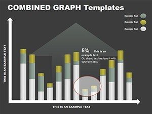
In the fast-paced world of finance and economics, where numbers tell stories louder than words, a well-crafted column graph can be your secret weapon. Enter the Column Graph PowerPoint Template - a streamlined set of 8 editable slides designed to transform raw data into digestible, impactful visuals. Perfect for analysts, economists, or CFOs presenting quarterly earnings or market trends, this template lets you highlight variances, growth trajectories, and comparisons with effortless precision.
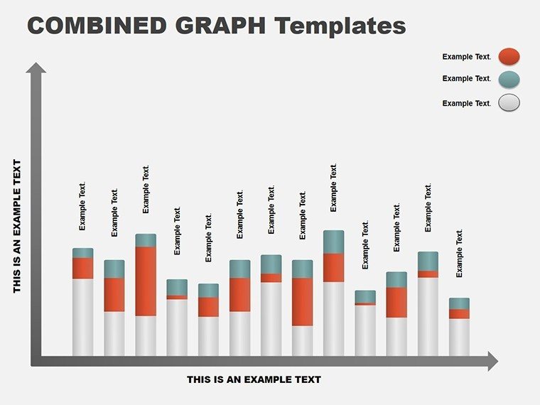
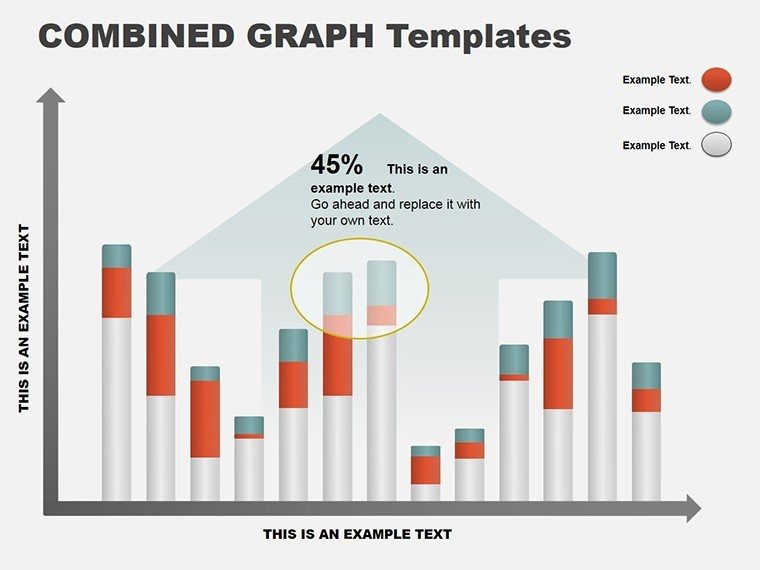
Think of it as your canvas for clarity: Tall columns rise to show revenue spikes, grouped bars compare sectors, and stacked variants layer expense breakdowns. With a palette that shifts colors in one click, you adapt to any theme - corporate blues for boardrooms or vibrant greens for investor decks - without breaking a sweat. Built for PowerPoint 2016+, it ensures smooth rendering on any device, keeping your focus on insights, not tech glitches.
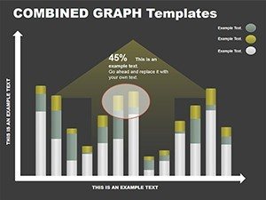
This template addresses the common pain of bland spreadsheets: It turns them into narratives that engage, whether you're forecasting budgets in a team huddle or dissecting GDP shifts for policymakers. A financial advisor might use slide 4's clustered columns to juxtapose asset performances, sparking informed discussions. Or an economist illustrating inflation trends on slide 7, where ascending bars make projections undeniable. At just $10, it's an investment in presentations that persuade and perform.
Essential Features for Data-Driven Design
What sets this template apart is its no-fuss approach to sophistication. Each slide leverages clean lines and balanced spacing, ensuring data stands out without clutter. Vector graphics mean scalability without loss, ideal for large venues.
- One-Click Customization: Alter the entire color scheme instantly, syncing bars to your slide deck's motif.
- Varied Layouts: From simple single-series to multi-axis comparisons, covering diverse analytical needs.
- Built-In Labels: Auto-adjusting text boxes that rotate or resize as data changes, maintaining readability.
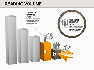
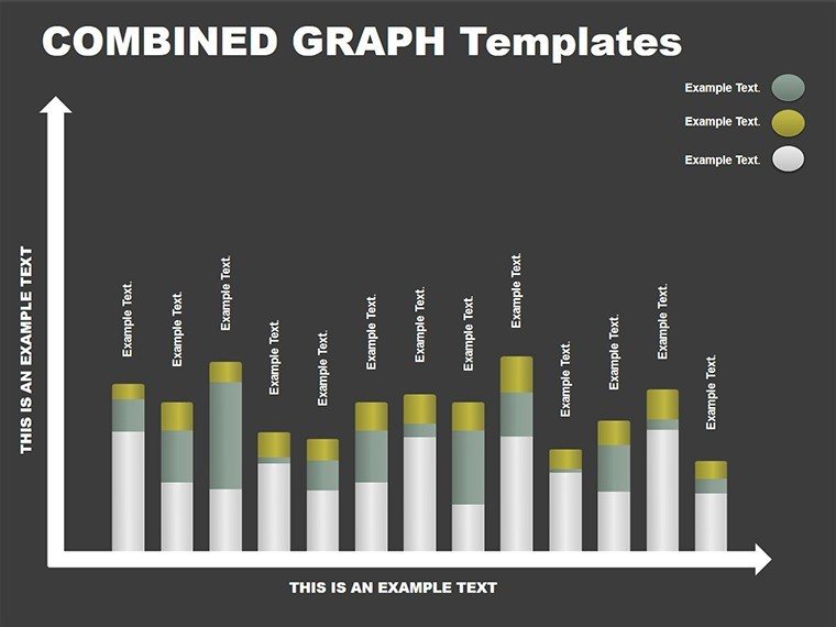
Slide 2 exemplifies this: A basic vertical column set for year-over-year sales, where you input values and watch bars animate upward, revealing trends progressively. Slide 6 offers horizontal flips for longer category names, like department budgets, preventing text overlap.
Pro Tips for Polishing Your Graphs
- Gather your dataset first: Align columns with key metrics to avoid mid-edit reshuffles.
- Limit to 5-7 categories: Keeps visuals scannable, echoing best practices from data viz experts like Edward Tufte.
- Preview in grayscale: Ensures accessibility for color-blind viewers by relying on height contrasts.
These steps elevate your graphs from functional to unforgettable, much like those in Federal Reserve reports.
Targeted Use Cases in Economics and Finance
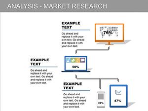
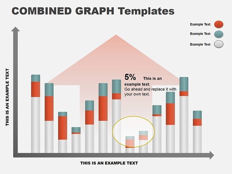
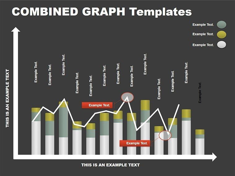
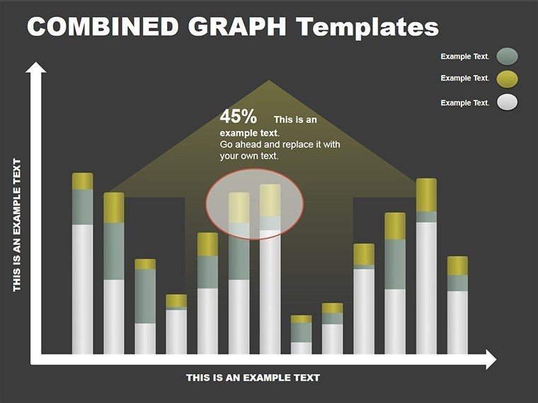
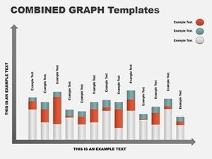
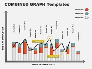
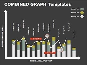
Column graphs thrive in scenarios demanding quick comprehension. In financial reporting, use slide 3's grouped bars to pit actuals against forecasts, helping auditors spot discrepancies at a glance. For economic briefings, slide 5's stacked design dissects sector contributions to GDP, layering industries for a holistic view.
Sales teams adapt it for performance reviews: Compare regional quotas with a side-by-side column setup on slide 1, motivating with visual wins. Even in academic settings, professors chart historical data evolutions, making theories tangible. Versus vanilla PowerPoint charts, this template's pre-formatted axes and legends save setup time, letting you iterate on stories instead.
A market researcher once leveraged these for client pitches, using clustered columns to benchmark competitors - turning dry stats into strategic edges that won contracts.
Seamless Workflow Integration
Incorporate this into your routine by linking slides to external sources like Excel for live updates during volatile market talks. Start broad with an overview slide (number 0), then zoom into specifics. For interactivity, add hyperlinks to source files, empowering self-serve deep dives.
Pair with complementary tools: Export to PDF for handouts or embed in reports via PowerPoint's object insertion. The outcome? Decks that adapt to feedback loops, refining your message on the fly.
Elevate Your Analytics Game
With crisp animations that build columns sequentially and fonts optimized for 10-foot views, this template ensures every presentation lands. It's more than graphs - it's a bridge to better decisions.
Step up your financial visuals with the Column Graph PowerPoint Template for just $10. Download now and let your data do the talking.
Frequently Asked Questions
What is the slide count?
The template includes 8 editable slides focused on various column graph styles.
Are the colors customizable?
Yes, a one-click palette change applies across all slides for quick theming.
Does it work with older PowerPoint versions?
It's optimized for 2016 and later, with full compatibility on Windows and Mac.
Can I use it for non-financial data?
Definitely, its versatile designs suit any comparative or trending data visualization.
How do I add my own data?
Simply edit the placeholders or link to Excel for automatic updates.