PowerPoint Diagrams Collection: Weaving Data into Narratives


In the rush of crafting a pitch that captivates, the last thing you need is fumbling with clunky charts. The PowerPoint Diagrams Collection steps in as your versatile arsenal - thirteen meticulously designed slides that span flowcharts to Venn diagrams, all primed for seamless storytelling. Geared toward business pros streamlining reports, teachers igniting classroom discussions, or project leads clarifying timelines, this template turns potential chaos into cohesive visuals that resonate.
Envision a sales meeting where a bar graph doesn't just show figures but pulses with competitive edges, or a mind map that unfurls brainstorming sessions like a living document. Handcrafted for PowerPoint (.potx format), it's compatible from 2016 versions up, ensuring broad accessibility. Echoing the structured elegance seen in Harvard Business Review infographics, this collection empowers you to convey overlaps, sequences, and hierarchies with finesse. No more generic placeholders; these are tools that adapt to your voice, amplifying impact without overwhelming effort.
Embrace the collection's breadth to fit any canvas - from quarterly reviews to thesis defenses. With customization at your fingertips, infuse your brand's essence and watch engagement soar. Snag this PowerPoint diagram template set for $18 and redefine how you present the profound in the everyday.
Standout Elements: Inside the Diagrams Toolkit
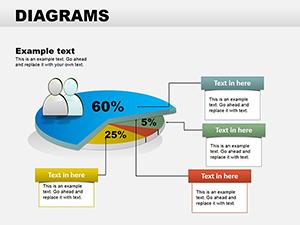
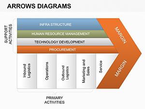
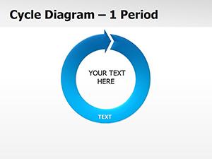
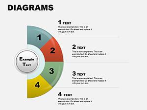
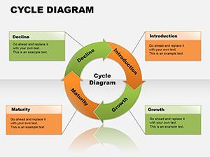
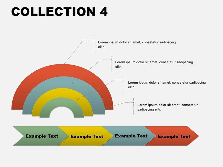
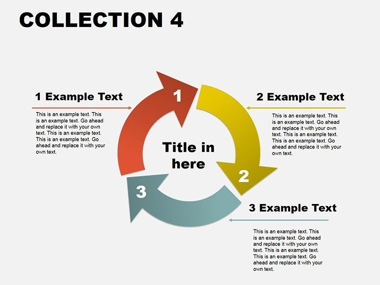
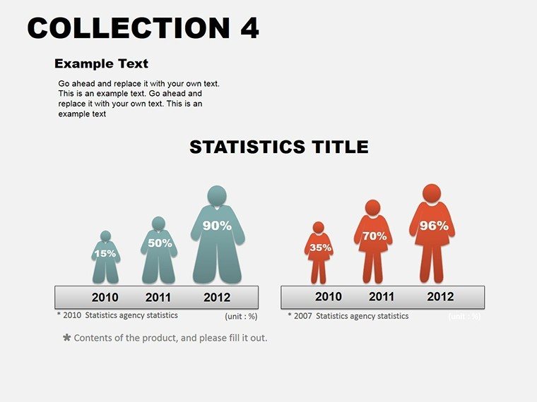
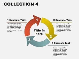
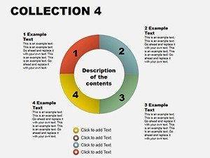
This thirteen-slide suite is a symphony of variety, each diagram a soloist in your presentation orchestra. Kick off with the flowchart for workflow breakdowns: Arrows that snake through steps, editable to reflect agile sprints or approval chains. Transition to pie charts for portion mastery - slice data distributions with gradient fills that denote priorities, like budget allocations in marketing plans.
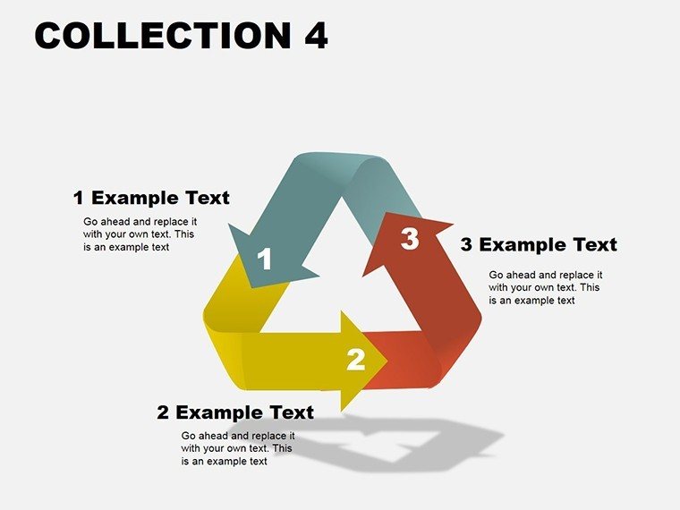
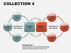
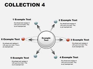
- Diverse Diagram Spectrum: Flowcharts, bar graphs, mind maps, Venns, hierarchies - all vector-sharp and rescalable.
- Effortless PowerPoint Tweaks: Color swaps, text resizes, and symbol additions via intuitive panels.
- Integrated Icons Library: Hundreds of scalable graphics to symbolize concepts, from clocks for timelines to gears for mechanics.
- Animation-Ready Builds: Sequential entrances that mirror logical progression, enhancing flow.
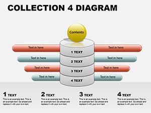
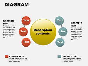
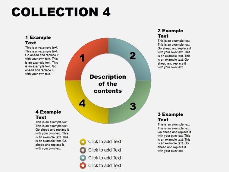
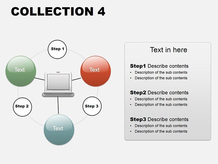
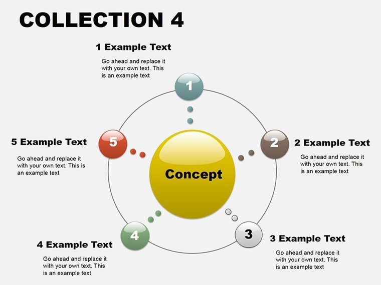
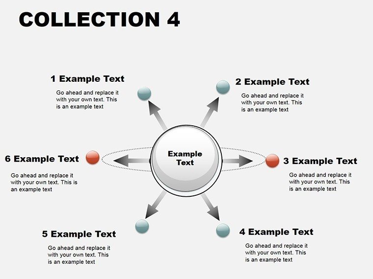
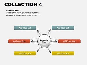
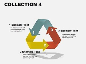
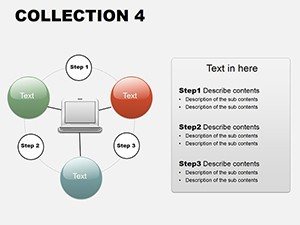
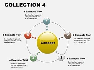
Beyond basics, the mind map slide invites nonlinear thinking, with radial arms for idea clustering - perfect for ideation sessions. Venn diagrams overlap with transparency effects, ideal for alliance strategies, while hierarchy trees descend cleanly for org charts. This isn't a one-trick set; it's a modular system that evolves with your needs, outpacing stock PowerPoint libraries in depth and detail.
Targeted Uses: Diagrams in Action Across Fields
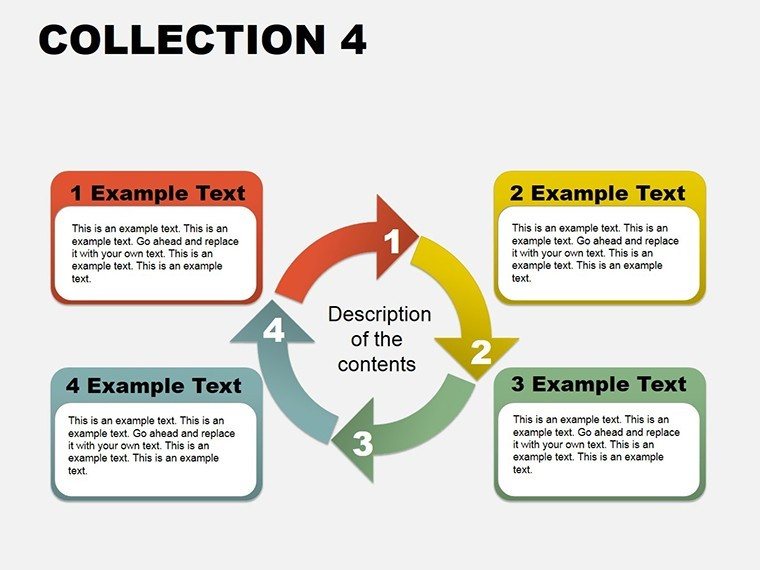
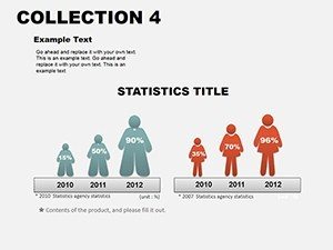
For corporate warriors, the bar graph slide dissects performance metrics: Stack comparisons side-by-side, animating bars to climb with revenue narratives, much like how Salesforce demos pipeline health. In education, a teacher leverages the flowchart for scientific methods - steps branching into hypotheses, drawing students into the experiment's logic. Project managers adore the Gantt-inspired hierarchy, layering tasks with dependencies to preempt bottlenecks.
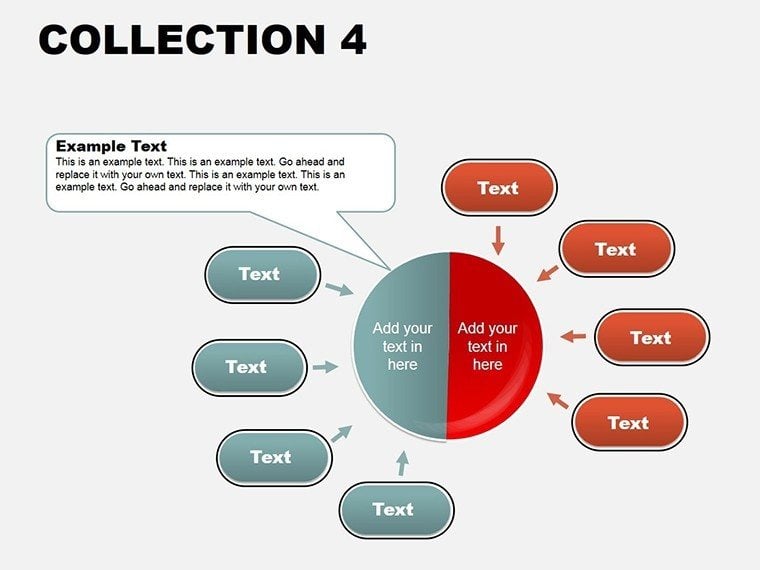
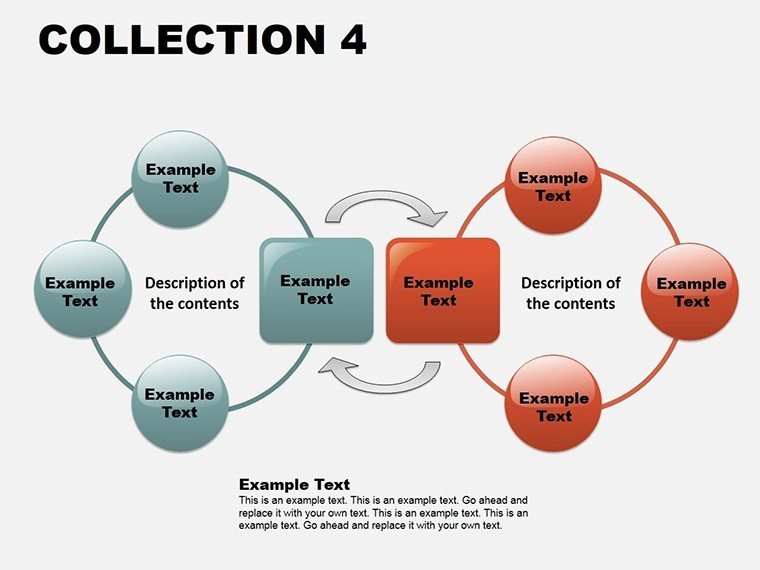
Marketing teams thrive on Venns for audience segmentation: Circles intersecting demographics with behaviors, revealing untapped niches. Sales pitches gain traction with pie timelines, portioning deal stages to forecast closes. Even in creative agencies, mind maps blueprint campaign concepts, connecting themes to assets in a web of inspiration. Each scenario leverages the template's modularity, solving the puzzle of "how to visualize this?" with ready precision.
Implementation is straightforward: Launch PowerPoint, apply the .potx theme, and duplicate slides as needed. For a Venn, select overlapping shapes and adjust opacity for depth; input labels via smartart text. Harness morph transitions for fluid shifts between diagrams, testing in slideshow mode to nail timing. This ritual not only refines your content but hones your presenter's edge.
Mastery Moves: Refining Your Diagram Workflow
To truly own the collection, layer in subtlety. Audit your palette first - consistent hues across diagrams foster unity, like earth tones for sustainability talks. For data imports, link Excel sheets directly to charts for auto-updates, a boon for iterative reviews. Enhance interactivity: Hyperlink Venn sections to appendices, guiding deep dives without derailing the main thread.
Alt text is key for inclusivity: "Venn diagram illustrating market overlap in tech sectors." Versus ad-hoc drawings, this pro collection maintains alignment and scalability, preserving sanity during revisions. A gentle nudge: If a diagram feels crowded, prune to essentials - clarity trumps completeness every time.
Blueprint: Crafting a Project Timeline Presentation
- Theme Apply: Open PowerPoint; insert the collection via design tab.
- Diagram Select: Choose hierarchy slide; outline phases in tiers.
- Detail Infuse: Add icons and metrics; format lines for emphasis.
- Animate Flow: Sequence task reveals; align with voiceover cues.
- Review Export: Proof on multiple screens; save as PPTX or video.
Such steps forge presentations that don't just inform - they propel action, turning data dumps into decision drivers.
Frequently Asked Questions
What diagram types are included in this PowerPoint collection?
A robust mix: Flowcharts for processes, pies and bars for distributions, mind maps for ideas, Venns for intersections, and hierarchies for structures.
Can I resize elements without quality loss?
Yes, all vectors ensure crispness at any scale, from thumbnails to full-screen.
How does it handle team collaborations in PowerPoint?
Share via OneDrive for real-time edits, with version history to track changes.
Is it geared toward beginners or advanced users?
Both - simple drags for novices, advanced linking for pros.
Does it include templates for 3D effects?
Base 2D with easy extrusion options to add depth where needed.
What's the compatibility with Mac PowerPoint?
Fully cross-platform, with .potx files opening identically on Windows or macOS.
Diagram your way to distinction - acquire the PowerPoint Diagrams Collection for $18 and let your visuals lead the charge.