PowerPoint Diagrams Collection 2: Craft Data Stories That Stick


In the fast-paced world of business and education, your presentations need to do more than inform - they must engage, persuade, and linger in minds long after the last slide. Enter the PowerPoint Diagrams Collection 2, a robust set of 22 editable slides that transform raw data into narrative gold. Tailored for analysts, educators, and executives who juggle complex info daily, this template equips you with tools to visualize everything from growth trajectories to comparative analyses without starting from scratch.
Compatible with PowerPoint 2013 onward, these diagrams span cycles for process mapping, graphs for trend spotting, pies for proportion breakdowns, tables for structured comparisons, and arrows for directional flows. The beauty lies in their flexibility: drag, drop, and tweak to align with your voice, whether you're dissecting quarterly metrics or outlining lesson plans. Priced at $28, it's a small step toward presentations that command attention and drive decisions.
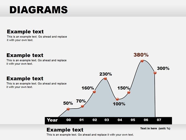
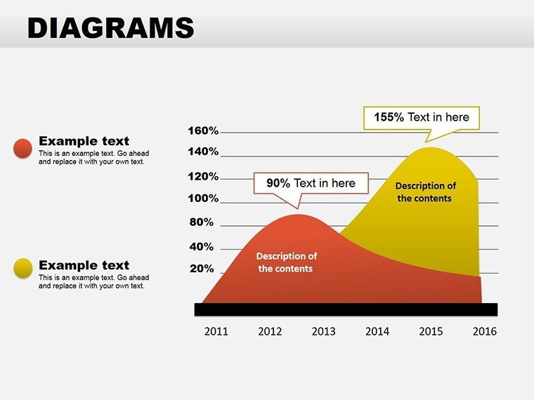
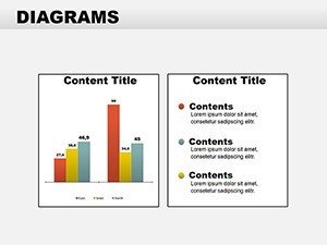
Think back to that last meeting where charts blurred into monotony - this collection revives the spark. Graphs here aren't bland lines; they're styled with gradient fills and markers that highlight inflection points, making spikes in user engagement or dips in costs impossible to ignore. For educators, table diagrams organize curricula into digestible grids, complete with sortable headers for interactive sessions.
Unpacking the Rich Variety in This Diagram Collection
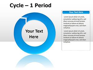
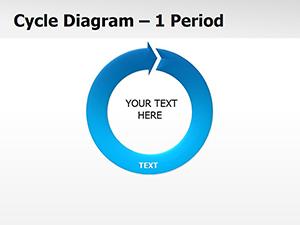
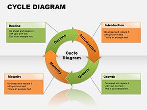
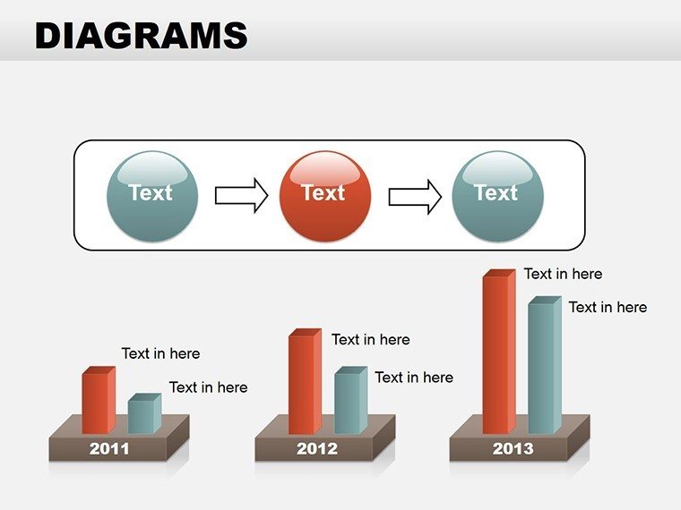
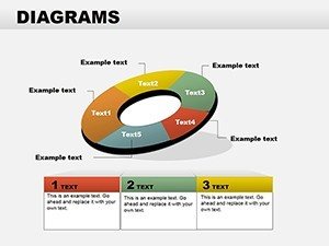
At its heart, Collection 2 offers a balanced toolkit. The four cycle diagrams loop elegantly, suiting everything from feedback mechanisms in customer service to biological processes in science talks. Infuse them with icons for added context, like gears for operational cycles, turning abstract concepts into tangible touchpoints.
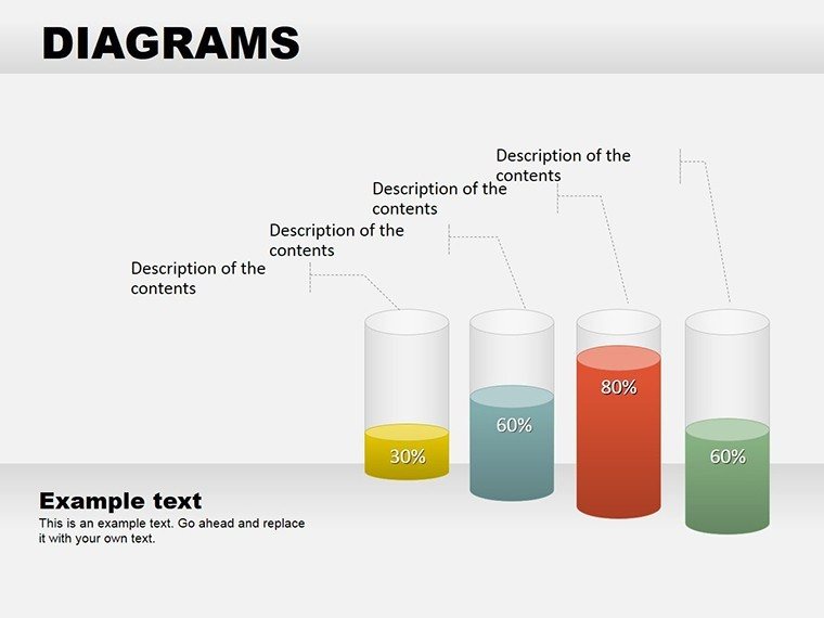
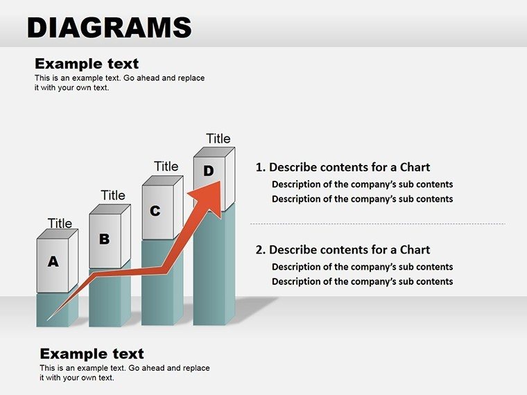
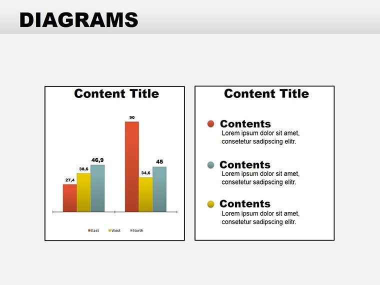
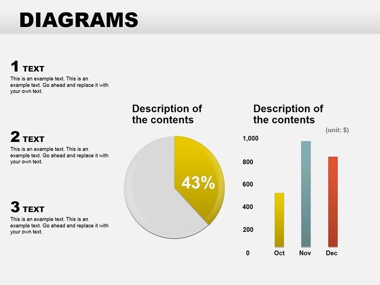
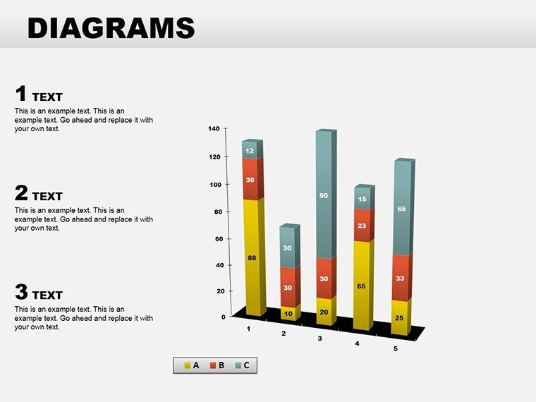
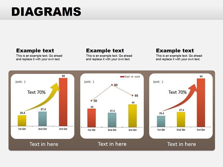
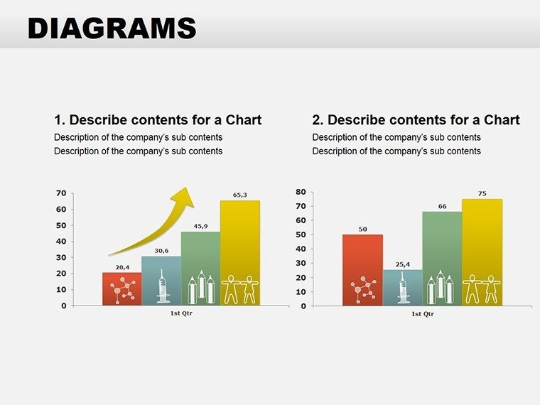
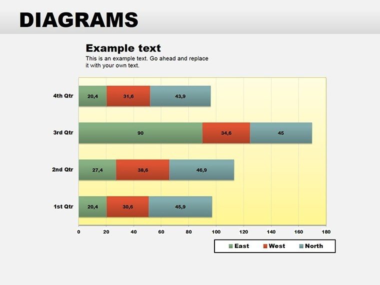
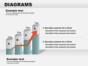
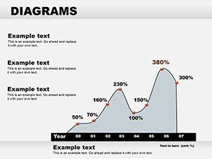
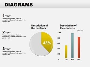
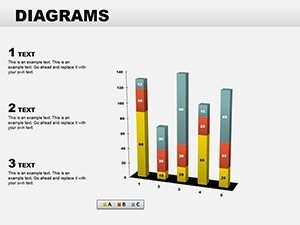
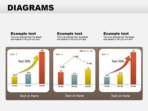
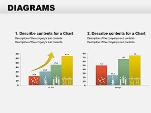
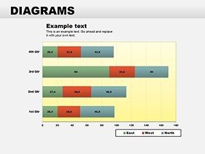
Graphs take center stage with seven options: bar, line, and scatter varieties that plot data with precision. Customize axes for logarithmic scales if needed, or add trendlines to forecast future scenarios - handy for sales forecasts where patterns predict revenue upticks.
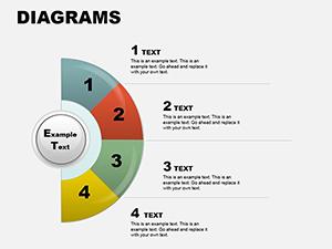
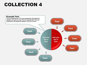
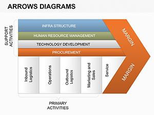
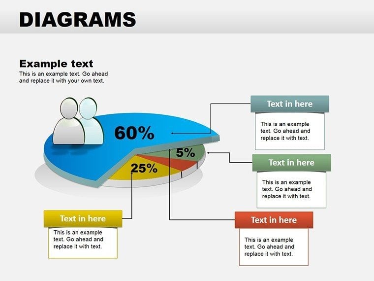
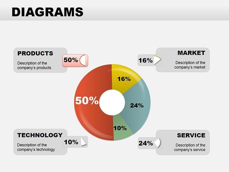
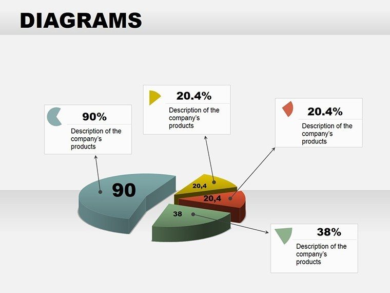
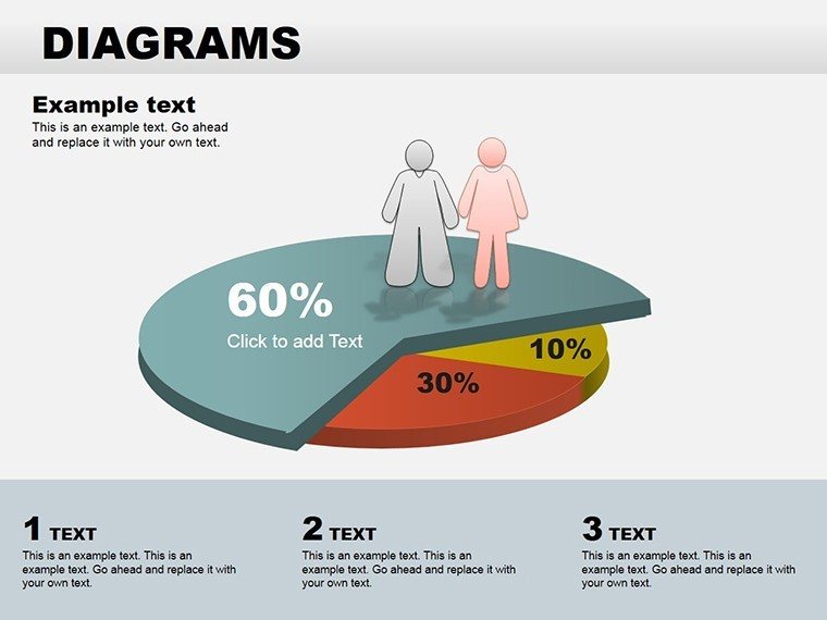
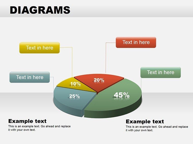
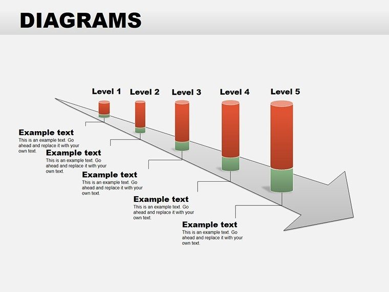
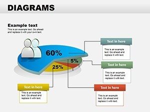
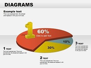
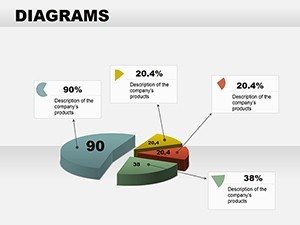
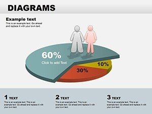
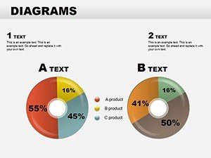
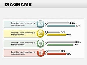
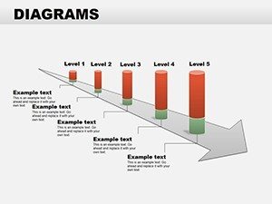
Pie diagrams, numbering five, dissect wholes into parts with exploded views and legends that auto-update. Tables provide four grid-based layouts, from simple two-column contrasts to multi-row matrices for SWOT analyses. Arrows round it out with two sets: straight for linear progressions and bent for nuanced paths, like navigating regulatory hurdles.
- Cycle Diagrams: Closed loops for iterative concepts, editable paths for custom node counts.
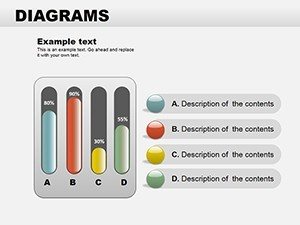
- Graph Options: Multi-series support for overlaid datasets, with customizable legends.
- Pie Charts: 3D illusions for depth, shadow options for emphasis.
- Tables: Resizable cells with merged capabilities for headers.
- Arrow Flows: Connector lines that snap to shapes for seamless integration.
All sourced in .potx for easy templating, ensuring your customizations carry over to new projects.
Step-by-Step Integration for Dynamic Presentations
Getting started is straightforward: open the template, select a slide, and paste your data. For a graph illustrating market share, input values via the data table pane - PowerPoint handles the rendering, then fine-tune with fill colors to match competitor branding. Animate the bars to rise sequentially, revealing insights one by one for dramatic effect.
In a classroom, use table diagrams to compare historical events: populate rows with dates and impacts, then sort alphabetically for quick reference. Arrows can link causes to effects, creating a visual chain that's far more engaging than bullet points.
For business pros, cycle diagrams map supply chains: label segments with suppliers and logistics, adjusting arc widths to reflect volume. This mirrors how logistics firms like DHL visualize global routes, emphasizing efficiency bottlenecks.
- Import the template into your existing deck via Insert > Slides from Outline.
- Edit data sources directly in the chart tools.
- Apply themes from Design tab for brand alignment.
- Preview in Presenter View for timing checks.
- Save as PDF for distribution if needed.
Such integration keeps your flow uninterrupted, whether presenting virtually or in-person.
Pro Tips for Tailoring Graphs and Tables
Enhance pies by adding percentage labels that format automatically - set to two decimals for financial precision. For tables, use conditional formatting via add-ins if available, coloring high performers green. Graphs benefit from secondary axes for dual metrics, like revenue versus units sold, revealing correlations at a glance.
Avoid overload: limit pies to five slices max, directing complex data to graphs instead. Arrows shine with feathered ends for softer transitions in creative pitches.
Standing Apart: Comparisons and Lasting Value
Versus basic inserts, these diagrams offer layered sophistication - tables with built-in formulas for auto-calcs, graphs with error bars for credibility. In consulting, arrow flows delineate decision trees, akin to branching strategies in strategy sessions at Bain & Company.
The collaborative edge? .potx files enable team edits without overwriting masters. Scalable vectors ensure crispness on any device, from laptops to projectors.
As your slides evolve, so does their impact - start weaving these diagrams into your toolkit and notice the shift in audience reactions.
Seize the opportunity to make your data dance: download Collection 2 now and redefine your presentation standards.
Frequently Asked Questions
Does this template support multi-series graphs?
Yes, all graph slides accommodate multiple data series, with options to adjust line styles and colors for clarity.
How editable are the table layouts?
Fully editable - resize rows, merge cells, and add formulas via PowerPoint's table tools.
Can I add animations to arrow diagrams?
Certainly; use path animations to make arrows "fly" along their trajectory for engaging flows.
Is it compatible with older PowerPoint versions?
Optimized for 2013+, but test in your version; core features work broadly.
How do I handle large datasets in pies?
For more than six segments, consider switching to a graph slide to maintain readability.
Are there icon libraries included?
No dedicated library, but integrate from PowerPoint's built-in icons seamlessly.