Discs Venn PowerPoint Diagrams - Editable PPTX | ImagineLayout


18 Diagrams Across Venn Layouts: Full Contents
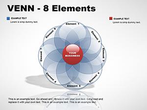
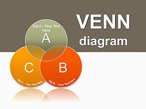
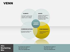
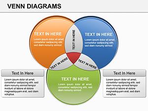
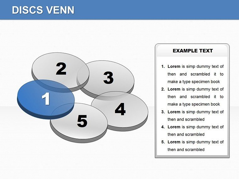
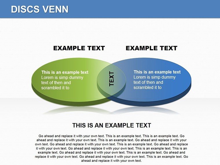
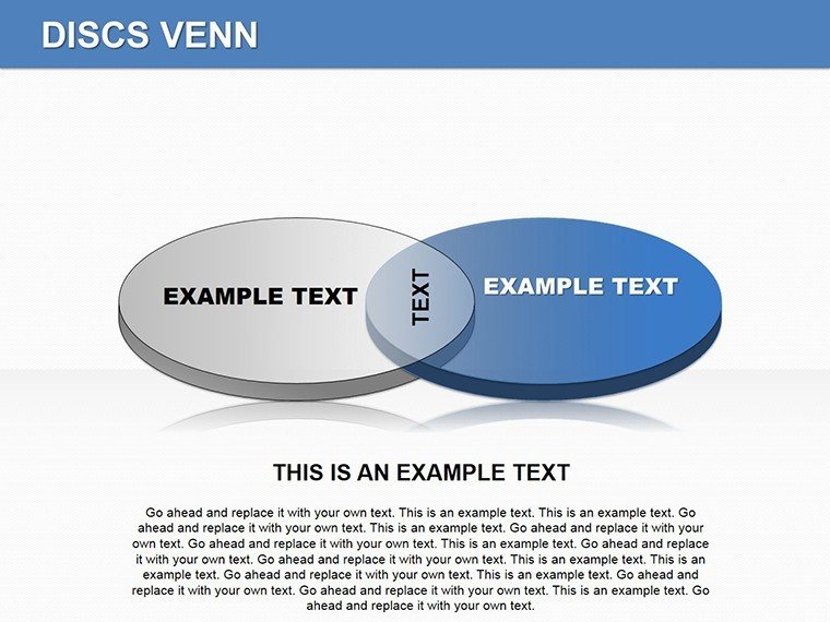
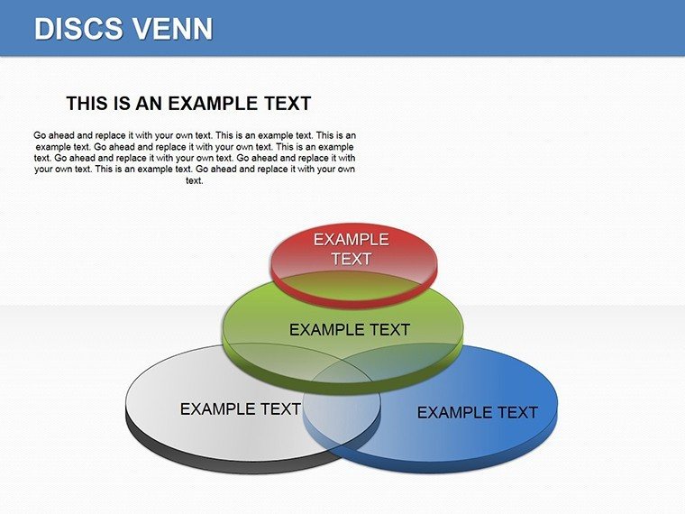
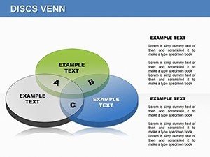
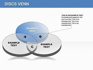
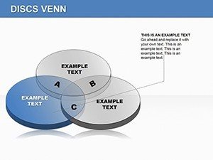
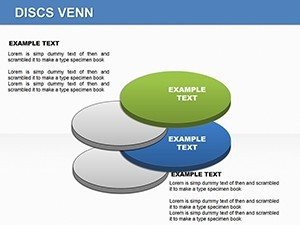
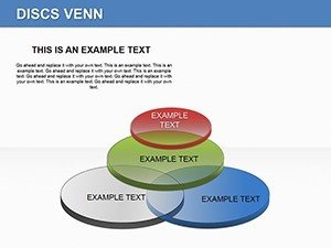
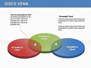
18 diagrams fill the download package. Professional discs form overlapping zones for data relationships. Each slide keeps editable shapes separate so overlaps adjust without distortion.
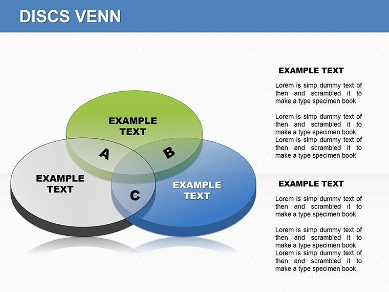
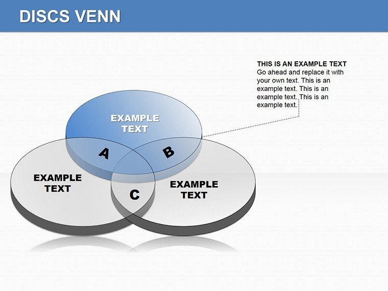
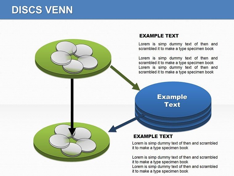
The package supports relationship visuals in business presentation settings through disc-based overlaps. Diagram structure combines multiple discs into zones that show shared and unique elements together for investor decks.
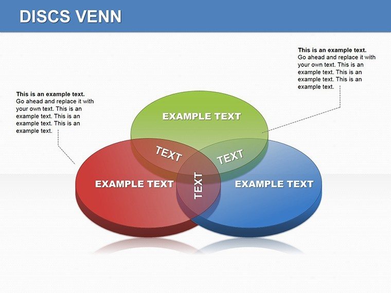
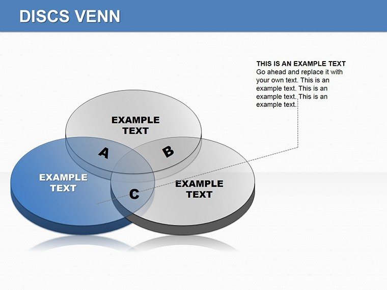
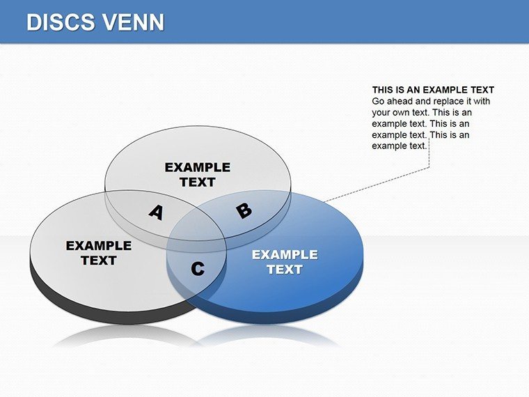
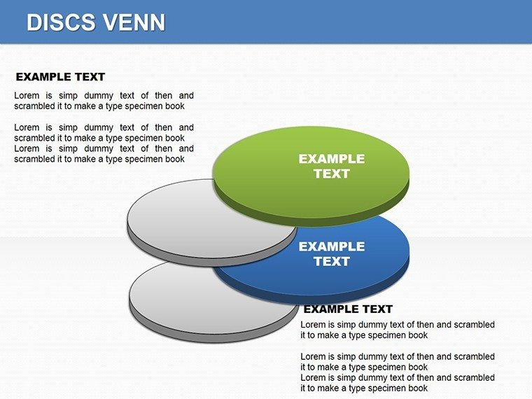
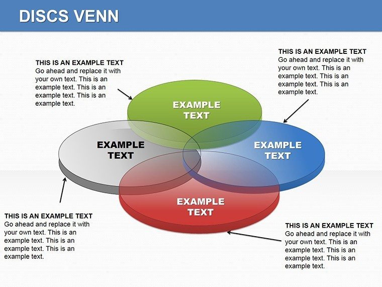
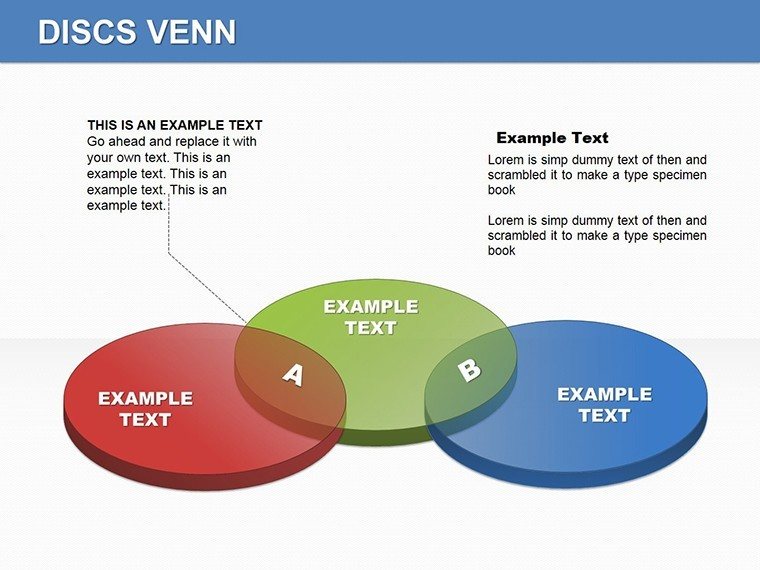
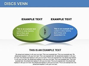
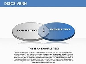
The professional discs enable clear data stories unlike standard venn sets. One specific visual characteristic is the disc-shaped overlaps with clean edges. For conveying relationships between datasets in board briefings this works best since the structure clarifies intersections better than single-chart layouts. The paid version delivers all 18 slides with independent shape editing.
Technical Specs
| Feature | Details |
|---|---|
| Slides included | 18 diagrams focused on discs venn |
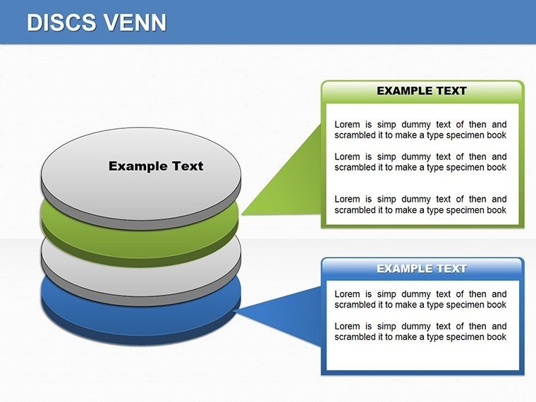
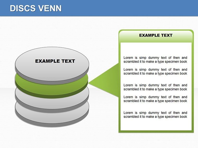
| Editable elements | Disc segments resize and recolor independently |
| Color theme adjustments | Slide master palette supports full recoloring |
| Diagram connectors | Overlap lines adjustable in style |
| Aspect ratio | Standard 16:9 for modern screens |
| PowerPoint compatibility | Versions 2016, 2019 and Microsoft 365 |
Adapting the Template to Your Brand
1. Open the .pptx file in PowerPoint 2016 or later (1 minute).
2. Replace placeholder text with your content (3 minutes).
3. Adjust brand colors via the slide master (2 minutes).
4. Edit diagram labels and connectors (4 minutes).
5. Export as PPTX or PDF (1 minute).
Editing difficulty remains moderate.
Typical Use Cases by Role
Consultants in management firms reach for this template during client proposals. They map overlapping strategies in the discs and finish the deck in 45 minutes instead of three hours from scratch.
Marketing teams in consumer goods adapt the overlaps for campaign analysis. They pair the set with idea comparison diagrams for multi-segment reports and reuse the same file across five quarterly briefings by swapping color schemes.
Download the discs venn diagrams now to start editing immediately.
Why This Template, Not a Blank Slide
Professionals spend over four hours building disc overlaps manually. This package reduces that to under 15 minutes. Advanced vector alignment skills are required when starting from blank slides. Alignment issues and inconsistent spacing often appear on projection screens.
Disc layouts place labels outside the overlaps connected by thin lines. That approach maintains readability during live meetings without adding editing complexity compared to inside labels that shrink on zoom. Consultants often pair these diagrams with multi element venn layouts when structuring relationship decks.
Get the full set and present with confidence today.
What PowerPoint versions support these discs venn diagrams?
The PPTX format works with PowerPoint 2016, 2019, and Microsoft 365 on Windows systems. Mac users can open it in PowerPoint for Mac 2016 or later with full editing support. Test the file in your installed version before large projects to ensure compatibility. The page does not specify exact requirements beyond PPTX so verify your software.
How do I change the color scheme in the file?
Open the slide master view in PowerPoint. Select the color palette and update the theme colors. All disc zones update automatically across the 18 diagrams. Save the file and return to normal view to check the result in under two minutes.
What does the license permit for client work?
You can use the diagrams in paid client work and internal presentations. Resale of the template file or sublicensing remains prohibited. The download includes a license file with full terms. Contact support for any specific usage questions.
Are there free and paid versions available?
The page does not list a free version. The paid purchase covers the full set of 18 editable slides. No partial diagrams appear in any tier. Check the download page for current pricing details.
What file formats are included and which software opens them?
The download contains only PPTX files. PowerPoint 2016 and newer opens them directly on Windows or Mac. Export options include PDF for distribution. No KEY or other formats appear.