Probability Venn PowerPoint Diagrams: Master Set Visuals with Ease


Type: PowerPoint Diagrams template
Category: Cycle, Relationship, Venn
Sources Available: .pptx
Product ID: PD00042
Template incl.: 14 editable slides
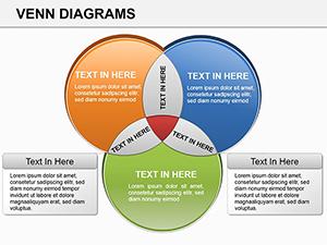
Diving into probability and set theory can feel like navigating a maze of abstract intersections, but what if your slides could light the path? The Probability Venn PowerPoint Diagrams template steps in as your guide, offering 14 meticulously crafted slides that demystify Euler-Venn constructs for anyone from classroom teachers to data analysts. This isn't just a collection of shapes - it's a bridge from theory to tangible understanding, helping you illustrate concepts like union, intersection, and complements without losing your audience in jargon.
Tailored for those grappling with "how do I even start building these?" moments, the template assumes no prior design expertise. Launch it in PowerPoint 2016 or newer, and you'll find ready-to-populate circles that handle everything from basic two-set probabilities to intricate four-way overlaps. Colors shift intuitively - soft pastels for educational decks, sharper tones for analytical reports - ensuring your visuals adapt to the room's vibe. Think of it as the visual equivalent of a well-structured proof: logical, layered, and leaving viewers enlightened rather than exhausted.
For educators, it's a game-changer in lessons on discrete math, where students often stumble over verbal explanations. Swap in example probabilities, like the overlap of rainy days and event attendance, and watch engagement soar as overlaps reveal real-world odds. Analysts in finance or research use it to map risk scenarios, overlaying variables like market volatility and regulatory changes to spotlight critical junctures. The beauty lies in its precision: every curve and shade serves the math, turning potential confusion into confident comprehension.
Core Features for Precise Probability Mapping
This Euler-Venn PowerPoint template stands out by embedding mathematical integrity into every slide, so your diagrams aren't just pretty - they're accurate.
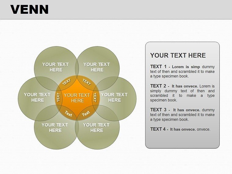
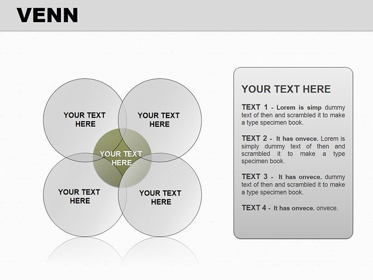
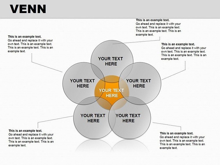
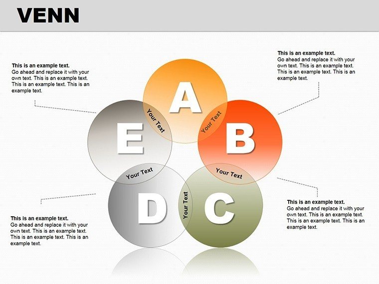
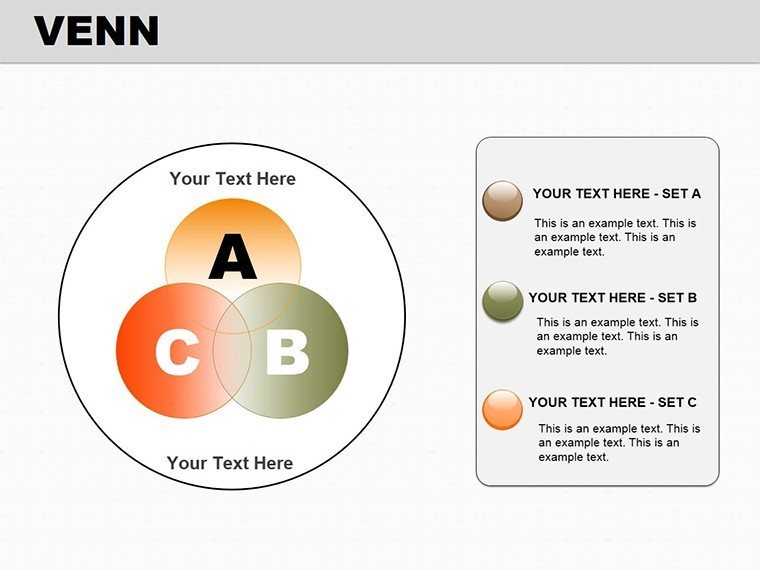
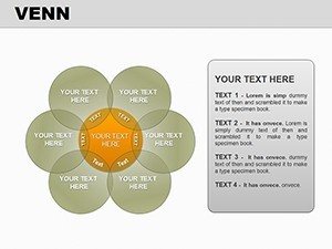
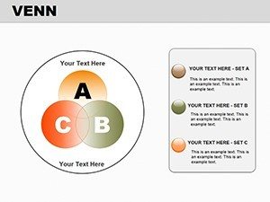
- Scalable Set Configurations: From duo to quad overlaps, with guides for symmetric and asymmetric placements to match probability distributions.
- Formula-Ready Labels: Placeholder spots for equations like P(A ∪ B) = P(A) + P(B) - P(A ∩ B), editable in one click.
- Neutral Yet Flexible Palette: Grayscale bases with accent options, ideal for printing or projecting in lit rooms.
- Layered Builds: Animate segments to unfold probabilities sequentially, mirroring deductive reasoning.
These tools ensure your slides support the science, not overshadow it, fostering trust in your delivery.
Navigating the Slides: A Guided Tour
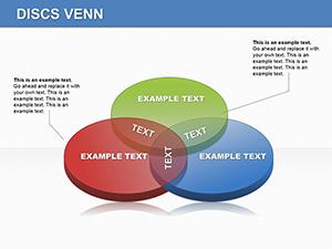
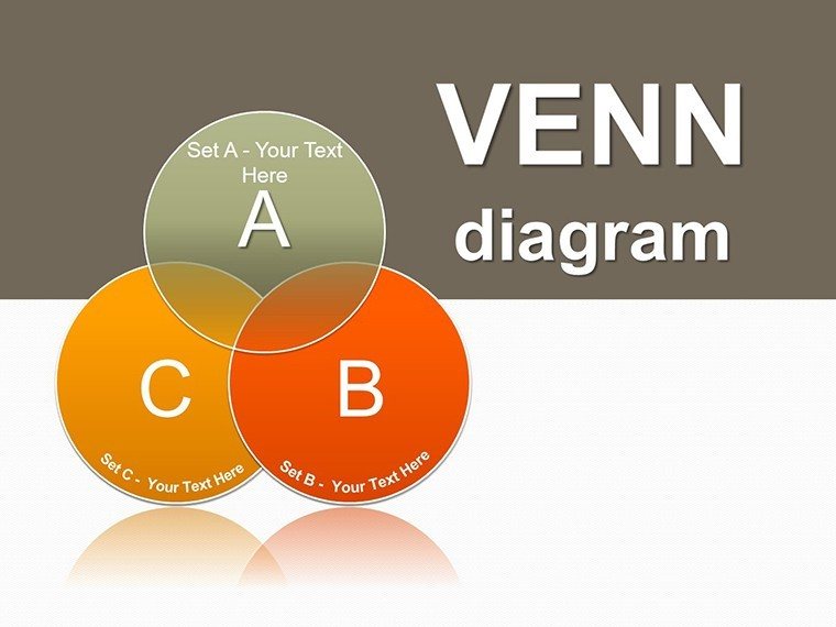
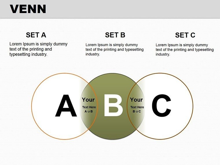
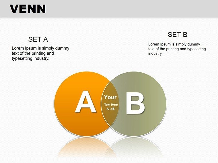
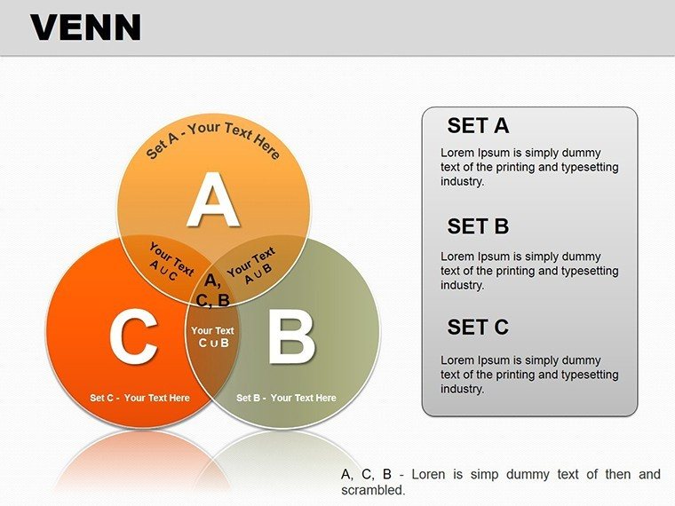
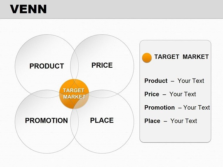
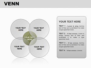
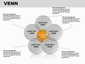
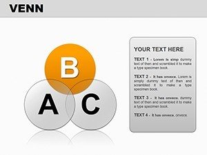
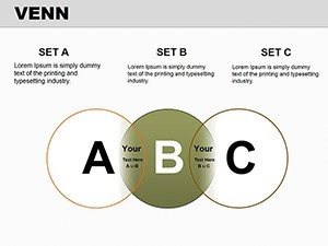
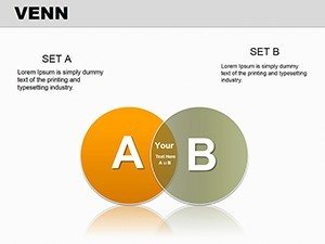
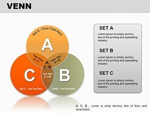
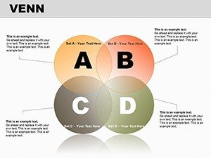
Opening with Slide 1's foundational two-circle Venn for basic unions, the progression builds logically. By Slide 4, triple sets introduce complements, perfect for inclusion-exclusion demos - drop in your values, and the areas auto-highlight intersections.
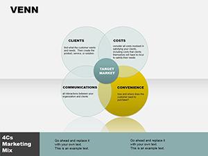
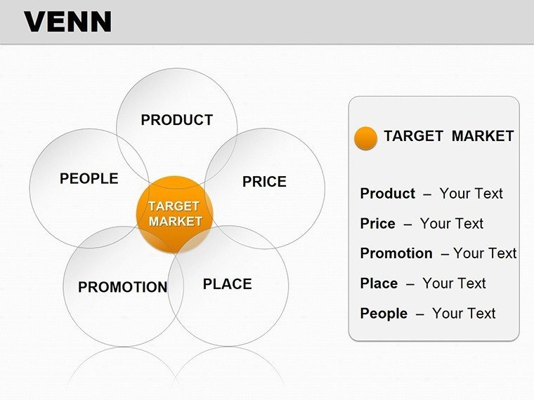
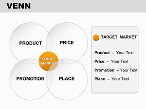
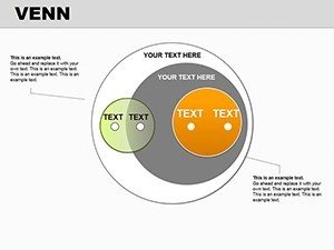
Slides 7-10 delve into conditional probabilities, with shaded regions denoting given events; use the alignment tools to fine-tune for non-overlapping cases. Advanced users will appreciate Slides 11-13's Euler extensions, where non-circular shapes accommodate irregular sets, like in Bayesian updates. Wrap with Slide 14's summary chart, aggregating key formulas for review.
Customization is straightforward: Right-click a shape, select Format Shape, and input your data via the data pane. A quick tip from probability pros: Use gradient fills on overlaps to denote magnitude, adding depth without clutter.
Practical Use Cases: From Classroom to Conference
In academic settings, this template transforms dry set theory into interactive explorations. A professor might overlay student poll data on event preferences, calculating live probabilities to reinforce concepts - students leave with tools they can apply beyond the lecture hall.
For business intelligence, envision a risk analyst charting scenario branches: Overlaps between economic indicators and portfolio impacts clarify mitigation strategies, much like how quantitative teams at firms dissect volatility clusters. It's these targeted applications that elevate routine reports into strategic assets.
One subtle edge over generic tools? The template's adherence to Euler's principles avoids common pitfalls like impossible intersections, ensuring your visuals hold up under scrutiny.
Your Step-by-Step Setup Guide
- Load and Select: Open in PowerPoint, choose a slide matching your set count.
- Populate Probabilities: Enter values in text boxes; shapes resize proportionally if linked.
- Style for Context: Adjust line weights for emphasis - thicker for boundaries, dashed for hypotheticals.
- Animate Insights: Set entrance effects to "wipe" for revealing areas, syncing with explanations.
- Validate and Export: Cross-check with a calculator, then save variants for different audiences.
This method keeps your prep time minimal, letting you focus on the narrative that brings numbers to life.
Beyond Basics: Elevating Your Probability Presentations
While PowerPoint's native Venn tools suffice for sketches, they falter on scalability and theming. This template bridges that gap with pre-optimized layouts that integrate seamlessly into larger decks, preserving flow while amplifying math-heavy sections.
Whether prepping for a stats conference or internal training, it equips you to convey uncertainty with certainty - because in probability, the visuals matter as much as the math.
Unlock the clarity your audience craves: Grab this Probability Venn PowerPoint template for $28 and turn abstract sets into accessible stories now.
Frequently Asked Questions
What's the difference between Venn and Euler diagrams here?
Venns use circles for all sets; Euler allows varied shapes for precise intersections, included for advanced probability visuals.
Does it support importing data from Excel?
Yes, link shapes to spreadsheets for dynamic updates, keeping probabilities current as data evolves.
Is it suitable for high school math classes?
Perfectly - start with simpler slides and build up, making set theory approachable for beginners.
Can I add more than four sets?
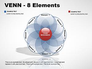
For five-plus, chain multiple slides or use the summary for overviews, avoiding visual overload.
How about compatibility with older PowerPoint versions?
Optimized for 2016+, but basic edits work in 2013 with minor animation tweaks.
Are there built-in examples for common problems?
Yes, placeholder scenarios like dice rolls guide initial setups, easing your first use.