Cause and Effect PowerPoint Diagrams Template


In the fast-paced world of decision-making, where one small factor can cascade into major outcomes, clarity is your greatest ally. Enter the Cause and Effect PowerPoint Diagrams template - a robust set of 13 editable slides engineered to dissect and display those pivotal connections. Tailored for analysts, project leads, and strategists, this template empowers you to map out root causes, ripple effects, and corrective paths with precision and poise.
From troubleshooting supply chain disruptions to forecasting market trends, these diagrams replace vague explanations with structured visuals that command attention. Built for PowerPoint 2016 and beyond, the slides feature resizable shapes and intuitive layouts, letting you input data without wrestling with formatting. Priced at $27, it's a smart investment in presentations that not only inform but propel action. Why settle for confusion when you can chart the course to solutions? Secure this template today and turn "what if" into "here's how."
Essential Features for Impactful Analysis
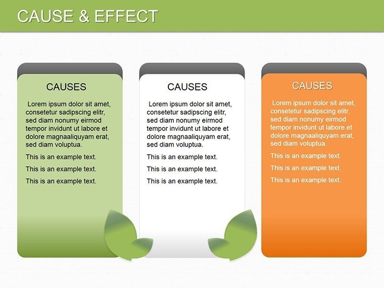
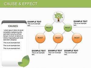
This PowerPoint diagram template stands out with its focus on logical flow, starting from core cause nodes that branch into layered effects. Each slide incorporates color-coded segments - warm tones for triggers, cool for consequences - guiding the eye naturally. SmartArt alternatives here are superior, with drag-and-drop connectors that auto-adjust, saving you from alignment headaches.
Key to its appeal is the inclusion of placeholder annotations, prompting you to add metrics or timelines right away. For quality teams, the integrated arrow systems mimic Ishikawa methods, fostering deeper dives into variables. And unlike basic charts, these support hyperlinks to detailed appendices, enhancing interactivity in large decks.
- Dynamic Scaling: Shapes adapt to text length, keeping layouts balanced.
- Theme Integration: Matches corporate colors seamlessly for branded consistency.
- Export Ready: High-res outputs for web or print without tweaks.
These elements ensure your cause-and-effect stories unfold with the rigor they deserve, making complex data accessible and compelling.
A Closer Look at the 13 Slides
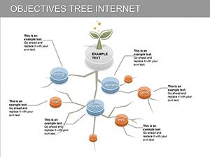
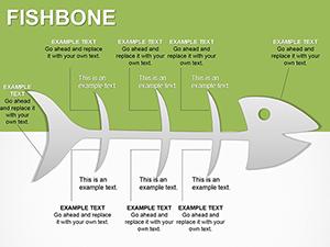
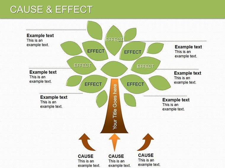
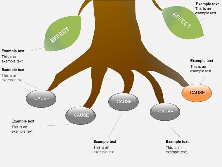
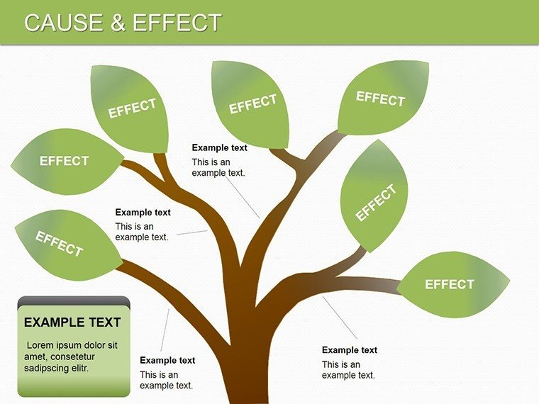
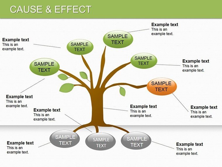
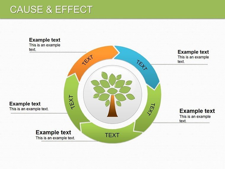
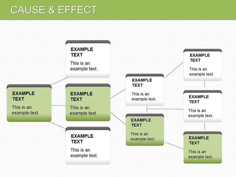
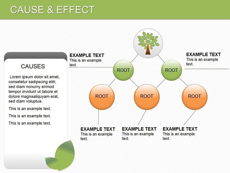
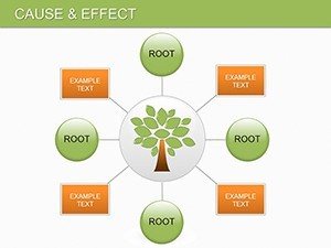
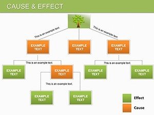
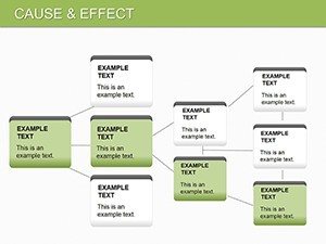
Dive into the template's architecture: Slide 0 offers a panoramic fishbone overview, aggregating multiple causes into a skeletal frame - perfect as an executive summary. Slide 2 narrows to a vertical cascade, tracing a single event's domino fallout, with editable tiers for phases like initiation and escalation.
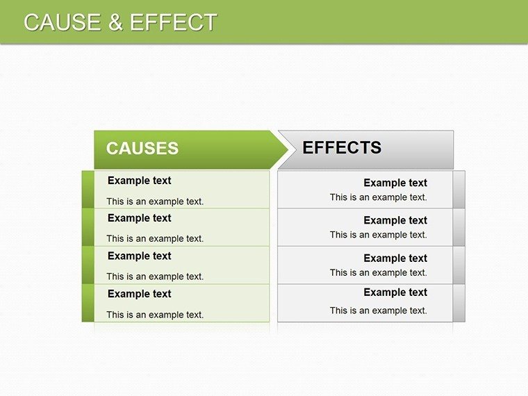
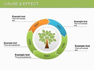
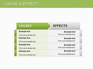
By Slide 5, a matrix grid intersects causes with effects, ideal for risk assessments where rows denote departments and columns track impacts. Operations managers appreciate Slide 8's looped feedback diagram, which circles back resolutions to prevent recurrence, echoing lean manufacturing principles.
Slides 10-12 escalate to scenario variants: one for positive chains (success drivers), another for negatives (failure modes), and the last a comparative split-view. Each includes subtle shadows for depth, adding a professional sheen without overwhelming the content. Use the built-in notes pane to jot presenter cues, like emphasizing high-impact links.
- Customization Step: Right-click connectors to curve them for organic flows.
- Integration Tip: Link to Excel for live data pulls in quantitative slides.
This sequential build equips you to layer complexity gradually, holding viewer focus throughout.
Practical Use Cases Across Industries
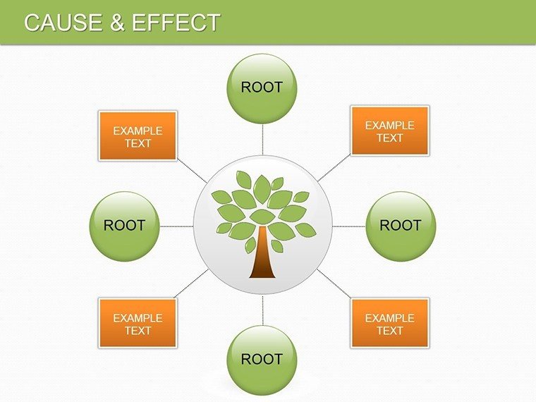
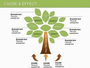
Consider a logistics coordinator facing delivery delays: Using Slide 3's radial cause wheel, she pinpoints weather as a hub, with spokes to staffing and routing - leading to a revised protocol that cut turnaround by streamlining alerts. In healthcare, administrators deploy Slide 7's effect tree to link policy changes to patient outcomes, clarifying pathways for board approvals.
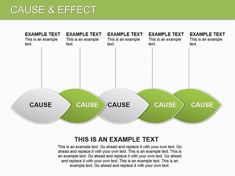
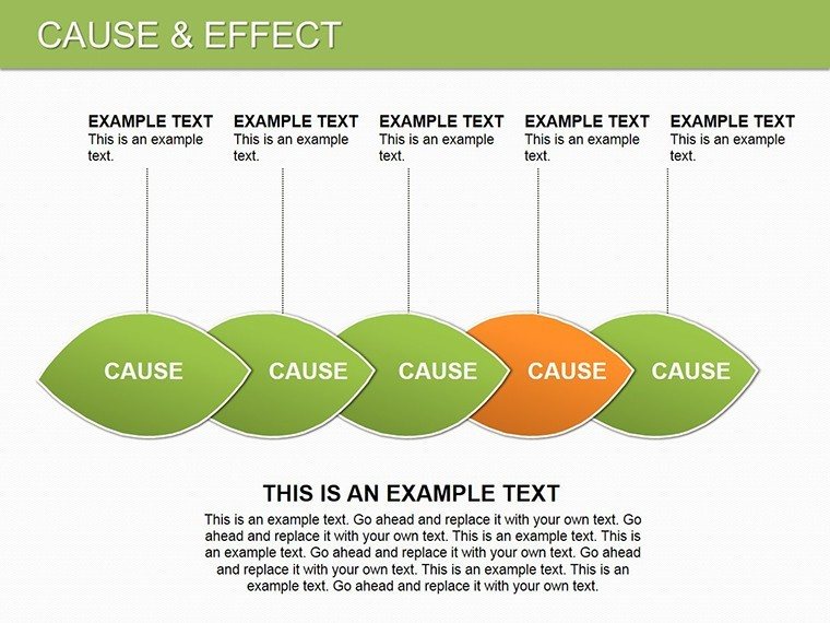
Marketing pros find value in Slide 11's attribution model, connecting campaign elements to conversion spikes, much like dissecting A/B test results. A tech PM once adapted the horizontal chain (Slide 4) for bug triage, visually prioritizing fixes based on user ripple effects. These scenarios highlight the template's role in not just diagnosing but strategizing forward.
For educators, it's a teaching aid in critical thinking workshops, where students populate effects to explore historical events. The thread? Always ground diagrams in real stakes, transforming analysis into advocacy.
Pro Tips for Seamless Customization
Launch in PowerPoint, select a slide, and use the Format pane to tweak line weights - thicker for major causes, dashed for hypotheticals. To infuse personality, incorporate thematic icons like gears for mechanical faults or clouds for externalities.
Avoid clutter by grouping minor effects under summaries; PowerPoint's selection tool makes this a snap. For animations, sequence reveals from causes outward, building suspense akin to a detective reveal. Test in slideshow mode to ensure smooth pans on wide-screen setups.
If collaborating, leverage co-authoring - edits sync in real-time for team refinements. These habits turn the template into an extension of your workflow, yielding polished outputs every time.
Elevate your analytical edge - download for $27 and map your path to precision.
Frequently Asked Questions
What PowerPoint versions does this support?
Works with 2016 and later; save as .ppt for broader compatibility if needed.
Can I add my own data sources?
Absolutely - import from Excel or paste tables directly into placeholders.
Are the diagrams animated by default?
Basic entry effects are set; customize via the Animations tab for more flair.
How do I adjust colors for branding?
Use Slide Master to apply your palette globally across all slides.
Is it suitable for non-business presentations?
Yes, adaptable for academic or personal projects like event planning.