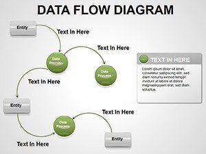
Data Flow PowerPoint Diagrams Template


Type: PowerPoint Diagrams template
Category: Flow
Sources Available: .potx
Product ID: PD00017
Template incl.: 11 editable slides
Imagine transforming complex technological processes into crystal-clear visuals that guide your team without a single point of confusion. That's the power of our Data Flow PowerPoint diagrams template, crafted specifically for professionals who need to map out workflows with precision and ease. Whether you're outlining software integrations, supply chain logistics, or operational protocols, these 11 editable slides turn abstract ideas into tangible roadmaps. Designed for seamless integration into your existing presentations, this template saves you hours of manual diagramming while ensuring every arrow and node tells a compelling story of efficiency.
In today's fast-paced business environment, where miscommunication can derail projects, having a reliable tool to visualize data flows is essential. Our template draws from real-world applications, like those used in IT departments to illustrate network traffic or in manufacturing to depict assembly lines. Each slide is fully customizable, allowing you to tweak colors, add labels, or resize elements to match your brand's aesthetic. No more starting from scratch in PowerPoint's basic shapes - dive right into professional-grade diagrams that resonate with stakeholders and empower your audience to grasp the big picture instantly.
Unlocking the Core Features of Data Flow Diagrams
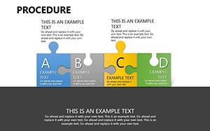
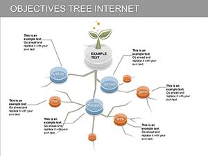
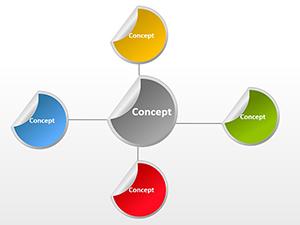
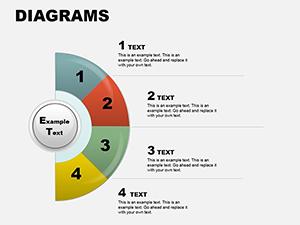
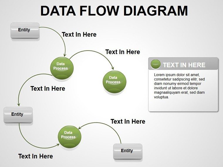
At the heart of this template lies a suite of thoughtfully designed slides that cater to diverse data flow needs. Slide 1 introduces a foundational linear flow chart, perfect for sequential processes like order fulfillment. Here, bold arrows connect rectangular nodes, each labeled for key steps, making it simple to highlight dependencies. Move to Slide 3, where branching decisions come alive with diamond-shaped gateways, mimicking real decision trees in project management scenarios.
- Versatile Flow Types: From sequential to parallel processes, including loops for iterative tasks like feedback cycles in customer service.
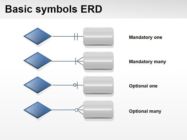
- Intuitive Icons: Built-in symbols for inputs, outputs, and storage, sourced from standard UML notations to ensure universal understanding.
- Color-Coded Layers: Distinguish between departments or phases with gradient fills that enhance readability without overwhelming the viewer.
These features aren't just decorative; they're engineered for impact. Consider how a logistics coordinator might use Slide 7's circular flow diagram to depict inventory cycles - inputs from suppliers feed into central storage, branching out to distribution points. The editable text placeholders let you insert specific metrics, like delivery times, directly into the flow, turning a static diagram into a dynamic tool for discussions.
Streamlining Employee Onboarding with Workflow Maps
One standout application is employee onboarding. Picture a new hire navigating HR protocols: Slide 5's hierarchical flow breaks it down into phases - recruitment, training, integration - with sub-flows for documentation and mentorship. Start by duplicating the slide, then drag and drop to adjust paths. Add hyperlinks to supporting documents right within the nodes, creating an interactive guide that doubles as a reference handout. This approach not only clarifies expectations but fosters a sense of structure from day one, much like how leading consultancies visualize client journeys to build trust.
- Identify core stages: List out onboarding steps in a simple brainstorm.
- Map connections: Use the template's connectors to link stages, noting decision points.
- Enhance with visuals: Insert team photos or icons to personalize the flow.
- Present and iterate: Share in a team meeting, gathering feedback to refine arrows and labels.
This step-by-step method ensures your diagrams evolve with your processes, keeping them relevant as your organization grows.
Integrating Data Flow Diagrams into Broader Presentations
Beyond standalone use, these diagrams shine when woven into larger narratives. For instance, in a quarterly review, embed Slide 9's swimlane diagram to delineate responsibilities across teams - marketing's content creation flows into sales' lead nurturing, with clear handoff points. Compared to vanilla PowerPoint charts, which often look cluttered, our template's clean lines and balanced spacing maintain focus on the message, not the medium.
Customization is a breeze: Right-click any element to access formatting options, or use the slide master for global theme updates. Compatible with PowerPoint 2016 and later, it supports animations like fade-ins for sequential reveals, adding a layer of engagement during live pitches. A project manager once adapted Slide 11 for a software rollout, animating data packets zipping through servers - the result? A demo that captivated executives and secured buy-in without lengthy explanations.
Tailoring for Tech and Manufacturing Audiences
For tech teams, leverage the template's database icons in Slide 4 to model ETL processes - extract from sources, transform in staging, load into analytics. In manufacturing, Slide 8's conveyor-style flow illustrates just-in-time production, with buffers highlighted to prevent bottlenecks. These tailored visuals bridge the gap between technical details and executive overviews, ensuring everyone from coders to C-suite leaders stays aligned.
Don't overlook accessibility: Use high-contrast colors for color-blind viewers and alt text for screen readers, turning your diagrams into inclusive tools that amplify reach.
Practical Tips for Maximizing Impact
To elevate your presentations, pair these diagrams with storytelling. Begin with a problem statement - "Our current workflow bottlenecks cost us two days per cycle" - then reveal the optimized flow on the next slide. This contrast drives home the value. For collaborative edits, share via OneDrive, allowing real-time tweaks during brainstorming sessions.
Explore complementary elements like embedded Excel data links for live updates, keeping your flows dynamic as metrics change. Whether prepping for a board meeting or training webinar, this template positions you as the go-to expert for clarity in chaos.
Ready to map out success? Download the Data Flow PowerPoint diagrams template today for just $22 and watch your presentations flow seamlessly.
Frequently Asked Questions
- How editable are the data flow slides?
- All 11 slides are fully editable, with resizable shapes, customizable text, and adjustable colors directly in PowerPoint.
- Can I use this template for non-tech workflows?
- Absolutely - it's versatile for any process, from HR onboarding to sales pipelines, with neutral designs that adapt easily.
- What PowerPoint versions are supported?
- Compatible with PowerPoint 2016 and newer versions, including Microsoft 365.
- Does it include animation options?
- Yes, built-in entrance animations can be applied to arrows and nodes for sequential reveals.
- Are there instructions for getting started?
- A quick-start guide is included in the download, covering basic customizations and best practices.