World Economic Situation PowerPoint Charts: Presentation Template


Type: PowerPoint Charts template
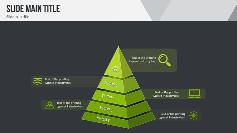
Category: Tables, Illustrations, Pyramids, Analysis
Sources Available: .pptx
Product ID: PC00591
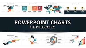
Template incl.: 30 editable slides
Navigating the complexities of global economics requires tools that simplify data without sacrificing depth. Our World Economic Situation PowerPoint Charts Template delivers exactly that with 30 editable slides packed with dynamic visuals for market trends, GDP forecasts, and trade analyses. Designed for economists, executives, and academics, it leverages real-time data integration to create presentations that inform strategic decisions. Envision presenting at a conference where your charts on inflation patterns captivate the room, or in a board meeting where forecast line graphs drive investment choices. Inspired by World Bank reports and UN economic briefings, like those in the Monthly Briefing series, this template ensures your insights are presented with authority and clarity. Customization options let you adapt to specific scenarios, making it a versatile asset for anyone dealing with macroeconomic data.
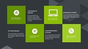
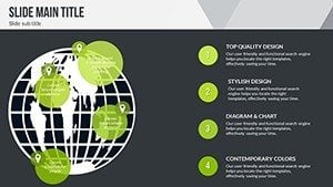
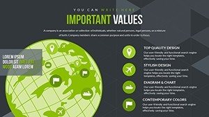
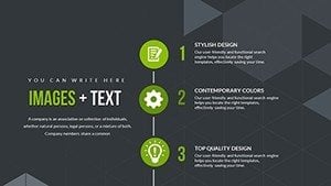
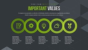
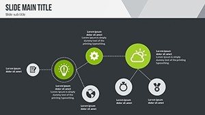
Core Features for Economic Storytelling
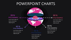
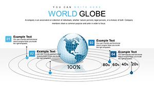
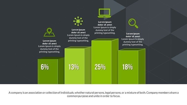
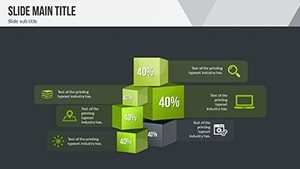
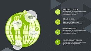
The template's strength lies in its array of charts: Area graphs for regional comparisons, scatter plots for correlation analyses, and heat maps for global hotspots. These are crafted to handle complex datasets, such as those from the World Economic Outlook by IMF, where similar visuals illustrate growth projections. Seamlessly integrate data from sources like Excel or APIs for up-to-date accuracy. Customization extends to themes - shift to dark modes for formal settings or bright palettes for educational forums - while maintaining legibility per design standards from Slideshare's economic presentations.
Data-Driven Customization and Integration
Personalize every element: Adjust axes for scale, add annotations for key events like recessions, and modify legends for clarity. This flexibility aligns with best practices from ATINER's global crisis slides, ensuring your presentation resonates. Easy data import saves time, allowing focus on analysis rather than formatting.
Diverse Applications in Economic Contexts
From quarterly reports to academic lectures, this template adapts effortlessly. Executives can use bar charts to compare economic indicators across countries, mirroring SlideTeam's world economic outlook examples. Academics might employ pie charts for resource distribution in development economics, as in BU.edu's EuroMAC presentations. A real case: During the Great Recession, similar visuals in World Bank decks helped policymakers visualize debt impacts, leading to informed recoveries. Consultants impress clients with forecast models, drawing from Columbia Business School's economic outlooks that boosted strategic planning.
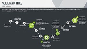
Guided Workflow for Effective Presentations
- Gather data: Source from reliable databases like World Bank or IMF.
- Select visuals: Match chart types to data stories.
- Customize: Tailor to audience needs and branding.
- Add insights: Include narratives and sources for credibility.
- Present and iterate: Use feedback to refine.
This process, akin to Hilldale's international business slides, maximizes impact.
Advantages Over Standard Tools
Stand out with professional-grade designs that convey expertise, unlike basic PowerPoint charts. Benefits include enhanced decision-making through clear visuals, time efficiency, and audience engagement - studies show visualized data improves retention by 65%. It supports by allowing citations from authoritative sources, building trust in your analyses.
Advanced Tips for Economic Visuals
- Focus on trends: Use lines for time-series data.
- Avoid clutter: Limit to 5-7 data points per chart.
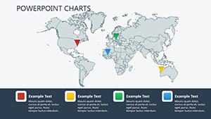
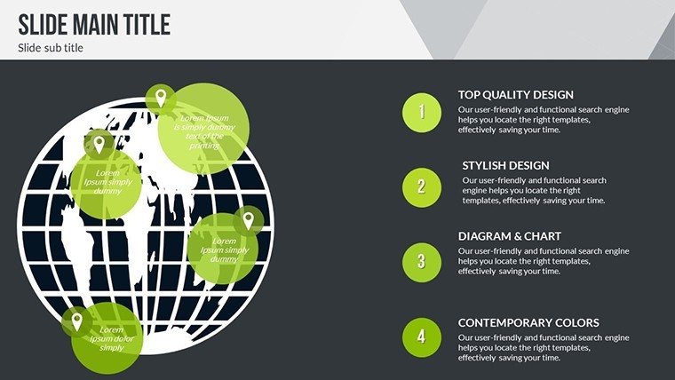
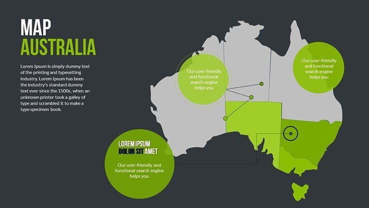
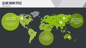
- Incorporate globals: Add maps for geographical context.
- Use colors wisely: Reds for declines, greens for growth.
- Backup with data: Always include sources.
Tips from experts like those in Slidegeeks' world economic decks.
Embrace this template to turn economic data into powerful narratives. Download now and lead with insight.
Frequently Asked Questions
- How many slides does it include?
- 30 editable slides for comprehensive economic coverage.
- Can I update data in real-time?
- Yes, integrate from external sources easily.
- Is customization full?
- Absolutely, colors, fonts, layouts all adjustable.
- What format is it?
- .pptx, compatible with PowerPoint and more.
- Suitable for conferences?
- Ideal for professional and educational settings.
- Any data examples included?
- Placeholders for trends and forecasts to start with.