Data Information PowerPoint Charts - Templates


Type: PowerPoint Charts template
Category: Tables
Sources Available: .pptx
Product ID: PC00584
Template incl.: 16 editable slides
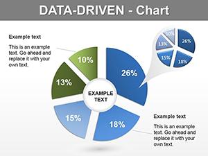
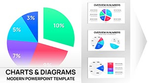
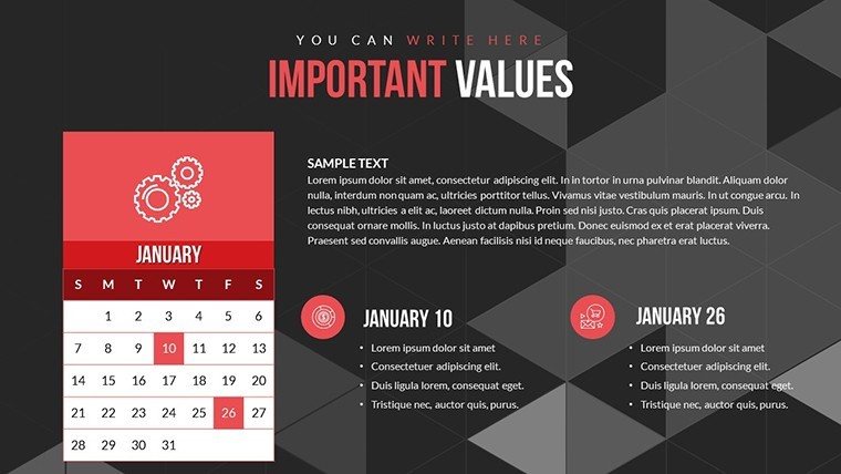
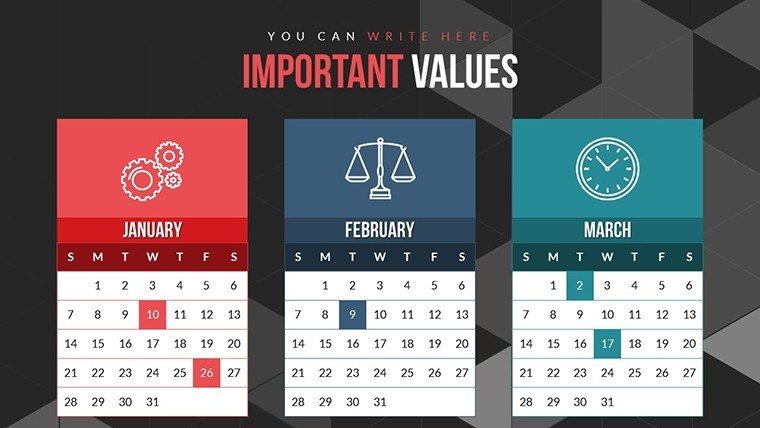
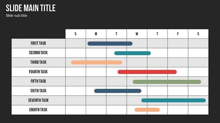
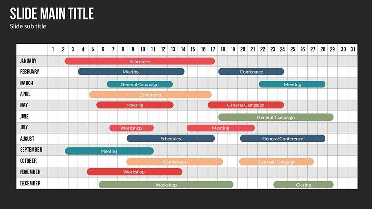
Data drives decisions, but only when presented clearly. In an era where information overload is common, our Data Information PowerPoint Charts template cuts through the noise, offering 16 editable slides packed with color variations and custom animations. Tailored for analysts, marketers, and educators, this template simplifies complex data dependencies, making comparisons intuitive and visually striking. Inspired by data visualization best practices from experts like Stephen Few, it helps you avoid common pitfalls like chart junk, focusing instead on precision and impact. Whether you're analyzing market trends or teaching statistical concepts, these slides transform numbers into narratives, enhancing understanding and retention while saving you valuable preparation time.
Master Data Visualization with Ease
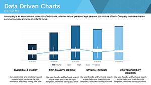
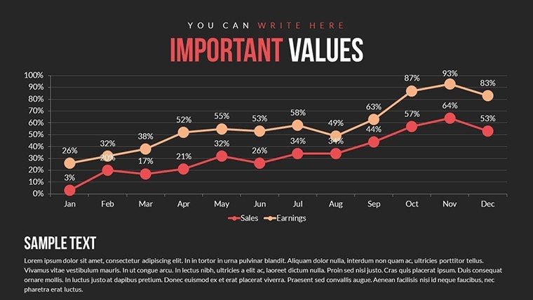
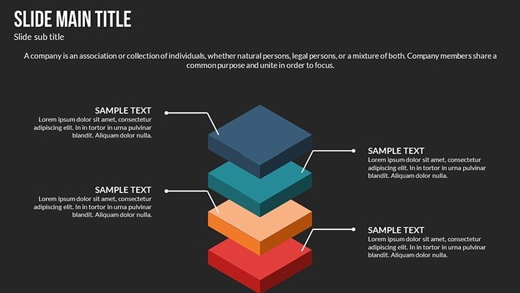
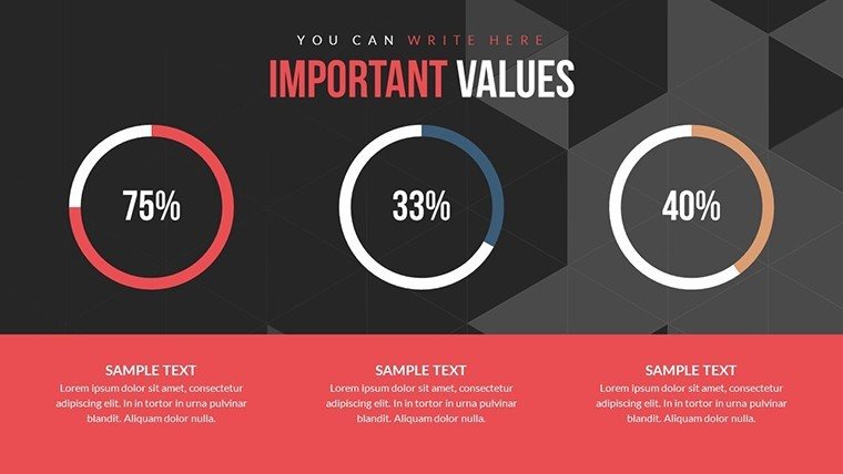
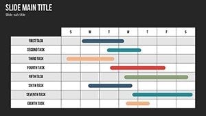
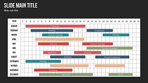
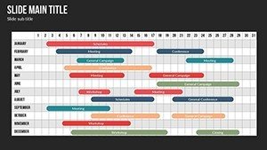
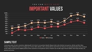
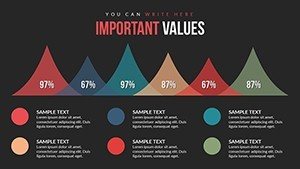
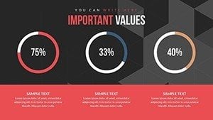
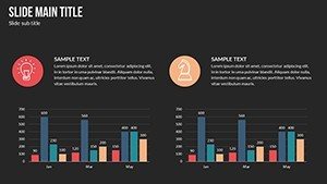
Effective data presentation isn't about fancy effects - it's about clarity. This template provides high-quality charts that graphically depict value relationships, such as growth over time or category breakdowns. For example, in a sales report, use the editable line charts to show revenue fluctuations, customizing axes and legends for exact fits. Unlike rigid default templates, ours allows full color and text edits, ensuring your visuals align with audience expectations. Real-world applications shine in scenarios like urban planning meetings, where data on population shifts can be animated to reveal patterns dynamically, drawing from principles in the International Association for Statistical Computing (IASC).
Standout Features for Professional Polish
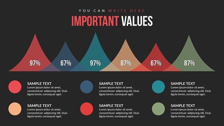
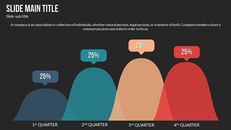
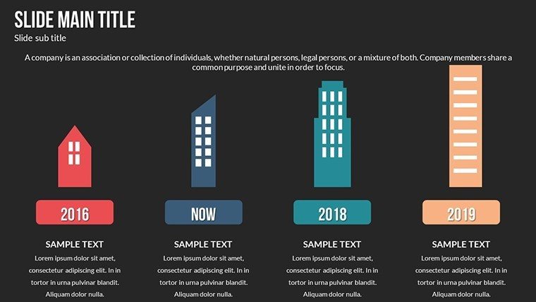
With wide functionality for animations, this template lets you insert video or audio for multimedia depth. The fully editable nature means no limits - change inscriptions, add images, or tweak layouts in seconds. Vector icons ensure sharpness at any scale, ideal for large-screen projections.
- Animated Effects: Custom transitions for engaging data reveals.
- Color Variations: Full spectrum options to match branding.
- Multimedia Integration: Embed videos or audio for richer stories.
- High-Quality Assets: JPGs and vectors included.
Practical Use Cases That Deliver Results
Envision a data analyst preparing for a stakeholder briefing. Starting with a blank slate is daunting, but this template offers pre-built comparison charts, allowing quick population of data sets. Animate bars to grow sequentially, emphasizing key insights like cost savings. Educators benefit too, using slides to explain correlations in science classes, with editable text for tailored examples. In marketing, compare campaign performances side-by-side, leading to informed strategies - as seen in case studies from firms like McKinsey, where visual data tools accelerated decision-making by 25%.
Workflow Integration Tips
- Open the .pptx file in your preferred software.
- Input data into chart placeholders for instant updates.
- Apply animations to highlight trends progressively.
- Test compatibility on different devices.
- Export and share for feedback loops.
These steps align with agile methodologies, ensuring your presentations evolve with your needs.
Superior to Basic Alternatives
Why settle for static slides when you can have dynamic ones? This template outperforms basic PowerPoint by offering expandable options, like audio narration for self-running decks. Its focus on data information sets it apart, with a touch of whimsy in icon designs to keep things light during heavy analyses. Built for trustworthiness, it supports cross-platform use, making it a reliable choice for remote teams.
Elevate your data stories - download and customize this template today for presentations that inform and inspire.
Frequently Asked Questions
How do I edit the colors and text?Simply select the element and use PowerPoint's built-in tools for instant changes - fully intuitive.
Can I add videos to the slides?Yes, the template supports easy insertion of video and audio fragments.
Is it suitable for data comparison?Absolutely, with charts designed to show dependencies and contrasts effectively.
What formats are provided?Includes .pptx, vector icons, and JPG files.
Does it work on older PowerPoint versions?Compatible with most versions, but best on recent ones for full animation support.