Impact PowerPoint Charts - Editable PPTX | ImagineLayout


Type: PowerPoint Charts template
Category: Analysis
Sources Available: .pptx
Product ID: PC00582
Template incl.: 34 editable slides
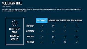
34 Slides, Analysis Charts: What You Get
34 editable slides come in the PPTX download.
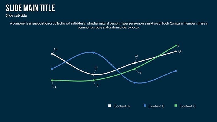
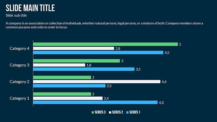
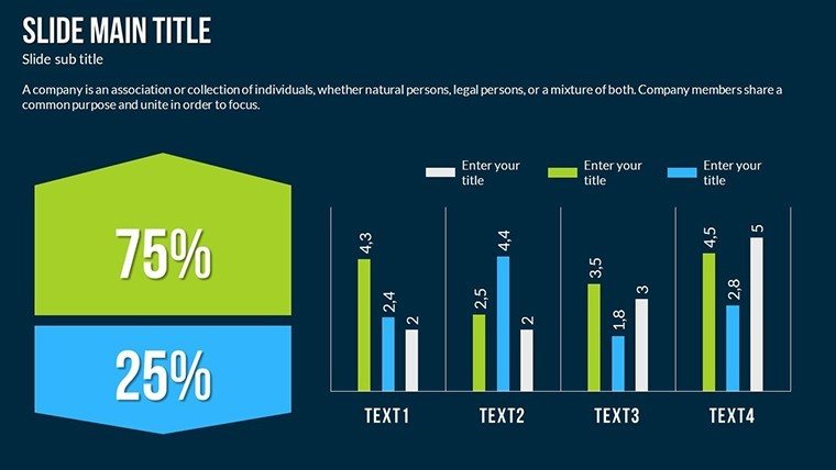
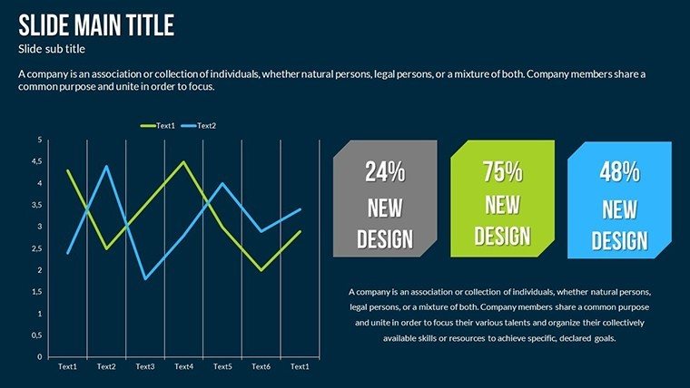
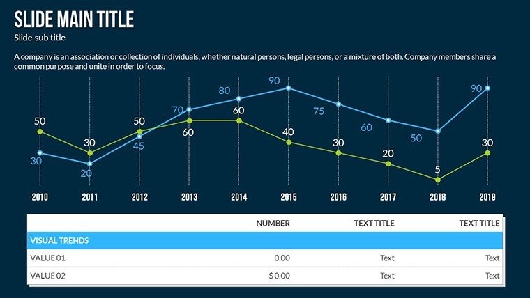
Column charts track quarterly metrics while area charts highlight cumulative growth scatter plots reveal correlations and waterfall charts break down impact phases.
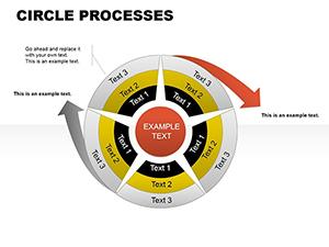
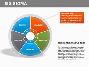
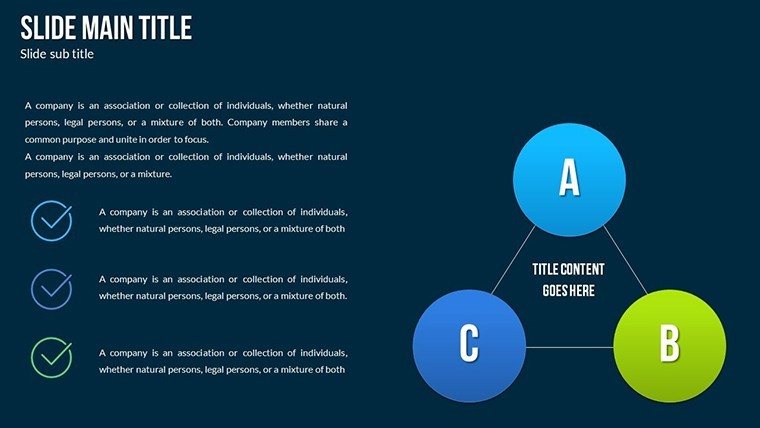
These chart types connect to support complete analysis flow in strategy meetings. Diagram structure maintains information spacing and color contrast across zones.
The full set enables clear communication during board briefings where data drives decisions. It covers impact visualization better than isolated chart options because one file handles the entire story.
Key Specifications
| Feature | Details |
|---|---|
| Slides / diagrams included | 34 charts covering column area scatter and waterfall types for business analysis |
| Diagram categories | Impact process visualization with data focus in the analysis category |
| Editable elements | Shapes resize independently text placeholders update without unlocking groups color theme adjustments diagram connectors |
| Aspect ratio | 16:9 standard for modern screens |
| PowerPoint compatibility versions | 2016 2019 365 on Windows and Mac |
| Icon layers | Replaceable without affecting layout |
Typical Use Cases by Role
A financial analyst in manufacturing maps cost impact during quarterly review. Waterfall segmentation shows phases clearly. Deck preparation drops from three hours to 45 minutes after data input only.
Consultants in strategy workshops reuse scatter plot slides across three client reports. Color theme adjustments align everything to brand identity in minutes.
Download now for your board briefing
Customization in 5 Steps
Moderate skill level users finish in under 15 minutes.
1. Open the .pptx file in PowerPoint (1 minute)
2. Replace placeholder text with your metrics (3 minutes)
3. Adjust brand colors via the slide master palette (2 minutes)
4. Edit diagram labels and connectors in scatter and waterfall charts (4 minutes)
5. Export as PPTX or PDF (1 minute)
Why This Template, Not a Blank Slide
Replicating these charts from scratch requires four hours and advanced layout composition skills. Manual flow direction errors appear frequently on screen. The ready structure avoids that entirely.
Waterfall charts segment cumulative bars for phase clarity. Labels sit outside shapes connected by thin lines. This keeps readability high during live board meetings without added editing steps. The paid version covers all 34 slides and full editing features.
Get the full set and present with confidence
Which PowerPoint versions are compatible with this template?
The PPTX file opens without issues in PowerPoint 2016 2019 and Microsoft 365 on both Windows and Mac. Subscribers to the latest version receive full slide master palette support for color changes. Older versions may need a simple save-as step but core editable shapes and text placeholders remain intact. Always verify compatibility in your installed version before the meeting.
How do I change the color scheme?
Open the slide master view in PowerPoint. Select the theme colors section and update the palette to match your brand. All charts automatically inherit the new scheme because they use theme-based fills and lines. Apply the change once and every slide updates instantly. This process takes under two minutes even for complex decks.
What does the license permit?
The license allows use in internal company presentations and paid client work. You may customize and deliver the final decks to customers. Resale or sublicensing of the original file remains prohibited. Commercial projects benefit from the full editing freedom provided.
What file formats are included and which software opens them?
The download consists of a single PPTX file. PowerPoint 2016 or newer opens it natively on desktop or web. Google Slides imports the file with minor layout preservation. Export options include PDF for distribution after editing.
Is animation support available and how do I apply it?
No built-in animations ship with the file but you can add entrance and emphasis effects manually to any chart element. Use the animations pane to sequence waterfall segments or scatter points. This works in all supported PowerPoint versions and enhances flow direction during live presentations.