Development Trends PowerPoint Charts Template: Visualize Tomorrow's Insights Today


In an era where industries evolve at breakneck speed, staying ahead means not just understanding development trends but presenting them in ways that inspire action. Our Development Trends PowerPoint Charts Template empowers market analysts, executives, and innovators with 24 editable slides packed with 3D visualizations and analytical tools. Tailored for those dissecting tech advancements, economic shifts, or sustainable growth patterns, this template transforms dense reports into dynamic narratives that resonate with decision-makers.
Envision leading a boardroom discussion on emerging markets: You deploy a 3D graph to illustrate growth trajectories, making abstract forecasts tangible and persuasive. Or, as an educator training future leaders, you break down innovation cycles with infographics that spark classroom debates. Compatible with PowerPoint and Google Slides, these slides offer seamless editing, ensuring your presentations reflect current data without technical hurdles.
Standout Features for Cutting-Edge Presentations
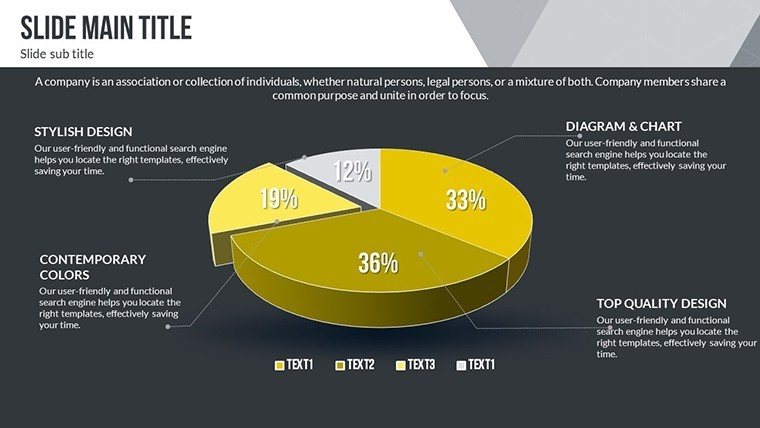
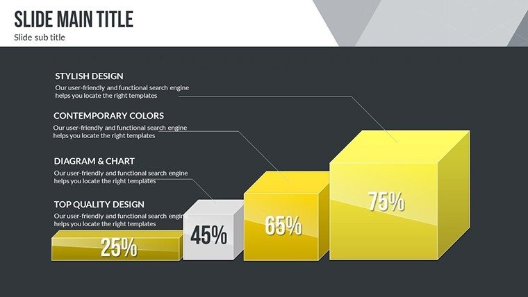
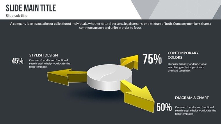
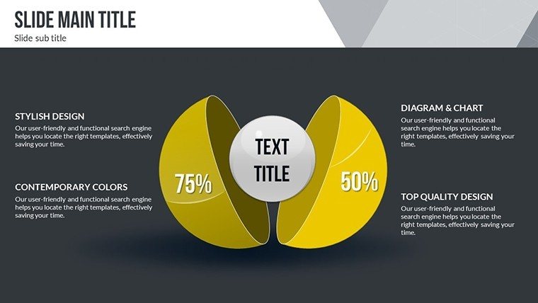
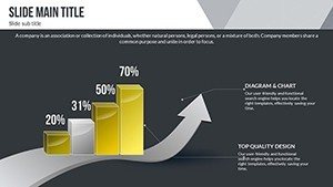
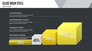
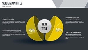
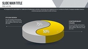
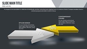
At the heart of this template are advanced 3D charts that add depth to your data - literally. Drawing from design principles in reports like those from McKinsey on global trends, these elements allow for multi-layered views, such as rotating models of market penetration. The flexible color schemes adapt to your branding, whether it's vibrant hues for tech startups or subdued tones for corporate analyses.
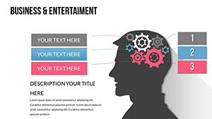
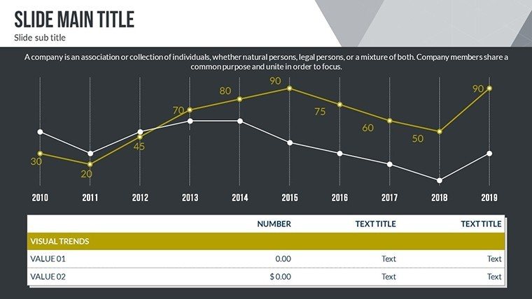
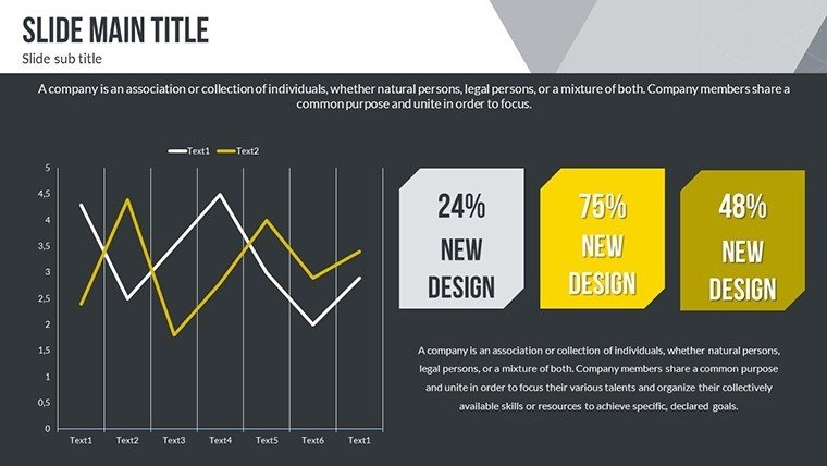
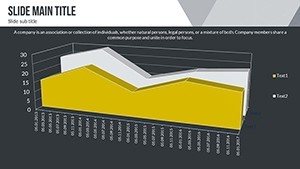
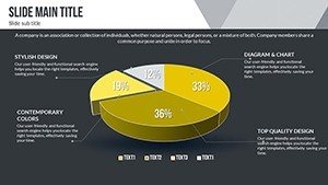
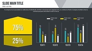
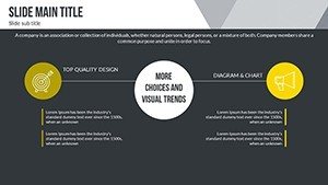
- 3D Graphs: Render complex trends like AI adoption rates in interactive formats, enhancing audience immersion.
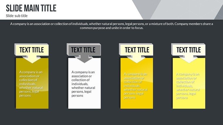
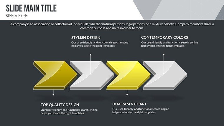
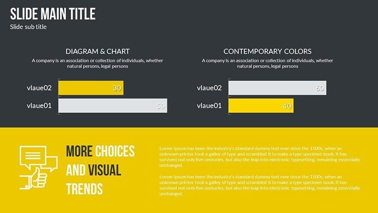
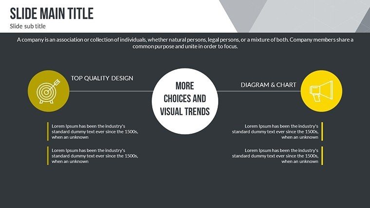
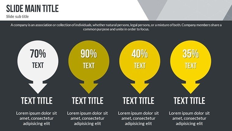
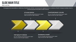
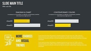
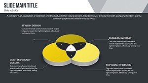
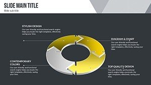
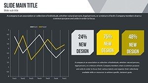
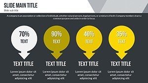
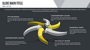
- Infographic Variety: From timelines to heat maps, cover diverse data types with ease.
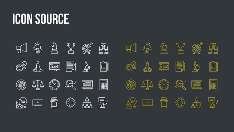
- Icon Library: Themed icons for sectors like renewable energy or digital transformation, aligned with icons8 standards for clarity.
- Animation Options: Subtle builds that reveal trends progressively, keeping viewers engaged per storytelling best practices.
Accessibility is key: Built-in screen reader compatibility ensures inclusivity, echoing guidelines from the Web Content Accessibility Guidelines (WCAG) for digital presentations.
Practical Use Cases Across Industries
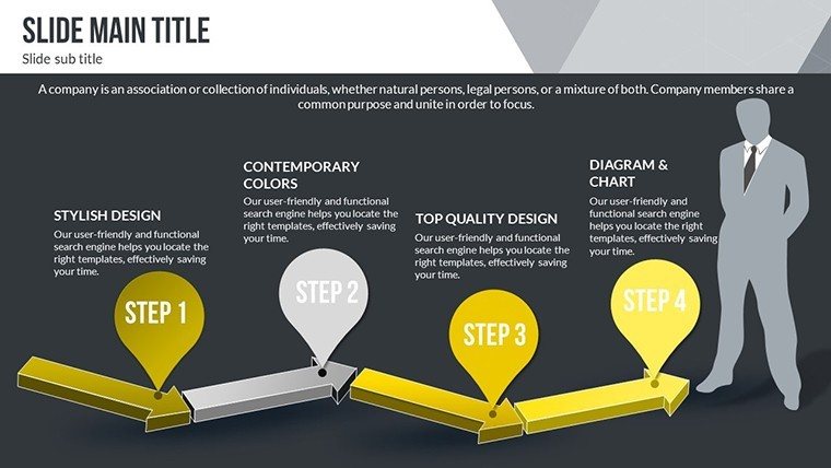
Apply this template in real scenarios, like a market researcher forecasting e-commerce booms. Step-by-step: Import trend data into a 3D slide, customize axes for variables like consumer spending, add annotations from sources like Statista, and finalize with a call-to-action slide. This mirrors how firms like Deloitte use visuals in their annual trend reports to drive client strategies.
- Identify key trends from reliable sources like World Economic Forum reports.
- Populate 3D charts with data, adjusting perspectives for emphasis.
- Incorporate comparative elements to benchmark against historical data.
- Rehearse and refine for virtual platforms like Zoom.
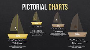
A case in point: Startups at Y Combinator have leveraged similar templates to pitch venture capitalists, securing funding by vividly depicting growth projections - a tactic highlighted in TechCrunch articles on effective pitching. For educators, it's ideal for courses on sustainable development, using pie charts to segment environmental impacts.
Advantages Beyond Basic Charts
Unlike generic PowerPoint options, this template's 3D capabilities prevent flat, uninspiring displays. It includes pre-set data validation to avoid errors, saving time in high-stakes environments. Users often note a boost in audience retention, akin to findings in Forbes pieces on visual communication.
Weaving in terms like "trend analysis visualization" or "3D data modeling" enhances relevance, but the focus remains on empowering your narrative. It's like having a design consultant at your fingertips, ensuring every slide advances your message.
Pro Tips from Industry Experts
With my background in marketing analytics, I advise starting with a trend overview slide, then layering in details. Limit colors to three per chart for focus, per Edward Tufte's data-ink ratio. Integrate real-time data links for live updates, perfect for agile teams. For global audiences, include multilingual placeholders, boosting cross-cultural appeal.
Trust in the template's scalability - enlarge for keynote screens without pixelation, ideal for events like CES.
Seize the Future with This Template Now
Don't let trends pass you by; harness them with visuals that command attention. Download and customize to lead the conversation in your field.
FAQ
What makes the 3D charts unique?
They provide depth and interactivity, allowing rotations to explore data from multiple angles, unlike flat 2D options.
Is customization beginner-friendly?
Yes, with drag-and-drop interfaces and preset styles, even novices can create pro-level slides quickly.
Can it handle large datasets?
Certainly - optimized for efficiency, it manages extensive trend data without slowing down.
Compatible with other tools?
Fully works with PowerPoint, Google Slides, and exportable to PDF for sharing.
Any limits on modifications?
None - edit as much as needed for unlimited projects.