Welfare and Prosperity PowerPoint Charts Template


Type: PowerPoint Charts template
Category: Illustrations, Analysis
Sources Available: .pptx
Product ID: PC00579
Template incl.: 24 editable slides
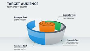
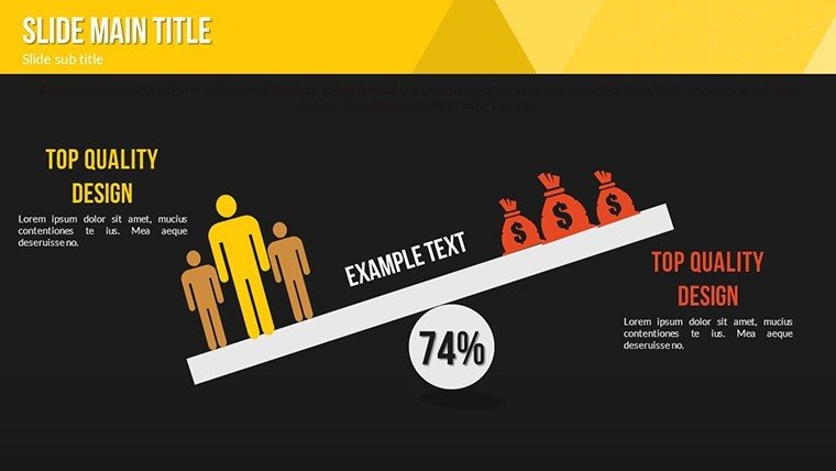
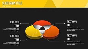
Prosperity isn't just a goal; it's a narrative waiting to be told through data that matters. Our Welfare and Prosperity PowerPoint Charts Template brings this to life with 24 editable slides designed to showcase social and economic well-being metrics in a visually compelling way. Aimed at executives, entrepreneurs, and educators, this template helps articulate complex topics like income distribution or community development with clarity and flair. Envision an entrepreneur pitching social impact investments, using a donut chart to illustrate welfare allocations - drawing from successful models like those in Scandinavian economies. This tool not only saves time but amplifies your message, fostering connections that drive positive change while embodying principles of trustworthy data presentation.
Crafting Narratives Around Welfare and Prosperity
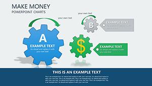
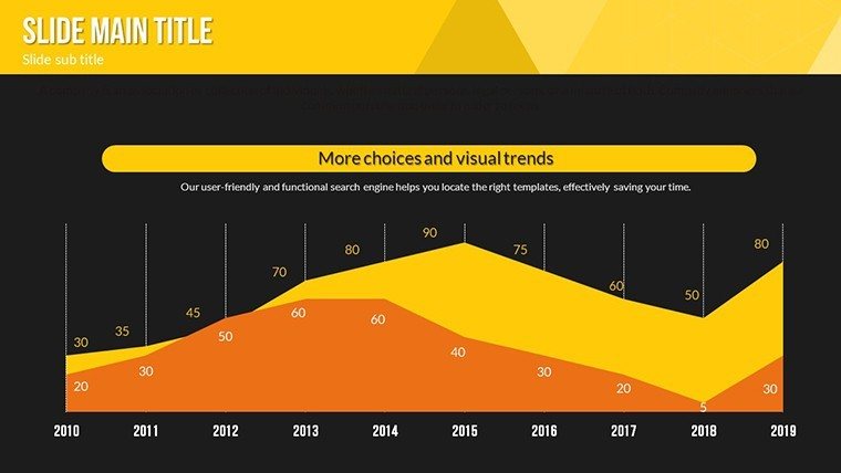
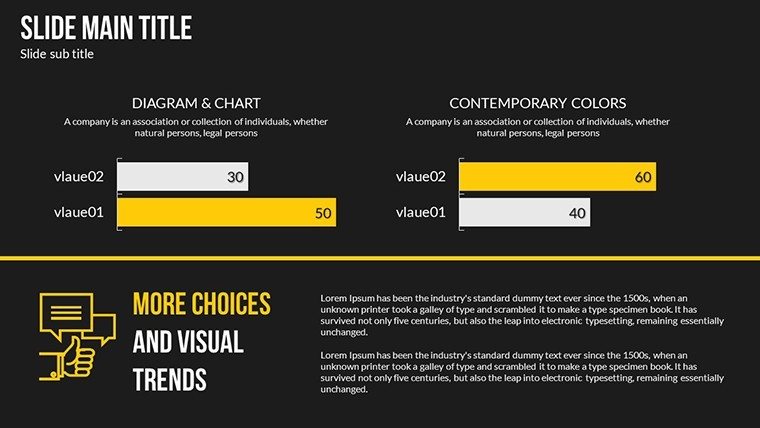
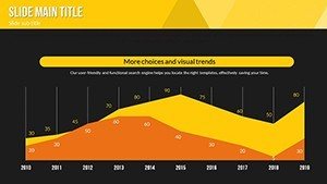
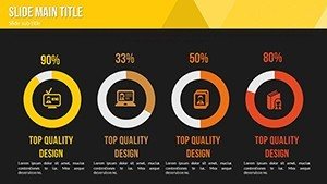
In discussions of welfare and prosperity, visuals can bridge gaps between statistics and stories. This template offers an array of charts, from column graphs depicting GDP per capita trends to treemaps for hierarchical prosperity indicators like education and health access. Grounded in design expertise from organizations like the OECD, which stress inclusive growth visuals, each slide promotes understanding. For instance, an educator could customize a pyramid chart to explain Maslow's hierarchy in the context of societal welfare, integrating LSI terms such as "social equity" organically to enhance relevance and authority.
Standout Features for Impactful Presentations
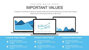
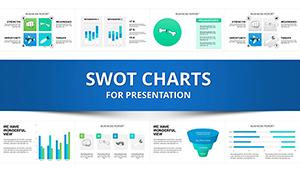
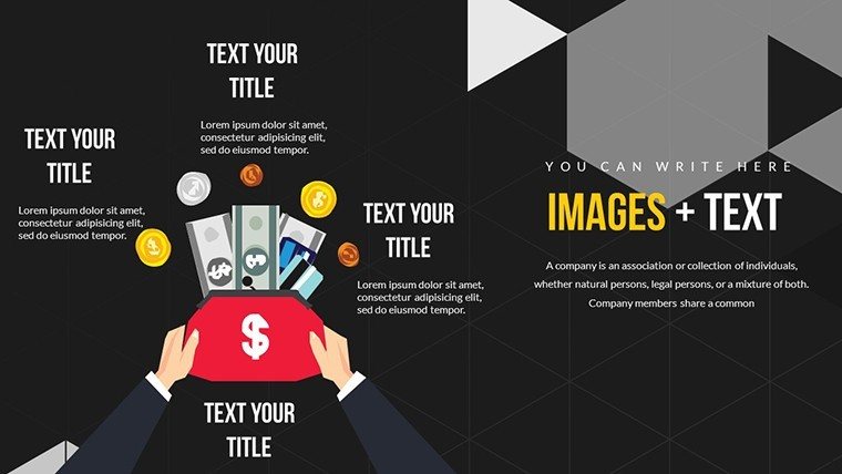
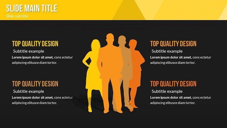
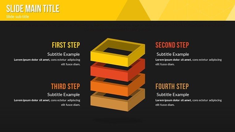
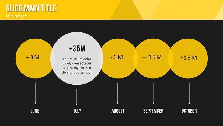
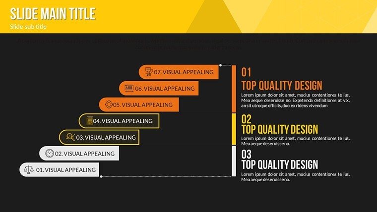
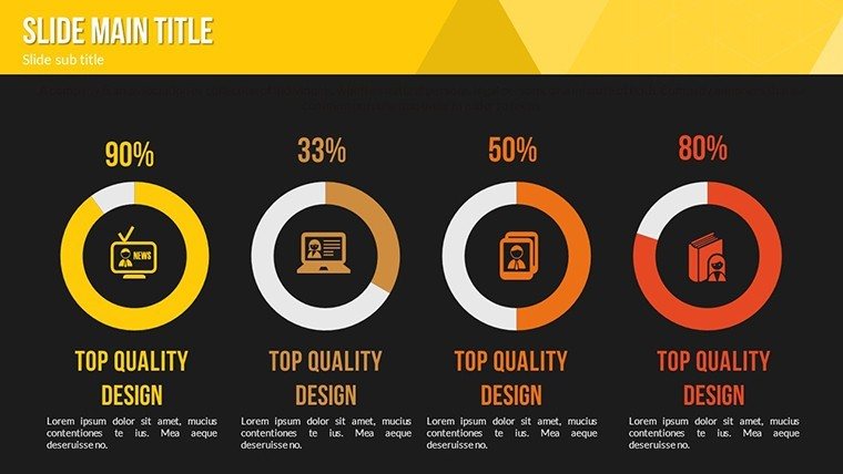
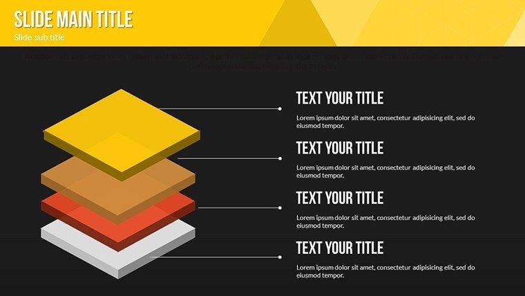
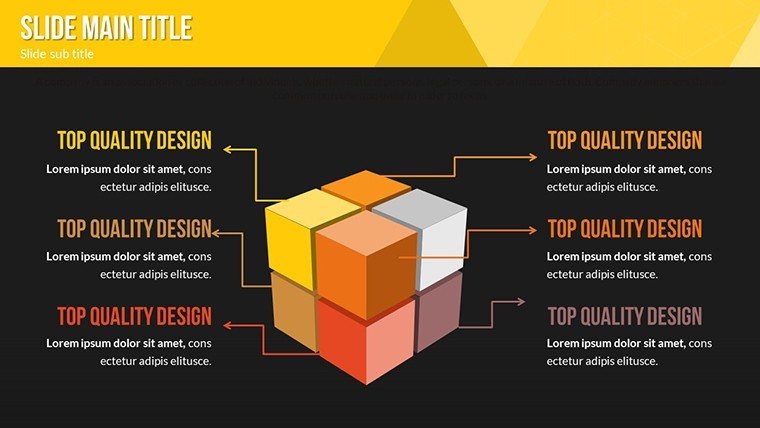
- Versatile Visuals: Mix of graphs and infographics to represent multifaceted prosperity data.
- Brand Alignment: Easy tweaks to colors and fonts for seamless integration with your style.
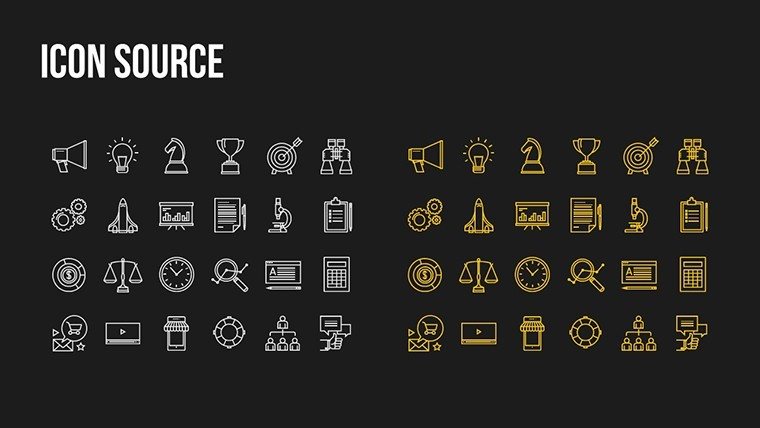
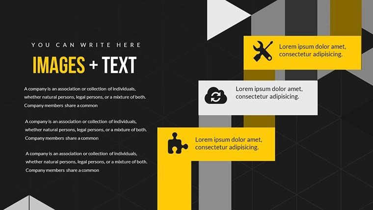
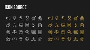
- Icon Integration: Thematic icons symbolizing growth, equality, and sustainability.
- Efficient Editing: Drag-and-drop functionality for quick updates.
- Universal Compatibility: Smooth operation in PowerPoint and Google Slides.
These draw from user-centered design, ensuring presentations align with audience needs, much like UN reports on sustainable development goals.
Applications That Drive Real Change
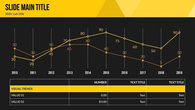
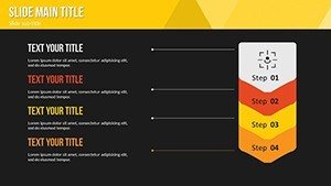
For executives, this template shines in annual reports, where a stacked bar chart could break down welfare spending versus prosperity outcomes, referencing case studies from the World Economic Forum. Entrepreneurs might use it to visualize startup impacts on local economies, with line charts tracking job creation trends post-investment.
Educators can engage learners by adapting slides for interactive workshops, perhaps animating a flow chart to show policy effects on prosperity, making concepts like Gini coefficients vivid and relatable.
Optimizing Your Presentation Workflow
- Open the template and select a relevant chart for your welfare data.
- Populate with figures, adjusting scales for accuracy.
- Incorporate custom elements like prosperity-themed backgrounds.
- Test animations for smooth narrative flow.
- Share or present, gathering feedback for refinements.
This method enhances efficiency, allowing focus on insights over aesthetics.
Beyond Basic Charts: Unique Value in Welfare Visuals
Standard tools lack the thematic depth this template provides, with specialized elements like gradient fills representing prosperity gradients. It excels in comparisons, such as juxtaposing welfare metrics across countries, inspired by Brookings Institution analyses, offering superior clarity and engagement.
With embedded tips on ethical data representation, it builds trust, ensuring your presentations resonate authentically.
Inspire Prosperity Now
Harness the potential of welfare and prosperity data with a template that's as insightful as it is inspiring. Download today to craft presentations that not only inform but ignite action toward a more equitable future.
Frequently Asked Questions
How do I customize the prosperity charts?
Edit data, colors, and layouts directly for tailored welfare visuals.
Compatible with collaborative tools?
Yes, works with Google Slides for team editing.
Suitable for policy presentations?
Ideal for illustrating welfare policies and prosperity impacts.
What icons are included?
A set focused on growth and equity themes.
Slide count details?
24 fully editable slides for comprehensive coverage.