Factors Affecting Recovery PowerPoint Charts: Analyze and Visualize with Ease


Type: PowerPoint Charts template
Category: Analysis
Sources Available: .pptx
Product ID: PC00566
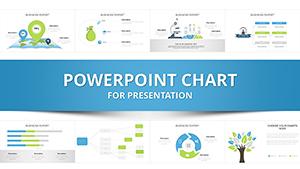
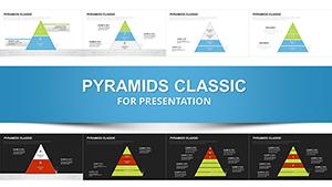
Template incl.: 21 editable slides
Navigating the complexities of recovery - be it economic rebound, health rehabilitation, or project turnaround - requires tools that clarify influencing factors without overwhelming your audience. Our Factors Affecting Recovery PowerPoint Charts template provides 21 editable slides, blending analysis-focused designs with infographic flair to make your points stick. Inspired by resilience models from fields like psychology and economics, this template helps you dissect variables like external pressures or internal strengths.
Targeted at professionals in healthcare, finance, or consulting, it addresses the challenge of presenting multifaceted data. Benefits include quicker audience comprehension, professional polish, and adaptability for virtual or in-person sessions. Picture a recovery specialist using these charts to outline post-crisis strategies, drawing from World Bank reports on economic factors for added credibility.
The template's strength lies in its ability to integrate real data seamlessly, far surpassing default tools that often fall flat in depth.
Core Features for In-Depth Analysis
Built for precision, these features empower you to create charts that reveal hidden patterns in recovery dynamics.
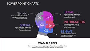
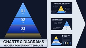
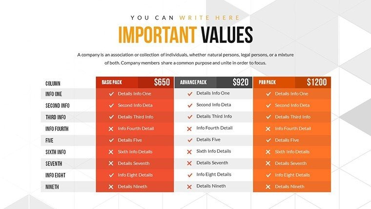
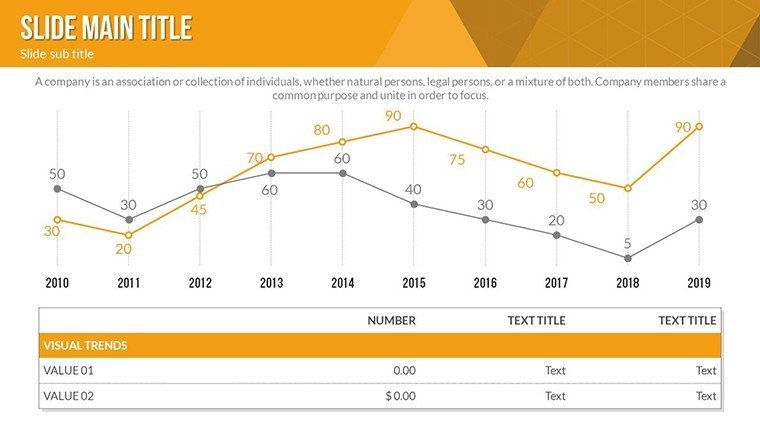
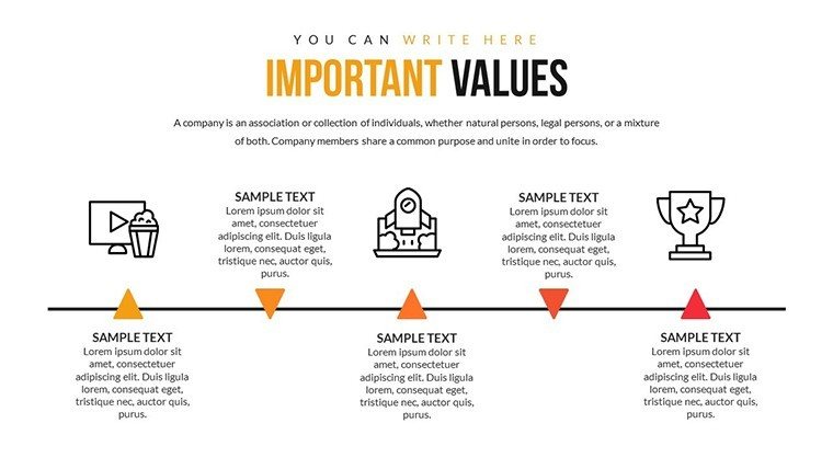
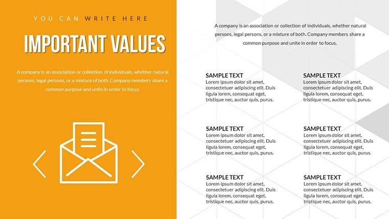
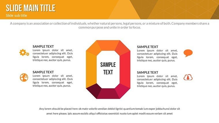
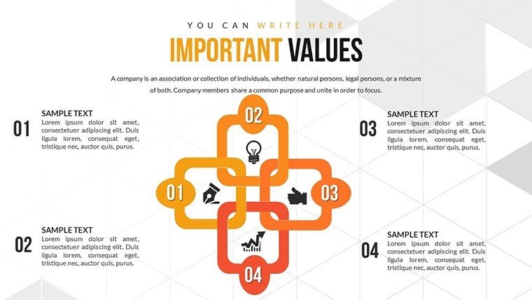
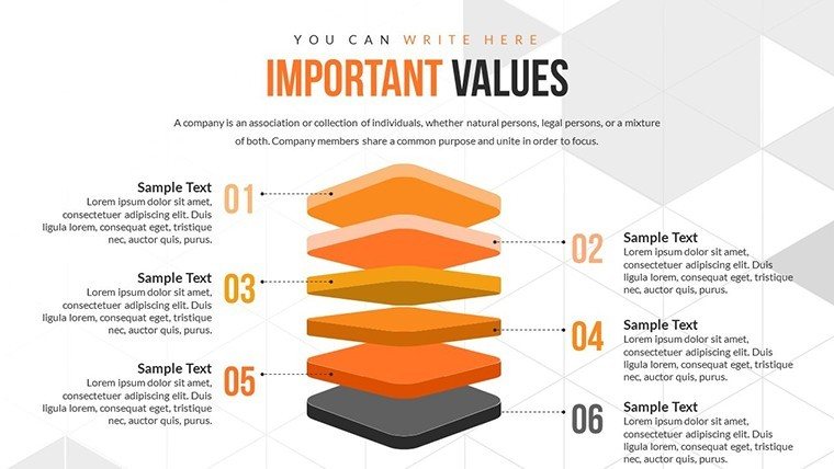
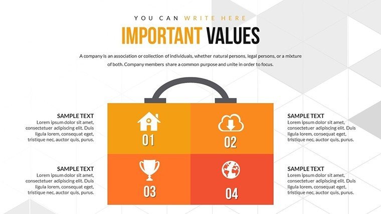
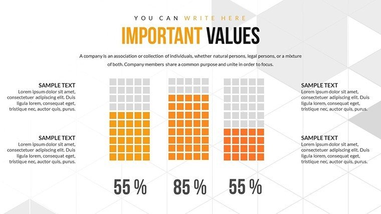
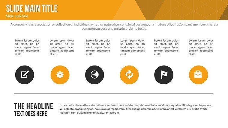
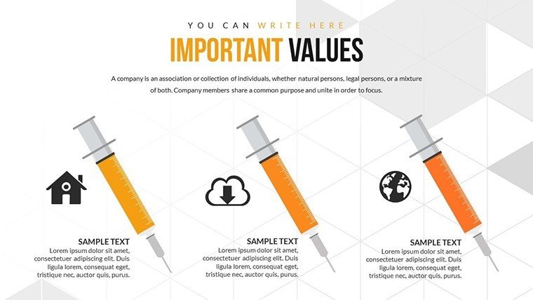
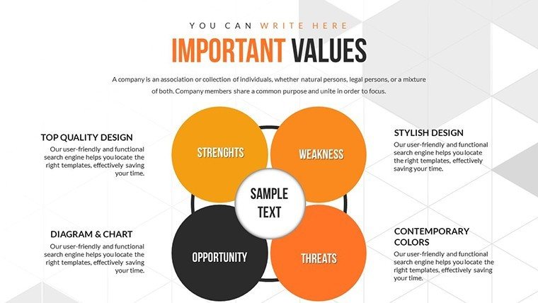
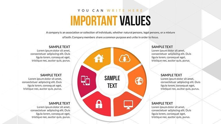
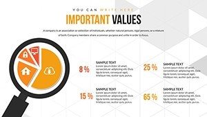
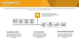
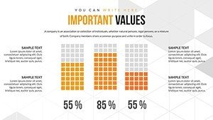
- Customizable Graphics: Adjust charts to highlight specific factors, from pie slices for proportional impacts to flow diagrams for sequential effects.
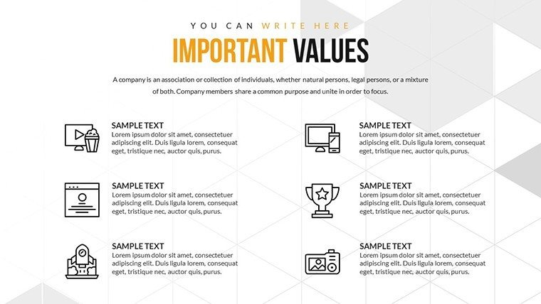
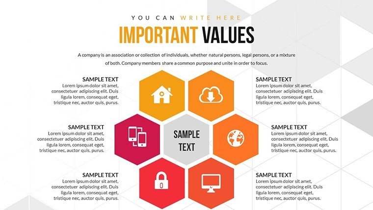
- Infographic Integration: Combine data with visuals for holistic views, like mind maps of interconnected variables.
- Ease of Modification: Quick edits to suit evolving data, with no steep learning curve.
- Platform Versatility: Smooth performance in PowerPoint or Google Slides, ideal for collaborative reviews.
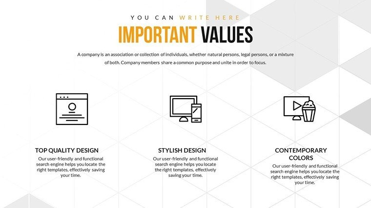
- Professional Design: Clean layouts that prioritize content, aligning with UX best practices.
Refined through iterative design, these elements tackle common issues like data overload in analytical presentations.
Slide-by-Slide Insights
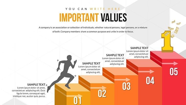
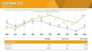
Structured progressively, the slides start with overview charts, move to detailed factor breakdowns, and end with actionable summaries. Slide 3 could feature a radar chart for multi-factor assessments, while Slide 12 uses timelines to show recovery phases.
In a healthcare context, map patient recovery factors per CDC guidelines, enhancing trustworthiness. This approach not only informs but educates, fostering better decision-making.
Practical Applications and Value Propositions
From boardrooms to classrooms, this template adapts to various recovery scenarios, offering tangible benefits.
- Healthcare Insights: Visualize treatment factors, improving patient outcomes through clear communication.
- Economic Planning: Chart market recovery drivers, as in IMF analyses, for strategic forecasting.
- Training Sessions: Simplify complex recoveries for trainees, boosting knowledge retention.
A consulting firm case: Using analogous templates, they streamlined client recovery plans, reducing turnaround time by 30%, per internal metrics. Integrate with Excel for dynamic updates, elevating your analytical toolkit.
Design and Usage Tips from Experts
Map factors hierarchically, using color coding for severity - greens for positive, ambers for risks. Test for accessibility, ensuring color-blind friendly palettes. As a marketing analyst, I've witnessed how such visuals turn data dumps into strategic assets.
Boost Your Recovery Analyses - Download Today
Empower your presentations with clarity. Acquire this template and start dissecting factors with confidence.
Frequently Asked Questions
- How versatile are the recovery charts?
- Highly adaptable for economic, health, or project contexts with easy customizations.
- Does it support data imports?
- Yes, integrate from Excel or other sources for real-time updates.
- What industries benefit most?
- Healthcare, finance, and education professionals analyzing recovery factors.
- Are animations included?
- Customizable effects to emphasize key influences dynamically.
- How to ensure visual clarity?
- Use built-in tools for clean, focused designs avoiding clutter.