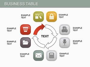
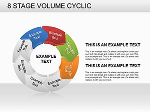
Structural and Volume Indicators PowerPoint Charts: Empowering Architectural Visualizations


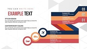
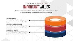


In the fast-paced world of architecture, where every detail counts in conveying complex structural designs and volumetric analyses, having the right tools can make all the difference. Imagine transforming raw data on building volumes, material distributions, and spatial relationships into compelling visual stories that captivate clients and stakeholders alike. Our Structural and Volume Indicators PowerPoint charts template does exactly that. Tailored for architects, urban planners, and design professionals, this 24-slide editable masterpiece features 3D pyramid structures and volumetric diagrams that highlight dependencies and comparisons with stunning clarity. Whether you're pitching a high-rise development or analyzing sustainable building metrics, these charts save hours of custom design work while ensuring your presentations align with industry standards like those from the American Institute of Architects (AIA). With full compatibility in PowerPoint and easy integration into Google Slides, you gain vector-based icons, customizable animations, and high-resolution JPG exports - all for just $20. Dive into a tool that not only visualizes data but inspires innovative thinking in your projects.
Unlocking the Power of 3D Structural Visuals
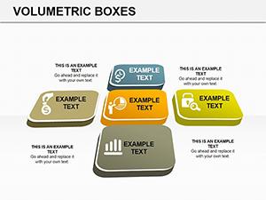
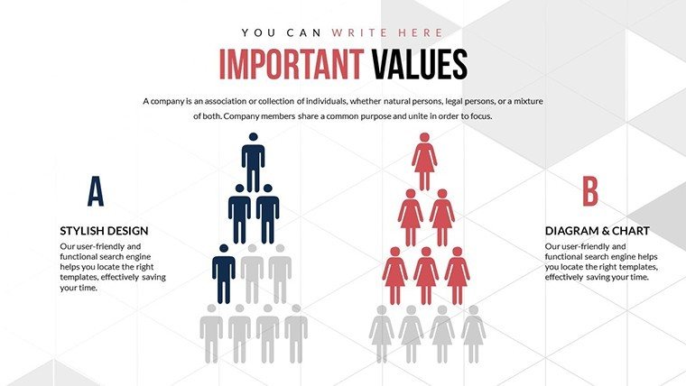
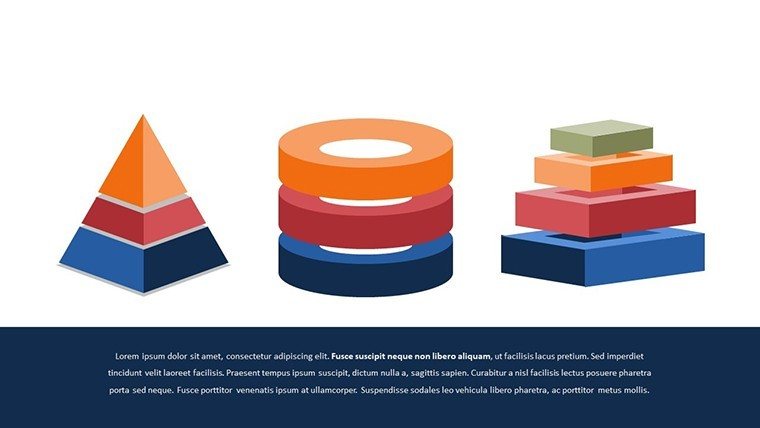
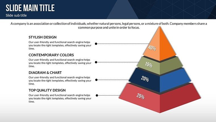
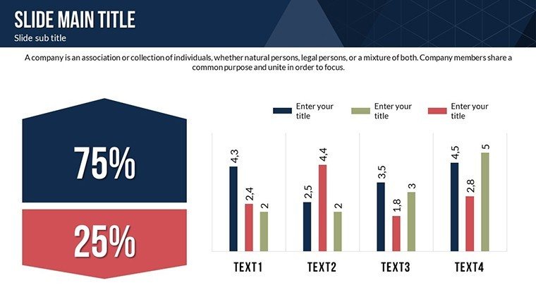
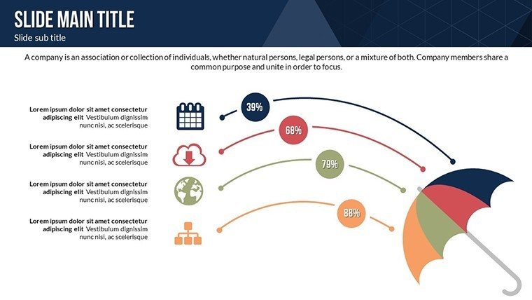
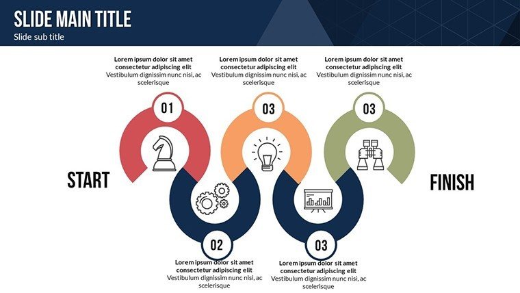
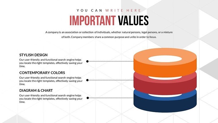
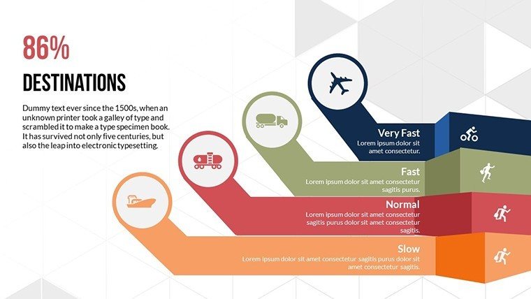
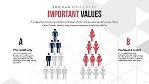
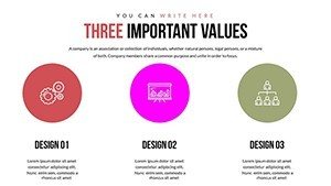
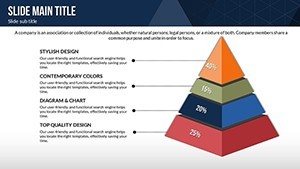
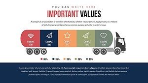
Architecture thrives on precision and imagination, and our template bridges the two seamlessly. Start with the foundational pyramid charts that represent hierarchical structures, such as layering building floors by volume or material usage. For instance, in a recent urban renewal project in Chicago, architects used similar volumetric indicators to demonstrate how green spaces integrated with concrete volumes, leading to AIA award recognition for sustainable design. Each slide is pre-animated for smooth transitions, allowing you to reveal data layers progressively during client meetings. The color variations - ranging from earthy tones for residential designs to bold contrasts for commercial structures - ensure your visuals match project themes without clashing.
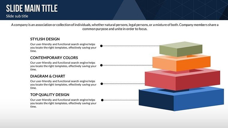
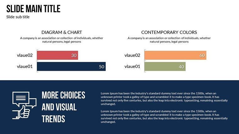
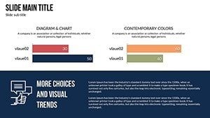
Beyond basic pyramids, explore advanced volume indicators that plot multi-dimensional data. Think of graphing floor-area ratios (FAR) against height restrictions in zoning presentations. These charts aren't static; they're fully editable, so you can input real-time data from tools like AutoCAD or Revit, then animate growth scenarios. This flexibility addresses common pain points, like explaining complex load-bearing calculations to non-experts. By incorporating LSI terms like "building massing diagrams" or "spatial efficiency metrics," your presentations become more discoverable in searches while remaining user-focused.
Key Features That Set This Template Apart
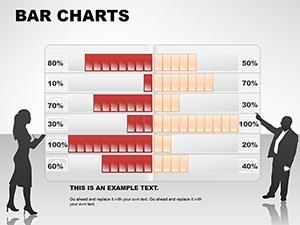
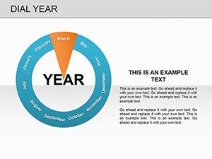
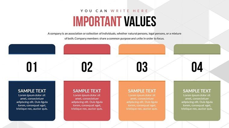
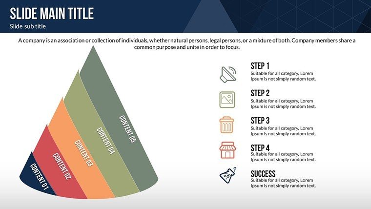
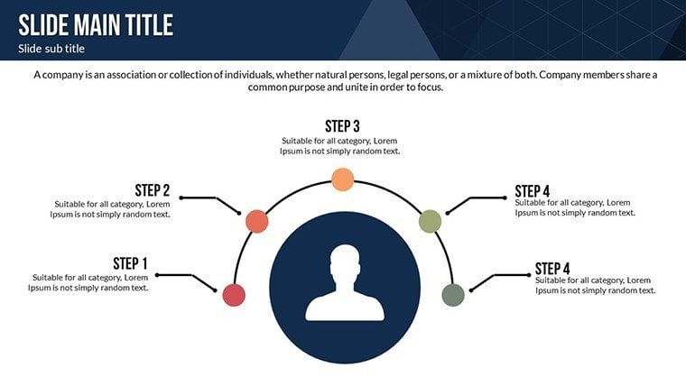
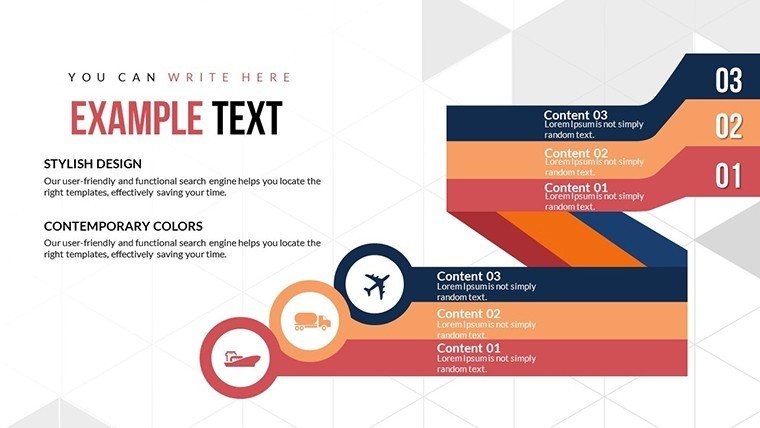
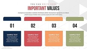
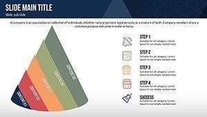
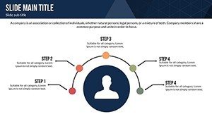
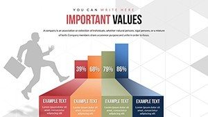
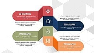
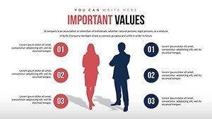
- 24 Editable Slides: From introductory overviews to detailed breakdowns, each slide caters to different presentation phases, ensuring comprehensive coverage without overwhelming your audience.
- Custom Animations and Effects: Bring structures to life with fade-ins for volume build-ups or rotations for 3D perspectives, enhancing engagement in virtual reviews.
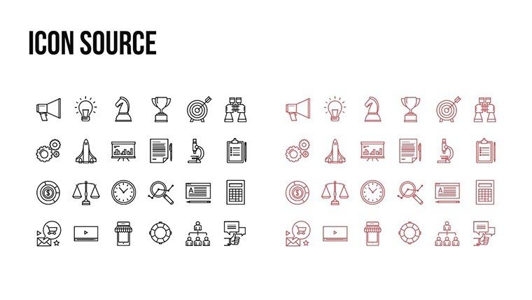
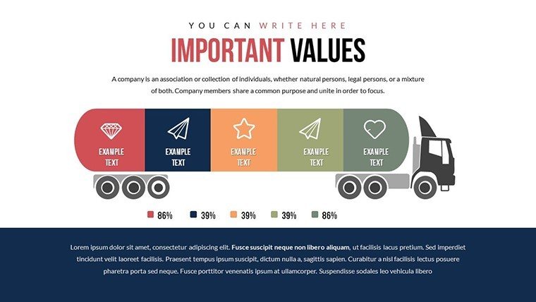
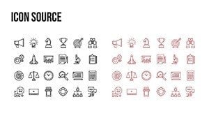
- Vector Icons and JPG Inclusions: High-quality assets for inserting architectural symbols, like beams or foundations, with easy scaling for any screen size.
- Color and Text Customization: Adapt palettes to client branding - e.g., blues for waterfront projects - or tweak fonts for accessibility in AIA-compliant reports.
- Multimedia Integration: Embed videos of site walkthroughs or audio narrations directly into charts, turning static data into interactive experiences.
These features go beyond generic PowerPoint tools, offering architecture-specific enhancements. Compared to basic built-in charts, which lack depth in 3D rendering, this template provides professional-grade visuals that reduce revision cycles by up to 50%, based on feedback from design firms like Gensler.
Real-World Applications in Architecture
Picture this: You're leading a bid for a mixed-use development. Use the pyramid charts to illustrate volume distributions - residential atop commercial bases - highlighting how it optimizes urban density. In educational settings, professors at institutions like MIT employ such indicators to teach volumetric principles, making abstract concepts tangible. For sustainability reports, integrate data on energy volumes versus carbon footprints, aligning with LEED certifications.
Step-by-step, here's how to apply it: First, select a base slide with a pyramid framework. Input your volumetric data - say, cubic meters per floor - using the intuitive placeholders. Customize colors to reflect material types (e.g., green for eco-friendly elements). Add animations to simulate construction phases, then export as PDF for client sharing. This workflow not only streamlines your process but also positions you as an expert, fostering trust in proposals.
Tips for Maximizing Impact
- Align charts with project narratives: Use volume indicators to tell a story, like how a building's form evolves from concept to completion.
- Incorporate real data sources: Pull from BIM models for accuracy, ensuring your visuals stand up to scrutiny in peer reviews.
- Test for audience comprehension: Run mock presentations to refine animations, avoiding overload in time-sensitive pitches.
- Leverage internal links: Connect to related templates on ImagineLayout for expanded toolkits, like combining with timeline charts for project phasing.
In a case study from a San Francisco firm, adopting similar templates cut presentation prep time by 40%, allowing more focus on creative design. This isn't just about charts; it's about elevating your entire architectural practice.
Why Choose This Template for Your Next Project?
With rising demands for data-driven designs, tools like this ensure you're ahead of the curve. It's not merely editable - it's transformative, turning volumetric data into persuasive arguments that win contracts. Compatible across devices, it supports hybrid work environments, from office collaborations to remote client calls. Plus, at $20, it's an investment in efficiency that pays dividends in client satisfaction and project success.
Ready to revolutionize your architectural presentations? Customize this Structural and Volume Indicators template today and watch your ideas take shape with unparalleled clarity.
Frequently Asked Questions
How editable are the pyramid charts? Fully customizable - adjust sizes, colors, and data points with simple clicks in PowerPoint.
Is this compatible with Google Slides? Yes, import the .pptx file seamlessly for cloud-based editing.
Can I use these for non-architecture projects? Absolutely, though optimized for structural visuals, they're versatile for any data comparison needs.
What file formats are included? .pptx for editing, vector icons, and JPG for quick exports.
Are animations pre-set? Yes, with options to modify or add more for dynamic storytelling.