Financial PowerPoint Charts - Fully Editable


25 Slides with Financial Charts: What You Get
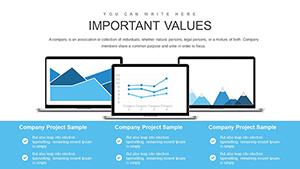
25 editable slides include line charts for trend tracking. Bar graphs compare categories. Pie charts show distribution. Scatter plots reveal correlations. Maps display geographic performance.
These elements work together to support fiscal reporting by allowing data swaps across multiple views in one file. The set differentiates itself by incorporating geographic maps alongside scatter plots for investment and trend forecasting unlike workflow-focused sets.
This one works best for quarterly financial reviews because the 25 slides allow seamless integration of line charts for trends and maps for regional performance. The paid version includes the full 25 editable slides while free tier details are not listed on the page.
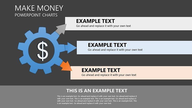
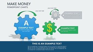
File format is PPTX only. Color schemes remain adjustable through the slide master. Information spacing follows zone segmentation principles. Flow direction guides the eye from left to right in every layout.
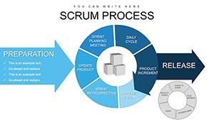
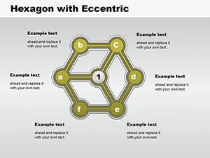
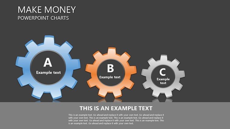
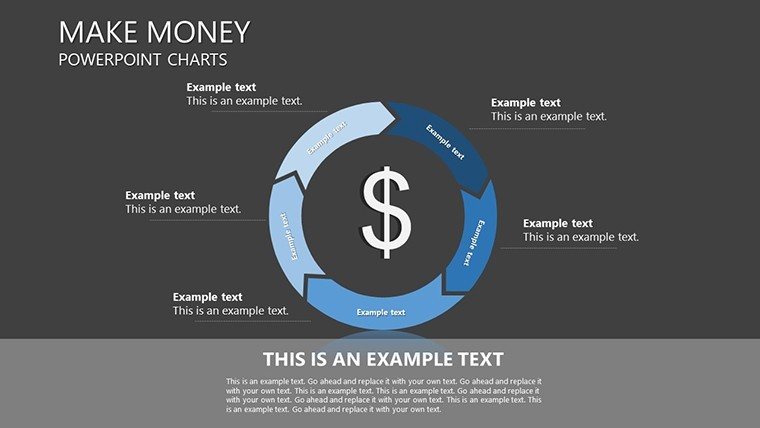
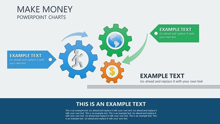
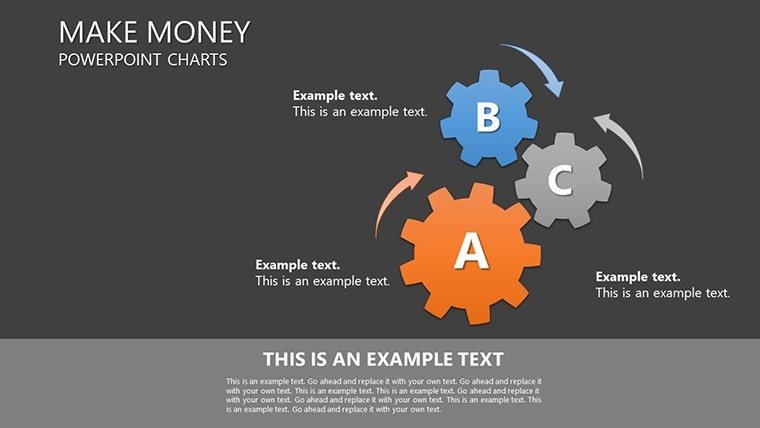
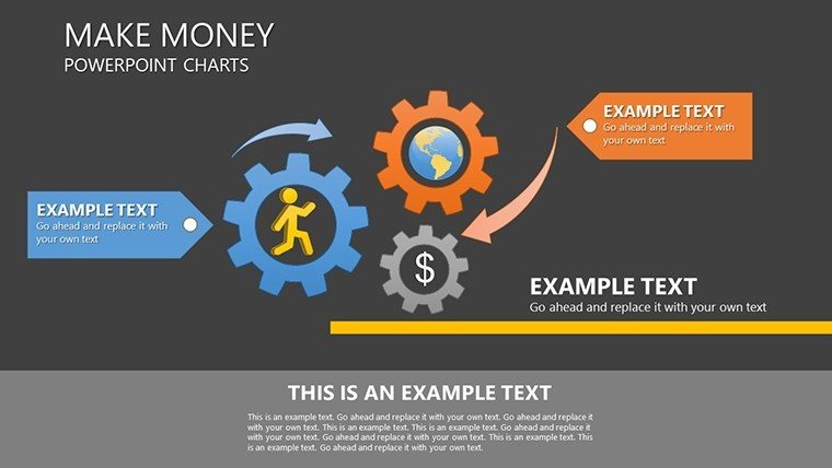
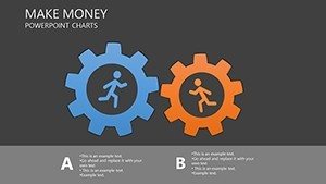
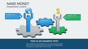
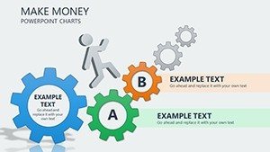
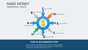
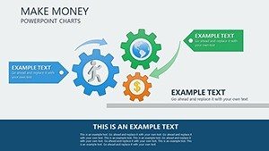
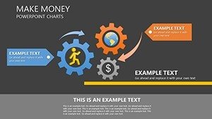
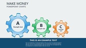
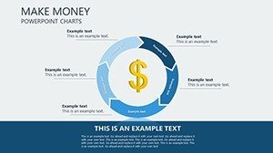
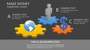
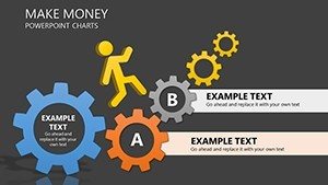
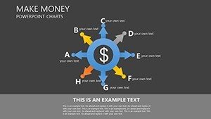
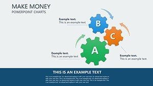
Project managers often pair these diagrams with a process chart templates when structuring multi-tier strategy decks. Diagram connectors stay adjustable in direction and weight.
Key Specifications
| Feature | Details |
|---|---|
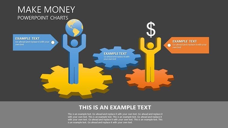
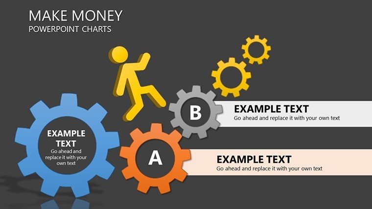
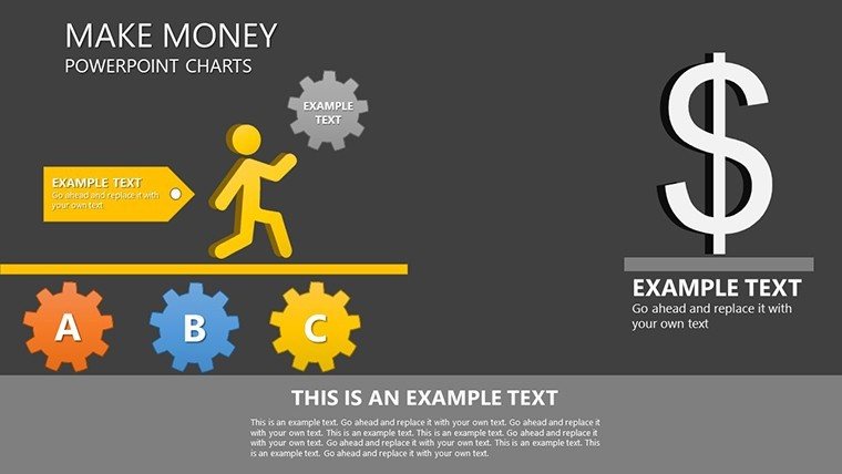
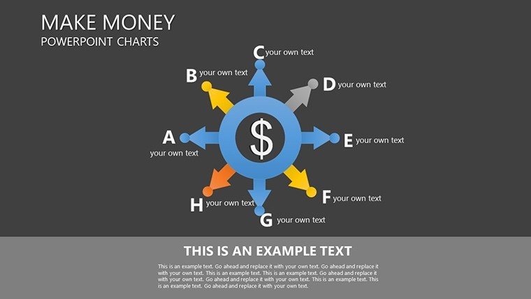
| Slides included | 25 charts covering line bar pie scatter and maps |
| Editable shapes | diagram segments resize and recolor independently |
| Text placeholders | labels update without unlocking grouped elements |
| Color theme adjustments | compatible with PowerPoint slide master palette |
| Diagram connectors | arrows and lines adjustable in direction and weight |
| PowerPoint compatibility | 2016 2019 365 on Windows and Mac plus Google Slides |
How Financial Analysts Use This in Board Briefings
A financial analyst at a multinational bank preparing quarterly earnings reports cut deck preparation from 3 hours to 45 minutes by swapping data in the line charts.
An investment consultant in private equity reused the same file across three client reports by adjusting the map charts color schemes.
These outcomes occur because the layout composition keeps visual hierarchy intact after every edit.
Color contrast segments phases rather than decorating the slides.
Download the financial PowerPoint charts now
Customization in 5 Steps
1. Open the .pptx file in PowerPoint (1 minute).
2. Replace placeholder text with your content (3 minutes).
3. Adjust brand colors via the slide master (2 minutes).
4. Edit diagram labels and connectors (4 minutes).
5. Export as PPTX or PDF (1 minute).
Editing difficulty is moderate. The workflow reflects actual PPTX behavior in versions 2016 and later.
Why This Template, Not a Blank Slide
Building equivalent slides from scratch takes four hours and advanced design skill. Labels sit outside diagram shapes connected by thin lines. That approach works on a laptop screen but becomes harder to read on a projection screen.
Many presentations place labels directly inside shapes. This layout maintains readability during live meetings without adding editing complexity.
You save time on information spacing and flow direction. The purchase covers the complete 25 editable slides.
Get the template and start presenting
Which PowerPoint versions does this template support?
The template opens in PowerPoint 2016 2019 and 365 on both Windows and Mac. It also works with Google Slides. Open the PPTX file in your version first. Update any missing fonts through the slide master to ensure full compatibility.
How do I change the color scheme?
Open the file and navigate to the slide master view. Select the theme colors palette. Replace the existing colors with your brand palette. The changes apply automatically to all 25 charts. Save the file and exit master view.
What does the license allow for client work?
The license permits use in internal reports and paid client presentations. You may not resell the file or sublicense it. Attribution is not required. Contact support for any custom license questions.
What is the difference between free and paid versions?
The paid version includes the full 25 editable slides. Free tier details are not listed on the page. The single purchase covers all diagram types and layouts. No additional files are provided.
Is animation supported?
No animations come included by default. You can add entrance or emphasis animations in PowerPoint. Remove them easily through the animation pane. The base charts remain fully editable.