Pie Process PowerPoint Charts Template: Simplify Complex Narratives


Visual storytelling turns data drudgery into delightful discovery. Our Pie Process PowerPoint Charts Template, with 20 editable slides, is crafted for those who need to convey processes and proportions without losing audience interest. From pie charts breaking down budgets to process flows mapping workflows, this tool infuses clarity into chaos. Perfect for educators explaining ecosystems or executives outlining quarterly goals, it blends pie visuals with sequential diagrams for a holistic view. Users appreciate how it demystifies intricate topics, much like how infographics revolutionized TED Talks, allowing you to focus on insights rather than illustrations.
Unlocking the Power of Pie in Processes
Pie charts excel at showing parts of a whole, but combined with process elements, they become powerhouse tools. Inspired by design pros from firms like IDEO, who emphasize user-centered visuals, this template adheres to data visualization best practices. For instance, in urban planning presentations, use it to depict resource allocation in city projects, aligning with AIA guidelines for transparent reporting. This approach has helped organizations like nonprofits in grant applications, where clear process pies secured funding by illustrating impact distribution.
Essential Features for Effortless Visualization
The template's design prioritizes usability, ensuring every slide serves your story.
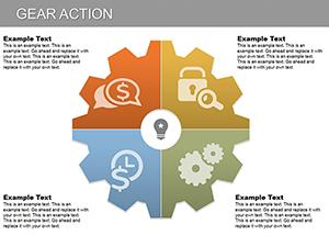
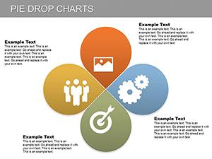
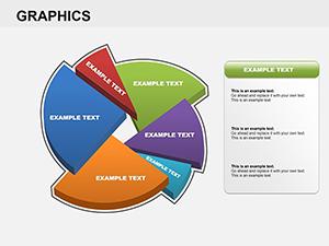
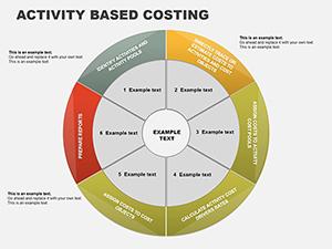
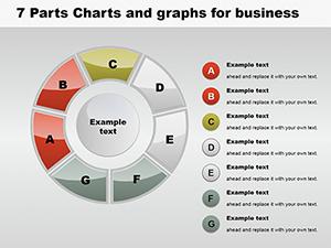
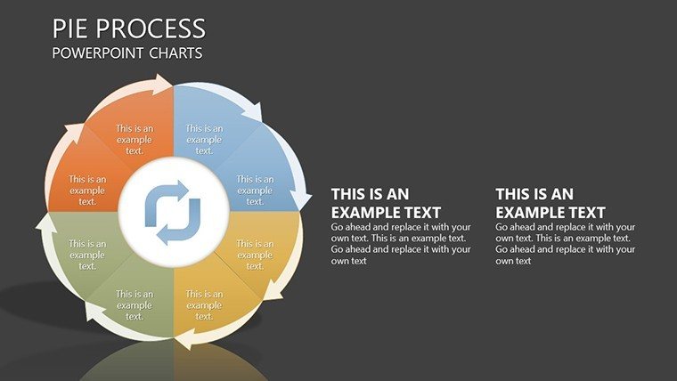
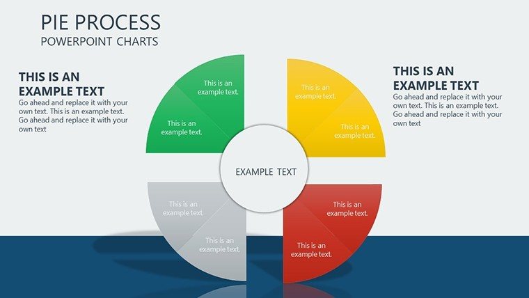
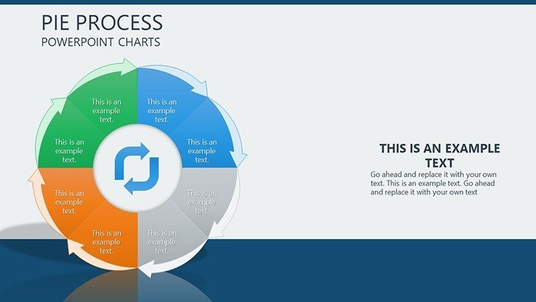
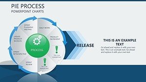
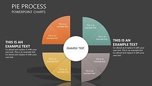
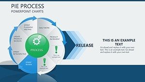
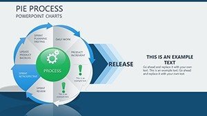
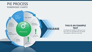
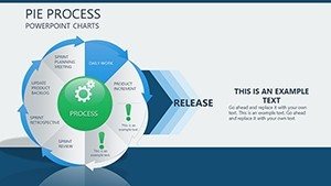
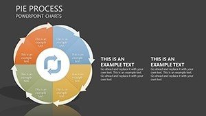
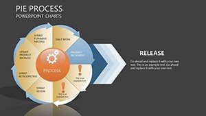
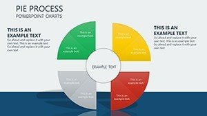
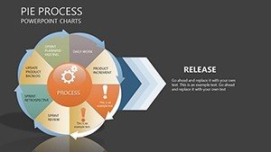
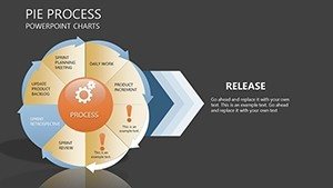
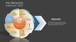
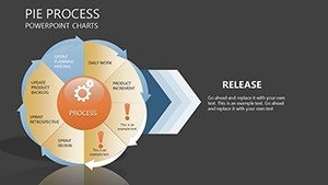
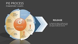
- Varied Pie Chart Styles: From simple segments to exploded views, customizable for emphasis on key data slices.
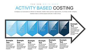
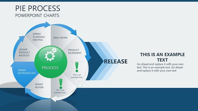
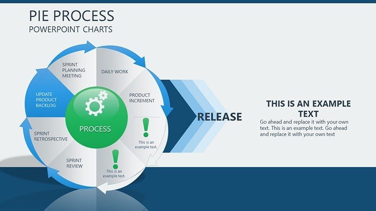
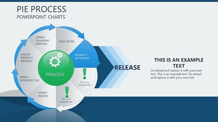
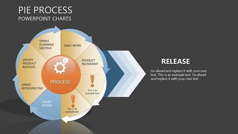
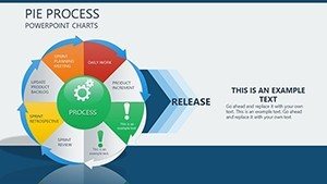
- Process Integration: Link pies to arrows and steps, ideal for sequential narratives like product development cycles.
- Customization Flexibility: Alter labels, colors, and sizes with ease, supporting brand alignment across slides.
- Efficient Pre-Designs: Ready-to-use layouts save hours, with documentation for quick mastery.
- High-Quality Assets: Vector graphics and tips for best practices ensure professional polish.
These features draw from authoritative sources like "The Visual Display of Quantitative Information" by Tufte, enhancing your content's credibility.
Diverse Applications Across Fields
Consider a teacher using pie processes to show ecological balances, engaging students in environmental science - a tactic praised in educational journals.
Corporate Reporting and Strategy
In business, visualize sales distributions tied to growth processes, incorporating LSI like "workflow optimization charts" for natural depth.
Educational Engagements
Educators simplify curricula overlaps with Venn-like pies, fostering interactive learning as seen in modern pedagogy.
Research and Analysis
Researchers map study variables in process flows, accelerating insights in fields like market research.
Freelancers also adapt it for client pitches, turning proposals into visual journeys.
Seamless Workflow Enhancement
Incorporate data directly, then refine with built-in tools. Outperforms basic charts by offering thematic unity, with tips like using gradients for depth perception.
Pro Tips for Pie Process Mastery
- Select data wisely - limit segments for clarity.
- Integrate narratives with process arrows.
- Test visuals for color accessibility.
- Combine with other charts for multifaceted views.
- Update dynamically for evolving data.
These align with expert advice from data viz communities.
Transform Your Data Today
Elevate your visuals with our Pie Process PowerPoint Charts Template. Download and start storytelling that sticks.
Frequently Asked Questions
What pie variations are available?
Multiple styles including standard, doughnut, and exploded for diverse needs.
Compatible with Keynote?
Yes, fully editable in PowerPoint, Keynote, and Google Slides.
Suitable for large datasets?
Best for concise data; tips included for handling complexity.
How to add animations?
Built-in support for smooth process reveals.
Any support resources?
Comprehensive docs and community access.