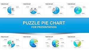
Animated Pie Chart PowerPoint Template - Fully Editable Budget Charts


Type: PowerPoint Charts template
Category: Organizational
Sources Available: .pptx
Product ID: PC00164
Template incl.: 28 editable slides
Use this animated PowerPoint pie chart template to present architectural budgets, financial breakdowns, and project cost allocations with clarity and visual impact. Designed specifically for architects, project managers, and finance teams, this fully editable PPTX features dynamic pie charts that animate segment by segment to reveal data progressively - perfect for keeping audiences engaged during executive reviews, client pitches, or internal planning meetings.
With professional designs and built-in animations, this template helps you communicate complex budget information clearly and confidently, saving hours of design time while delivering polished, memorable presentations.
Key Features
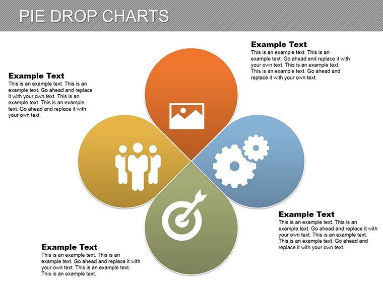
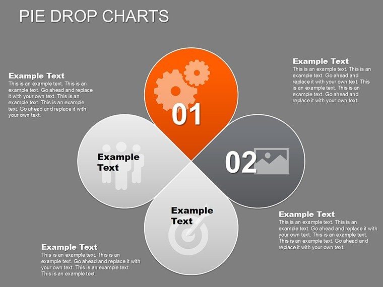
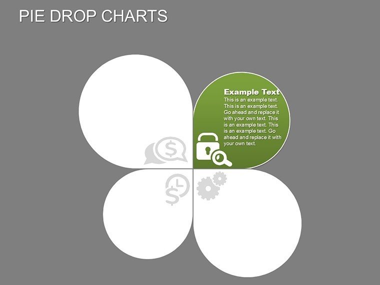
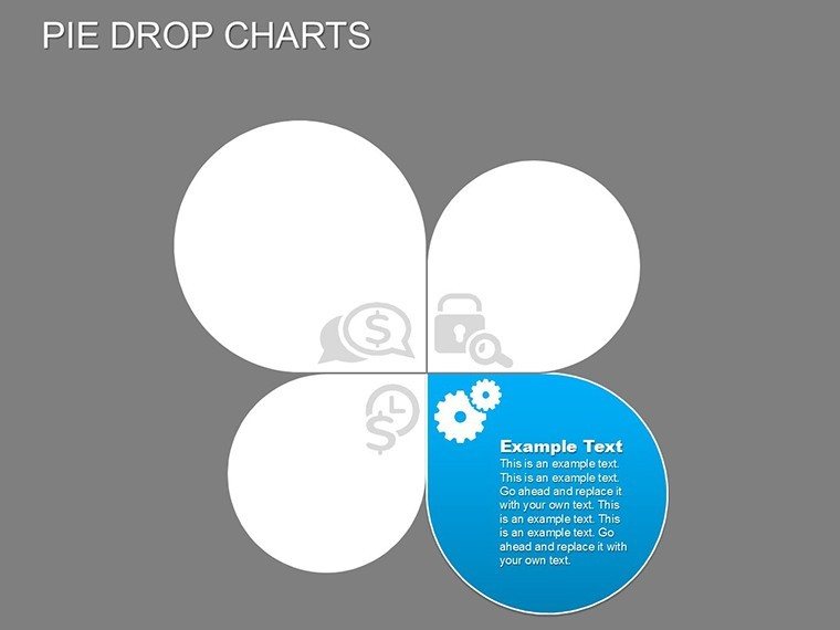
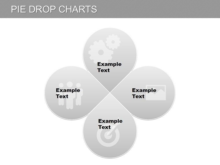
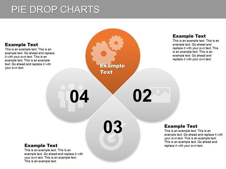
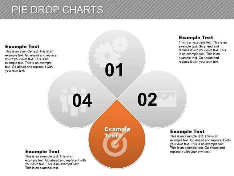
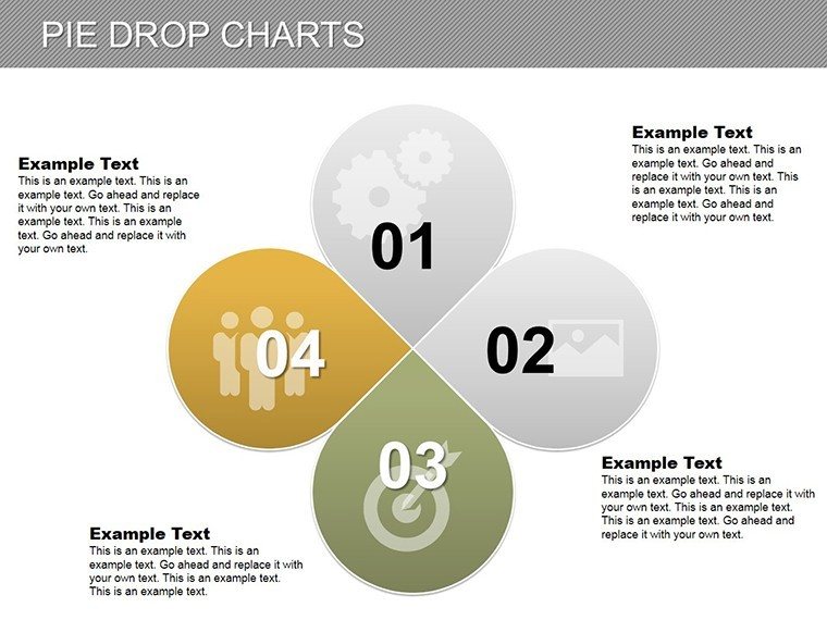
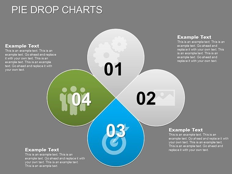
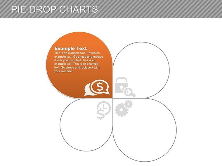
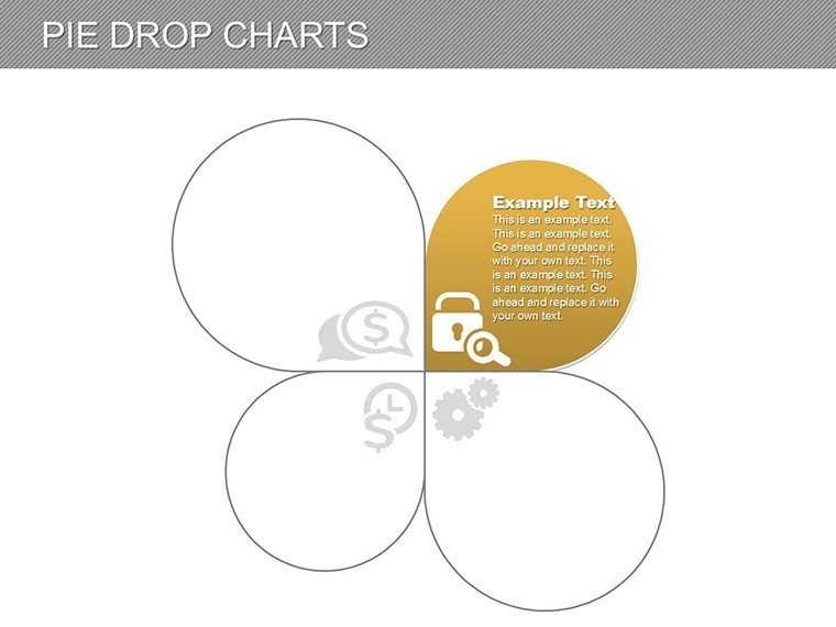
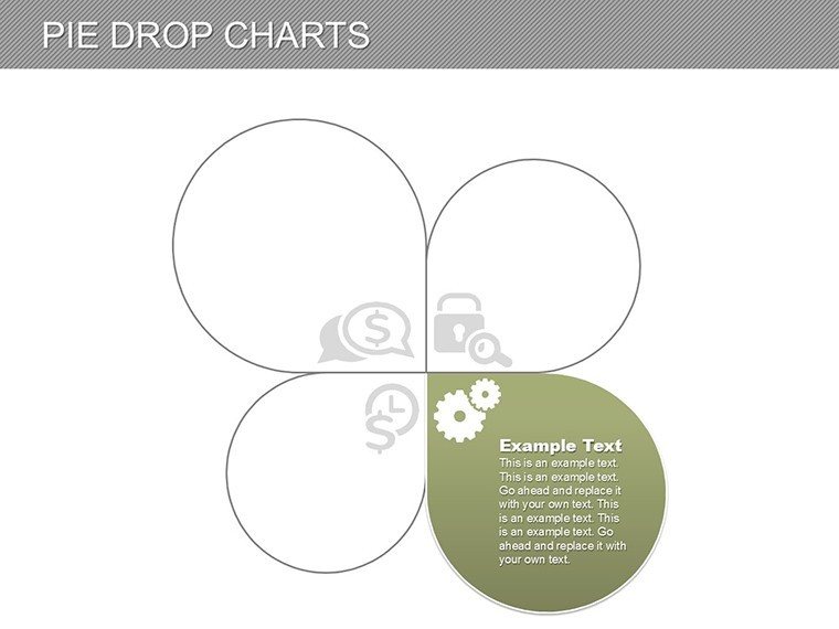
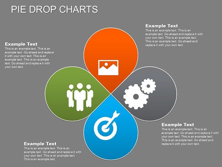
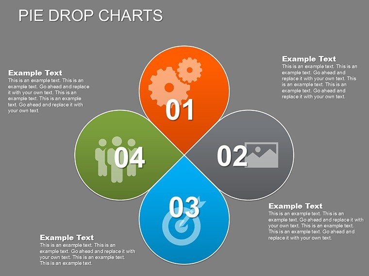
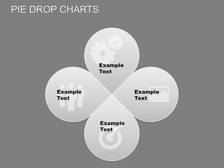
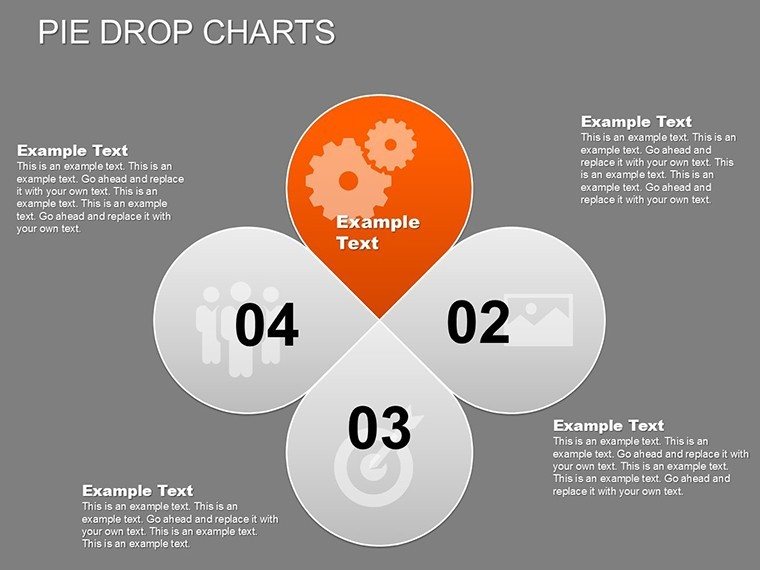
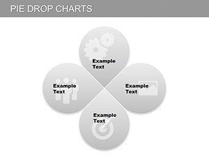
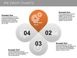
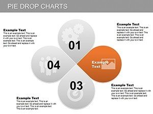
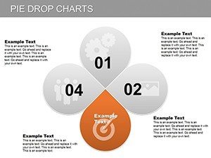
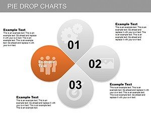
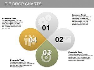
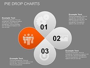
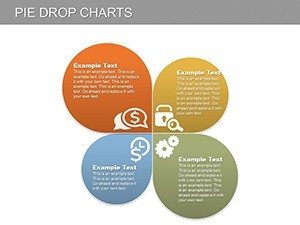
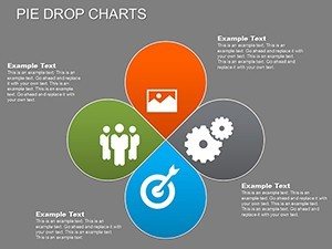
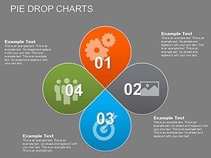
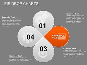
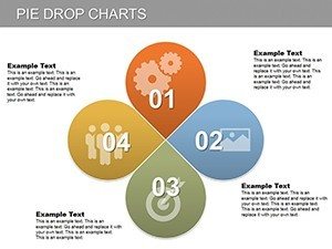
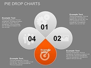
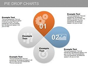
- Fully editable pie charts with customizable data, labels, percentages, and colors
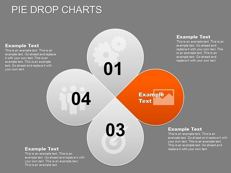
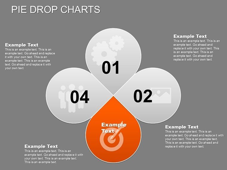
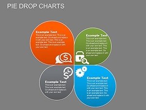
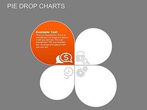
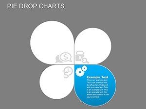
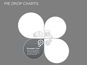
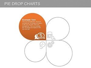
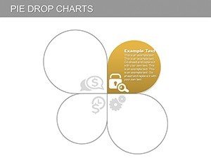
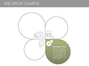
- Dynamic "drop" animations that reveal each segment step-by-step
- 28 professionally designed editable slides
- High-resolution graphics optimized for screens and PDF exports
- Native PowerPoint elements for easy customization and compatibility
Why Choose This Template
Animated charts maintain audience attention far better than static ones by introducing data progressively, making your key budget points more memorable and persuasive. This template eliminates the need to build complex charts from scratch, allowing you to focus on your content and delivery.
Ideal for professionals who regularly present financial data, it delivers consistent, high-quality visuals that enhance credibility and support better decision-making.
Download today and elevate your next budget presentation with engaging, professional-grade visuals.
How to Customize the Template
Open the downloaded PPTX file in Microsoft PowerPoint. Update chart data directly in the embedded spreadsheet or on the slide itself. Adjust colors through the theme palette or individually, modify text and labels, and fine-tune animations in the animation pane.
The template uses only native PowerPoint tools, making it accessible even for users with intermediate skills. Changes apply instantly across linked elements for efficient editing.
Professional Use Cases
- Architectural Client Pitches: Clearly show cost distribution across design, construction, materials, and sustainability phases.
- Executive and Stakeholder Reviews: Highlight budget allocations and variances with engaging animated reveals.
- Consulting Proposals: Illustrate recommended budget structures for projects or operations.
- Internal Team Meetings: Facilitate discussions on resource planning and cost forecasting.
- Educational Presentations: Teach financial planning principles in architecture or business courses.
Frequently Asked Questions
What software is required to edit this template?
This template works with Microsoft PowerPoint 2010 and newer versions, including Microsoft 365. No additional software or plugins are needed.
Are the pie charts fully customizable?
Yes, all chart elements - data, labels, colors, percentages, and layout - are fully editable using standard PowerPoint tools for complete flexibility.
How do the animations work?
The pie charts feature a "drop" animation where segments appear sequentially, either automatically or on click, to guide the audience through the data step by step.
What files are included in the download?
You receive a single .pptx file containing 28 fully editable slides with multiple animated pie chart variations and supporting layouts.
Can I use this template for printed handouts or PDF exports?
Yes, the high-resolution designs scale perfectly for printing and PDF export while maintaining professional quality.