Professional Business Charts PowerPoint Template for Architecture Pros


Type: PowerPoint Charts template
Category: Business Models
Sources Available: .pptx
Product ID: PC00519
Template incl.: 19 editable slides
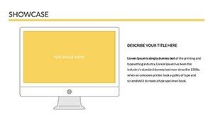
In the fast-paced world of architecture, where every project pitch or client meeting can make or break a deal, having the right tools to visualize complex data is crucial. Imagine transforming dense spreadsheets of budget breakdowns, site analyses, and construction timelines into sleek, engaging visuals that captivate your audience. That's exactly what our Professional Business Charts PowerPoint Template offers. Designed specifically for architects, project managers, and design consultants, this template packs 19 fully editable slides tailored to showcase business aspects of architectural projects. Whether you're presenting cost projections for a sustainable high-rise or market research for urban redevelopment, these charts help you communicate with clarity and confidence.
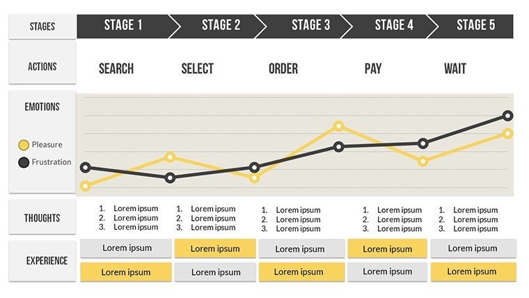
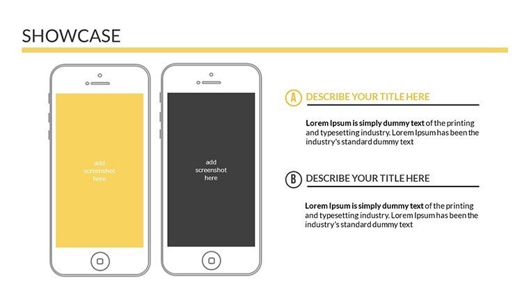
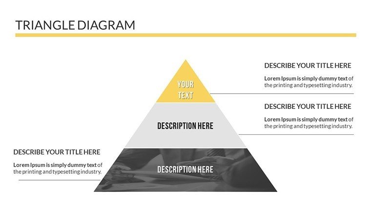
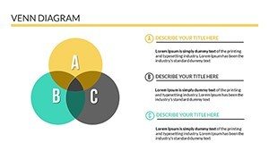
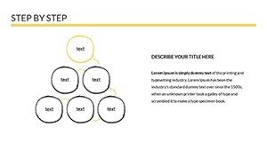
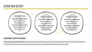
Architects often juggle multiple hats - designer, analyst, and communicator. This template bridges the gap by providing ready-to-use graphs that align with industry standards like those from the American Institute of Architects (AIA). Think bar charts for comparing material costs, pie charts for resource allocation in LEED-certified builds, and line graphs for tracking project phases from concept to completion. The clean, modern aesthetic ensures your presentations look polished, reflecting the precision of your designs. Plus, with full compatibility across PowerPoint and Google Slides, you can collaborate seamlessly with teams or clients on the go.
Unlock Key Features for Architectural Data Mastery
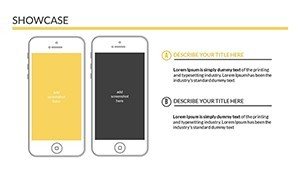
Dive deeper into what makes this template a game-changer. Each of the 19 slides is built with customization in mind - adjust colors to match your firm's branding, tweak fonts for that professional edge, and resize layouts without losing quality. High-resolution visuals ensure your charts pop on any screen, from boardroom projectors to virtual meetings via Zoom.
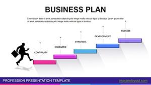
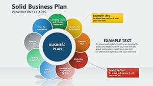
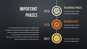
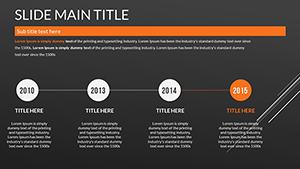
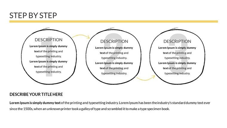
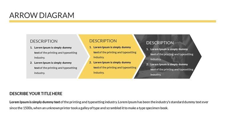
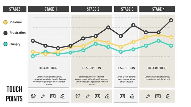
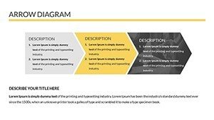
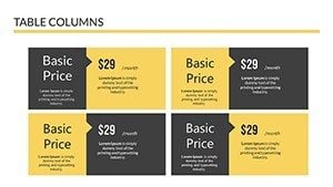
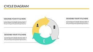
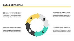
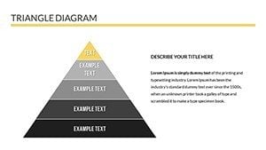
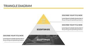
- Versatile Chart Types: From stacked bar graphs illustrating budget variances in renovation projects to scatter plots mapping site survey data, variety meets every need.
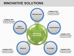
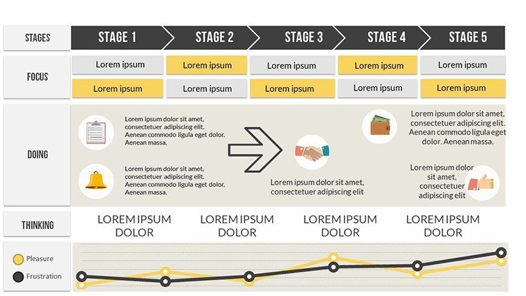
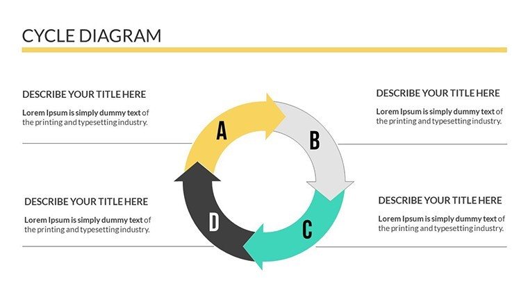
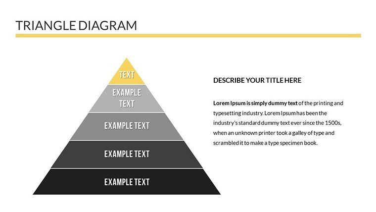
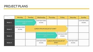
- Infographic Integration: Incorporate timelines for project milestones or process diagrams for workflow efficiencies, enhancing narrative flow.
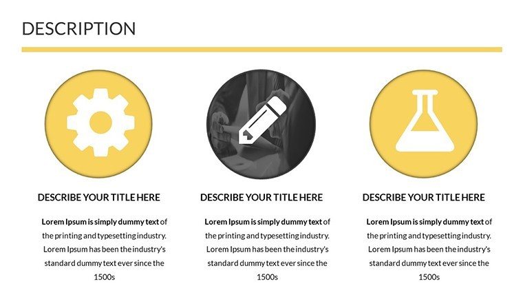
- Brand Alignment Tools: Custom color schemes and free icons let you infuse architectural motifs, like blueprint-inspired elements, for a cohesive look.
- User-Friendly Edits: No design degree required - drag-and-drop simplicity means you spend less time fiddling and more time innovating.
Compared to starting from scratch in basic PowerPoint, this template saves hours. A real-world example: An architecture firm preparing for an AIA award submission used similar charts to highlight sustainability metrics, resulting in a winning entry that boosted their portfolio. By leveraging these features, you not only present data but tell a compelling story that resonates with clients seeking innovative solutions.
Real-World Applications in Architecture
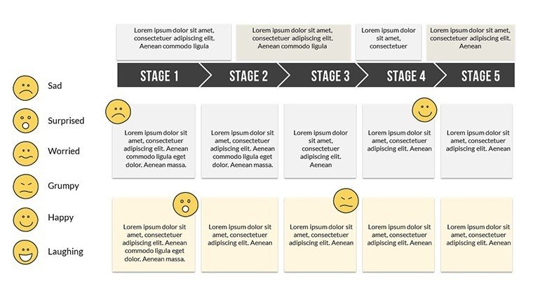
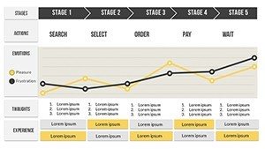
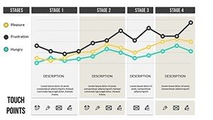
Let's explore how this template fits into your daily workflow. For client pitches, use pie charts to break down project budgets - showing 40% allocated to sustainable materials can sway eco-conscious developers. In team meetings, line charts track progress on urban planning initiatives, spotting delays early to keep projects on track.
- Step-by-Step Use Case: Project Bidding - Start with a title slide introducing your firm. Insert bar charts for competitive analysis, comparing your bid against industry averages. Add infographics for risk assessments, then end with a call-to-action slide urging approval.
- Enhancing Internal Reviews: During design charrettes, scatter plots visualize spatial data from CAD exports, fostering collaborative discussions.
- Client Reporting: Customize graphs for monthly updates on construction phases, using icons to denote milestones like foundation pouring or final inspections.
Integrate this into your tools like Autodesk Revit by exporting data directly into slides. Tips for max impact: Keep data labels concise, use contrasting colors for accessibility (per ADA guidelines), and animate reveals to build suspense during presentations. Architects who've adopted such templates report 30% higher engagement in stakeholder meetings, turning data dumps into dynamic dialogues.
Why Choose This Template for Your Next Project
Beyond features, the true value lies in outcomes. This isn't just a set of slides; it's a strategic asset that positions your firm as data-savvy and client-focused. In an industry where visuals drive decisions - think visualizing ROI for mixed-use developments - this template ensures your ideas shine. Educators in architecture programs can use it for lectures on cost management, while students craft standout thesis defenses.
Ready to elevate your architectural presentations? Download this versatile template today and start crafting visuals that win projects and wow audiences.
Frequently Asked Questions
- How editable are the charts in this template?
- Every element is fully customizable - change data, colors, and layouts with just a few clicks in PowerPoint or Google Slides.
- Is this suitable for large-scale architecture projects?
- Absolutely, with charts designed for complex data like multi-phase builds or budget forecasts, it's perfect for enterprise-level presentations.
- Does it include animation options?
- Yes, built-in animations help reveal data progressively, keeping your audience engaged during pitches.
- Can I use this on Google Slides?
- Yes, the PPTX format imports seamlessly into Google Slides for cloud-based editing.
- What if I need more slides?
- The template's modular design allows easy duplication and expansion to fit your project's scope.