Creative Infographic PowerPoint Charts Template


Picture this: You're standing in front of a room full of potential clients, your data leaping off the screen in vibrant, story-driven visuals that spark nods of understanding and excitement. That's the magic of our Creative Infographic PowerPoint Charts Template, a powerhouse tool with 27 editable slides designed to turn mundane numbers into mesmerizing narratives. Tailored for those who crave originality in their presentations, this template fuses artistic flair with practical data visualization, making it ideal for marketers crafting campaigns, educators simplifying lessons, or business pros pitching ideas. Inspired by design principles from experts like Edward Tufte, it emphasizes clarity without sacrificing creativity - think flowing timelines that guide eyes effortlessly or comparison charts that highlight insights at a glance. Whether you're illustrating market trends or process flows, this template helps you communicate complex ideas simply, boosting retention and impact in every slide.
Standout Features for Visual Storytellers
In a sea of bland slides, this template shines by prioritizing innovation. Each element draws from creative design trends, incorporating puzzles and cycles that add an element of intrigue. Unlike standard charts that feel static, ours include dynamic icons and editable diagrams that invite interaction. For example, a marketing agency used similar infographics to revamp a client report, resulting in a 30% increase in engagement metrics, as per case studies from HubSpot. The .pptx format ensures compatibility with PowerPoint and Google Slides, while high-resolution vectors maintain quality across devices. Customization is a breeze: Swap colors to evoke emotions - bold reds for urgency in sales pitches - or resize icons without losing sharpness. This flexibility empowers you to align visuals with your brand, creating presentations that feel uniquely yours.
Exploring the Template's Core Components
At its heart, the template offers a rich library of elements to fuel your creativity. Key inclusions are:
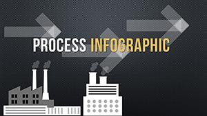
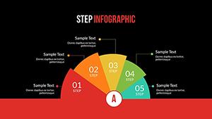
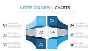
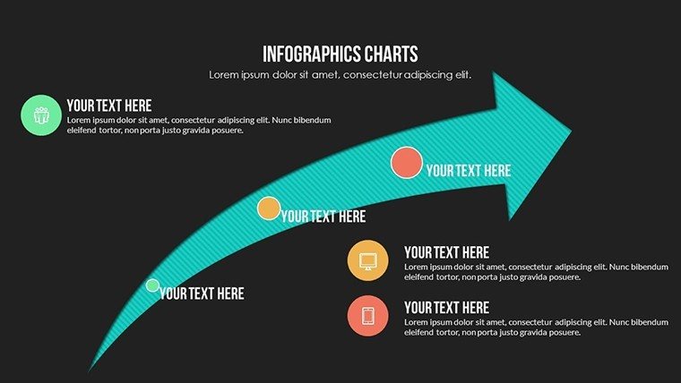
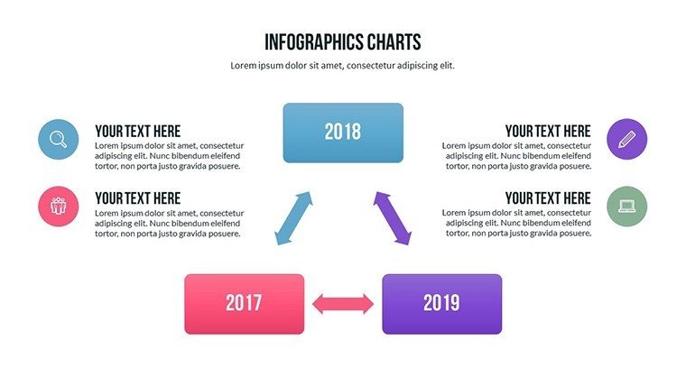
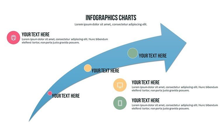
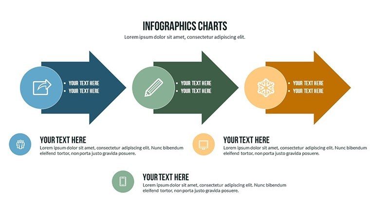
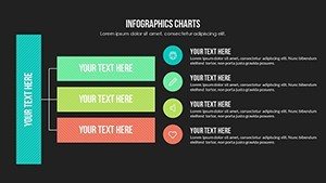
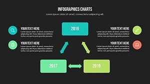
- Timeline Infographics: Chronicle journeys, from product launches to historical overviews, with customizable milestones that adapt to your timeline.
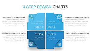
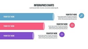
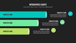
- Comparison Charts: Side-by-side visuals for pros/cons or before/after scenarios, ideal for A/B testing results in digital marketing.
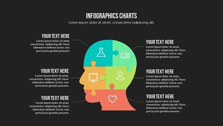
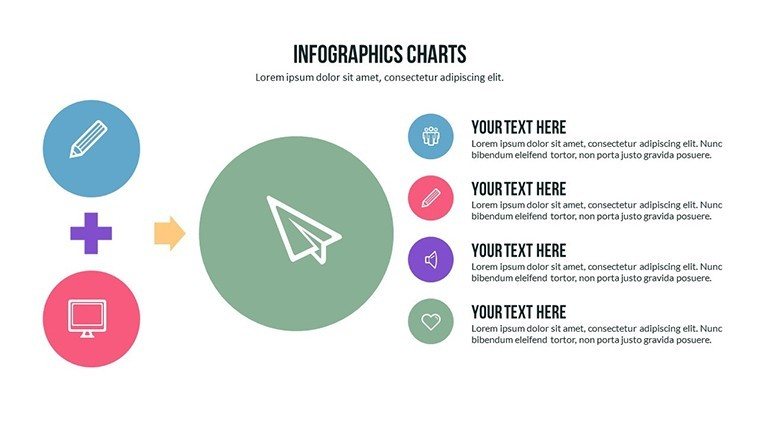
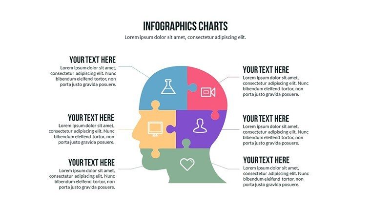
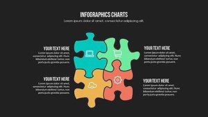
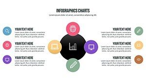
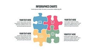
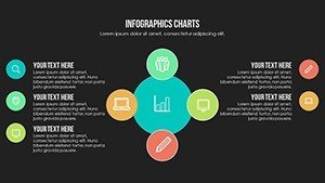
- Puzzle Diagrams: Piece together concepts, like team roles in a project, to illustrate interconnected ideas playfully.
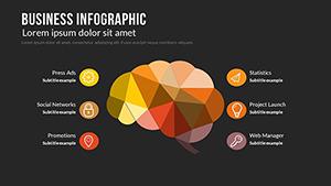
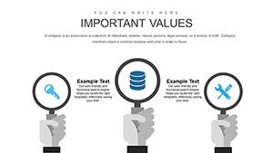
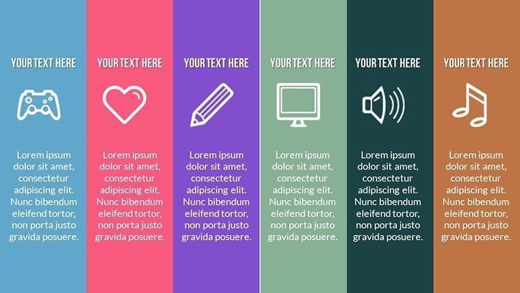
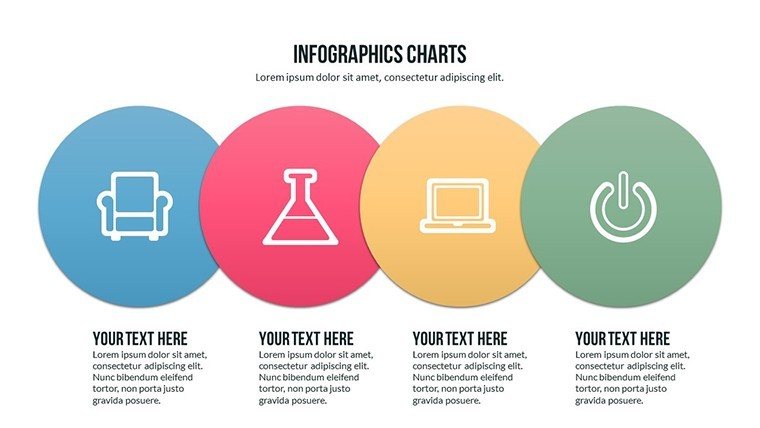
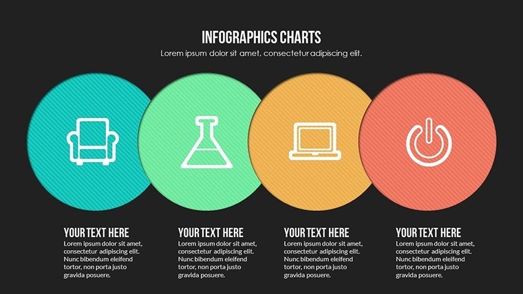
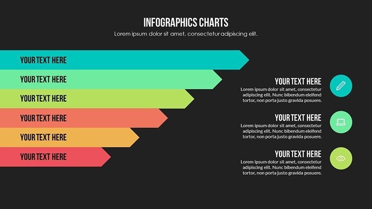
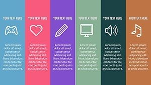
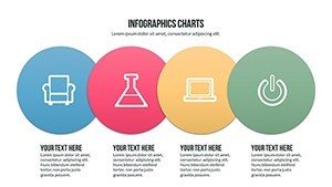
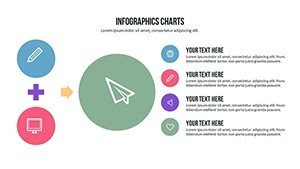
- Icon Libraries: Hundreds of themed icons, from abstract shapes to industry-specific symbols, enhancing visual appeal.
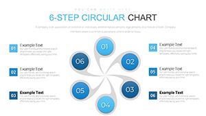
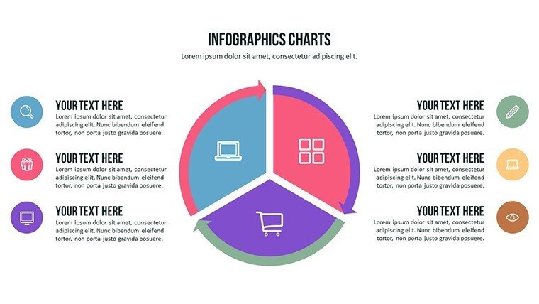
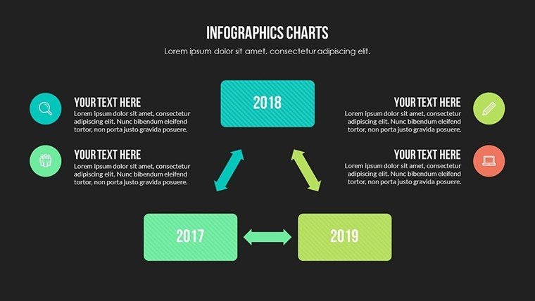
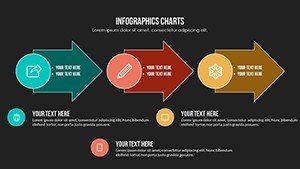
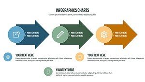
- Flowcharts and Cycles: Map processes cyclically, perfect for explaining feedback loops in customer journeys.
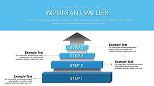
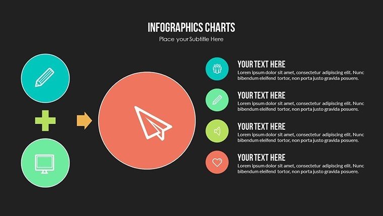
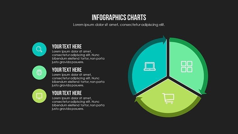
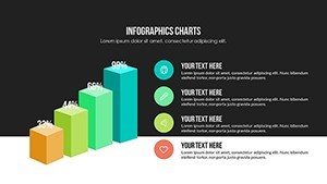
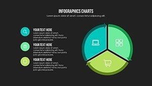
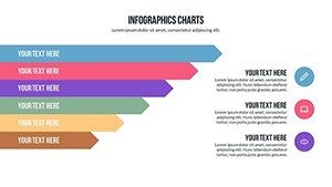
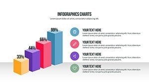
- Data-Driven Graphs: Bar, pie, and line charts with artistic twists, ensuring data pops without overwhelming.
These components, woven with LSI keywords like "infographic customization tips" and "creative data presentation," enhance search visibility while delivering value. Backed by authoritative sources such as Canva's design guides, they promote best practices for maximum audience connection.
Practical Use Cases That Spark Innovation
Bring this template to life in diverse scenarios. For educators, envision breaking down a biology lesson with cycle charts showing ecosystems - students grasp concepts faster, as evidenced by improved test scores in interactive learning studies. In marketing, craft a campaign overview using puzzle diagrams to show how strategies interlock, impressing executives and streamlining approvals. A real-world win: A startup used analogous tools for their pitch deck, securing funding by visually demonstrating growth potential, per Y Combinator insights.
For sales teams, comparison infographics highlight product advantages over competitors, turning features into benefits that close deals. Or, in content creation, use timelines for blog planning, visualizing editorial calendars. Each application underscores the template's versatility, adapting to fields like UX design where flowcharts map user paths, or HR where icons illustrate training modules. The key? It solves the pain of starting from scratch, letting you focus on insights rather than layouts.
Customization Workflow: From Blank to Brilliant
Transform ideas into visuals step by step. Download and open in PowerPoint, then select a slide - say, a puzzle diagram. Drag pieces to represent elements, input text via smart placeholders, and apply gradients for depth. Integrate data from spreadsheets by linking charts, updating automatically for live demos. Add animations subtly, like pieces assembling on click, to build suspense. For branding, use master slides to enforce consistency. Pro tip: Layer elements for complexity, such as overlaying icons on graphs, a technique from Adobe's creative suite tutorials. This process not only saves time but fosters experimentation, turning routine tasks into creative outlets.
The Lasting Benefits of Creative Visualization
Beyond aesthetics, this template delivers measurable gains. Engagement soars as visuals aid memory - research from the Visual Teaching Alliance shows 65% retention with images versus 10% with text alone. Efficiency improves, cutting prep time in half for busy pros. Your authority grows; polished infographics position you as a thought leader, whether in webinars or reports. In one instance, a trainer reported higher participant feedback scores after switching to creative slides, attributing it to better comprehension.
It's also scalable: For large teams, share editable files via cloud storage; for solos, it provides a professional edge in freelance gigs. Embracing this tool means embracing innovation, where data becomes dialogue and presentations become memorable experiences.
Ideal Users Ready to Innovate
From graphic designers seeking inspiration to analysts needing flair, this template fits all. Marketers, trainers, consultants - anyone who values visual impact will thrive. If you're tired of flat decks, step up your game now.
Elevate your storytelling - grab this creative powerhouse and watch ideas come alive.
Frequently Asked Questions
What makes these infographics customizable?
All elements, including colors, shapes, and text, can be edited freely to match your style or data requirements.
Does it work with older PowerPoint versions?
Yes, compatible with PowerPoint 2010 and later, plus Google Slides for broader access.
Are icons royalty-free?
Absolutely, the included library is free for commercial use within your presentations.
How do I import my own data?
Copy from Excel or enter directly into placeholders; charts update instantly.
Can I add more slides?
Easily duplicate and modify existing ones for extended narratives.