Competitive Analysis PowerPoint Charts Template - Fully Editable & Instant Download


Type: PowerPoint Charts template
Category: Relationship
Sources Available: .pptx
Product ID: PC00510
Template incl.: 20 editable slides
In competitive business environments, data alone is not enough - strategic presentation drives decisions. This Competitive Analysis PowerPoint Charts Template provides a variety of chart types to compare performance, highlight advantages, and reveal market positioning clearly.
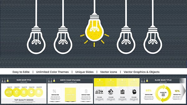
Key Features
- 20 fully editable slides
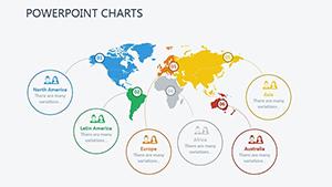
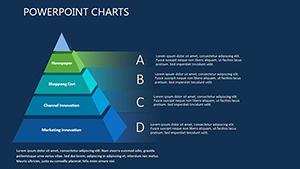
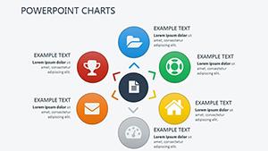
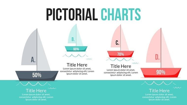
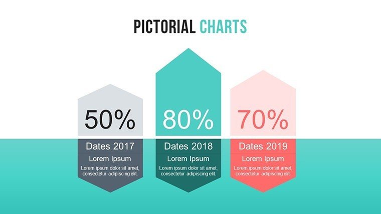
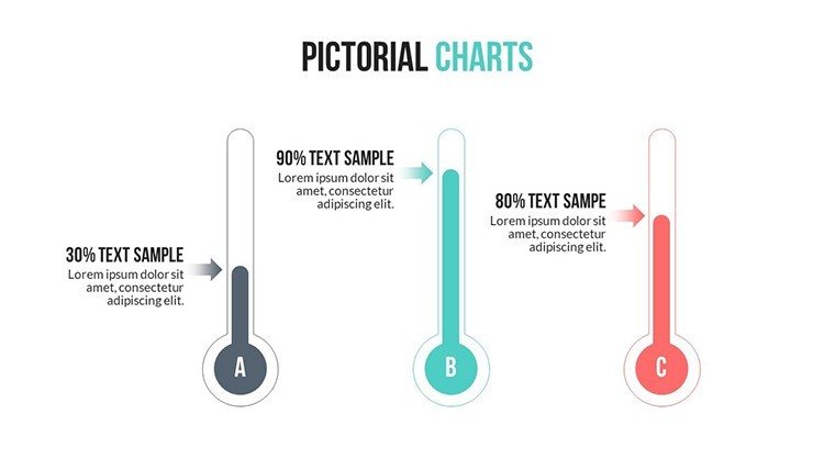
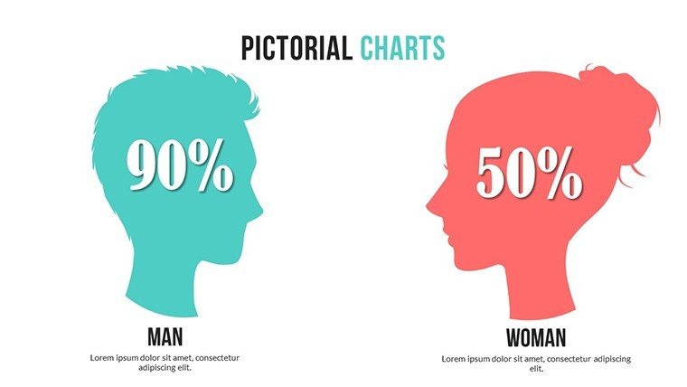
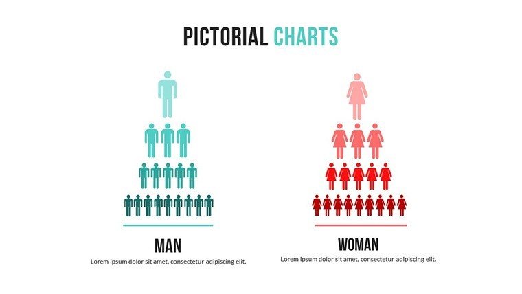
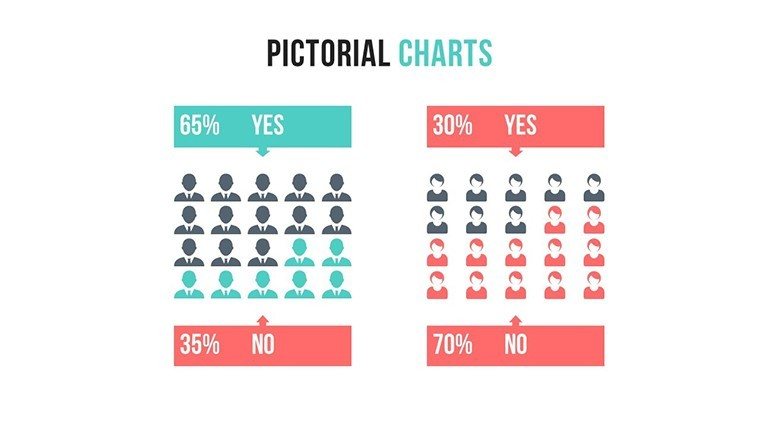
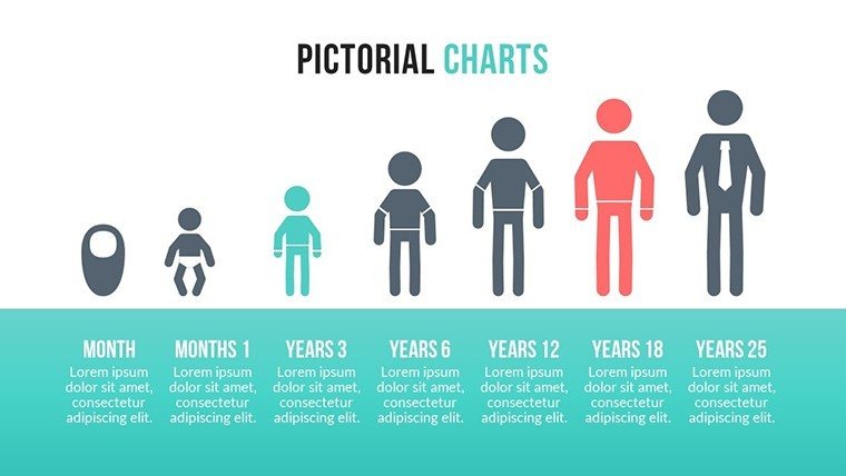
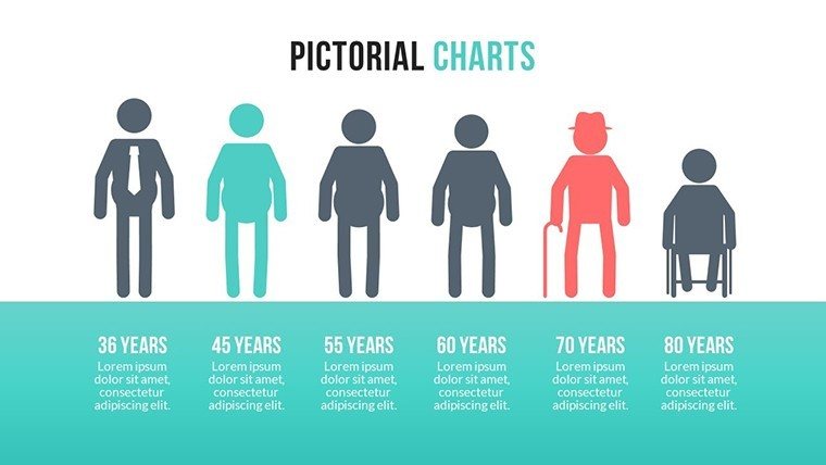
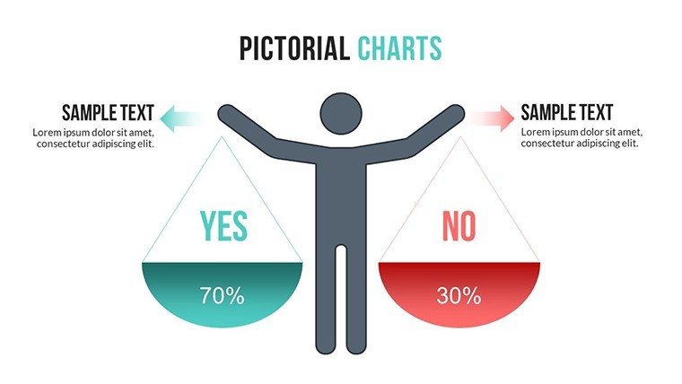
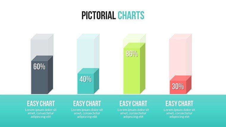
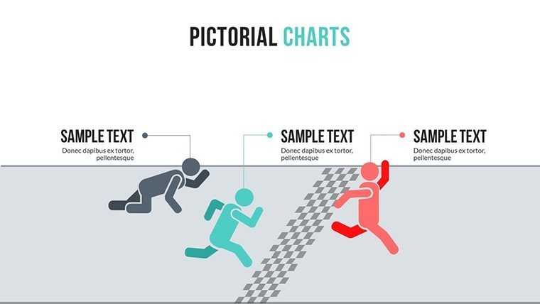
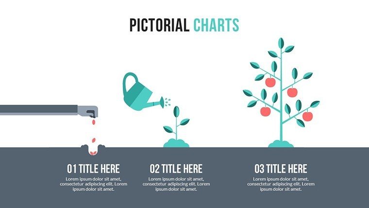
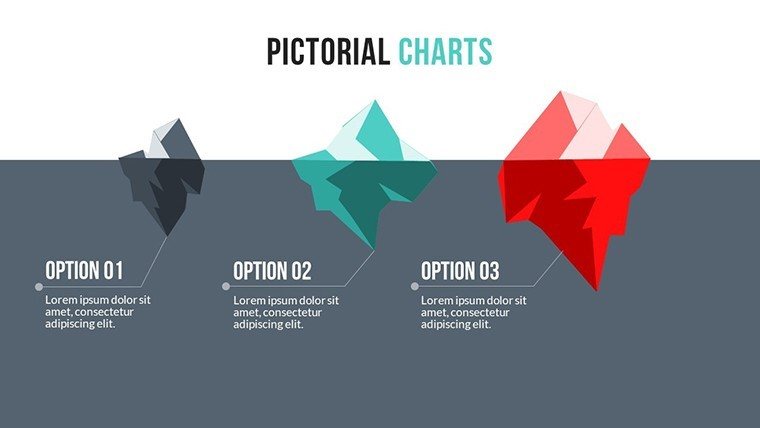
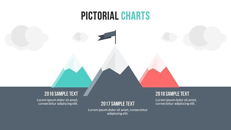
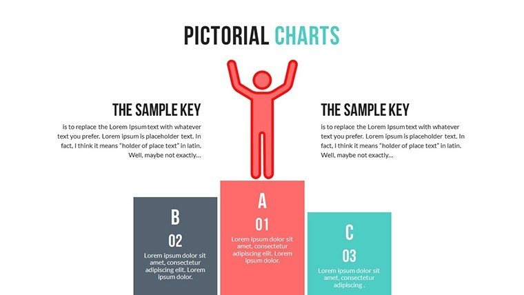
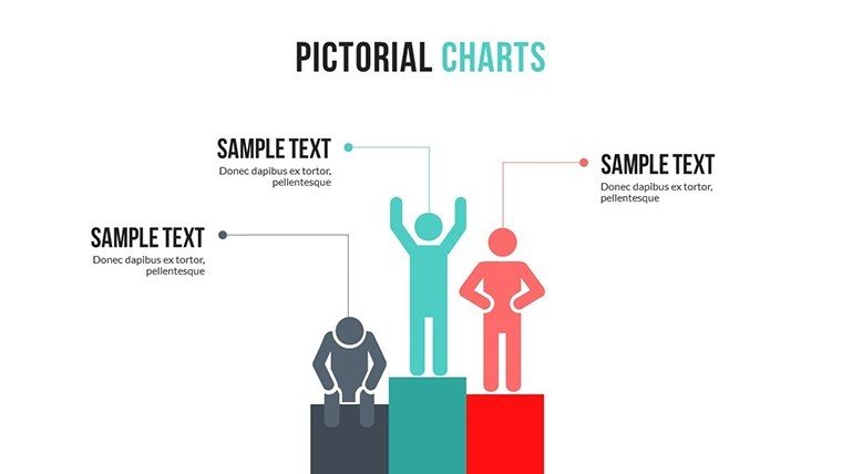
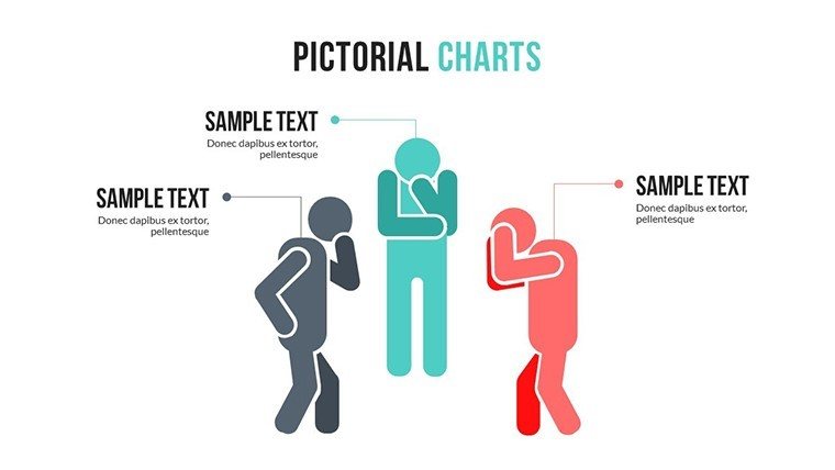
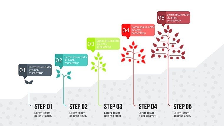
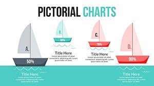
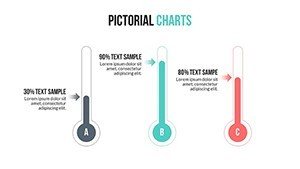
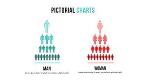
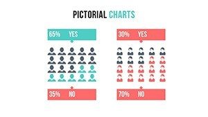
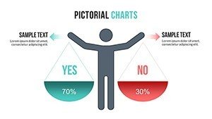
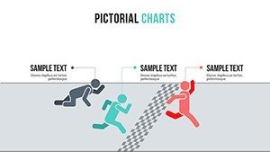
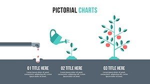
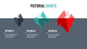
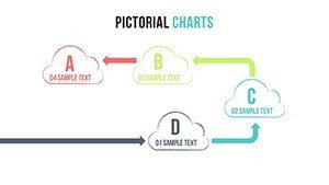
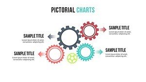
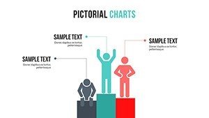
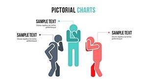
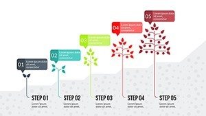
- Mix of bar, pie, line, area, and spider/radar charts
- Designed for competitor benchmarking and trend analysis
- Easy data and color customization
- Compatible with Microsoft PowerPoint
Why Choose This Template
Effective competitive charts transform raw numbers into actionable strategic narratives. The variety of chart types supports different analysis needs while maintaining professional consistency.
It enables marketers and executives to present insights that influence direction and resource allocation.
How to Use the Template
Open the PPTX file in PowerPoint and input your competitive data into the charts. Adjust labels, colors, and scales for accuracy. Select the most appropriate chart type for each comparison. Customization is straightforward with standard PowerPoint tools.
Professional Scenarios
Marketers analyze market share and positioning for campaign planning.
Strategists present competitor benchmarks to executive teams.
Sales leaders compare performance metrics during quarterly reviews.
Consultants illustrate industry dynamics in client reports.
Strengthen your competitive presentations - download this template now.
What chart types are included?
The template features bar, pie, line, area, and spider/radar charts optimized for competitive analysis.
Is the template fully editable?
Yes, all charts, text, colors, and data points are fully editable in PowerPoint.
What file format is provided?
The template is delivered in PPTX format, compatible with recent versions of Microsoft PowerPoint.
Can I use it for market forecasting?
Yes, the line and area charts are particularly useful for displaying trends and projections.
Is commercial use allowed?
Yes, the template is licensed for personal and commercial purposes, including client deliverables.