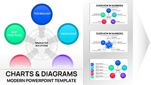
Services PowerPoint Charts Template: Elevate Your Professional Presentations


When it comes to showcasing services, nothing beats a well-structured chart that turns numbers into narratives. Our Services PowerPoint Charts Template provides 18 editable slides packed with diverse chart types, from bars to scatters, designed to highlight performance metrics and strategies. Targeted at executives crafting board reports, marketers analyzing campaigns, or trainers developing modules, this template embodies efficiency. Inspired by data storytelling techniques from experts like Stephen Few, it focuses on eliminating chartjunk for pure, impactful visuals. Use it to present quarterly results or service portfolios, ensuring your audience walks away with clear takeaways. The integration of arrows for directional flow and analysis elements adds analytical depth, making your slides not just informative but persuasive.
Key Features Driving Presentation Excellence
At its core, this template is a powerhouse of customization. Each slide connects to Excel for live data updates, automating refreshes to keep your info current. Professional layouts include cover pages for branding and conclusion slides for strong closes. Visual enhancements like themed icons and infographics transform dry data into engaging stories. Drag-and-drop ease means quick tweaks, while flexible grids allow layout experiments. Fully compatible with PowerPoint, it scales flawlessly for any screen size. Unlike generic templates, ours incorporates analysis-focused arrows, guiding eyes through data paths for better comprehension.
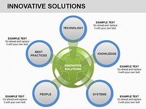
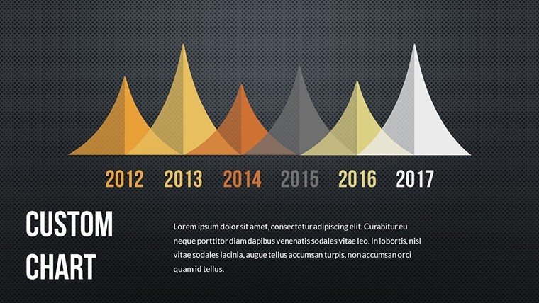
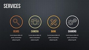
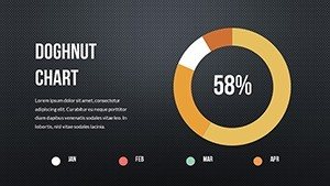
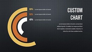
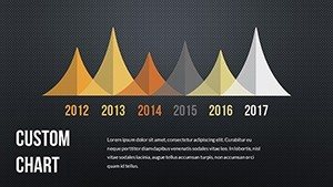
- Varied Chart Options: Bar, line, pie, area, and scatter for comprehensive data representation.
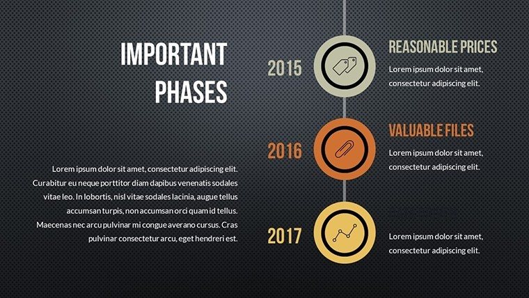
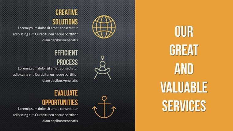
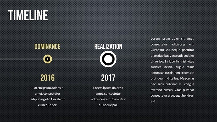
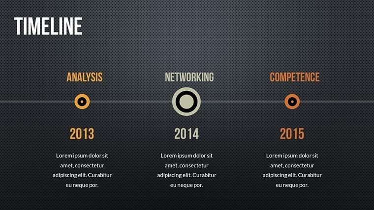
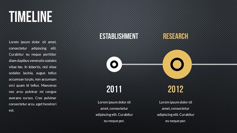
- Structured Layouts: From intros to summaries, covering all presentation phases.
- Data-Driven Automation: Excel links for real-time updates.
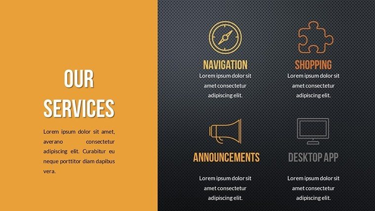
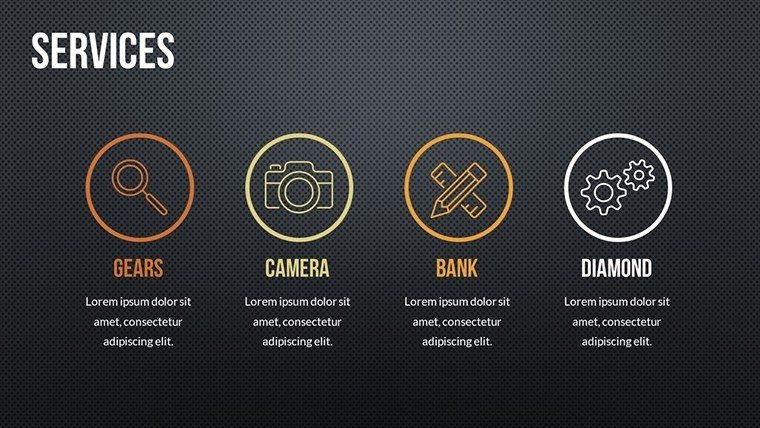
- Visual Toolkit: Icons, palettes, and infographics for enhanced appeal.
- User-Friendly Edits: Intuitive tools for non-designers.
Benefits That Translate to Real Success
The advantages are profound. Gartner reports suggest visuals can accelerate understanding by up to 60%, a stat this template leverages through clean designs. For marketing pros, pie charts slice market shares vividly, aiding strategy pitches. Executives might use line graphs to track service growth, impressing stakeholders with trends. The template's trustworthiness shines in its adherence to data integrity principles, avoiding misleading scales. Time savings are huge – pre-built elements cut creation time in half, allowing focus on insights. In training, scatter plots reveal correlations in performance data, sparking discussions. Overall, it builds authoritativeness, positioning you as a data-savvy leader.
Implementation Guide: Seamless Integration
- Download the .pptx and import into PowerPoint.
- Pick a chart type aligned with your service metrics.
- Enter data via placeholders or Excel sync.
- Customize with brand colors and arrows for emphasis.
- Add infographics for context.
- Finalize with a rehearsal, ensuring flow.
This workflow promotes precision; for instance, use arrows to denote process flows in service delivery models, far superior to plain text descriptions.
Application Scenarios: Tailored for Impact
From boardrooms to classrooms, applications abound. Consultants can deploy bar charts for benchmark comparisons, drawing from real cases like Deloitte reports. Educators use area charts to illustrate resource allocation in admin training. A marketing firm might visualize campaign ROIs with pies, leading to refined tactics and higher conversions. Case in point: A service provider revamped their proposal deck with these charts, securing a major contract through demonstrated clarity. For finance teams, scatter plots uncover service efficiency patterns. Tips: Layer data labels sparingly to avoid clutter, and incorporate subtle animations for reveal effects. Compatible with collaborative platforms like Microsoft Teams, it's ideal for group refinements. Emphasize by citing sources in notes, bolstering credibility. This template isn't static; it's a dynamic ally in your quest for compelling service communications.
Step up your game – customize this template to reflect your expertise and watch your presentations transform engagements.
Frequently Asked Questions
How do the charts update with new data?
They link directly to Excel, refreshing automatically upon data changes.
Is customization limited to colors?
No, edit layouts, add elements, and resize freely for total control.
What if I need more slides?
Duplicate existing ones and modify as needed for expansion.
Are there tutorials for advanced features?
PowerPoint's built-in help covers most, but our download includes basic tips.
Can this be used in non-service industries?
Yes, adaptable for any data-heavy presentations across sectors.
Does it support high-resolution exports?
Absolutely, export to PDF or images without quality loss.