Dynamic Interactive PPT Charts Template - Engage Now


Type: PowerPoint Charts template
Category: Analysis
Sources Available: .pptx
Product ID: PC00476
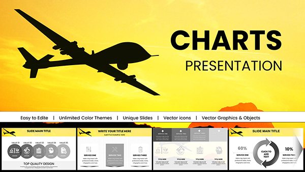
Template incl.: 13 editable slides
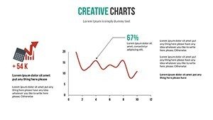
Imagine captivating your audience not with words alone, but with data that dances across the screen, responding to their curiosity in real time. Our Dynamic Interactive PowerPoint Charts Template is engineered for precisely that - turning analytical data into interactive experiences that foster deeper understanding. With 13 meticulously designed editable slides, this tool is a boon for professionals grappling with dense datasets, offering a way to highlight trends and insights without overwhelming viewers. Suited for analysis-heavy fields like finance or market research, it addresses the challenge of making numbers tell a story. From bar graphs that animate growth trajectories to pie charts segmenting market shares interactively, each element is crafted to enhance retention. Think of a financial analyst presenting quarterly earnings: instead of static figures, interactive elements allow stakeholders to explore variances, leading to informed discussions and strategic pivots. This template doesn't just present data; it invites exploration, making it indispensable for educators demystifying statistical concepts or consultants unveiling client analytics.
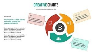
Exploring the Depth of Dynamic Data Visualization
At its core, this template revolutionizes how we approach analysis presentations. Slides are prepped for data import from sources like Excel, ensuring real-time accuracy and interactivity that standard charts can't match. For marketing experts, this means dissecting campaign performance with hover-reveal metrics, transforming reports into exploratory tools.
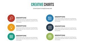
Essential Features for Analytical Excellence
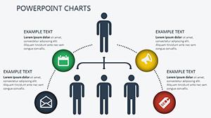
- Interactive Dynamics: Charts that respond to clicks, zooms, and hovers, revealing layers of data on demand.
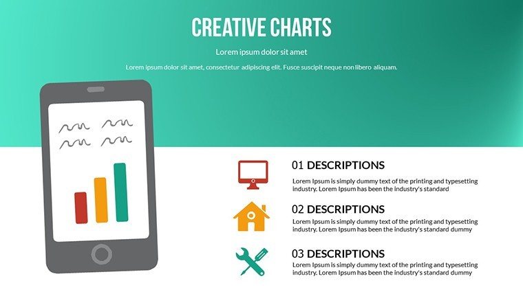
- Diverse Chart Arsenal: Including advanced options like scatter plots for correlations and heat maps for density analysis.
- Seamless Customization: Adapt visuals to your dataset with easy-to-use editors, maintaining brand integrity.
- Data Sync Capabilities: Link directly to spreadsheets for automatic updates, keeping presentations current.
- Audience-Centric Design: Focus on clarity with tooltips and legends that guide viewers through complex analyses.
These features culminate in presentations that are as informative as they are interactive, as seen in a case where a data firm used it to visualize market trends, boosting client satisfaction by clarifying predictive analytics.
Application Scenarios That Drive Results
Leverage this template across analytical contexts. In strategic planning, employ line charts to forecast trends, with interactivity allowing scenario simulations. Educators can use it to teach data interpretation, letting students interact with graphs to uncover statistical relationships.
A standout example: A consultant firm customized the template for a competitive analysis pitch, using interactive bar charts to compare benchmarks, which helped secure a major contract by demonstrating clear value propositions through data exploration.
Mastering Customization: Step-by-Step
- Open the template and paste your data into the integrated tables.
- Enable dynamics by assigning actions to chart elements.
- Tweak aesthetics to align with your analysis theme.
- Simulate audience interactions in rehearsal mode.
- Save and present, confident in its responsive performance.
This method surpasses vanilla PowerPoint by embedding analysis-ready tools, minimizing setup time for data-heavy tasks.
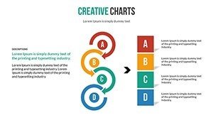
Elevating Beyond Basic Charting
Generic tools provide charts, but this template delivers analytical depth with themed icons for data points - like trend arrows or variance indicators - enhancing interpretability. Research from Forrester indicates interactive data viz can improve decision-making speed by 28%, validating its superiority.
Integrate into your analytical workflow for ongoing use, such as monthly KPI dashboards or ad-hoc reports, ensuring consistency in data storytelling.
Insights from Analysis Pros
- Prioritize key metrics: Feature one primary insight per slide to guide analytical focus.
- Utilize animations sparingly: Use them to emphasize data revelations without distraction.
- Validate data sources: Cross-check integrations for accuracy, upholding analytical integrity.
- Gather metrics post-presentation: Track interaction logs to refine future analyses.
Drawing from standards like those in "The Visual Display of Quantitative Information" by Tufte, these tips ensure rigorous, engaging outputs.
Step up your analysis game - download this dynamic template and make data dialogue a reality.
Frequently Asked Questions
How do the interactive features work?
Features use PowerPoint's built-in actions for clicks and hovers, enabling data exploration without external apps.
Can I import data from Excel?
Yes, direct linking allows for real-time updates and seamless integration.
Is customization beginner-friendly?
Certainly, with drag-and-drop interfaces and presets for quick analytical setups.
What chart types are included?
A range from bars and pies to scatters and heats, all dynamic.
Does it support team collaboration?
Yes, shareable via cloud for collective editing.