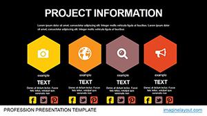
Powerful Project Information PowerPoint Charts Template


Type: PowerPoint Charts template
Category: Matrix
Sources Available: .pptx
Product ID: PC00466
Template incl.: 21 editable slides
In the dynamic world of project management, where deadlines loom and stakeholders demand clarity, having the right tools to visualize complex data can make all the difference. Imagine transforming raw project metrics - timelines, budgets, and performance indicators - into compelling stories that resonate with your audience. Our Powerful Project Information PowerPoint Charts Template is designed precisely for that purpose. With 21 fully editable slides, this template empowers project managers, business analysts, and consultants to present information in a sleek, professional manner. Whether you're updating a team on progress or pitching to clients, these charts help bridge the gap between data and decision-making. Drawing from best practices in data visualization, inspired by experts like Edward Tufte who emphasize minimalism and clarity, this template avoids clutter while highlighting key insights. It's compatible with all PowerPoint versions and even Google Slides, ensuring seamless integration into your workflow. Users love how it saves hours of design time, allowing focus on strategy rather than aesthetics. From Gantt charts that map out milestones to pie charts breaking down resource allocation, every element is tailored to enhance understanding and engagement. If you've ever struggled with bland slides that fail to captivate, this is your solution - turning routine reports into persuasive narratives that drive action.
Essential Features That Set This Template Apart
What makes this template a standout choice for professionals handling multifaceted projects? It starts with its core features, meticulously crafted to address common pain points in data presentation. The customizable charts allow you to input your specific data without hassle, ensuring accuracy and relevance. For instance, the professional design incorporates modern color schemes and fonts that align with corporate branding guidelines, making your slides look polished right out of the box. No need for advanced graphic design skills - the user-friendly interface supports drag-and-drop functionality, so even beginners can create stunning visuals in minutes. Comprehensive layouts cover everything from financial overviews to timeline tracking, providing a one-stop solution for project reporting. And with full compatibility across PowerPoint platforms, including older versions, you won't face any technical hurdles. These features aren't just add-ons; they're built to streamline your process, reducing the cognitive load on both creators and viewers.
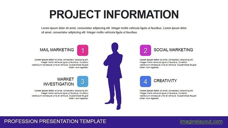
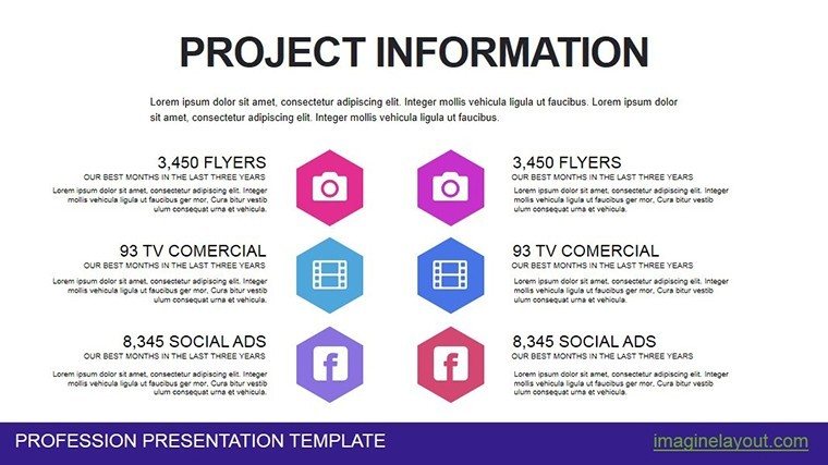
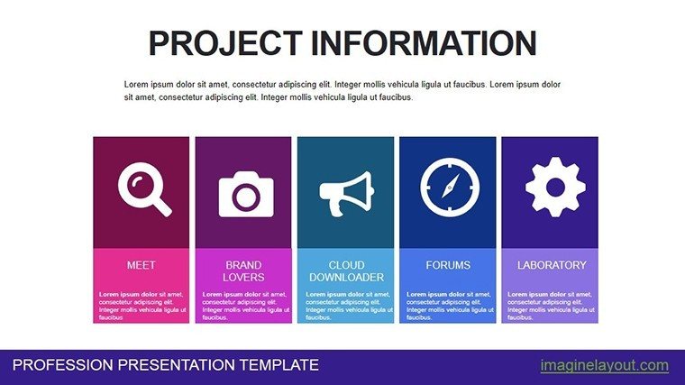
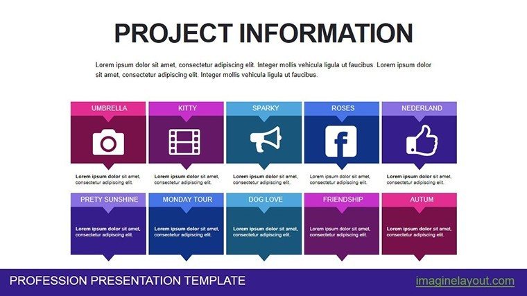
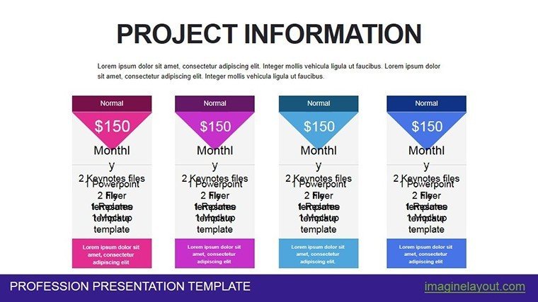
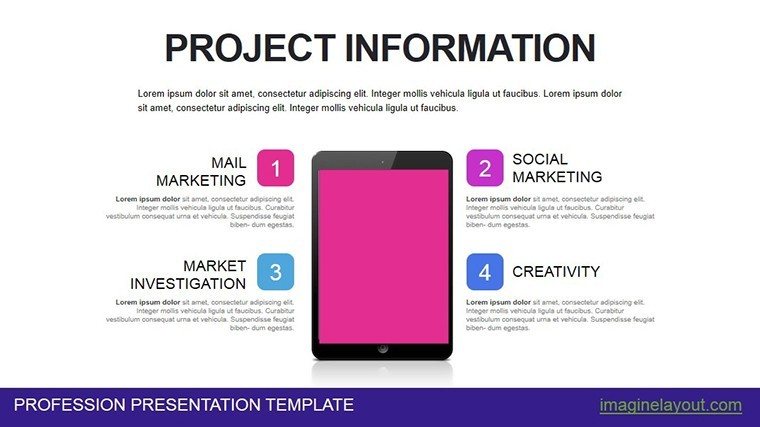
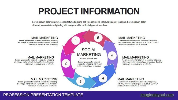
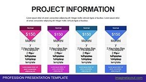
- Customizable Charts: Adapt pie, bar, line, and Gantt charts to your dataset for precise representation.
- Sleek Professional Design: Modern aesthetics that impress without overwhelming the content.
- Intuitive User Interface: Simple edits via drag-and-drop, ideal for quick updates during meetings.
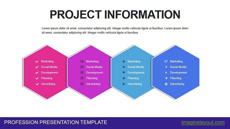
- Versatile Layouts: From budget breakdowns to progress trackers, covering all project facets.
- Broad Compatibility: Works flawlessly with Microsoft PowerPoint and alternative tools like Google Slides.
Unlocking the Advantages for Your Projects
Beyond the features, the real value lies in the advantages this template delivers to your daily work. Time savings are immediate: instead of starting from scratch, you leverage pre-built structures to focus on analysis and insights. This is particularly crucial in high-stakes environments, where according to PMI's Pulse of the Profession report, poor communication contributes to one-third of project failures. By enhancing clarity through visual aids, you minimize misunderstandings and foster better collaboration. Engagement skyrockets with visually appealing slides that hold attention longer than text-heavy decks - think of how a well-crafted Gantt chart can illustrate dependencies and risks at a glance. Professionally, it elevates your presentations, positioning you as a thoughtful leader who values audience experience. In real-world scenarios, users have reported securing funding faster or gaining team buy-in more effectively, all thanks to the template's ability to make complex information digestible.
Ideal Users: From Managers to Students
This template isn't limited to one niche; it's versatile enough for various professionals. Project managers can use it to deliver status updates that align with agile methodologies, showcasing sprints and backlogs vividly. Business analysts benefit by highlighting trends and forecasts in a way that's easy for non-experts to grasp, perhaps integrating with tools like Excel for data import. Consultants impress clients with tailored reports that reflect industry standards, such as those from the Project Management Institute. Even students find it invaluable for academic projects, turning research data into compelling visuals that earn higher grades. If you're in urban planning, for example, adapt the charts to display infrastructure timelines or budget distributions, drawing from AIA guidelines for clear architectural communication.
In-Depth Look at the Template's Contents
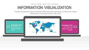
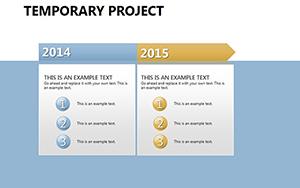
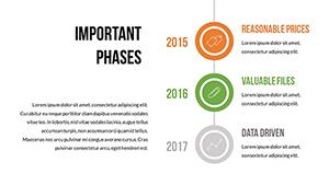
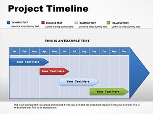
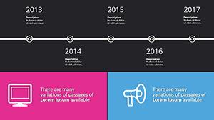
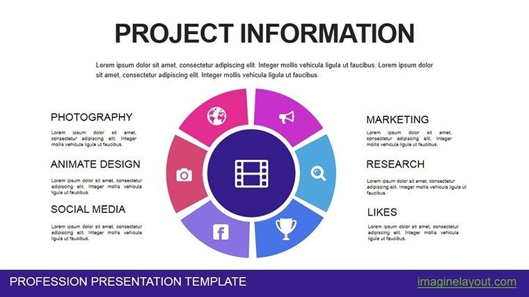
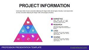
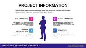
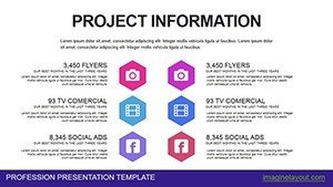
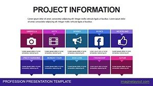
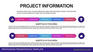
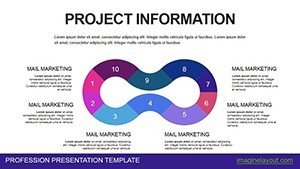
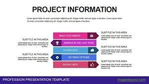
Diving deeper, the 21 slides are organized to flow logically through a project narrative. Start with overview slides featuring pie charts for resource allocation, then move to bar charts comparing planned vs. actual performance. Line charts track progress over time, ideal for quarterly reviews, while Gantt charts provide a visual roadmap of tasks and deadlines. Infographics tie it all together, simplifying complex interconnections like risk matrices. Each slide is editable, so you can swap colors to match your brand or add annotations for emphasis. This structure ensures your presentation builds momentum, guiding the audience from data introduction to actionable conclusions.
- Pie Charts: Break down budgets or team contributions proportionally.
- Bar Charts: Compare metrics across departments or phases.
- Line Charts: Illustrate trends in KPIs over months or years.
- Gantt Charts: Schedule tasks with dependencies and milestones.
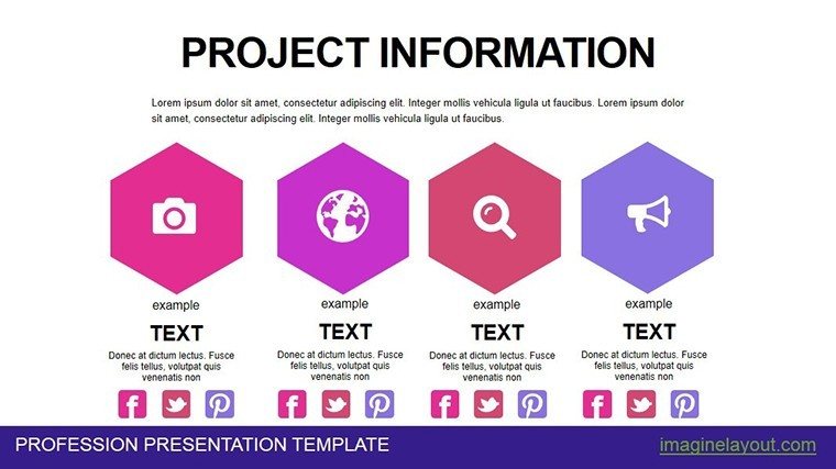
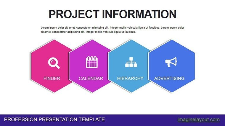
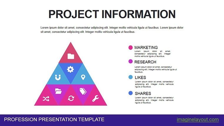
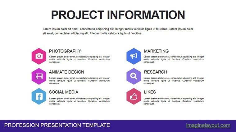
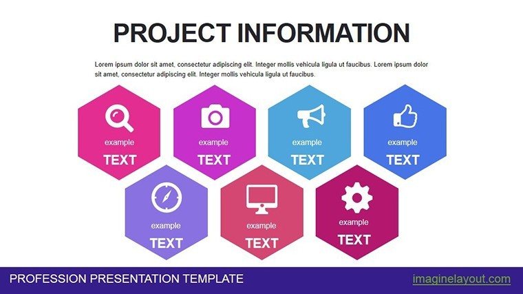
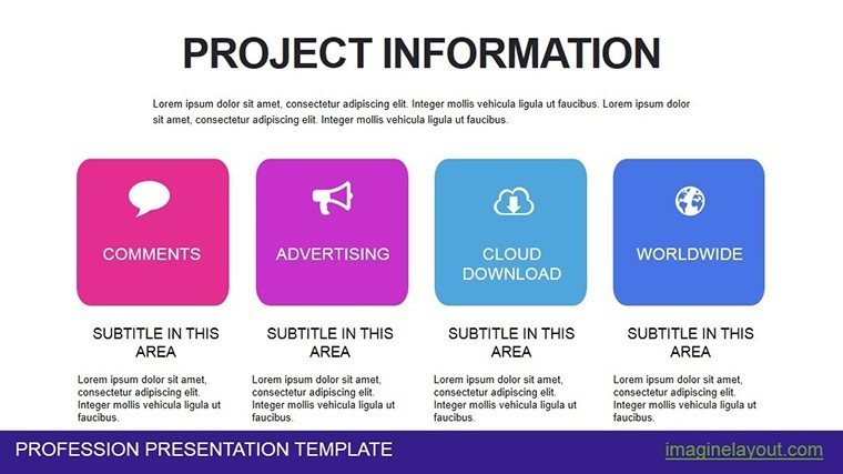
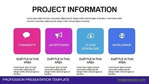
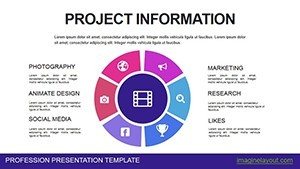
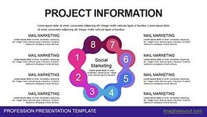
- Infographics: Visualize workflows or stakeholder impacts holistically.
Real-World Applications and Case Studies
Consider a construction firm using this template for a major build: Gantt charts outlined the timeline from foundation to completion, helping secure permits by clearly showing compliance with local regulations. In a tech startup, bar charts compared feature development costs, aiding investor pitches that resulted in additional funding. A nonprofit leveraged line charts to demonstrate impact metrics over time, boosting donor engagement during annual reports. These examples, grounded in real practices from industries like engineering and finance, show how the template adapts to diverse needs. For instance, aligning with ISO 21500 standards for project management ensures your visuals support certified processes, adding credibility.
Customization Tips for Maximum Impact
To get the most out of this template, start by importing your data via Excel links for automatic updates. Experiment with color palettes to evoke emotions - blues for trust in financial slides, greens for growth in progress reports. Add subtle animations to reveal data points sequentially, keeping the audience engaged without distraction. Test on different devices to ensure compatibility, and always include alt text for images to improve accessibility. These tips, drawn from years of presentation design experience, help you create slides that not only inform but inspire action.
Seamless Integration into Your Workflow
Incorporate this template effortlessly with tools like Microsoft Teams for collaborative editing or SharePoint for version control. It's also exportable to PDF for handouts, maintaining quality. For advanced users, embed hyperlinks to external resources, turning slides into interactive hubs. This integration supports hybrid work environments, where clear visuals are key to remote communication success.
Elevate your project storytelling today with this indispensable template - download and start transforming data into decisions.
Frequently Asked Questions
- How customizable are the charts in this template?
- All charts are fully editable, allowing changes to data, colors, and layouts to fit your project needs.
- Is this template compatible with Google Slides?
- Yes, it works seamlessly with Google Slides and all PowerPoint versions for versatile use.
- Can I use this for non-project presentations?
- Absolutely, adapt it for any data-driven scenario, from financial reports to academic analyses.
- What if I need more slides?
- The template's design allows easy duplication and modification to expand as needed.
- Are there animation options included?
- Basic animations are built-in, with room to add more for dynamic presentations.