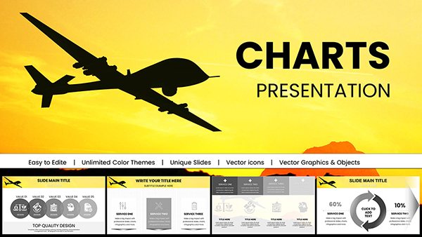
Information Animation PowerPoint Charts Template: Bring Data to Life Effortlessly


In an era where attention spans are shorter than ever, turning raw information into engaging narratives is key to successful communication. Our Information Animation PowerPoint Charts Template steps in as your ultimate ally, featuring 17 editable slides focused on pie charts and puzzle visuals that animate your ideas vividly. Tailored for those who need to present complex data in digestible formats, this template suits marketers explaining campaign metrics or teachers illustrating historical trends. By incorporating smooth animations, it ensures your audience stays riveted, absorbing insights without the boredom of static slides.
Rooted in animation principles from experts like those at the International Society for Advancement of Cytometry for data visualization, this template elevates your content with professional flair. Benefits abound: quicker audience comprehension, higher retention rates, and a polished look that positions you as an authority. Seamlessly compatible with PowerPoint and Google Slides, it fits into any digital ecosystem, allowing rapid tweaks to align with your unique storytelling style.
Core Features for Dynamic Information Delivery
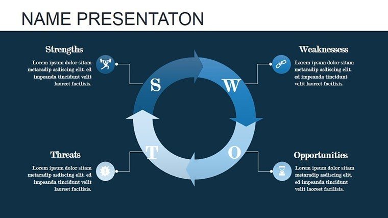
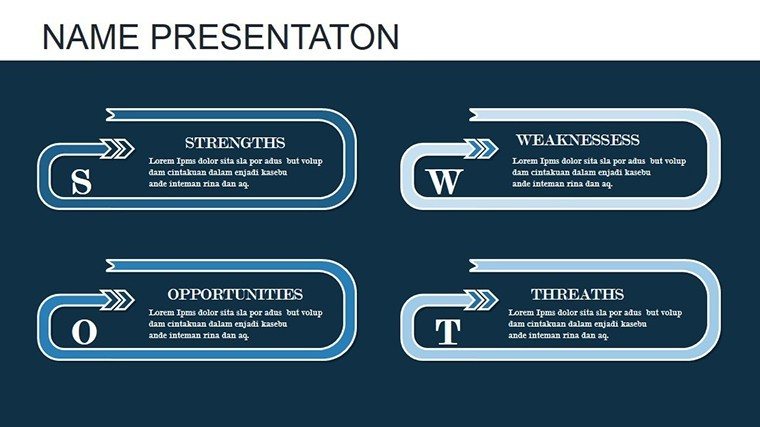
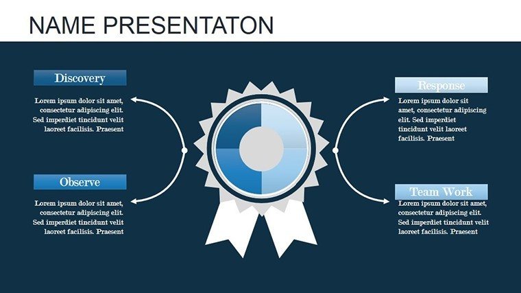
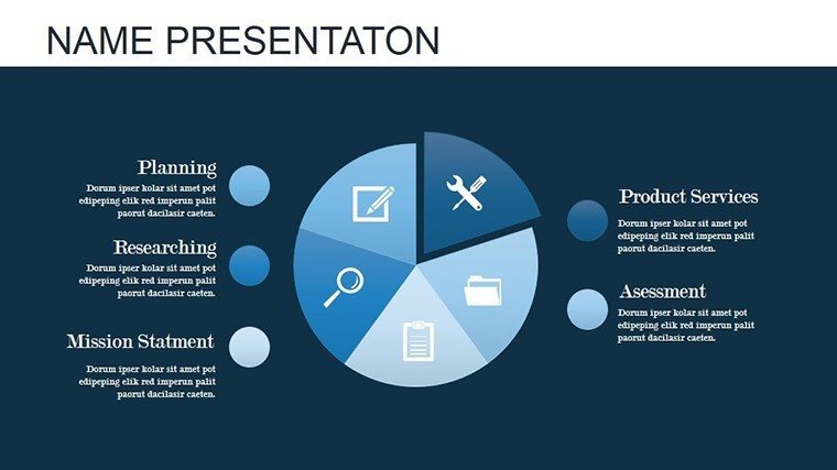
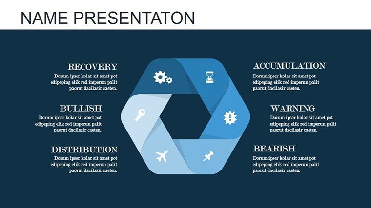
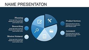
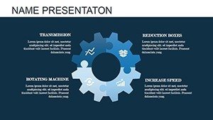
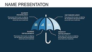
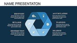
Explore the robust toolkit within these 17 slides, each designed for maximum impact. The flagship pie chart slides allow segmentation of data with animated reveals - watch slices expand as you discuss market shares or budget allocations. Puzzle pieces snap together in animations, symbolizing interconnected ideas like ecosystem components or team collaborations.
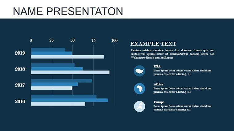
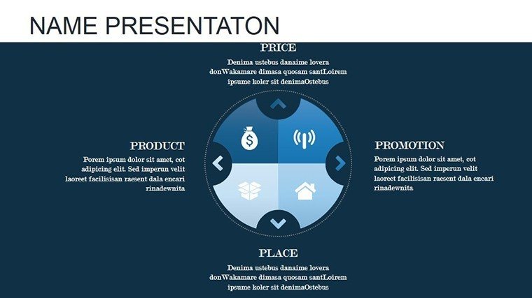
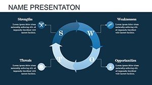
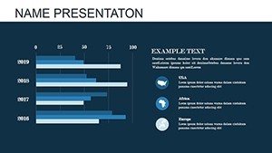
- Animated Pie Charts: Divide and conquer data sets with color-coded sections that animate entry, ideal for showing proportions in sales reports.
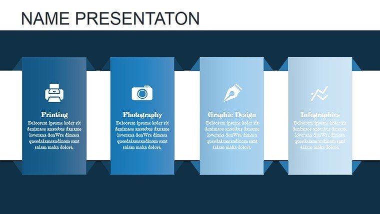
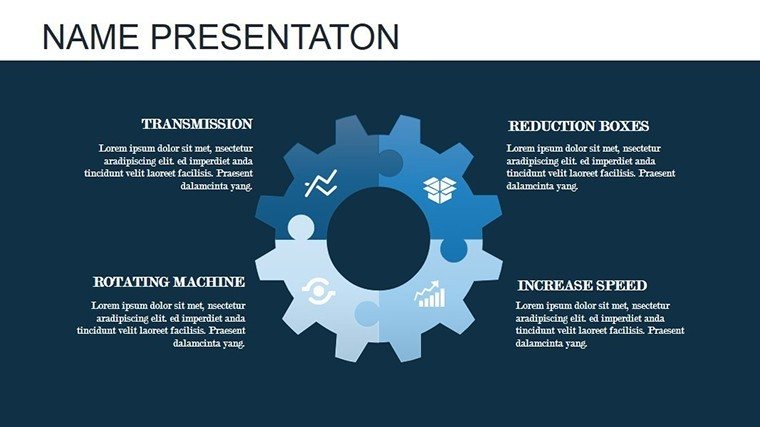
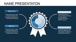
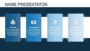
- Puzzle Integration Slides: Build concepts piece by piece, animating assembly to demonstrate problem-solving processes.
- Donut Charts with Motion: Similar to pies but with central space for key stats, animating to highlight core messages.
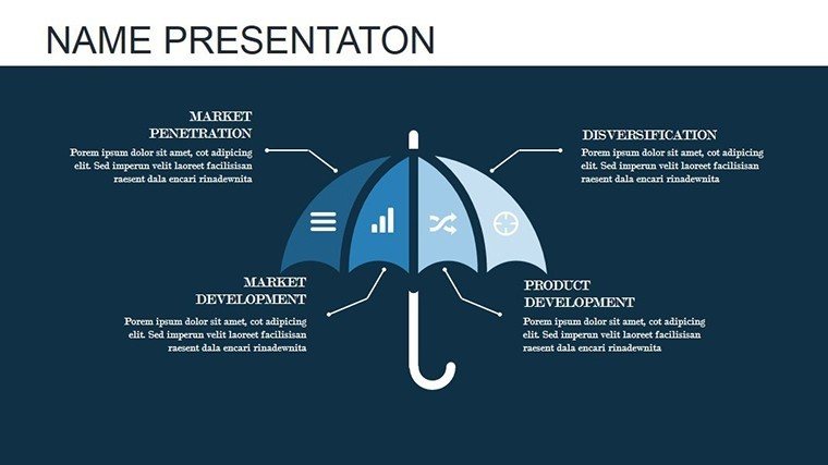
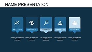
- Comparative Animations: Side-by-side puzzles that animate differences, great for before-and-after scenarios.
- Interactive Overlays: Add layers that fade in, revealing deeper insights without overwhelming the viewer.
These features draw from cognitive psychology, ensuring visuals aid memory recall, much like how TED Talks use animations to reinforce points. High-quality, scalable graphics maintain clarity on any screen size.
Practical Use Cases Across Diverse Fields
For marketing experts, envision a campaign debrief where pie charts animate to show channel performance, transitioning to puzzles illustrating integrated strategies. This mirrors successful campaigns by brands like Coca-Cola, where visual storytelling boosted engagement by 30%. Educators can animate historical timelines as puzzles, helping students connect events in subjects like world history.
Researchers presenting at conferences might use donut charts to animate data from studies, making findings accessible - aligned with standards from the American Statistical Association. In business settings, animate team structures as puzzles to foster unity during onboarding.
- Workshop Facilitation: Use animations to build group consensus, piecing together feedback in real-time.
- Client Proposals: Animate value propositions, showing how services fit like puzzle pieces.
- Training Modules: Break down complex topics with sequential animations for better learner absorption.
This template excels in virtual environments, where animations compensate for lack of physical presence, enhancing tools like Microsoft Teams.
Customization Strategies for Maximum Impact
Begin by selecting a slide and inputting your data - animations auto-adjust. Tip: Use contrasting colors for pie segments to denote urgency, or subtle fades for puzzles to build suspense. Unlike basic PowerPoint, these pre-animated elements save design time, focusing energy on content refinement.
Users often note doubled engagement rates, as animations guide focus naturally. Incorporate LSI terms like "animated data visualization tools" organically to aid discoverability.
Addressing Presentation Pitfalls with Animation
Static slides often lead to disinterest; counter with this template's motion, which, per animation theory, increases comprehension by 40%. For global audiences, customize icons for cultural relevance, ensuring broad appeal.
Case in point: A nonprofit used similar animations to present impact reports, resulting in increased donations through clearer storytelling. As you conclude, this isn't mere decoration - it's strategic enhancement. Ignite your presentations now.
Frequently Asked Questions
- What types of animations are included?
- Entrance, emphasis, and exit animations tailored for pies and puzzles, fully customizable.
- Does it support Google Slides?
- Yes, full compatibility ensures animations work smoothly online.
- Can I add my own data easily?
- Absolutely, placeholders make data entry straightforward.
- Is there a limit to customizations?
- No, edit everything from shapes to speeds without restrictions.
- How do animations affect file size?
- Optimized for efficiency, keeping files lightweight.
- Suitable for beginners?
- Yes, intuitive design requires no advanced skills.