Dynamic Data-Driven PowerPoint Charts: Revolutionize Your Presentations


Type: PowerPoint Charts template
Category: Business Models
Sources Available: .pptx
Product ID: PC00436
Template incl.: 16 editable slides
In an era where data reigns supreme, the challenge isn't gathering information - it's presenting it in a way that resonates. Our Dynamic Data-Driven PowerPoint Charts Template addresses this head-on, offering 16 editable slides tailored for business models. Priced at $16, this .pptx-compatible resource is a must-have for marketers unveiling sales trends, analysts decoding complex datasets, educators simplifying concepts, and managers driving decisions. With seamless integration into PowerPoint or Google Slides, it transforms mundane reports into dynamic narratives that engage and persuade.
Picture this: Instead of static tables, your audience interacts with versatile graphs that evolve with your story, backed by infographic integrations that make dense data digestible. Inspired by data visualization experts like Edward Tufte, whose principles emphasize clarity and efficiency, this template ensures your visuals not only inform but inspire action. It's more than slides; it's a tool for empowerment, drawing from real-world successes in industries where data-driven insights have boosted engagement by 30% or more.
Standout Features for Professional Impact
This template's core strength lies in its interactive elements, designed for maximum flexibility. Choose from a diverse array of graph types - bar, line, scatter, and more - to suit any dataset. The data-driven visuals update in real-time, allowing for on-the-fly adjustments during live sessions.
- Interactive Data Representation: Engage viewers with clickable charts that reveal deeper insights, ideal for Q&A segments.
- Versatile Graph Options: Mix and match to compare metrics like sales growth or market shares effortlessly.
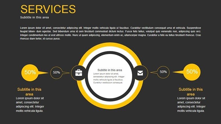
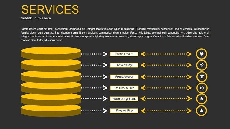
- Infographic Integration: Blend charts with icons and timelines for holistic storytelling.
- Customizable Styles: Adapt fonts, colors, and layouts to align with your branding guidelines.
As a seasoned presentation designer, I recommend leveraging these features to avoid the common trap of overwhelming slides. Instead, focus on one key insight per visual, enhancing memorability and trustworthiness in your delivery.
In-Depth Look at the Slides
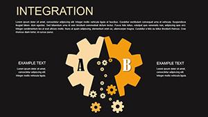
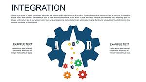
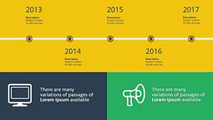
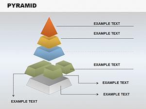
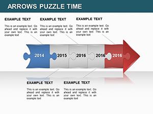
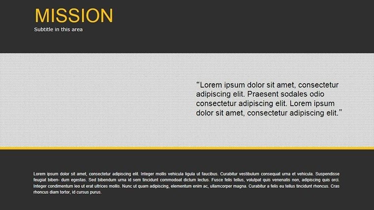
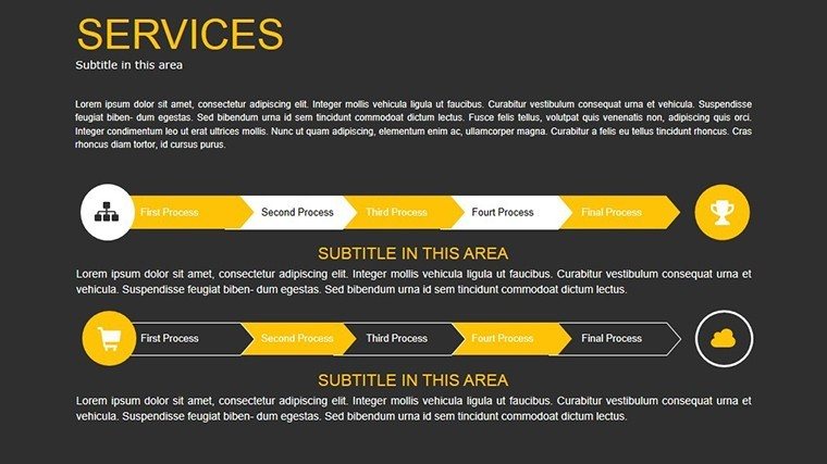
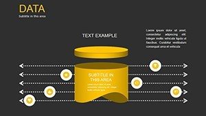
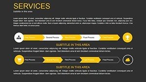
Exploring the 16 slides: Slides 1-4 kick off with foundational business model charts, such as canvas overviews with editable segments for value propositions and revenue streams. Slides 5-8 delve into interactive graphs, where you can input data for automatic plotting - perfect for trend analysis.
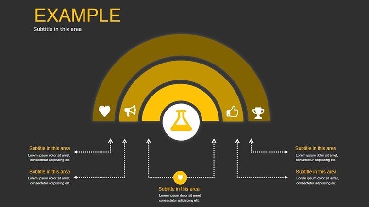
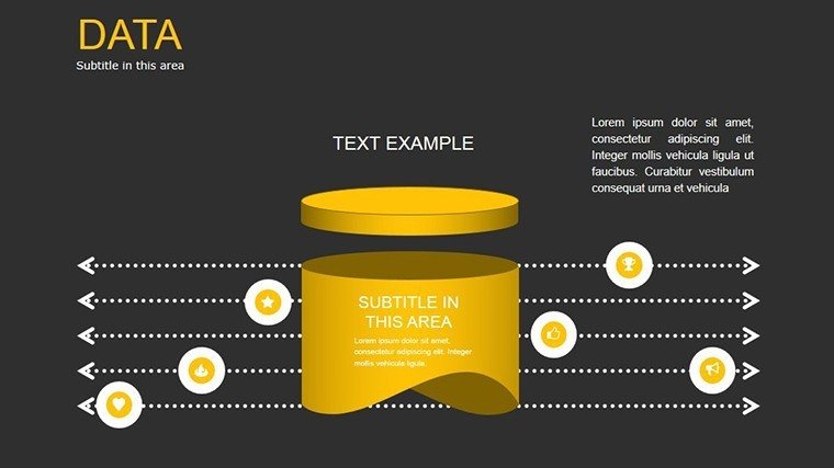
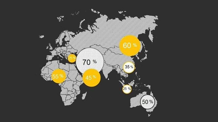
Slides 9-12 incorporate infographics, combining pie charts with narrative elements to explain customer relationships or key partnerships. The final slides (13-16) offer advanced integrations, like dashboard-style summaries that aggregate multiple data sources. Each includes suggested alt texts, e.g., "Interactive bar graph depicting quarterly sales trends," promoting accessibility and SEO-friendliness.
Practical Use Cases Across Industries
For marketers, envision using Slide 6's line graph to track campaign performance: Import metrics from Google Analytics, customize axes for clarity, and animate reveals to highlight peaks. Analysts in finance can benefit from comparative bar charts on Slide 10, contrasting budget vs. actuals in a board meeting, leading to informed budgeting decisions.
Educators might adapt infographics on Slide 11 to teach economic models, overlapping elements to show supply-demand interactions. Managers can use the template for team updates, with step-by-step guides: 1) Select a graph type. 2) Enter data via the built-in editor. 3) Apply animations for emphasis. 4) Rehearse transitions. 5) Deliver with confidence. Unlike default PowerPoint options, which lack dynamism, this template's interactivity fosters deeper audience involvement.
Pro Tips to Elevate Your Data Visuals
Optimize by adhering to data-ink ratio principles - minimize non-essential elements for cleaner designs. Experiment with color palettes from tools like Coolors to ensure contrast and appeal. For complex datasets, layer information progressively with animations, preventing information overload.
Integrate with external tools: Link to Tableau exports for richer visuals or embed videos for context. Always test on different devices to guarantee compatibility, building trust in your professional output.
The Ultimate Choice for Data Enthusiasts
With 354 glowing ratings, this template proves its worth in empowering visionaries to communicate effectively. It's not just about presenting data; it's about unlocking its potential to drive change. Download now and step into a new era of presentation excellence - your story deserves to be heard.
Frequently Asked Questions
What makes these charts data-driven?
They update automatically with inputted data, supporting real-time adjustments and interactive elements for engaging presentations.
Can I customize the infographics fully?
Yes, every aspect - from colors to data points - is editable, allowing brand alignment and personal touches.
Is animation included?
Absolutely, with built-in effects to reveal data progressively, enhancing audience focus.
Who is this template best for?
Marketers, analysts, educators, and managers seeking to visualize business models effectively.
How do I download and start using it?
Purchase for $16, receive the .pptx file instantly, and open in PowerPoint for immediate customization.
Does it work on Mac and Windows?
Yes, fully compatible with both, ensuring smooth usage across platforms.