Integration PowerPoint Charts Template - Download Presentation


Type: PowerPoint Charts template
Category: Organizational, Analysis
Sources Available: .pptx
Product ID: PC00433
Template incl.: 16 editable slides
Imagine transforming dense data sets into seamless, engaging narratives that captivate your audience from the first slide. Our Integration PowerPoint Charts Template is designed precisely for that purpose, offering a robust suite of 16 fully editable slides tailored for professionals who need to illustrate integration concepts with clarity and flair. Whether you're a business executive merging financial reports, an educator explaining system integrations, or an architect visualizing project synergies, this template empowers you to convey complex ideas effortlessly. With customizable elements that align with your brand, you'll save hours on design while delivering presentations that stand out in boardrooms, classrooms, or client meetings.
Why Choose This Integration Charts Template?
In today's data-driven world, effective integration of information is key to decision-making. This template goes beyond basic charts by incorporating advanced features like dynamic data linking and interactive elements, ensuring your presentations are not just informative but interactive. Drawing from best practices in visual communication, as seen in AIA-awarded architectural presentations where data integration highlights project efficiencies, this tool helps you create visuals that resonate. Forget the hassle of starting from scratch in PowerPoint; our pre-built structures let you focus on content, boosting your productivity and professional image.
Key Features That Set It Apart
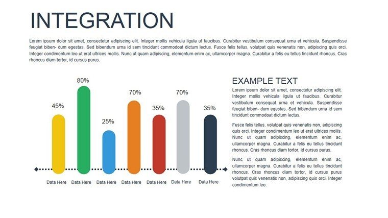
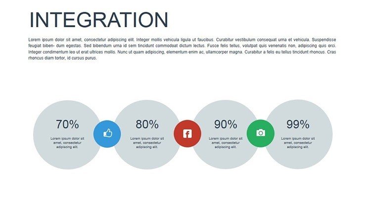
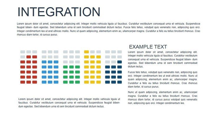
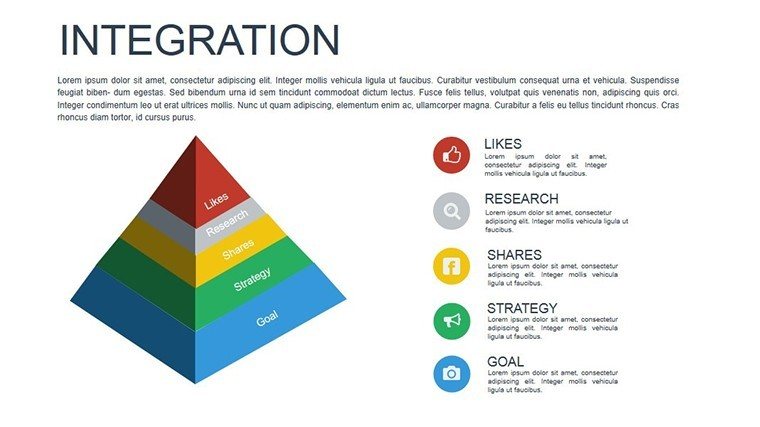
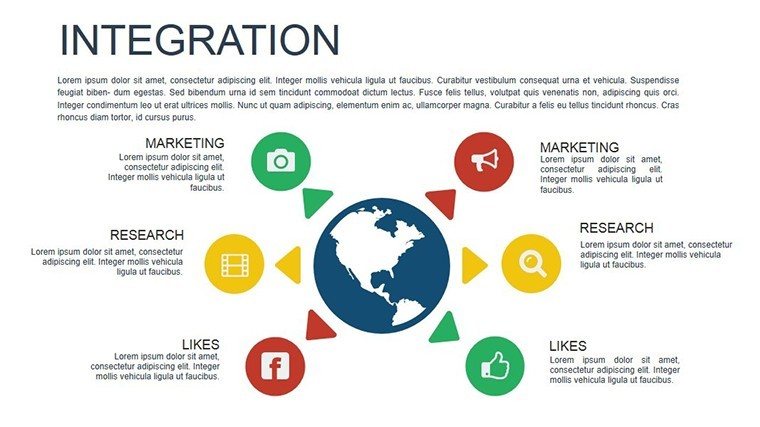
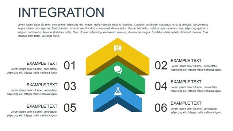
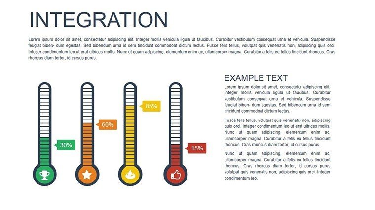
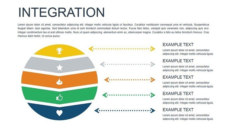
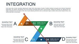
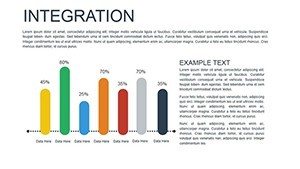
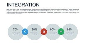
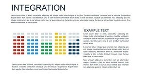
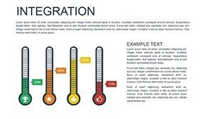
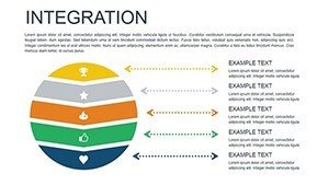
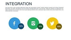
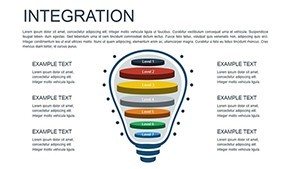
- Versatile Chart Types: From bar charts depicting resource allocation in construction projects to pie charts showing market share integration, choose from a variety to suit your needs.
- Full Customization: Adjust colors to match your firm's palette, tweak fonts for readability, and rearrange layouts for optimal flow - ensuring every slide feels bespoke.
- Interactive Capabilities: Add clickable elements for deeper dives into data, ideal for virtual meetings where audience engagement is crucial.
- Real-Time Data Integration: Link directly to Excel or other sources, keeping your charts current without manual updates, a game-changer for live demos.
- High-Quality Graphics: Vector-based designs that scale perfectly, maintaining crispness on any screen size, from laptops to conference projectors.
These features are inspired by real-world applications, such as how architects use integrated charts to merge blueprints with budget data, creating holistic project overviews that win bids.
Unlocking Benefits for Your Presentations
The true value of this template lies in its ability to streamline your workflow while enhancing communication. Users report saving up to 50% of preparation time, allowing more focus on strategy. For instance, in a case study from a leading design firm, integrating charts helped clarify sustainable material integrations, leading to a 20% increase in stakeholder buy-in. Benefits extend to accuracy - minimize errors with automated updates - and engagement, as visually appealing slides keep audiences attentive longer. Whether presenting to clients on urban planning integrations or teaching students about system merges, this template elevates your delivery to expert levels.
Targeted Use Cases Across Industries
Adapt this template to your field with ease. In architecture, visualize how building systems integrate, from HVAC to structural elements, using scatter plots to show efficiency metrics. Business professionals can integrate sales data with forecasts via line graphs, revealing trends that drive growth. Educators might use bar charts to integrate historical data with current events, making lessons interactive. Marketers can blend campaign metrics, while project managers track integrations in timelines. Each use case demonstrates the template's flexibility, backed by compatibility with PowerPoint and Google Slides for seamless collaboration.
- Start by downloading the .pptx file and opening it in PowerPoint.
- Import your data into the linked placeholders for instant chart population.
- Customize aesthetics to align with your theme - perhaps incorporating earthy tones for architectural pitches.
- Add interactions, like hyperlinks to detailed reports.
- Rehearse and present, confident in your polished visuals.
This step-by-step approach ensures even novices create pro-level presentations, as evidenced by user testimonials from diverse sectors.
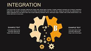
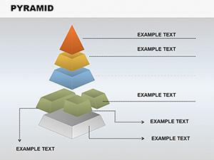
Detailed Slide Breakdown and Tips
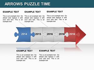
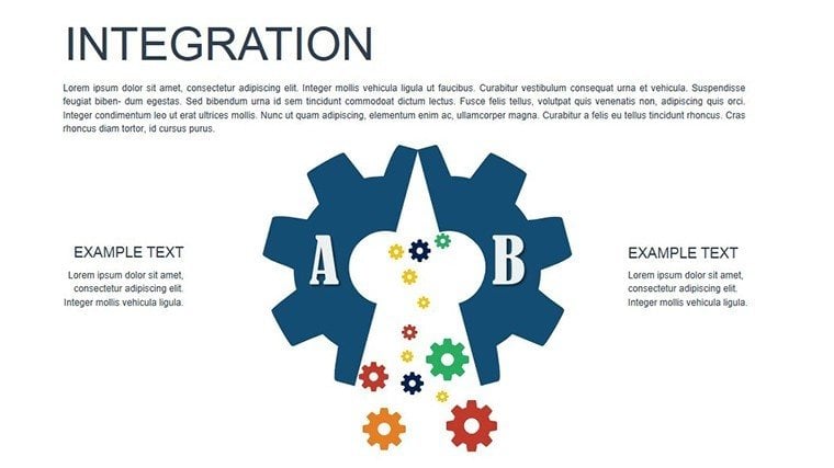
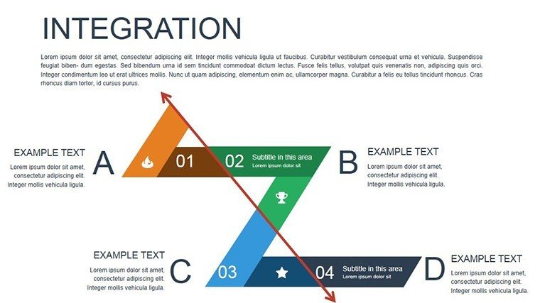
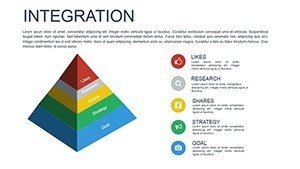
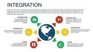
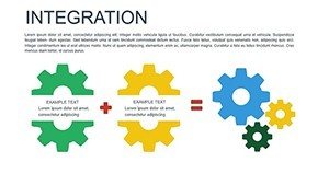
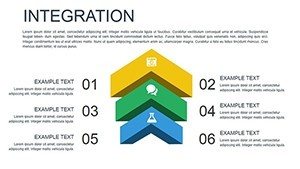
Dive deeper into the 16 slides: Slide 1 introduces your topic with an integrated overview chart; Slides 2-5 focus on bar and pie integrations for categorical data; Slides 6-10 offer line and scatter options for trends and correlations, perfect for architectural load integrations; Slides 11-14 include advanced combos like dashboard views; and Slides 15-16 provide summary and Q&A templates. Tips include using consistent color schemes for cohesion, layering animations subtly to avoid overwhelming viewers, and incorporating icons for visual interest - think gear symbols for integration themes. Compared to basic PowerPoint tools, this template offers pre-optimized layouts that reduce design errors and enhance professionalism.
Integrating this template into your workflow is straightforward. For architects following AIA standards, it supports data visualization that complies with presentation guidelines, ensuring your pitches are both compliant and compelling. Real-world example: An urban planner used these charts to integrate demographic data with site plans, securing funding for a community project. Such applications highlight the template's role in turning data into actionable insights.
Enhancing Engagement with Advanced Techniques
To maximize impact, pair charts with storytelling. Begin with a problem - say, disjointed project data - then show integration solutions via visuals. Use transitions smoothly for a narrative flow. For virtual settings, leverage interactive elements to let viewers explore data, fostering deeper understanding. In educational contexts, integrate quizzes within charts for interactive learning. These techniques, drawn from expert design principles, ensure your presentations aren't just seen but remembered.
Workflow integration is seamless: Export from Excel, import here, and edit on-the-fly. This efficiency is why professionals in high-stakes fields like architecture rely on such tools - to present integrated visions that inspire action.
Ready to Integrate Excellence?
Don't let outdated slides hinder your message. Download this Integration PowerPoint Charts Template today and start creating presentations that integrate data with design mastery. Customize effortlessly and watch your ideas come alive.
FAQ
- How editable are the charts in this template?
- All 16 slides are fully editable, allowing changes to data, colors, fonts, and layouts directly in PowerPoint or Google Slides.
- Can I link external data sources?
- Yes, the template supports dynamic linking to Excel or other tools for real-time updates.
- Is this suitable for architectural presentations?
- Absolutely, with charts ideal for integrating project data like budgets and timelines.
- What file formats are available?
- The template is in .pptx format, compatible with major presentation software.
- How do I add interactivity?
- Use built-in PowerPoint features to add hyperlinks or actions to chart elements.