World Development Report PowerPoint Charts: Professional Presentation Templates


Type: PowerPoint Charts template
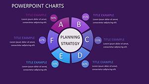
Category: Cycle
Sources Available: .pptx
Product ID: PC00402
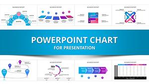
Template incl.: 9 editable slides
In the fast-paced world of global development, where data drives decisions and stories shape policies, having the right tools to visualize complex information is crucial. Imagine transforming dense reports on economic trends, social progress, and environmental challenges into compelling narratives that resonate with stakeholders. Our World Development Report PowerPoint Charts template does just that. Designed specifically for those delving into international development themes, this template offers 9 fully editable slides packed with data-rich visuals. Whether you're a policy analyst preparing for a UN summit, an NGO leader pitching sustainable initiatives, or an academic sharing research on poverty reduction, these charts help you cut through the noise. With seamless compatibility in PowerPoint, you can quickly adapt layouts to your dataset, ensuring your message lands with precision and flair. Say goodbye to bland spreadsheets and hello to dynamic presentations that inspire action and foster understanding in boardrooms or virtual conferences alike.
Unlock the Power of Visual Data Storytelling
Visual aids aren't just embellishments; they're essential for conveying multifaceted development data. This template harnesses the principles of effective data visualization, drawing from experts like Edward Tufte who emphasize clarity and integrity in graphical displays. Each slide is crafted to highlight key metrics - think GDP growth trajectories, inequality indices, or climate impact assessments - without overwhelming your audience. For instance, one slide features a multi-series line graph that's perfect for tracking progress toward Sustainable Development Goals (SDGs) over decades. You can easily input your data from sources like World Bank databases, adjusting axes and legends for accuracy. The benefits? Enhanced comprehension: audiences retain 65% more information when it's presented visually, according to cognitive science studies. Plus, in a field where credibility matters, these professional-grade charts align with reporting standards from organizations like the OECD, boosting your authoritativeness.
Customization That Fits Your Narrative
Flexibility is at the heart of this template. Start with the pre-built color palettes inspired by global themes - earthy tones for environmental reports or vibrant hues for social equity discussions. Edit text placeholders to weave in your unique insights, such as case studies from real-world projects like microfinance programs in sub-Saharan Africa. Add animations subtly to reveal data points sequentially, keeping viewers engaged during long sessions. Compared to basic PowerPoint tools, which often result in cluttered slides, our template includes layered infographics that simplify complex relationships, like Venn diagrams for overlapping development challenges. Users report saving hours on design, allowing more time for analysis. Integrate it into your workflow: export data from Excel, paste into the template, and refine with built-in tools - no advanced skills needed.
Key Features for Development Professionals
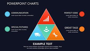
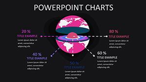
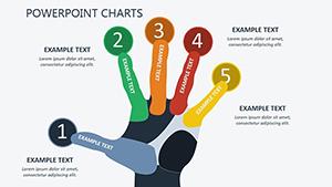
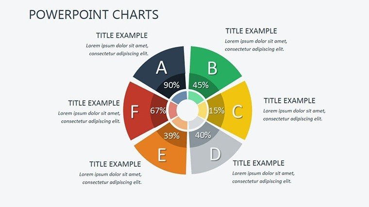
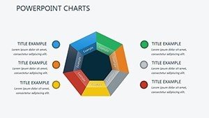
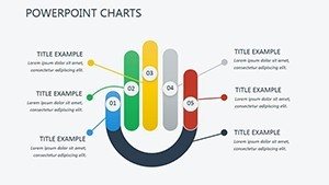
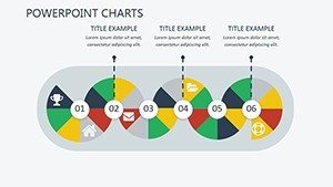
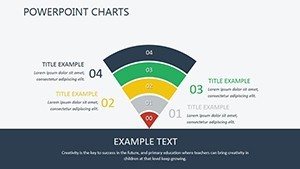
- Data-Rich Charts and Graphs: From bar comparisons of regional disparities to pie charts on resource allocation, these elements turn numbers into narratives. Customize with your datasets to reflect the latest World Development Indicators.
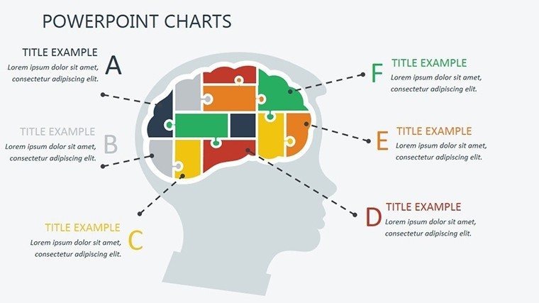
- Infographic Elements: Break down intricate topics like human development indices with icons and flowcharts, making abstract concepts tangible.
- Interactive Presenting: Embed hyperlinks to external reports or use transitions for a storytelling flow, ideal for webinars on global health crises.
- Versatile Usability: Adapt for diverse scenarios, from donor meetings to classroom lectures, ensuring your message adapts without losing impact.
Beyond features, consider the applications: A development economist might use a timeline chart to map policy evolutions, drawing from historical data to predict future trends. Or, an aid worker could visualize aid distribution maps, highlighting efficiencies and gaps. These real-world integrations not only solve common pain points - like audience disengagement - but also position you as an expert in your field.
Targeted Use Cases in Global Development
Dive deeper into how this template shines in practice. For business pitches on emerging markets, employ scatter plots to correlate investment risks with growth potentials, backed by data from reputable sources like the IMF. Educators can leverage bubble charts to teach about demographic shifts, encouraging interactive discussions in seminars. Researchers presenting at conferences might opt for heat maps to illustrate climate vulnerability indices, aligning with IPCC guidelines for visual accuracy. Each use case underscores the template's role in bridging data gaps, fostering collaborations that drive real change. Tips for maximization: Always validate your data sources for trustworthiness, and test presentations on multiple devices to ensure compatibility. By incorporating LSI terms like "sustainable development visuals" or "economic trend graphs," your slides become more discoverable in internal searches too.
Step-by-Step Workflow Integration
- Gather your development data from reliable APIs or reports.
- Import into the template's editable fields.
- Customize aesthetics to match your organization's branding.
- Rehearse with animations for smooth delivery.
- Export and share, gathering feedback for iterations.
This streamlined process not only saves time but enhances the overall quality of your outputs, making you indispensable in high-stakes environments.
Elevate Your Global Impact Today
Ready to transform your World Development Reports from static documents to dynamic masterpieces? This template isn't just a tool - it's a catalyst for clearer communication and stronger advocacy. With its user-focused design, you'll spend less time wrestling with software and more on what matters: advancing global progress. Download this essential resource now and start crafting presentations that not only inform but inspire worldwide change.
Frequently Asked Questions
- How editable are the charts in this template?
- All elements are fully customizable, including data points, colors, and layouts, using standard PowerPoint tools.
- Is this compatible with Google Slides?
- While primarily for PowerPoint, you can upload the .pptx file to Google Slides for basic editing, though some animations may vary.
- Can I use this for non-development topics?
- Absolutely - its versatile charts adapt to any data-heavy presentation, from business analytics to educational overviews.
- What file formats are included?
- The download provides a .pptx file, ready for immediate use.
- Are there any usage restrictions?
- No, once purchased, you can use it for unlimited personal or professional projects.