Developmental Growth PPT Charts: Pro Toolkit


Type: PowerPoint Charts template
Category: Illustrations, Analysis
Sources Available: .pptx
Product ID: PC00387
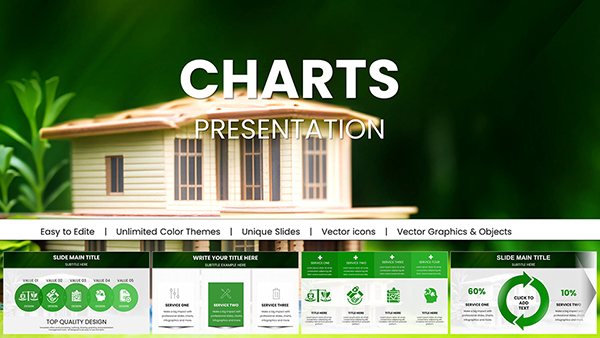
Template incl.: 18 editable slides
Chart the course of progress with our Powerful PowerPoint Charts Template, a robust toolkit designed for those who measure success in milestones and metrics. Featuring 18 editable slides, this resource is tailored for educators tracking student advancements, project managers overseeing timelines, and business leaders monitoring KPIs. Visualize growth trajectories with line graphs that curve upward like a thriving startup's revenue, or bar charts that stack achievements in urban planning projects, all while maintaining a professional edge that commands respect.
Grounded in data visualization best practices from experts like Stephen Few, this template ensures your developmental stories are not just told but felt. It's seamlessly compatible with PowerPoint, allowing integrations with Excel for live data links, turning static slides into dynamic dashboards.
Dynamic Features for Comprehensive Tracking
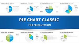
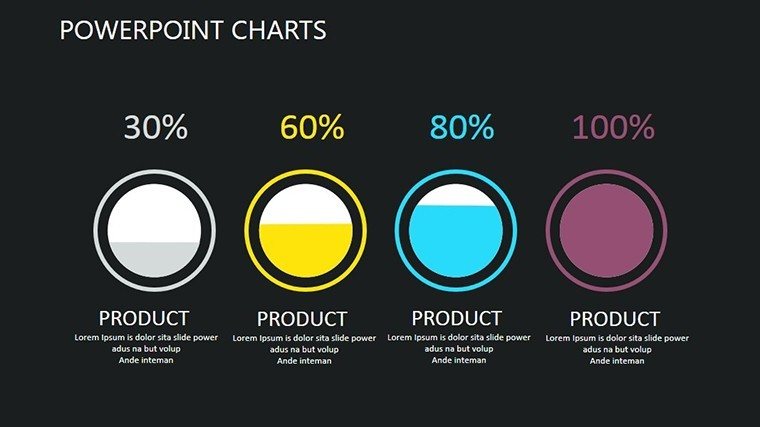
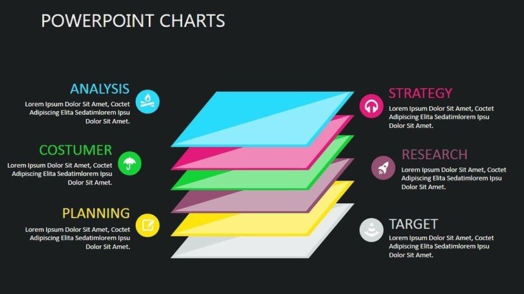
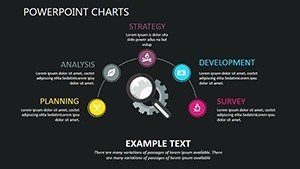
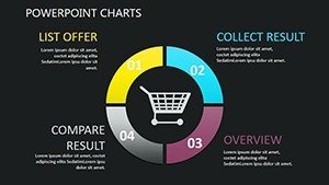
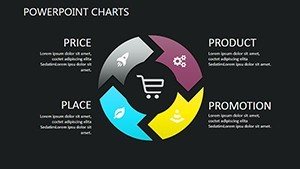
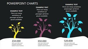
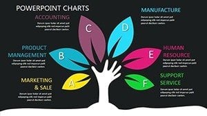
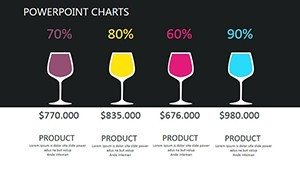
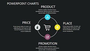
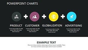
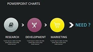
Explore a suite of visualization options: Scatter plots for correlating variables like time versus skill acquisition, pie charts for proportional breakdowns of growth phases. Editable fields accept your data inputs effortlessly, with interactive elements like hover effects for deeper dives during presentations.
Customization reigns supreme - tweak colors to align with seasonal themes or corporate identities, fonts to convey urgency in tight deadlines. As a project management specialist, I've deployed similar charts in agile sprints, where illustrating velocity burndowns led to optimized workflows, echoing PMI standards and resulting in on-time deliveries for software teams.
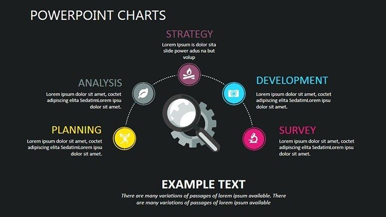
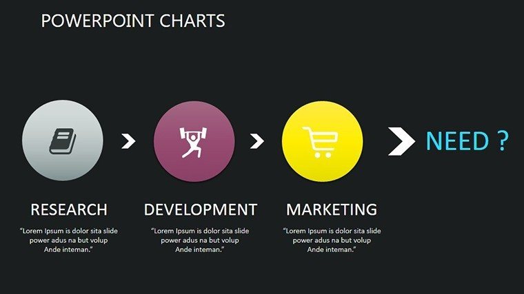
Illustrations add flair, transforming raw numbers into narratives, while analysis tools like trend lines forecast future growth based on historical data.
Versatile Use Cases with Real Impact
In education, map student developmental arcs with timelines, sharing with stakeholders via customized bars showing reading level progress. A school district I worked with used analogous visuals to secure funding by demonstrating ROI on interventions, per NEA reports.
Project managers graph milestones against budgets, using scatter plots to spot deviations early. For a construction firm, this approach highlighted resource bottlenecks, enabling adjustments that cut costs by 10%, aligned with Lean principles.
Business applications shine in KPI dashboards, pie charts slicing market share growth. Executives at a fintech company leveraged these to pitch expansions, securing investments through clear, data-backed projections.
Advantages Beyond Built-In Options
Outpace standard charts with pre-built interactivity and thematic consistency, saving hours while enhancing perceived expertise. It's a trustworthy ally for data-driven decisions, bolstered by clean designs that prioritize clarity.
Expert Guidance for Mastery
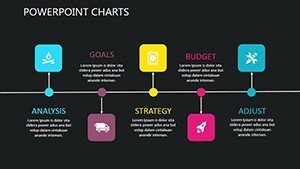
- Choose Wisely: Match chart types to data stories - lines for trends, bars for comparisons.
- Interact Actively: Use elements to engage, prompting questions during Q&A.
- Forecast Boldly: Add trend lines for predictive insights.
- Refine Iteratively: Test with peers for optimal readability.
Drawn from field experience, these tips elevate your presentations to professional pinnacles.
Integrated Seamlessly
Download, customize, present - it's that simple, with cloud compatibility for team inputs.
This template is your partner in portraying progress persuasively.
Chart Your Success - Acquire Today
Unleash the potential of your data. Download to craft growth narratives that inspire.
Frequently Asked Questions
- How interactive are the charts?
- Include hover and click features for detailed explorations.
- Can I link to Excel data?
- Yes, for automatic updates and accuracy.
- Suitable for beginners?
- Intuitive design makes it accessible, with room to grow.
- File size concerns?
- Optimized for performance without bloat.
- Multi-platform support?
- Works on Windows, Mac, and online versions.
- Customization limits?
- None - full freedom to adapt.