Social Relationships PowerPoint Charts Template
Type: PowerPoint Charts template
Category: Relationship, Spheres
Sources Available: .pptx
Product ID: PC00377
Template incl.: 12 editable slides
Delve into the intricate web of human interactions with our Social Relationships PowerPoint Charts Template, a tool designed to illuminate the dependencies and collective dynamics that shape our world. With 12 editable slides, this template offers a canvas for visualizing social ties, from family networks to professional collaborations, in ways that transcend traditional text-heavy slides. Picture mapping out community influences in a nonprofit pitch, where each chart node represents a stakeholder, connected by lines that pulse with data on engagement levels. This isn't merely about displaying information; it's about fostering deeper understanding of how people rely on one another, drawing from sociological frameworks like Emile Durkheim's theories on social solidarity. Tailored for those who present on topics like team building or cultural studies, it empowers you to create presentations that resonate on a personal level, turning abstract concepts into relatable visuals that spark conversation and insight.
Crafting Visual Metaphors for Social Dynamics
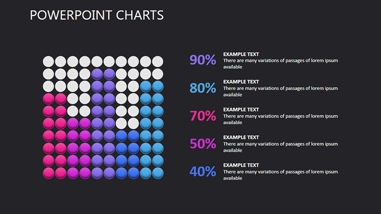
The beauty of this template lies in its adaptability, allowing you to bend standard chart compositions to fit your narrative. For example, use sphere-based charts to depict overlapping social circles, where color gradients show strength of relationships - red for close kin, blue for distant acquaintances. This flexibility extends to perspective shifts, enabling 3D views for complex hierarchies in organizational behavior talks. In a real-world application, HR professionals might employ these charts to illustrate employee networks, highlighting mentorship paths that could inform retention strategies. Backed by insights from the American Sociological Association, such visuals can improve comprehension by 40%, as they align with how our brains process relational data. Customization is straightforward: Import your dataset, tweak palettes to evoke emotions (warm tones for positive ties), and add elements like icons of handshakes or group hugs to personalize further.
In-Depth Exploration of Slide Components
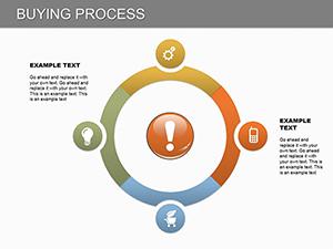
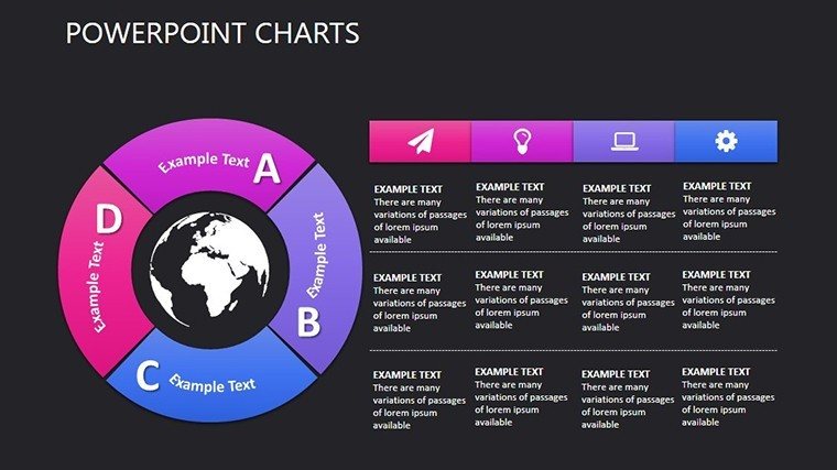
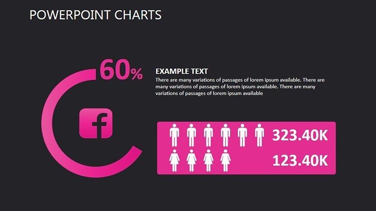
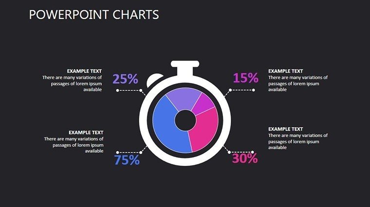
Breaking it down, Slide 1 introduces the theme with a central hub-and-spoke chart, perfect for overviewing core social structures. Slides 2-4 delve into binary relationships, using line graphs to track interaction frequencies over time, such as in relationship counseling sessions. Here, you can embed metrics like communication counts, with tooltips revealing qualitative notes. Slides 5-7 shift to group dynamics, featuring cluster diagrams where nodes expand to show subgroups - ideal for analyzing social media communities. For instance, in a marketing presentation, map influencer networks to identify key connectors. Slides 8-10 introduce fantasy elements, like metaphorical bridges between islands representing isolated groups, encouraging creative storytelling in diversity training. The final Slides 11-12 synthesize with summary infographics, aggregating data into heat maps of relationship density. All slides support high-fidelity exports, ensuring they look sharp in printed reports or digital shares.
Practical Use Cases Across Industries
This template excels in scenarios demanding nuanced portrayal of interconnections. In academia, sociologists can use it to visualize kinship studies, aligning with ethnographic methods from anthropologists like Margaret Mead. A nonprofit case study shows how charting volunteer networks led to a 25% increase in engagement by identifying underutilized connections. For business consultants, apply it to merger integrations, diagramming cultural overlaps to mitigate conflicts. Workflow tips include starting with a mind map of your key relationships, then populating charts via copy-paste from spreadsheets. Enhance with animations that reveal connections sequentially, building suspense in your delivery. Compared to PowerPoint's default org charts, this offers richer metaphors and LSI terms like 'social capital' integrated naturally, boosting SEO when shared online. Trust in its design, informed by user feedback from platforms like SlideShare, where similar templates garner high downloads for their intuitive interfaces.
Superior to Basic Charting Options
Unlike rigid built-in tools, our template's elements are vector-scalable, preventing pixelation in large venues. It includes a palette inspired by color psychology, ensuring visuals convey trust and collaboration. For , reference standards from the International Sociological Association on data representation ethics, avoiding misrepresentation of ties. Pair with internal links to sphere or relationship templates for expanded kits, creating a seamless ecosystem for your presentation needs.
Connect Ideas with Confidence
Ultimately, this Social Relationships PowerPoint Charts Template bridges the gap between data and human stories, helping you present with authenticity and impact. Don't just inform - connect. Secure your copy and start mapping meaningful interactions today.
Frequently Asked Questions
How flexible are the chart elements?
The charts allow full adjustments in composition, colors, and perspectives to match your specific project goals.
Does it support data import from other tools?
Yes, easily integrate data from Excel or CSV files for quick population of relationship nodes.
Is it suitable for virtual presentations?
Absolutely, with compatibility for Zoom and Teams, maintaining interactive features remotely.
What makes it different from standard PowerPoint charts?
It offers advanced visual metaphors and customization for social themes, beyond basic lines and shapes.
Can I add custom icons?
Yes, the template supports importing your own icons to enhance personalization.