Insightful Comparative Analysis PowerPoint Charts Template


Type: PowerPoint Charts template
Category: Business Models, Arrows
Sources Available: .pptx
Product ID: PC00371
Template incl.: 14 editable slides
In an era where data drives decisions, comparative analysis is the key to unlocking patterns and opportunities. Our Comparative PowerPoint Chart Template, with 14 editable slides, excels in representing spatial relationships, object interactions, and hierarchies - from basic needs to sublime aspirations. Perfect for project managers juggling timelines, business analysts dissecting models, and consultants refining strategies, this tool refines information through arrow-based diagrams and interactive charts. Grounded in principles from Abraham Maslow's hierarchy and modern project management via PMI, it helps schedule work, allocate resources, and visualize sequences amid changing deadlines. The editable nature ensures you adapt to any scenario, turning complex data into compelling stories that persuade and inform. Ditch scattered spreadsheets for cohesive visuals that elevate your presentations, fostering better understanding and faster consensus.
Essential Features for Analytical Depth
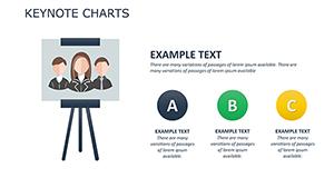
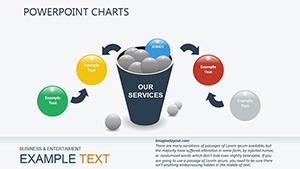
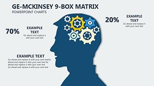
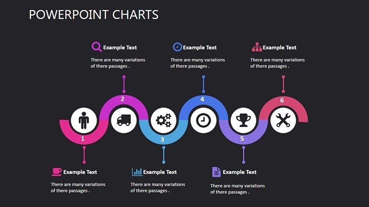
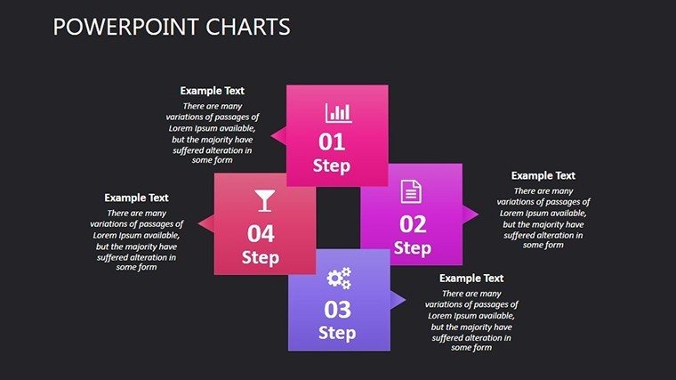
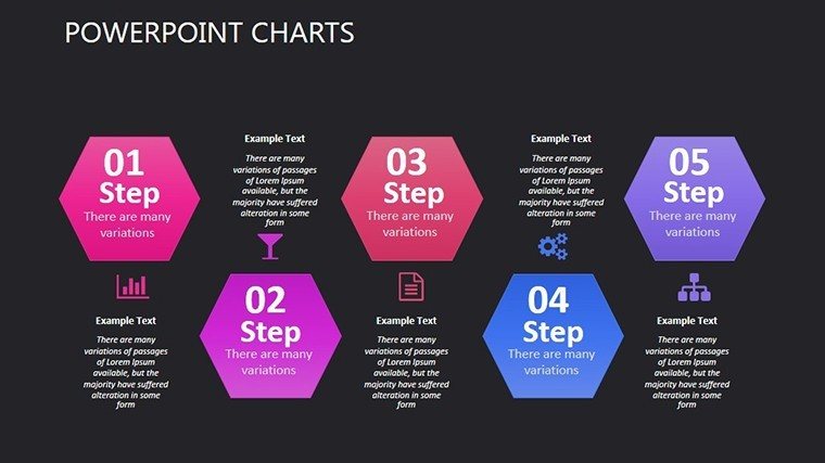
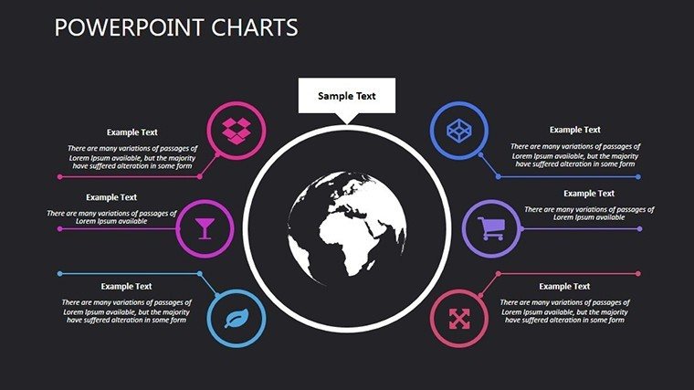
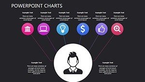
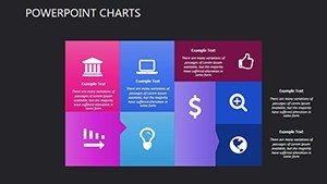
This template's charts specialize in comparisons, using arrows for flows and models for hierarchies, enabling precise depictions of interactions. A business analyst might use them to compare market segments, revealing insights per Forrester Research methodologies.
Flexible Customization for Accurate Representations
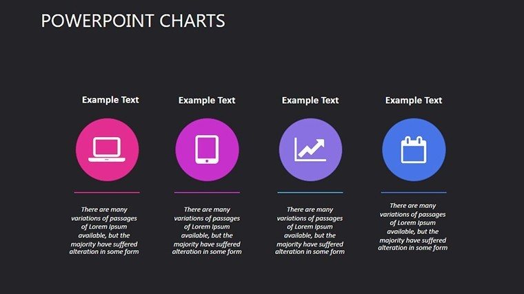
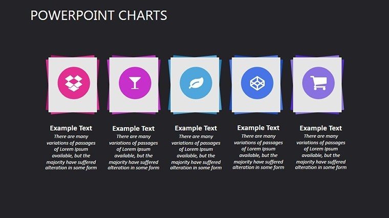
Edit objects, arrows, and layouts to match your data's nuance, ensuring every comparison is spot-on.
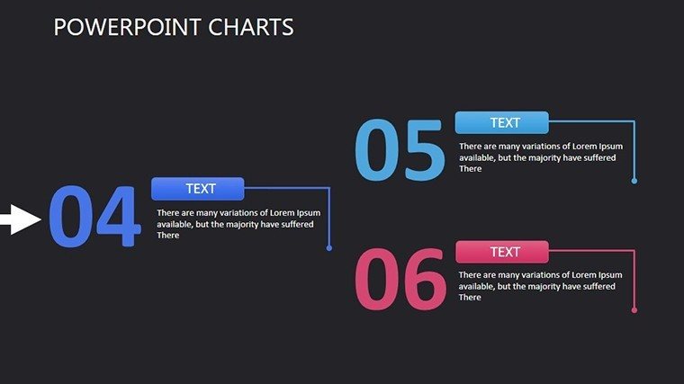
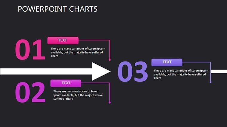
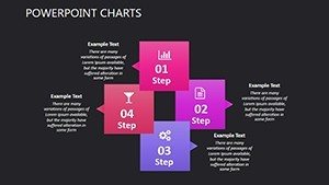
- Arrow Dynamics: Direct flows and sequences with adjustable paths.
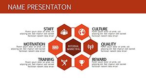
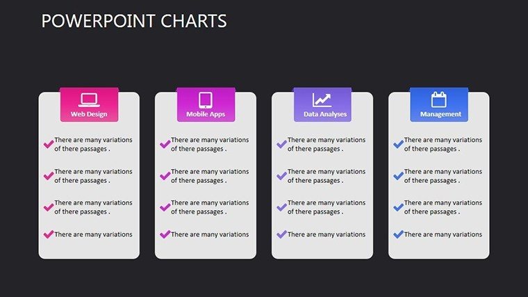
- Model Versatility: Build business hierarchies with scalable elements.
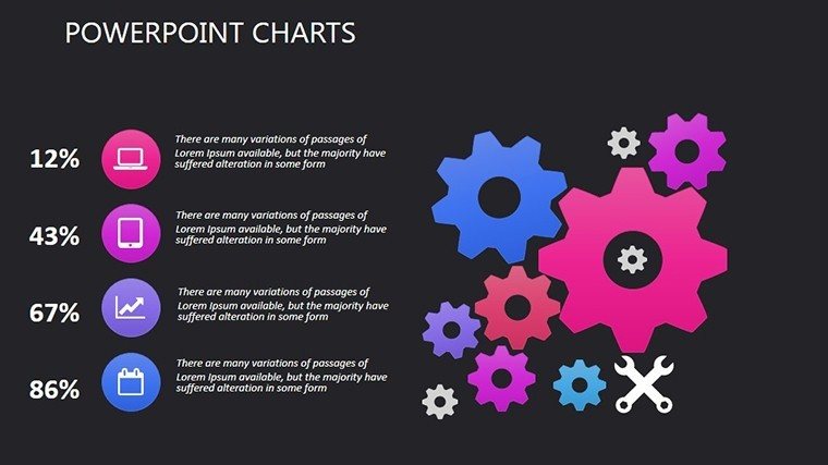
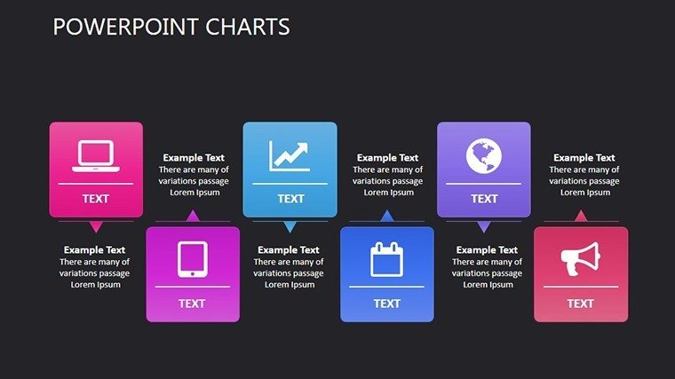
- Interaction Edits: Customize for multi-team scenarios.
Who Benefits and How
Project teams, analysts, and leaders in dynamic fields thrive with this. In agile environments, visualize deadline shifts; in strategy, compare options.
Practical Applications with Examples
A construction firm used comparative charts to allocate resources, cutting costs by 15%, akin to ASCE case studies.
- Gather data for comparison.
- Select chart types like arrows or models.
- Customize visuals and add details.
- Test for clarity in presentations.
Edge Over Conventional Charts
Surpasses basics with interactive depth and business focus, supporting complex plans effortlessly.
Analytical Expert Guidance
Incorporate Maslow's layers for motivational analyses, and use colors for emphasis per design principles.
Turn comparisons into narratives, like debating 'needs vs. wants' to engage audiences.
Compare and Conquer
Harness the power of comparison - download and analyze with precision.
Frequently Asked Questions
What makes these charts great for project management?
They handle hierarchies and sequences, ideal for scheduling and resource allocation.
Can I export to other formats?
Yes, easily to PDF or images for reports and shares.
Suitable for beginner analysts?
Yes, intuitive edits make it accessible while powerful.
How to handle large datasets?
Link to Excel for dynamic updates in charts.
Are there hierarchy examples included?
Slides feature Maslow-inspired structures for quick starts.