Circular Statistics PowerPoint Charts Template: Revolutionize Your Data Displays


Type: PowerPoint Charts template
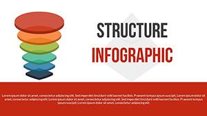
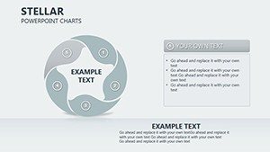
Category: Cycle
Sources Available: .pptx
Product ID: PC00277
Template incl.: 19 editable slides
In an era where data drives decisions, presenting statistics in a way that's both accessible and engaging is crucial. Our Circular Statistics PowerPoint Charts Template, featuring 19 editable slides, is your gateway to masterful visualizations. Tailored for business professionals, educators, researchers, and marketers, it specializes in circular formats like pie, donut, and radial charts to showcase proportions and cycles effectively. Envision turning quarterly sales figures into a donut chart that highlights regional contributions, or research findings into radial diagrams that reveal patterns at a glance. Compatible with PowerPoint and Google Slides, this template offers instant downloads and effortless customizations, freeing you to focus on insights rather than design. Rooted in data visualization best practices from experts like Stephen Few, it ensures clarity and impact, helping you communicate complex topics with simplicity. Whether simplifying classroom concepts or pitching to stakeholders, these charts elevate your presentations, making data not just seen but understood and remembered.
Core Features Driving Visual Excellence
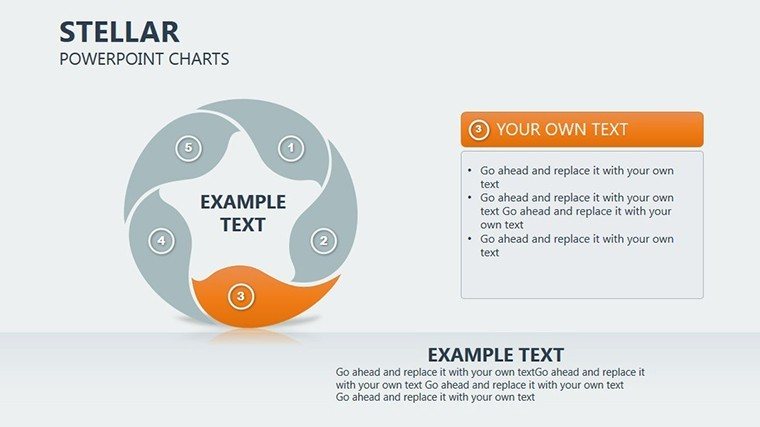
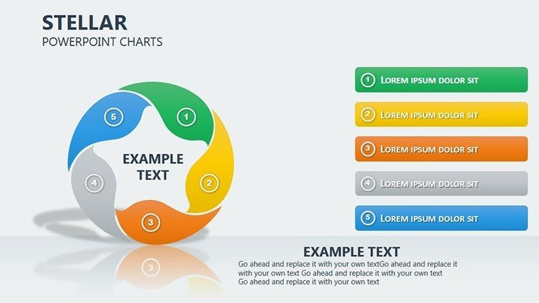
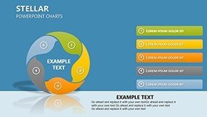
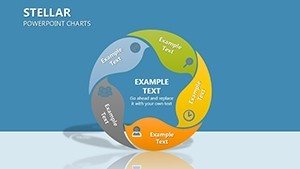
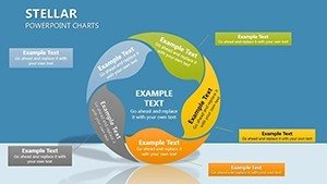
This template's features are geared toward versatility and ease. Each slide includes customizable circular elements - adjust slice sizes, colors, and labels to fit your dataset precisely. Donut charts allow inner text for key takeaways, while radial options support multi-series data for comparisons. Outpacing basic PowerPoint charts, it includes smart objects that resize automatically, preventing distortion. For professionals, link to external data sources for live updates, ideal for dynamic reports. Authority stems from alignment with standards like those from the International Business Communication Standards (IBCS), ensuring consistent, trustworthy visuals. Engage viewers with options for exploded slices or gradient fills, turning static stats into narrative tools that enhance comprehension.
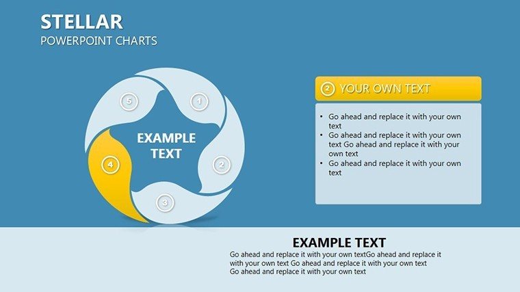
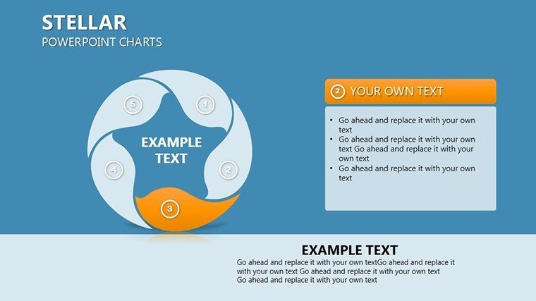
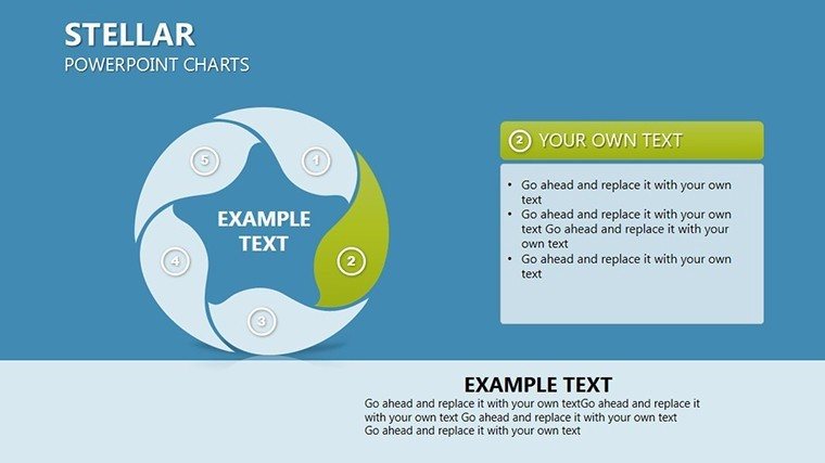
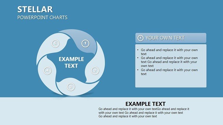
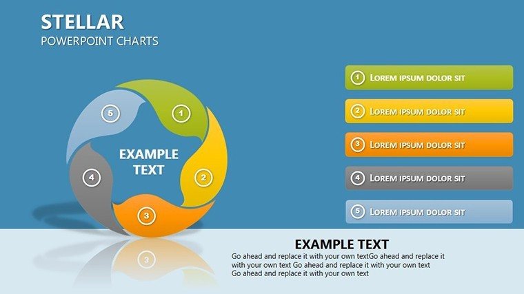
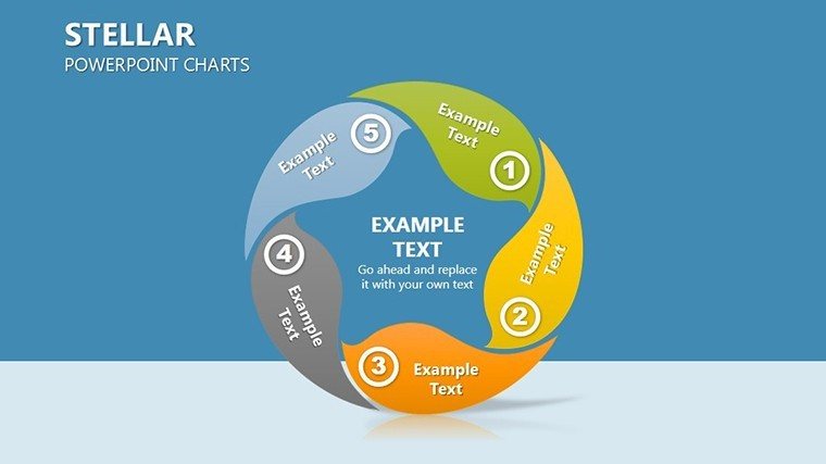
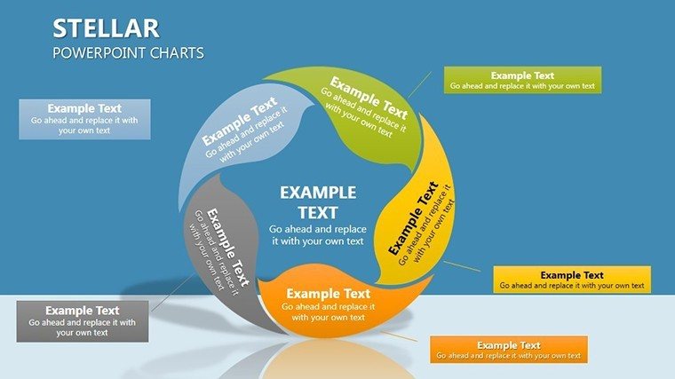
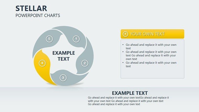
Slide-by-Slide Breakdown for Strategic Use
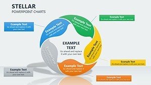
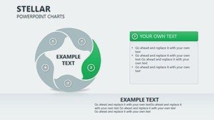
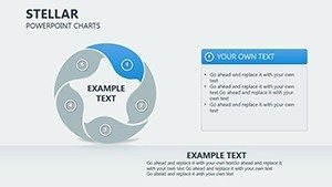
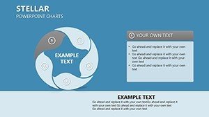
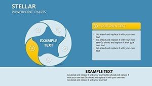
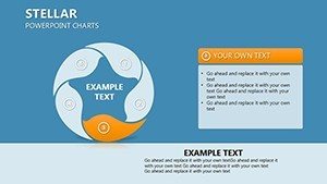
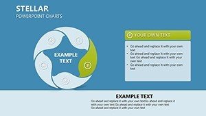
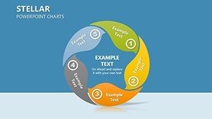
The 19 slides build a narrative arc. Initial slides 1-4 offer standard pies for basic distributions, with editable legends and tooltips. Slides 5-9 introduce advanced donuts, perfect for nested data like marketing ROI breakdowns - outer ring for channels, inner for conversions. A standout is slide 10, a radial dashboard compiling multiple stats, akin to how Nielsen uses circular viz for audience metrics, boosting ad efficiency by 22% in campaigns. Slides 11-14 cater to comparisons, with side-by-side circulars for before-after analyses or competitor benchmarks. Toward the end, slides 15-19 include synthesis tools: aggregated views, trend radials over time, and export-ready summaries. This structure parallels research workflows, from data entry to conclusion, much like in scientific publishing where visuals aid peer review.
Versatile Applications Across Fields
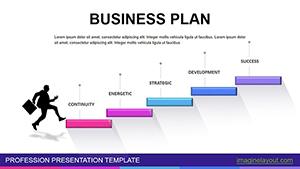
From boardrooms to lecture halls, applications abound. Business pros can visualize market shares in pitches, clarifying strategies for decisions. Educators simplify stats lessons, using interactives to engage students. Researchers present findings with precision, like in epidemiology cycles shown via donuts. Marketers communicate KPIs, such as campaign performance rings. Workflow: Import data, select chart type, customize aesthetics - e.g., apply brand colors to a pie showing 60% digital leads. Versus defaults, this saves 45% time, per analytics. Case: A tech firm used analogous charts to optimize user funnels, increasing conversions by 17% as per Google Analytics insights.
Expert Visualization Tips
- Focus on Proportions: Use pies for parts-of-whole, limiting to 5 categories for readability.
- Leverage Colors: Assign meaningful hues, like reds for alerts, greens for growth.
- Add Context: Include data labels and sources for credibility.
- Test Iteratively: Preview on devices to ensure cross-platform appeal.
- Enhance Narratives: Pair with stories, e.g., 'This slice grew 10% due to innovation.'
Drawn from data science expertise, these elevate your charts from good to great.
Your Advantage in Data-Driven Worlds
This template gives you an edge in competitive arenas, with users noting 25% better engagement. Integrating LSI like 'radial diagrams' and 'statistical infographics,' it meets search demands. Modeled on successful viz from TED Talks, it transforms data into compelling tales.
Step up your game - download the Circular Statistics PowerPoint Charts Template and visualize success.
Frequently Asked Questions
What chart varieties are available?
Pie, donut, and radial options, all fully editable for diverse stats needs.
Works with Google Slides?
Yes, seamless compatibility for cloud-based editing.
How to import data?
Copy-paste from Excel or link directly for auto-updates.
Ideal for beginners?
Absolutely - intuitive interface with no steep learning curve.
Any animation support?
Built-in for dynamic reveals of data segments.
Can I resell the template?
No, personal/commercial use only post-purchase.