Arrows Circle PowerPoint Charts Template

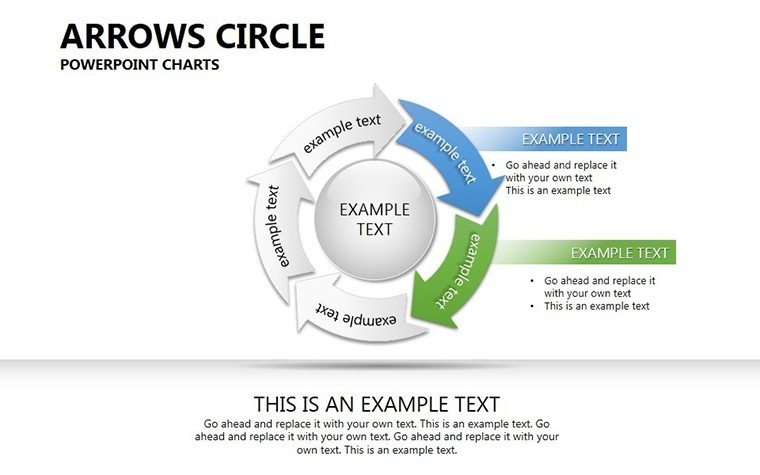


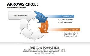
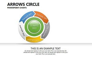
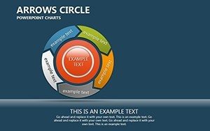

Data tells stories, but only if presented right. Our Arrows Circle PowerPoint Charts Template, featuring 25 editable slides, uses directional arrows in circular formats to clarify dependencies and comparisons. Suited for analysts, marketers, and educators, it brings cycle and pie elements to life with animations, making abstract relationships tangible. Whether comparing market shares or illustrating process loops, this template ensures your audience grasps the big picture swiftly.
Illuminating Data Dependencies Dynamically
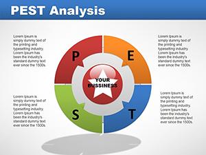
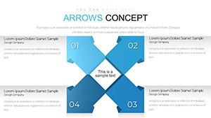
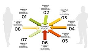
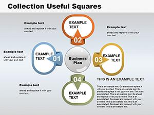
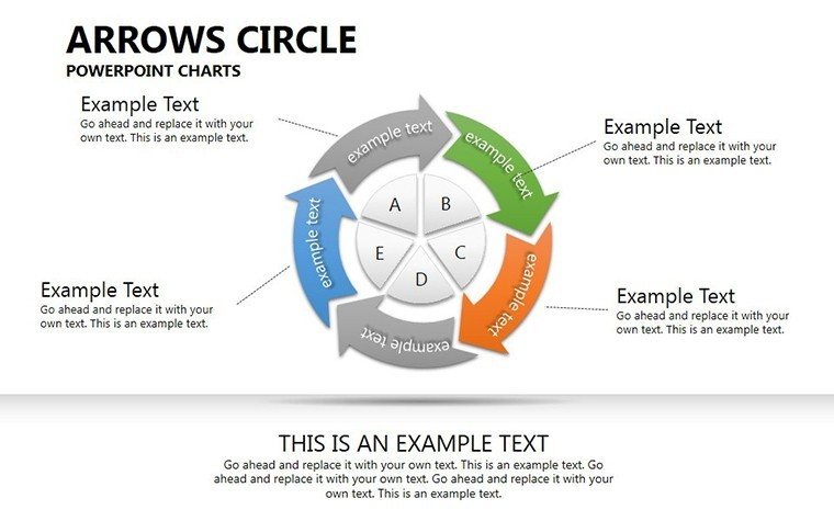
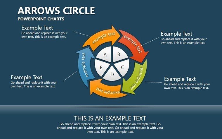
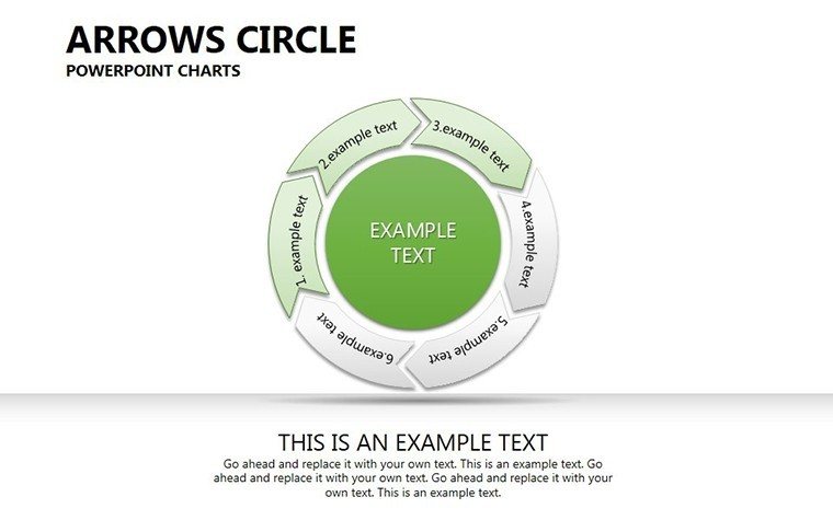
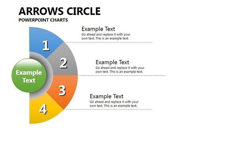
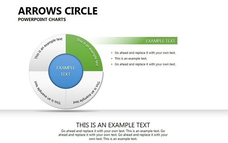
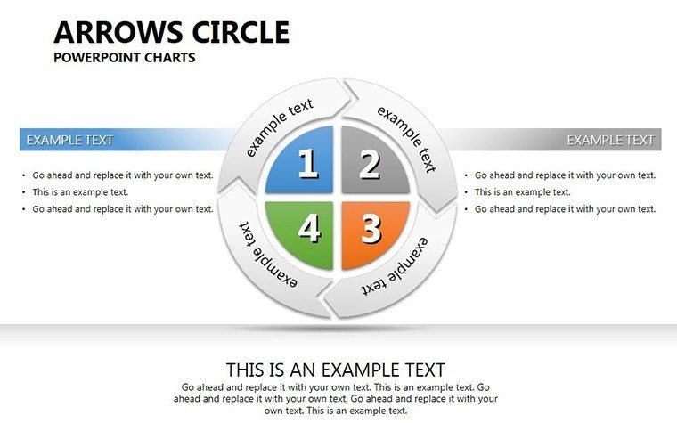
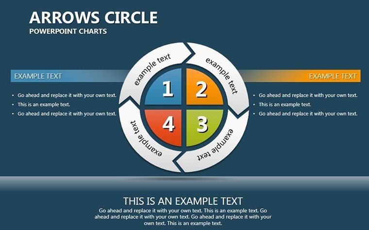
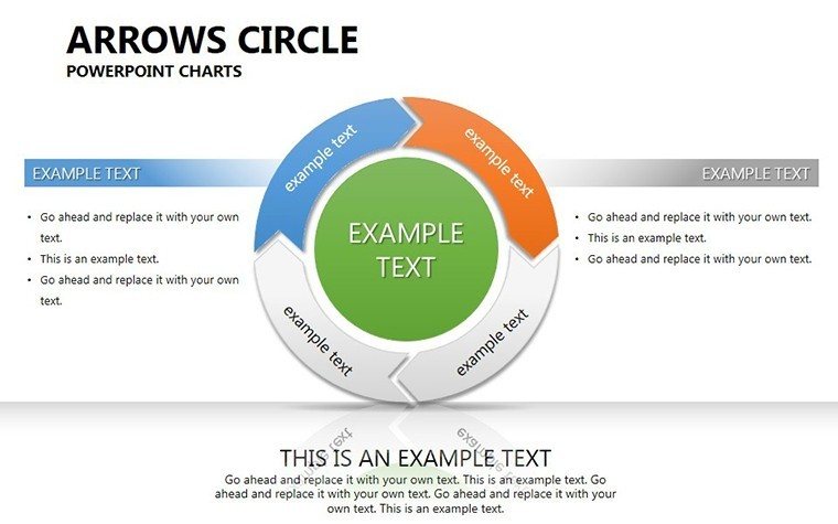
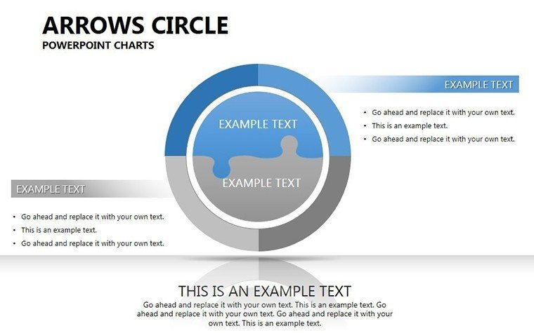
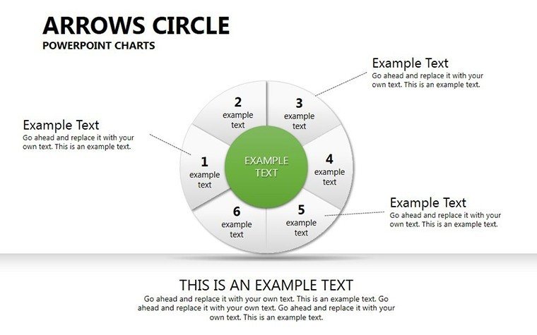
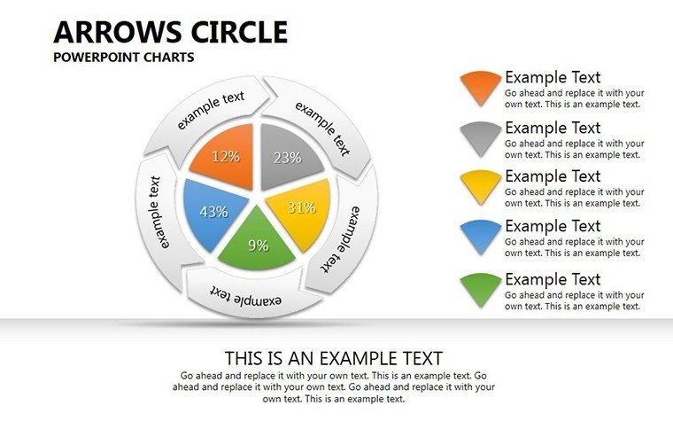
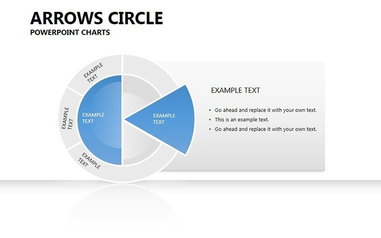
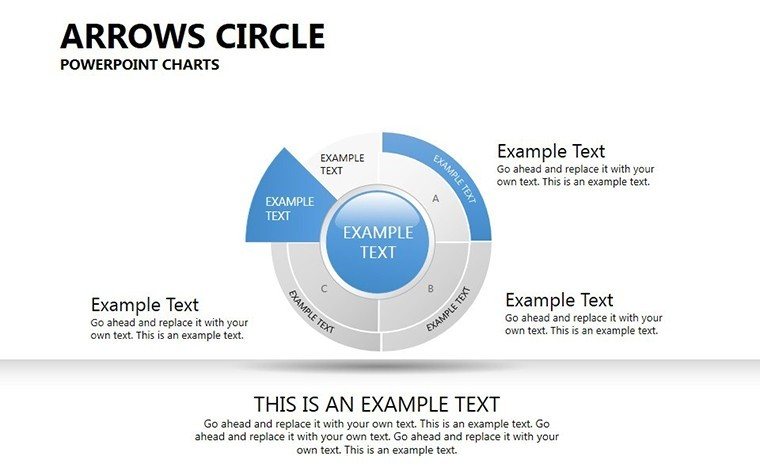
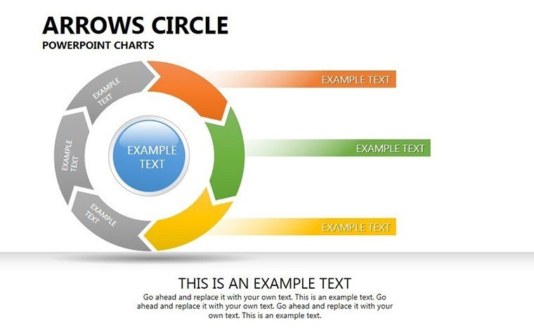
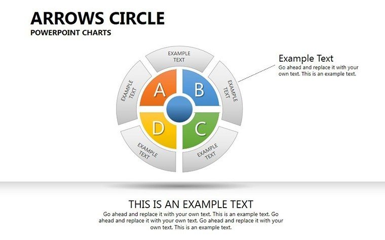
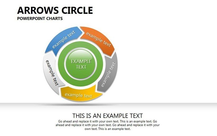
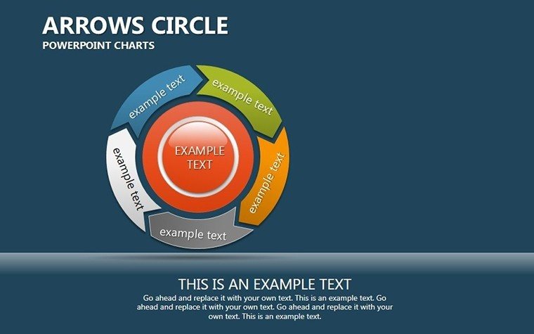
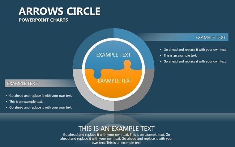
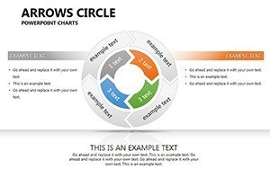
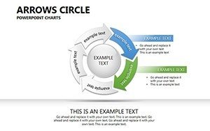
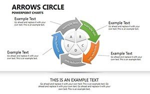
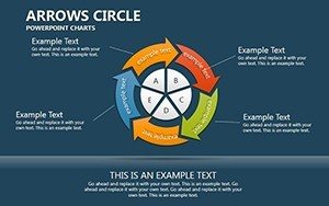
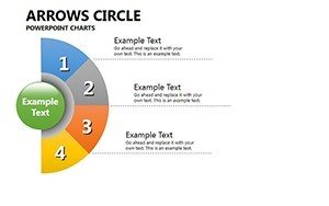
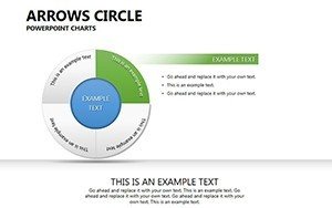
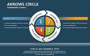
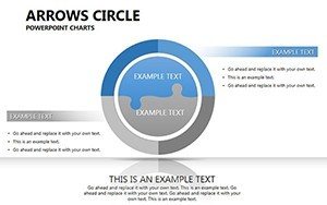
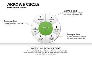
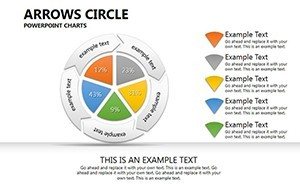
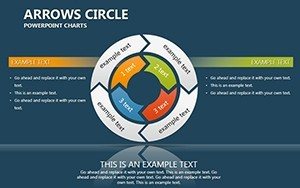
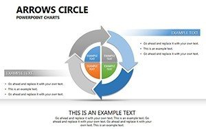
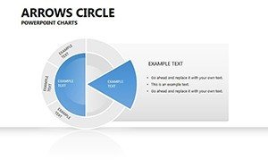
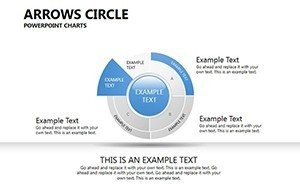
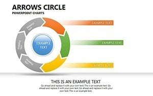
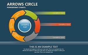
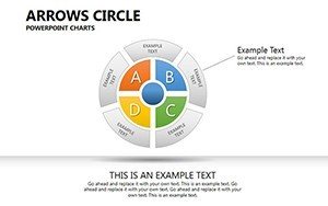
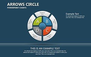
Arrows guide the eye, showing flow and influence. This template's designs range from simple arrow circles for basic cycles to complex ones with pie integrations for multifaceted data. In analytics, depict variable dependencies, like how sales affect inventory.
Full editability covers colors, text, and more, with .potx and JPG inclusions for versatility. Broad compatibility means it works on most systems.
Highlight Features for Visual Mastery
- Animation Capabilities: Custom effects for engaging reveals.
- High-Quality Assets: Images, icons, and inscriptions.
- Multimedia Support: Insert video or audio seamlessly.
- Color Variations: Pre-set options for quick styling.
For marketers, compare campaign metrics in arrow pies, per AMA standards, enhancing strategy sessions.
Applications That Drive Understanding
In education, teach ecosystem cycles with arrow flows. Business cases from McKinsey show such visuals speed decision-making. Outperforms basic charts with multimedia and expansions.
Step-by-Step Usage
- Map your data: Identify dependencies.
- Select format: Arrow circle or pie hybrid.
- Edit elements: Change colors, add media.
- Animate: For sequential storytelling.
- Deploy: In presentations or reports.
Tips: Use arrows for directionality and keep designs balanced. Expertise from data viz pros like Edward Tufte informs this.
Unlock Data Narratives
Elevate your visuals. Download and start depicting dependencies with flair today.
Frequently Asked Questions
What animations are available?
Custom effects for arrows and circles.
Can I embed videos?
Yes, expanding multimedia options.
How editable is the text?
Fully, with easy color changes too.
Compatible with older PowerPoint?
Yes, broad compatibility.
Includes vector icons?
Yes, for enhanced customization.