Fishbone Diagram PowerPoint Template - 19 Fully Editable Slides | Instant Download


Type: PowerPoint Charts template
Category: Business Models
Sources Available: .pptx
Product ID: PC00237
Template incl.: 19 editable slides
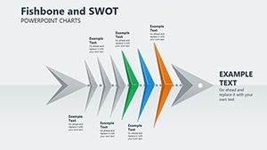
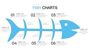
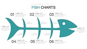
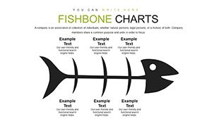
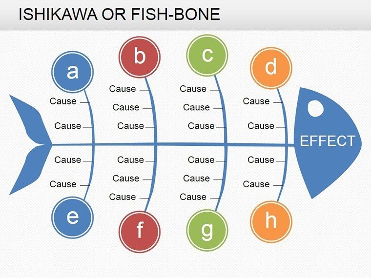
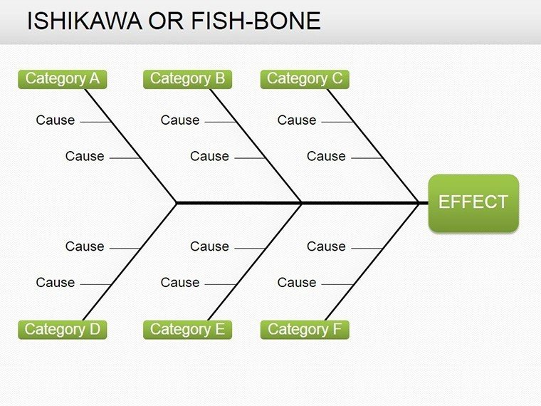
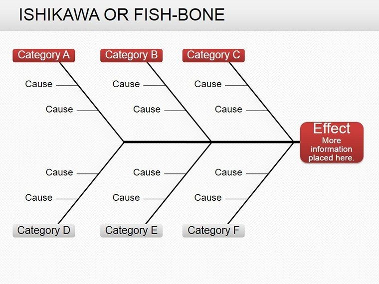
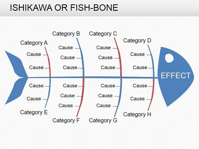
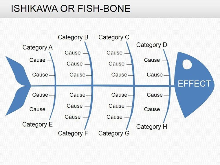
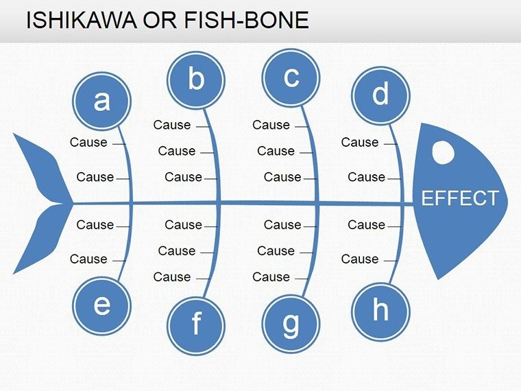
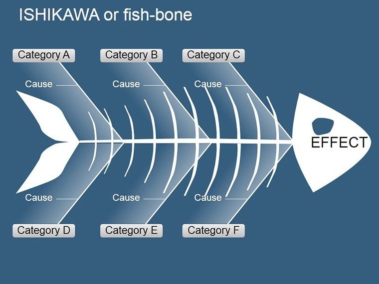
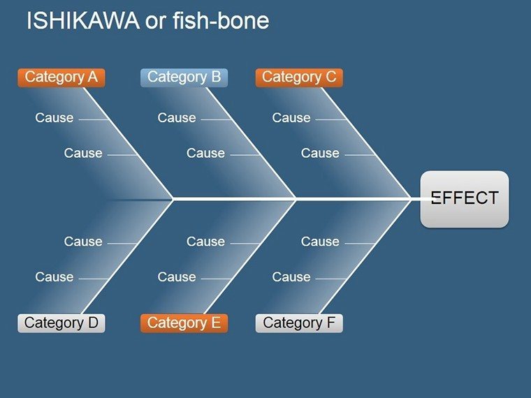
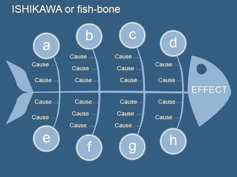
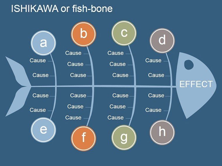
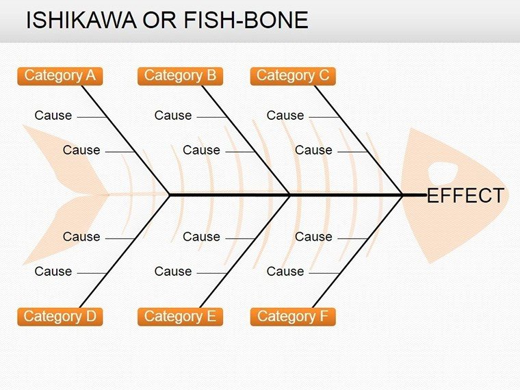
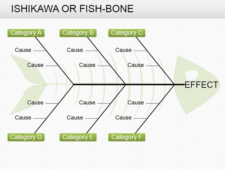
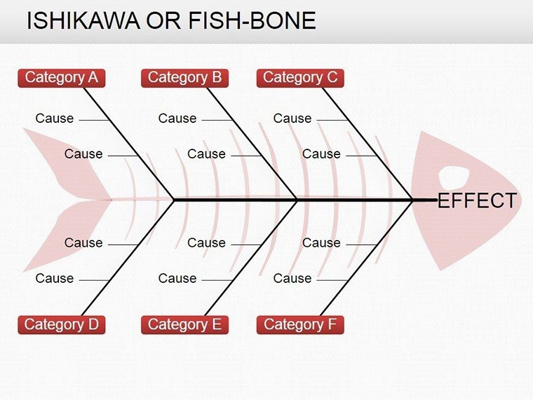
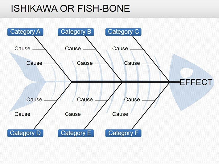
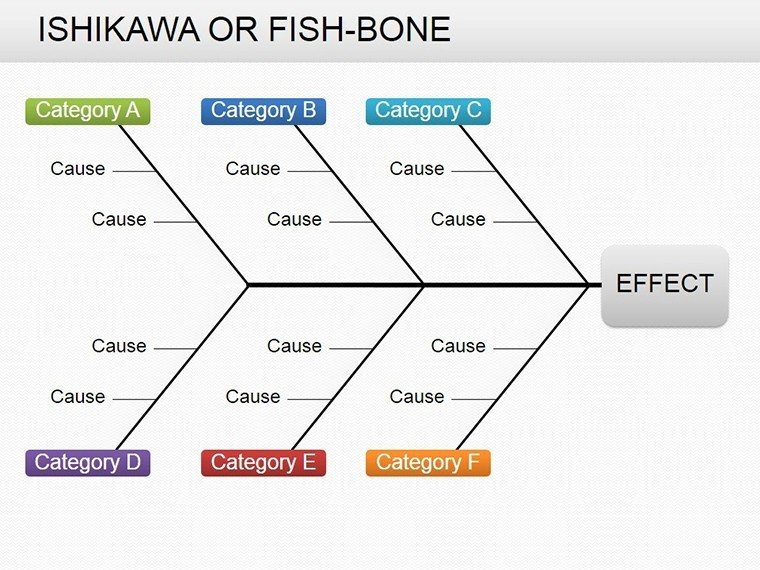
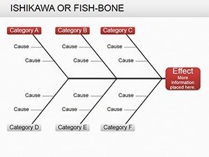
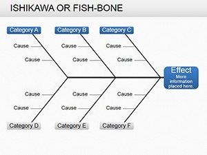
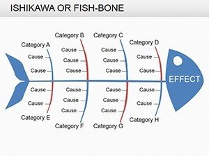
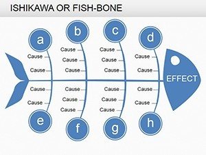
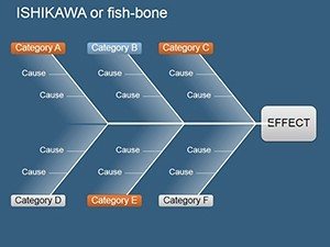
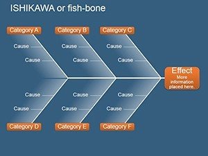
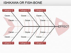
Identify root causes of complex problems quickly and professionally with this comprehensive Fishbone Diagram PowerPoint template. Also known as the Ishikawa or cause-and-effect diagram, this visual tool helps teams categorize potential factors contributing to an issue, making brainstorming sessions more structured and effective.
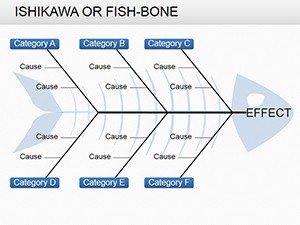
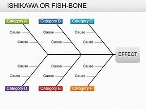
Featuring 19 unique, fully editable slides, this template provides multiple layouts and color variations to suit any presentation need. Save hours of design time and deliver clear, impactful visuals in your next meeting or report.
Instantly download and customize these ready-made diagrams to elevate your analysis process today.
Key Features
This Fishbone Diagram template is built for flexibility and professional results, using only native PowerPoint elements for seamless editing.
Every shape, line, and text box is 100% customizable, allowing you to adapt the diagrams to your specific content without losing quality.
The modern, clean design ensures your presentations remain focused on the analysis rather than distracting visuals.
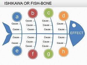
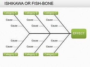
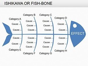
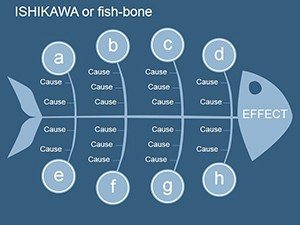
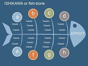
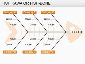
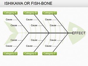
- 19 pre-designed Fishbone layouts with different branch configurations
- Multiple color themes and variations included
- Fully editable text, colors, sizes, and icons
- Vector-based graphics for perfect quality on screen or print
- Organized structure for quick navigation and updates
These features make the template suitable for both quick analyses and detailed executive presentations.
Professional Scenarios and Use Cases
In manufacturing and quality management, Fishbone diagrams are essential for investigating production defects, delays, or quality issues by breaking down causes into categories like materials, methods, manpower, and machines.
Consultants and project teams use this tool during retrospectives to identify root causes of risks, delays, or failed deliverables, enabling data-driven improvements.
Healthcare professionals apply Ishikawa diagrams to patient safety incidents, process bottlenecks, or error analysis to enhance operational efficiency.
Educators and trainers incorporate these visuals to teach structured problem-solving techniques in classrooms or workshops.
Internal operations teams benefit from clear cause mapping during brainstorming sessions, ensuring comprehensive coverage of all potential factors.
- Six Sigma and Lean improvement projects
- Incident and root cause investigations
- Business process optimization
- Team problem-solving workshops
- Executive reporting on performance issues
How to Customize and Use This Template
This template requires only Microsoft PowerPoint and no additional software or fonts.
After downloading the PPTX file, select a slide that matches your preferred layout and begin adding your content directly.
Place the main problem in the fish head, define major cause categories along the spine, and add sub-causes on the branches for a complete diagram.
Adjust colors to align with your branding, resize elements as needed, and apply animations for engaging presentations.
- Download and open the file in PowerPoint
- Select your preferred Fishbone layout
- Enter the problem statement and main categories
- Add detailed causes and supporting notes
- Present directly or export to PDF
Start creating professional root cause analyses in minutes with this ready-to-use template.
Frequently Asked Questions
What is a Fishbone Diagram?
A Fishbone Diagram, also called Ishikawa or cause-and-effect diagram, is a visualization tool that helps identify and organize potential causes of a problem into categories, making it easier to perform systematic root cause analysis.
How many slides are included in this template?
The template includes 19 fully editable slides featuring various Fishbone diagram layouts, color schemes, and structural variations for different analysis needs.
Is this template fully editable?
Yes - all shapes, text, colors, icons, and layouts are 100% editable using standard PowerPoint tools. No locked elements or external software required.
What file format will I receive?
You will receive a standard .pptx file compatible with Microsoft PowerPoint 2007 and newer, including Microsoft 365.
Can I use this template for printing?
Yes - all graphics are vector-based and high-resolution, ensuring sharp, professional results when printed or exported to PDF.
Does this work in Google Slides?
The template is optimized for PowerPoint, but the .pptx file can be uploaded to Google Slides. Minor formatting adjustments may be needed for full compatibility.