Magic Ring PowerPoint Charts Template


Step into a realm where data meets enchantment - our Magic Ring PowerPoint Charts Template redefines how you present information. With 13 meticulously designed editable slides, this template infuses your presentations with mesmerizing visuals that turn ordinary data into spellbinding stories. Ideal for business professionals, educators, entrepreneurs, and creatives, it addresses the common frustration of dull slides by offering dynamic charts and graphics that engage and persuade. Whether illustrating market trends in a boardroom or explaining concepts in a classroom, these charts provide the magic touch needed to hold attention and drive home your message. Experience the ease of customization that aligns perfectly with your brand, saving hours of design time while amplifying impact. This isn't just a template; it's a gateway to presentations that leave lasting impressions, blending professionalism with a hint of wonder.
Discover the Enchanting Features of Magic Ring Charts
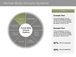
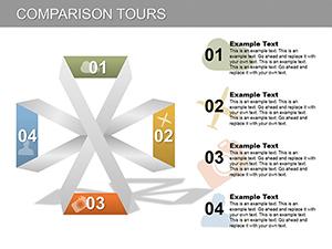
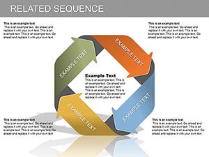
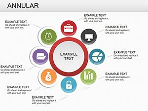
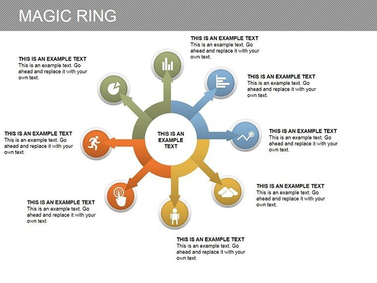
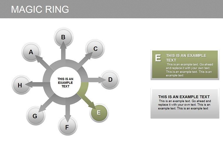
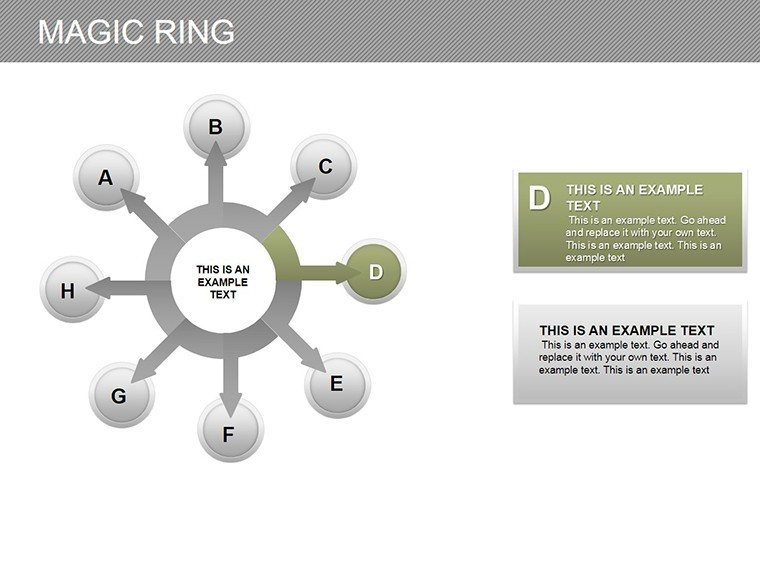
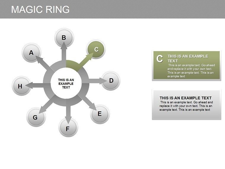
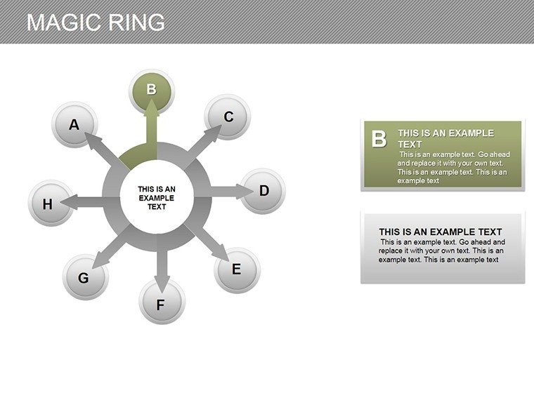
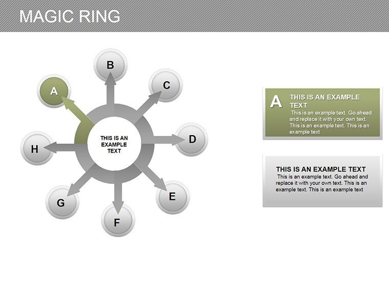
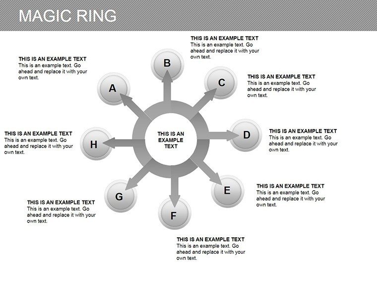
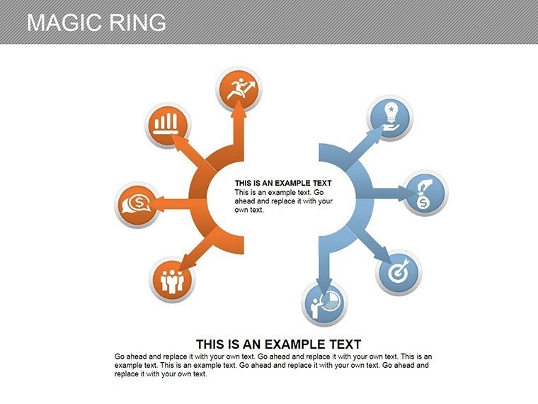
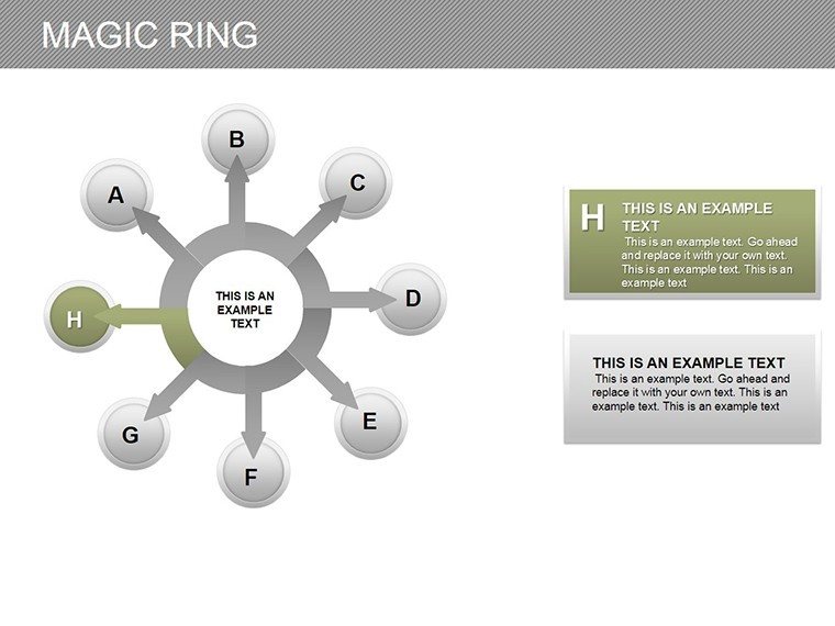
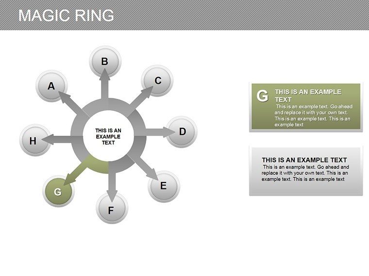
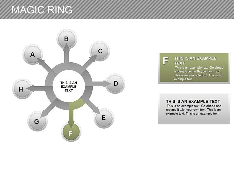
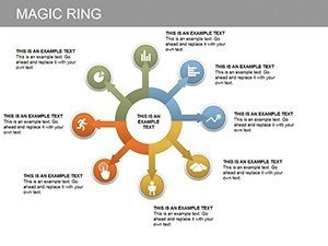
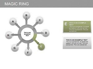
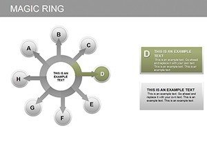
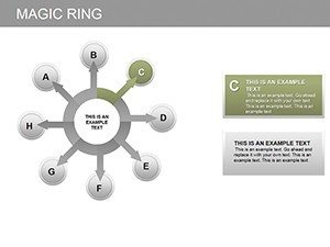
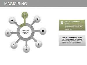
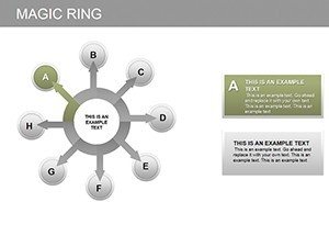
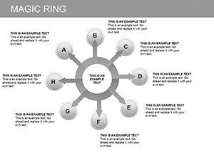
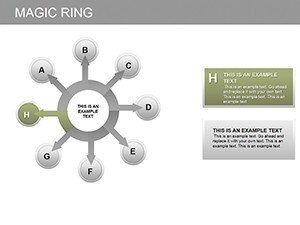
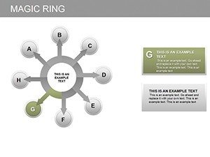
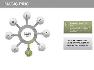
At the heart of this template lies a collection of features crafted to elevate your content. The mesmerizing visuals include ring-shaped charts that symbolize cycles, progress, and interconnections - perfect for depicting feedback loops in product development or annual growth rings in business reports. Customize effortlessly: Adjust colors to match your corporate palette, tweak fonts for readability, and rearrange layouts to fit your narrative flow. Unlike standard PowerPoint options that feel rigid, these slides offer fluidity, allowing animations to reveal data layers progressively, much like unfolding a magical tale. Benefits are clear - enhanced audience retention through visual intrigue, quicker comprehension of complex ideas, and a professional edge that sets you apart. For trainers conducting workshops, incorporate these into interactive sessions where participants can see real-time data magic unfold.
Versatile Applications Across Professional Landscapes
- Business Insights: Use ring charts to showcase KPI dashboards, making metrics like revenue cycles vivid and actionable.
- Educational Tools: Simplify lessons on scientific processes, such as ecological cycles, with visuals that spark curiosity.
- Entrepreneurial Pitches: Highlight startup milestones in investor decks, using concentric rings to represent scaling phases.
- Creative Showcases: Present design portfolios with layered charts that add depth to conceptual explanations.
These applications draw from proven strategies, akin to those employed in TED Talks where visuals amplify speaker authority. Imagine a sales team using the template to map customer journey rings, revealing bottlenecks and opportunities - resulting in more targeted strategies. Educators might adapt it for history lessons, illustrating timelines as enchanted loops that connect past events to present implications. The template's seamless integration means you can import data from Excel directly, streamlining preparation and allowing focus on delivery.
Pro Tips for Magical Presentation Mastery
- Layer information strategically: Start with outer rings for broad overviews, delving inward for details.
- Balance visuals and text: Ensure charts dominate while supporting copy provides context without overwhelming.
- Practice transitions: Use subtle animations to mimic 'magic' reveals, enhancing engagement without distraction.
- Gather feedback: Test slides with a small group to refine the enchanting effect before big presentations.
Incorporating these tips, you'll find the template not only versatile but transformative. Compared to free alternatives, its premium design elements - like gradient fills and shadow effects - convey expertise, boosting your in fields like consulting. For startups, this means more compelling funding pitches; for academics, more memorable lectures.
Ultimately, the Magic Ring PowerPoint Charts Template invites you to weave wonder into your work. Download it now and watch your presentations cast a spell of success.
Frequently Asked Questions
What makes the ring charts unique?
They symbolize cycles and layers, offering a fresh visual metaphor for interconnected data.
Can I add my own data easily?
Yes, simply input values into the editable fields for instant updates.
Is animation support included?
Absolutely, with built-in options for smooth, enchanting transitions.
Does it work on older PowerPoint versions?
It�s optimized for recent versions but compatible with 2010 onward.
How many color schemes are available?
Unlimited - customize to any palette that suits your brand.