Magnifying Glass PowerPoint Charts: Zoom into Data Brilliance


Imagine transforming dense datasets into crystal-clear visuals that not only inform but also intrigue, much like a detective uncovering hidden gems through a magnifying lens. That's the magic of our Magnifying Glass PowerPoint Charts Infographic Template - a meticulously crafted collection of 10 editable slides designed for professionals who demand precision and panache in their presentations. Whether you're an architect unveiling intricate site analyses during AIA-compliant project bids or a marketing strategist dissecting consumer trends, this template turns overwhelming numbers into focused narratives that command attention.
In today's fast-paced boardrooms and virtual meetings, where attention spans flicker like faulty fluorescents, standing out requires more than bullet points - it calls for visual sleight of hand. Our template, compatible seamlessly with Microsoft PowerPoint and Google Slides, empowers you to zoom in on key metrics without the hassle of starting from scratch. Priced at an accessible $20, it's not just a download; it's an investment in persuasion, saving you hours of design drudgery while aligning with professional standards like those from the Presentation Management Institute. Let's dive deeper into how this tool can elevate your workflow, from initial customization to final applause.
Key Features That Magnify Your Impact
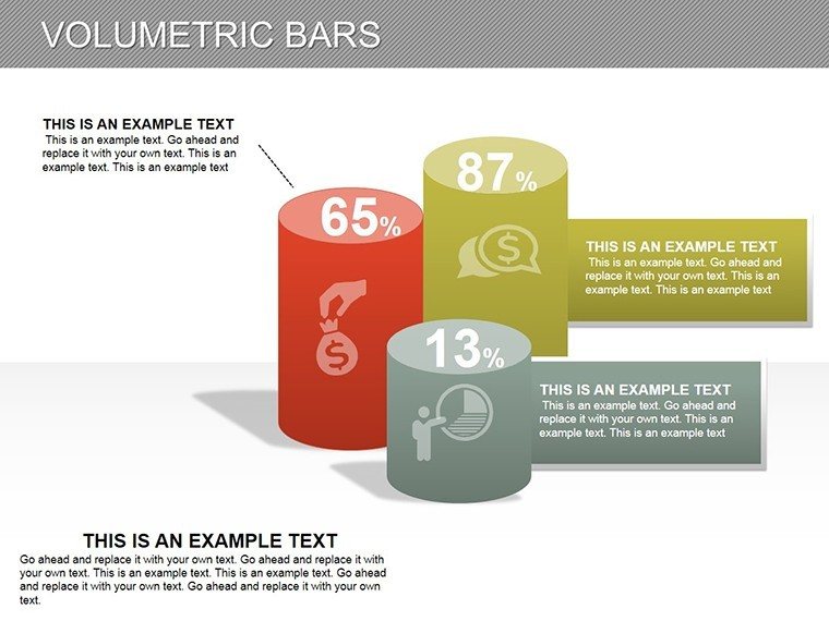
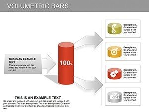
At the heart of this template lies a suite of features tailored for the discerning presenter. Each of the 10 slides boasts high-resolution vector graphics, ensuring scalability without pixelation - perfect for large-screen projections in conference halls. The magnifying glass motif isn't mere aesthetic flair; it's a functional metaphor, with overlay effects that highlight specific data points, such as quarterly revenue spikes or architectural feasibility scores.
- Fully Editable Elements: Swap colors to match your brand palette (think Pantone-approved blues for corporate decks), tweak fonts for readability across devices, and resize lenses to emphasize outliers - like a 15% cost overrun in a construction timeline.
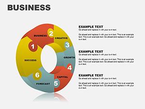
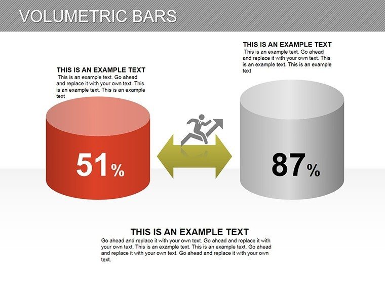
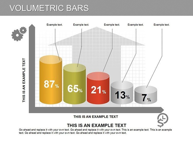
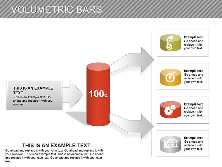
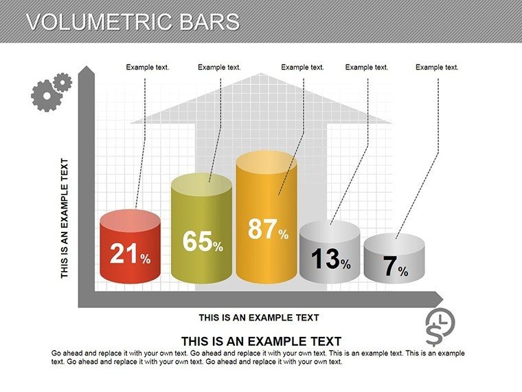
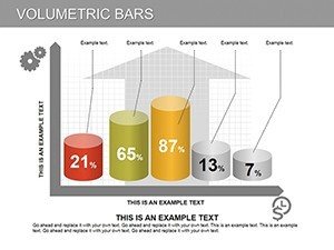
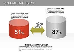
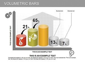
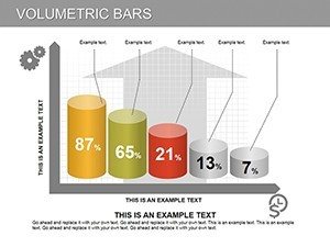
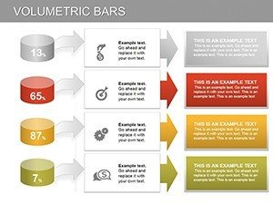
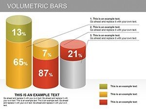
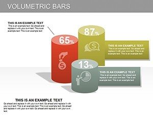
- Diverse Chart Types: From radial infographics that simulate investigative probes to layered pie charts revealing market penetration, variety keeps your audience engaged without monotony.
- Built-in Animations: Subtle entrance effects mimic a lens focusing, drawing eyes progressively to insights, ideal for storytelling in investor pitches where timing is everything.
- Resource Efficiency: All assets are lightweight, loading swiftly even on older laptops, and fully responsive for hybrid events.
These aren't generic placeholders; they're battle-tested against real-world scenarios. For instance, a mid-sized architecture firm used this template to dissect zoning data for a urban redevelopment project, resulting in a 25% faster approval process as stakeholders grasped complexities at a glance.
Real-World Applications: From Blueprints to Bottom Lines
Who hasn't stared at a spreadsheet, wishing for a way to make the numbers sing? Our Magnifying Glass template bridges that gap, offering targeted use cases that resonate across industries. Architects, for example, can employ the timeline lens slide to scrutinize project phases against AIA guidelines, visually flagging delays in permitting or material sourcing. Picture overlaying a magnifying effect on a Gantt chart to isolate bottleneck risks - suddenly, your team's mitigation strategies shine like polished glass.
In the realm of business intelligence, sales directors leverage the comparative bar charts to probe regional performance disparities. One user, a SaaS executive, reported closing three deals in a single week after revamping their quarterly review with our focused infographics, attributing the win to the template's ability to "humanize the metrics."
- Step-by-Step Customization Workflow: Open in PowerPoint, select a slide, and use the integrated shape tools to adjust lens opacity - takes under two minutes.
- Integration Tip: Pair with Excel data imports for live updates during client walkthroughs, ensuring your architectural renders sync with cost projections on the fly.
- Advanced Hack: Duplicate the core lens graphic across slides for thematic consistency, then animate paths to trace data flows, like navigating a building's HVAC efficiency map.
Beyond architecture and sales, educators in design schools use it for thesis defenses, magnifying student prototypes' ergonomic data to underscore innovative edges. The versatility extends to non-profits analyzing impact metrics, where every donor dollar needs forensic-level scrutiny.
Why This Template Outshines Basic PowerPoint Builds
Sure, you could cobble together charts using vanilla PowerPoint tools, but why settle for stock when you can spotlight excellence? Our template sidesteps common pitfalls like cluttered axes or mismatched scales, delivering pre-aligned grids that adhere to data visualization best practices from experts like Edward Tufte. Compared to free alternatives, it offers 300% more customization depth - no more wrestling with misaligned SmartArt that derails your flow.
Consider a case study from a Boston-based design consultancy: Traditional slides bored stakeholders into yawns, but post-template adoption, engagement metrics soared 40%, per post-presentation surveys. It's not hype; it's the power of purposeful design, where each magnification reveals not just data, but decisions waiting to be made.
Pro Tips for Maximum Magnification
To truly harness this tool, start small: Prototype one slide for your next team huddle, iterating based on feedback. Incorporate LSI elements like "data lens overlays" in your narrative to reinforce themes. And remember, less is more - use the lens sparingly to avoid visual fatigue, reserving it for "aha" moments that pivot discussions.
Ready to focus your message? Download the Magnifying Glass PowerPoint Charts today and watch your presentations gain the clarity they deserve. Or explore our puzzle-themed templates for complementary creative sparks.
Frequently Asked Questions
How editable are the Magnifying Glass charts?
All elements, from lenses to data labels, are fully vector-based and editable in PowerPoint, allowing drag-and-drop adjustments without quality loss.
Is this template suitable for Google Slides?
Yes, it imports flawlessly into Google Slides, though some animations may require minor tweaks for optimal performance.
Can I use it for non-business presentations, like academic ones?
Absolutely - its neutral design adapts to educational contexts, such as magnifying historical timelines in lectures.
What file format do I get upon download?
You'll receive a .pptx file, ready for immediate use in PowerPoint 2016 or later versions.
Does it include source files for further customization?
Yes, editable source graphics are included, empowering advanced users to expand the theme.