Service Financial Analyst PowerPoint Charts Template: Precision in Every Metric


Step into a realm where financial data becomes a strategic weapon, not just numbers on a page. Our Service Financial Analyst PowerPoint Charts Template is crafted for those who dissect balance sheets and forecast futures, offering 17 editable slides that blend line graphs, bar charts, and pie visuals into insightful narratives. Ideal for analysts in consulting firms or corporate finance teams, it addresses the pain of vague reports by providing clear, customizable tools compatible with PowerPoint and Google Slides. Experience the satisfaction of presentations that not only inform but influence, turning fiscal reviews into opportunities for growth and innovation.
Distinguishing Features of This Financial Toolkit
This template shines with its focus on analytical depth. Line graphs track trends over time, bars compare quarterly performances, and pies allocate budgets seamlessly. Tailor fonts to corporate standards or colors to highlight variances - green for positives, amber for cautions. Outpacing basic Excel exports, it incorporates principles from the CFA Institute's visualization guidelines, ensuring ethical and accurate depictions. For service-based industries, visualize client revenue streams or cost efficiencies, as in PwC case studies where similar charts clarified merger synergies, empowering decisions with visual authority.
Core Capabilities for Data-Driven Decisions
Harness features like dynamic data linking for real-time updates and layered charts for multifaceted analysis. Benefits extend to quicker audits and more persuasive pitches, reducing miscommunication risks. Backed by expertise from financial bodies like the Financial Accounting Standards Board (FASB), the designs promote transparency. Use in budget planning sessions or investor briefings, where pie charts can illustrate portfolio diversifications, making complex finances accessible and trustworthy.
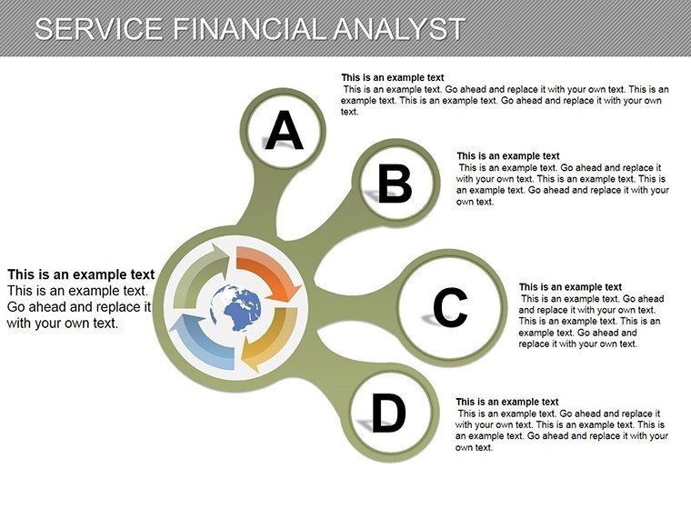
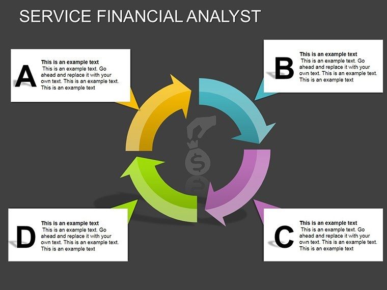
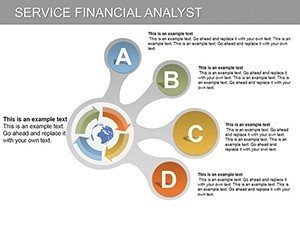
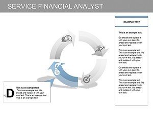
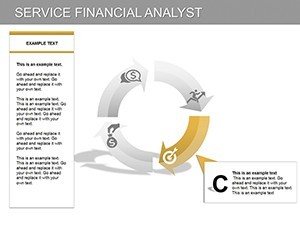
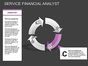
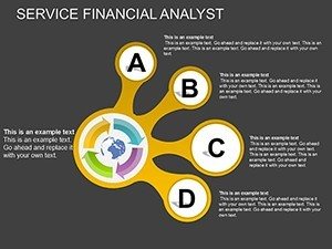
Slide-by-Slide Exploration: Analytical Essentials
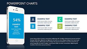
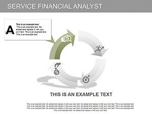
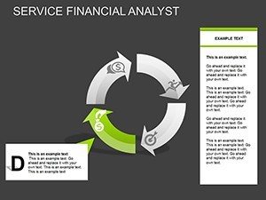
- Slide 1-5: Line Graph Focus - Trend lines for forecasting, with markers for key events like market shifts.
- Slide 6-10: Bar Chart Comparisons - Vertical and horizontal bars for peer benchmarks or variance analysis.
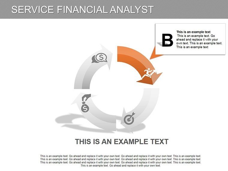
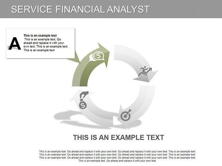
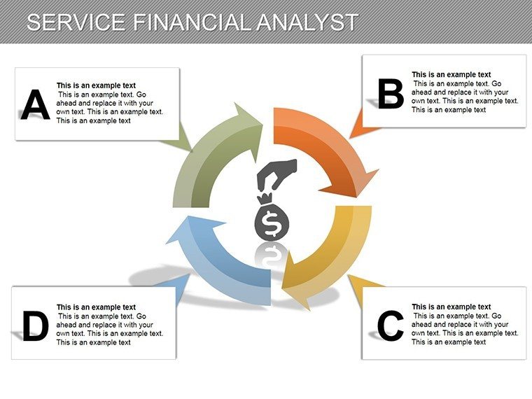
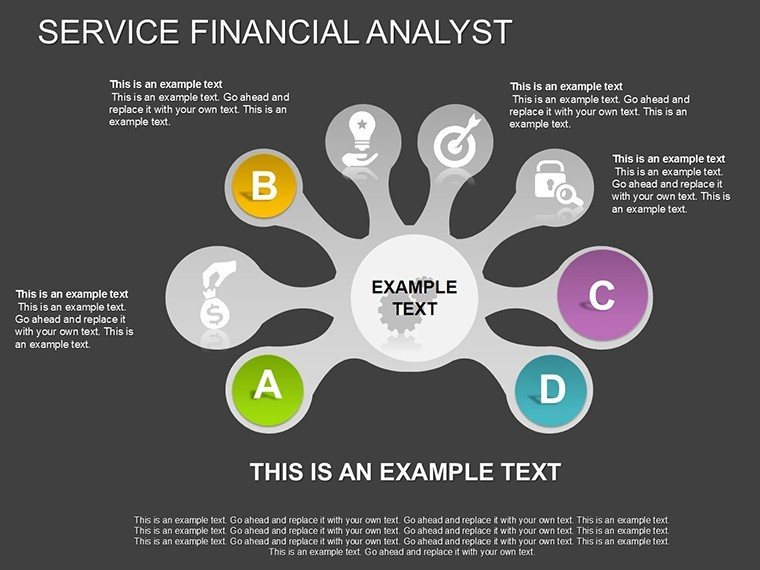
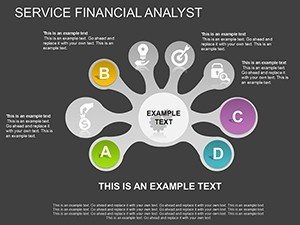
- Slide 11-14: Pie Chart Distributions - Sliced views of expenditures, with explode options for emphasis.
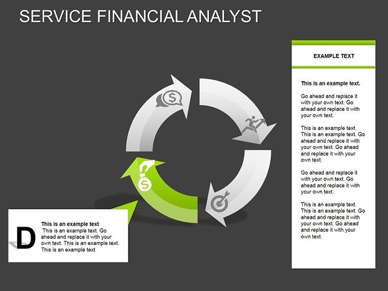
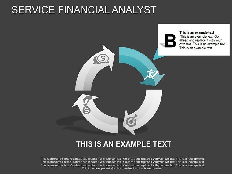
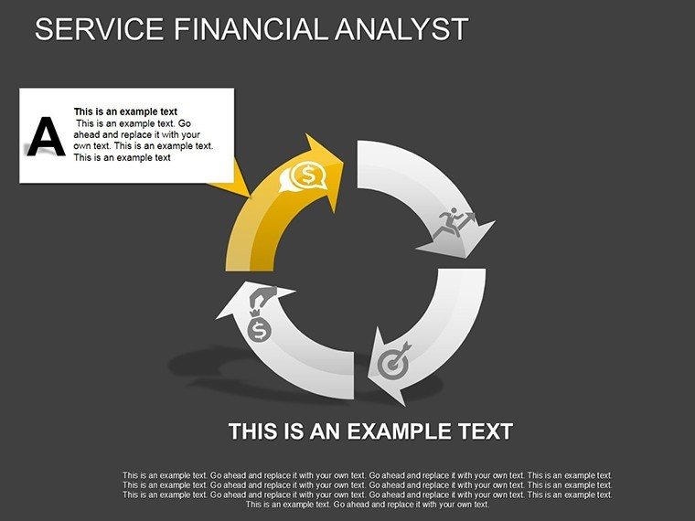
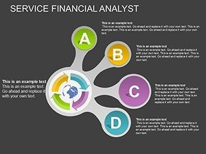
- Slide 15-17: Hybrid Integrations - Combined charts for comprehensive overviews, like revenue vs. expense dashboards.
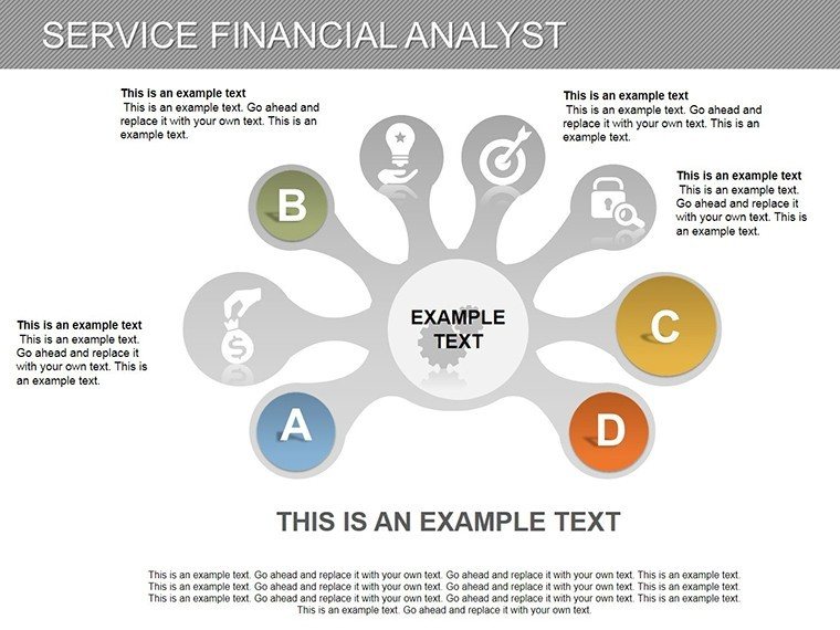
Included icons for financial symbols enhance thematic consistency, streamlining your workflow.
Applied Scenarios in Financial Services
Envision an analyst presenting to executives: bar charts reveal cost savings post-optimization, supported by lines showing sustained growth. In education, finance professors use pies to teach asset allocation, echoing Harvard Business Review examples. This template facilitates such applications, drawing from real successes like JPMorgan's data-driven strategies, building through proven, adaptable visuals.
Guide to Deploying the Template Effectively
- Import into PowerPoint.
- Populate with your datasets.
- Refine visuals for clarity.
- Incorporate narratives.
- Simulate Q&A with annotations.
- Finalize for distribution.
Compatible with analytics tools like Tableau for enhanced integration.
Pro Tips for Financial Visualization Mastery
Weave stories around data - contextualize spikes with economic notes. Maintain scale integrity to avoid distortion, per GARP risk management standards. For services, emphasize intangibles like client satisfaction metrics. These insights elevate your charts from informative to indispensable.
Seize the edge in financial storytelling - download this template and master your metrics now.
Frequently Asked Questions
- How do I link data to charts?
- Use PowerPoint's data tools for automatic updates from Excel sources.
- Compatible with older PowerPoint versions?
- Yes, works from 2010 onward with full features.
- Can I export to PDF?
- Easily, preserving all visuals and edits.
- Suitable for non-financial analysts?
- Yes, adaptable for any data-heavy field.
- Are there color-blind friendly options?
- Yes, customizable palettes ensure accessibility.
- How to add custom legends?
- Edit via the chart tools pane for personalized keys.